v.2.9.5
Overview
Buttons allow users to take action and make choices with a single click. There are four types: Filled, Outline, Text, and Icon Only. All but ‘Icon Only’ may include left or right icon add-ons, square and circle variants.
Anatomy
Visual Style
| FILLED | Default | Hover | Focus | Active | Disabled |
|---|---|---|---|---|---|
| Label |  |  |  |  |  |
| Icon-Right |  | ||||
| Icon-Left |  | ||||
| font/icon-color: neutral-000
(#FFFFFF) letter-spacing: 0 text-align: center background-fill-color: brand-600 (#1E79C2) border-color: brand-700 (#006AA9) border: 1px solid, inside, radius: 2px | background-fill-color: brand-700 (#006AA9) | border-inside: 2px solid border-color: neutral-000 (#FFFFFF) border-outside: 2px solid border-color: brand-700 (#006AA9) | background-fill-color: brand-700 (#006AA9) | background-fill-color: brand-100 (#E0E3E8) font/icon-color: custom-neutral (#5C6574) disabled_read-only_cursor |
| OUTLINE | Default | Hover | Focus | Active | Disabled |
|---|---|---|---|---|---|
| Label |  |  |  |  |  |
| Icon-Right |  | ||||
| Icon-Left |  | ||||
| font/icon-color: brand-600 (#1E79C2) background-fill-color: neutral-000 (#FFFFFF) border-color: #8C93A6 border: 1px solid, inside border-radius: 2px | font/icon/border-color: brand-700 (#006AA9) | font/icon-color: brand-600 (#1E79C2) border-inside-color: brand-700 (#006AA9) border: 2px solid, inside | font/icon/border-color: brand-700 (#006AA9) | font/icon-color: neutral-500 (#697489) border-color: custom-neutral (#8C93A6) disabled_read-only_cursor |
| TEXT | Default | Hover | Focus | Active | Disabled |
|---|---|---|---|---|---|
| Label |  |  |  |  |  |
| Icon-Right | 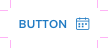 | ||||
| Icon-Left | 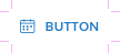 | ||||
| font/icon-color: brand-600 (#1E79C2) | font/icon-color: brand-700 (#006AA9) background-fill: brand-300 (#EBF6FF) border-radius: 2px | border-color: brand-700 (#006AA9) border: 2px solid, inside border-radius: 2px | font/icon-color: brand-700 (#006AA9) | font/icon-color: neutral-500 (#697489) disabled_read-only_cursor |
Icon Only
| FILLED | Default | Hover | Focus | Active | Disabled |
|---|---|---|---|---|---|
| Square |  |  |  |  |  |
| Round |  |  |  |  |  |
| icon-color: neutral-000 (#FFFFFF) background-fill-color: brand-600 (#1E79C2) border-color: brand-700 (#006AA9) border: 1px solid, inside square-border-radius: 2px round-border-radius: 14px | background-fill-color: brand-700 (#006AA9) | border-inside: 2px solid border-color: neutral-000 (#FFFFFF) border-outside: 2px solid border-color: brand-700 (#006AA9) | background-fill-color: brand-700 (#006AA9) | background-fill-color: brand-100 (#E0E3E8) font/icon-color: custom-neutral (#5C6574) disabled_read-only_cursor |
| OUTLINE | Default | Hover | Focus | Active | Disabled |
|---|---|---|---|---|---|
| Square |  |  |  |  |  |
| Round |  |  |  |  |  |
| icon-color: brand-600 (#1E79C2) background-fill-color: neutral-000 (#FFFFFF) border-color: custom-neutral (#8C93A6) border: 1px solid, inside square-border-radius: 2px round-border-radius: 14px | icon/border-color: brand-700 (#006AA9) | border-color: brand-700 (#006AA9) border: 2px solid, inside | icon/border-color: brand-700 (#006AA9) | font/icon-color: neutral-500 (#697489) border-color: custom-neutral (#8C93A6) disabled_read-only_cursor |
| ICON | Default | Hover | Focus | Active | Disabled |
|---|---|---|---|---|---|
| Square |  |  |  |  |  |
| Round |  |  |  |  |  |
| icon-color: brand-600 (#1E79C2) | icon-color: brand-700 (#006AA9) background-fill: brand-300 (#EBF6FF) square-border-radius: 2px round-border-radius: 14px | border-color: brand-700 (#006AA9) border: 2px solid, inside | icon-color: brand-700 (#006AA9) | font/icon-color: neutral-500 (#697489) disabled_read-only_cursor |
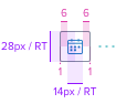
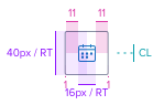
Dimensions
Width

Height
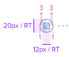
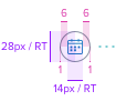
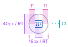
| Small (S) | Small- Focus Variant | Medium (M) | Large (L) |
|---|---|---|---|
 |  |  |  |
| button-height: 20px / RT font-size: 12px / RT font-weight: semibold (600) | outside border: 1px / RT, solid, color: #006AA9 inside border: 1px / RT, solid, color: #FFFFFF | button-height: 28px / RT font-size: 14px / RT | button-height: 40px / RT font-size: 16px / RT |
 |  |  |  |
| icon-size: 12x12px / RT | Variant is applied so that focus does not croud button content. | icon-size: 14x14px / RT | icon-size: 16x16px / RT |
 |  |  | |
| font-size: 12px / RT font-weight: semibold (600) text-transform: uppercase | font-size: 14px / RT | font-size: 16px / RT | |
| Square | |||
 |  |  | |
| Round | |||
 |  |  | |
| button-height/width: 20x20px / RT icon-size: 12x12px / RT | button-height/width: 28x28px / RT icon-size: 14x14px / RT | button-height/width: 40x40px / RT icon-size: 16x16px / RT |
Interaction
Tooltip
Button can be set to reveal a tooltip on Hover, Focus and Disabled states

Responsive Behavior
Font Resize
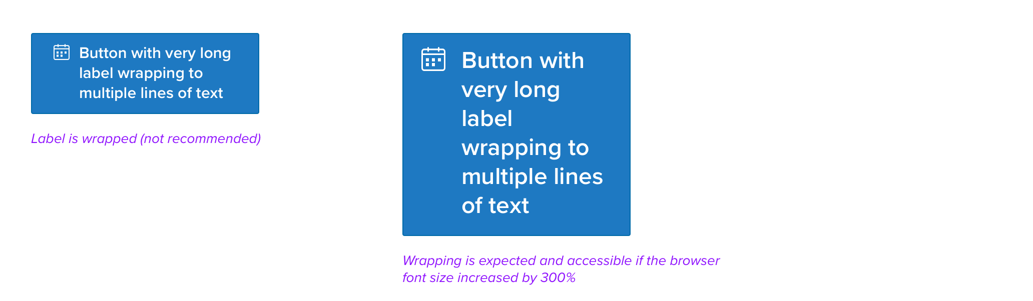
If longer labels cannot be avoided, or if the browser font size is increased, the text string will wrap to multiple lines. Buttons use rem values with the root element defined with Resize-Text (RT) rules. If an icon is included, it will always align to the top left or right for optimal legibility.
Digital Accessibility
Guidelines for Labels
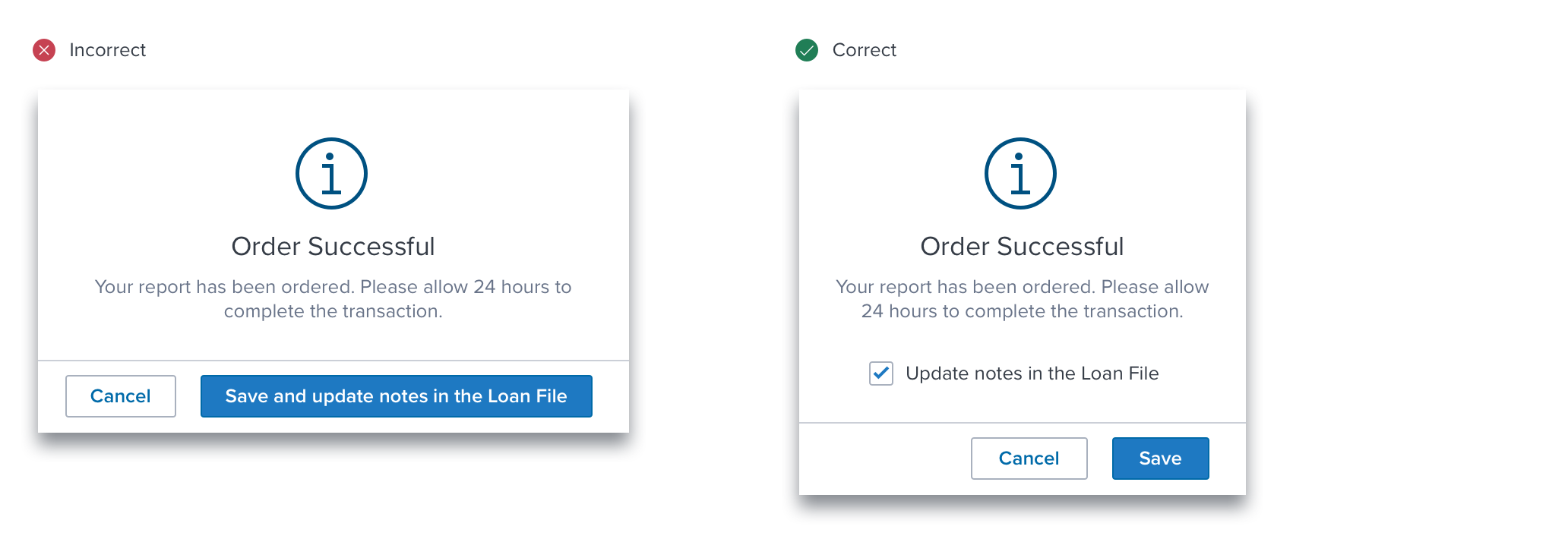
It's critical to consider usability when deciding on the label length for a button. Longer labels may cause issues with layout and readability, especially on smaller screens or when the button is used in conjunction with other elements.
It is recommended to keep button labels concise and descriptive, providing enough information for users to understand the action associated with the button without overwhelming them with excessive text. In this fictional case, the text regarding Loan File Notes is placed in the content region as a Checkbox instead of making the primary action difficult to read.
Keyboard Usage
Keyboard Interaction
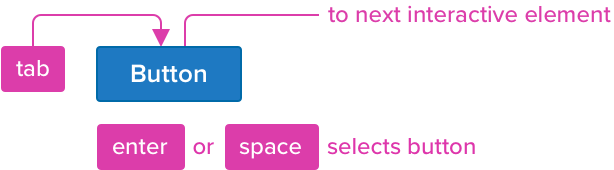
Buttons can be reached by Tab and selected with Space or Enter.
Keyboard & Focus
Global standard keyboard interactions apply, and in order of operations from left to right, top to bottom.
| Key | Function |
|---|---|
| (TAB) / (SHIFT+TAB) | Moves focus indication to the next and previous interactive elements in the tab order (when button receives focus). |
| (SPC) / (END/RET) | Activates and confirms action when an interactive element receives focus indication. |
Screen Readers
Steps from object to object or by jumping between components. Converts interactive elements into speech.
| Semantic HTML Role | Announced Content (defined by app-side) | ARIA Attributes |
|---|---|---|
| BUTTON | Label | NA |
| ARIA Consideration |
|---|
| Icon-only buttons have additional information about the button that is not communicated through the button text. The icon should have non-empty alt text (or aria-label for SVG). Otherwise it should have empty alt text (or aria-label for SVG). |
References
Usage Guidelines
Basic Keyboard Functions
WCAG Success Criterion for Target Size (Minimum)
View Code on Storybook