v.1.6.1
Overview
Side Panel is:
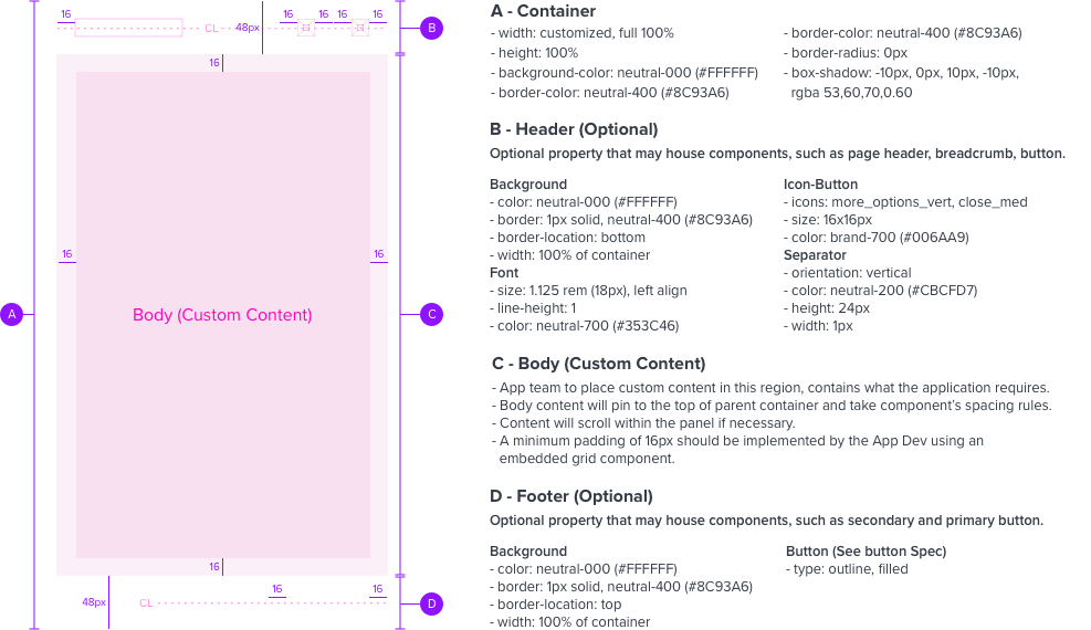
- A generic container which may house varying types of content.
- Opens into panel view, can be minimized to panel bar view, and can close out of view.
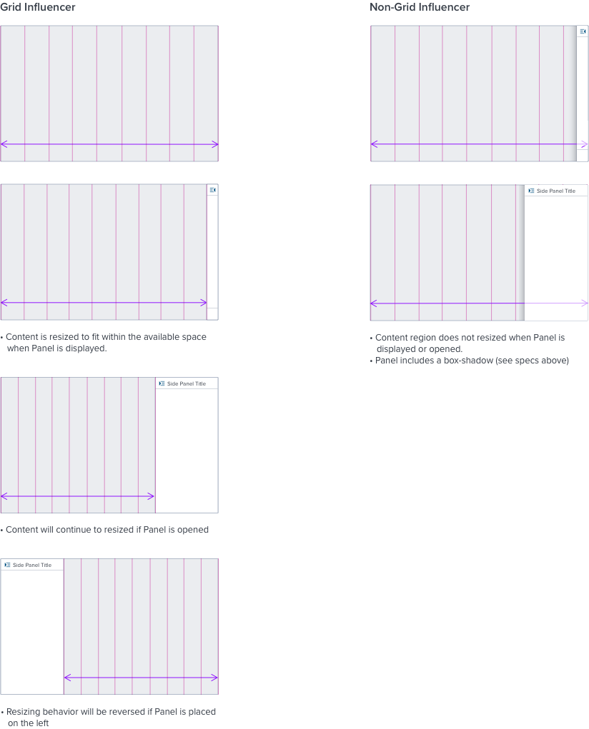
- A grid influencer that resizes page content, and a non-grid influencer that displays atop the page content.
- Positioned on the left or right side of the page content.
Anatomy

Interactions
Motion
• Positioned on the right side of the content, Side Panel will:
- Open into view from left-to-right
- Close out of view from right-to-left
• When placed on the left, Panel will behave in reverse.
Refer to existing implementation for exact motion details.


Grid Behavior

Digital Accessibility
Keyboard Interaction
- An interactive button is used to invoke the side panel open.
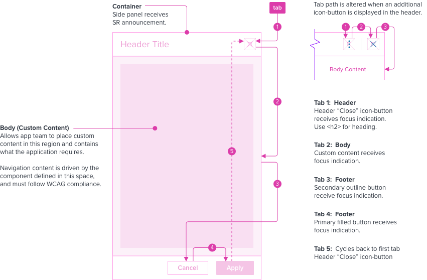
- Tab and focus indication should remain in the side panel until closed, cycling through.
- The side panel should contain the tab sequence so Tab and Shift + Tab keys do not move focus outside of the panel. The windows underneath are not available for interaction.
- To close the side panel, use the elements that are applicable, header use Close “X”, footer use “Cancel”, or Escape key when the focus is inside the side panel, but not intercepted by other content.
- When side panel closes, focus should retain the user’s point of regard and return to the element that invoked the panel open.

Keyboard & Focus
Global standard keyboard interactions apply, and in order of operations from left to right, top to bottom.
| Key | Function |
|---|---|
| TAB | SHIFT+TAB | Moves focus indication to the next and previous interactive elements in the tab order, cycling through (i.e. header, body, footer). |
| ESC | Closes panel, focus should retain the user’s point of regard and return to the element that invoked the panel open. modified content is not kept. |
Screen Reader
Steps from object to object or by jumping between components. Converts interactive elements into speech.
| Semantic HTML Role | Announced Content (app-side) | ARIA Attribute |
|---|---|---|
| BUTTON | aria-expanded=“true/flase”, aria-controls=“sidepanel-container-id” | |
| DIALOG | side panel | tabindex=“-1”, role=“dialog”, aria-labelledby=“sidepanel-header-id”/aria-label="dialog label", aria-modal=“true” |
Considerations
Add the dynamic content of the modal slide above the button in the DOM. This allows the trigger button to receive focus indication after the side panel closes.
