Overview
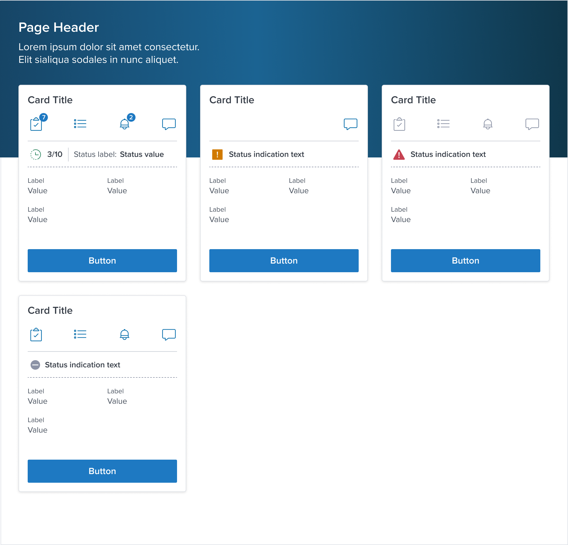
The CardHeader component acts as the initial point of engagement within the Dim Sum Design System's Card architecture.
It is crafted to frame the content of a card effectively, offering a visual cue to its importance and context.
By design, the CardHeader introduces the content with clarity and purpose, setting the stage for the information that follows.
Its structured and aesthetic integration ensures a smooth visual transition into the core content of the card, making it an essential element for guiding user interaction and enhancing content hierarchy.
Design
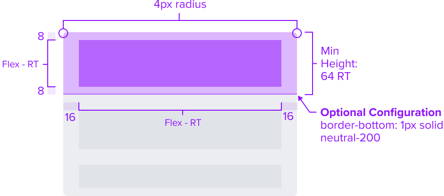
Box Model
The CardHeader Component's box model incorporates specific features aimed at fulfilling its role as a structured, visually appealing, and consistent container within the context of a card.
-
Border top radius 4px 4px 0 0
The rounded corners at the top of the CardHeader soften its appearance, contributing to a more modern and friendly user interface.This subtle curvature ensures the CardHeader aligns with the overall card design, promoting a cohesive look and feel within the user interface.
The specific radius values ensure consistency across the design system, enhancing the visual harmony of components within a layout.
-
Border-bottom 1px solid neutral-200 (Optional)
A delicate border outlines the bottom of the CardHeader, offering sufficient contrast to delineate it as a distinct element.This feature maintains a clean and minimalistic design, avoiding any visual clutter.
-
Padding-y 8px & Padding-x 16px
CardHeader maintains uniform spacing around its content to ensure it is easily distinguishable and does not overlap with the border.This consistent spacing contributes to a cohesive experience across various projects.
-
Min-height 64 RT
The minimum height ensures the CardHeader remains functional and visually appealing on different devices and screen sizes, embracing the principles of responsive design.Intentionally omitting a minimum width allows the content within to be more adaptable, enhancing customization without compromising readability.
The design and specification of the CardHeader Component's box model are intricately linked to its function as a layout tool.
It ensures a consistent header experience across projects by carefully selecting each aspect of the box model.
This deliberate choice promotes flexibility while maintaining a uniform appearance for the header area.
Responsive
The CardHeader Component is crafted with a responsive box model, ensuring it adapts gracefully to various screen sizes and contexts. This design approach guarantees a consistent and accessible user experience across different viewing environments.
By design, CardHeader supports responsive resize and reflow characteristics by defining minimum height in relative units and no limitation for the widths.
Relative measurements ensure that the CardHeader maintains its structural integrity and visual appeal across different screen sizes and orientations, adapting gracefully as needed.
Dictating content-specific reflow behaviors goes beyond its scope and is managed by the individual content elements within the card-header, which are designed to be responsive in their own right within the overarching design system.
This approach allows the card-header to serve a wide array of content types and interaction contexts without imposing rigid layout constraints that could hinder the adaptability of the content it hosts.
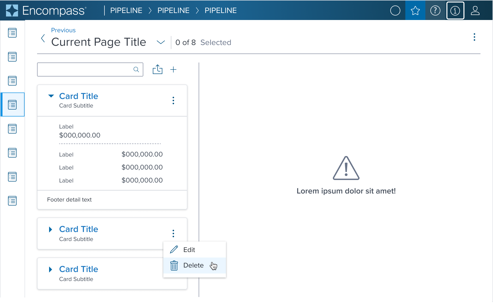
States
| State | Graphic | Default Styling |
|---|---|---|
| Idle |  | Border top radius: 4px 4px 0 0 Border-bottom: 1px solid neutral-200 (#CBCFD7) Padding-y: 8px Padding-x: 16px Min-height: 64 RT |
| Focus | N/A (content needed to apply) | N/A |
| Disabled | N/A (content needed to apply) | N/A |
| Read-only | N/A (content needed to apply) | N/A |
| Hover | N/A (content needed to apply) | N/A |
| Error | N/A (content needed to apply) | N/A |
Configuration
The CardHeader includes pre-set configurations to seamlessly integrate with common scenarios. For example, incorporating a bottom border to the CardHeader delicately outlines the header content from the body content, or deactivating the border to provide a more unified look and feel within the card if the content does not require explicit separation.
| Scenario with Header Border-Bottom Turned ON | Dim Sum Solution |
|---|---|
 |  |
| Scenario with Header Border-Bottom Turned OFF | Dim Sum Solution |
|---|---|
 |  |
Use Cases
| Original Scenario | Dim Sum Solution |
|---|---|
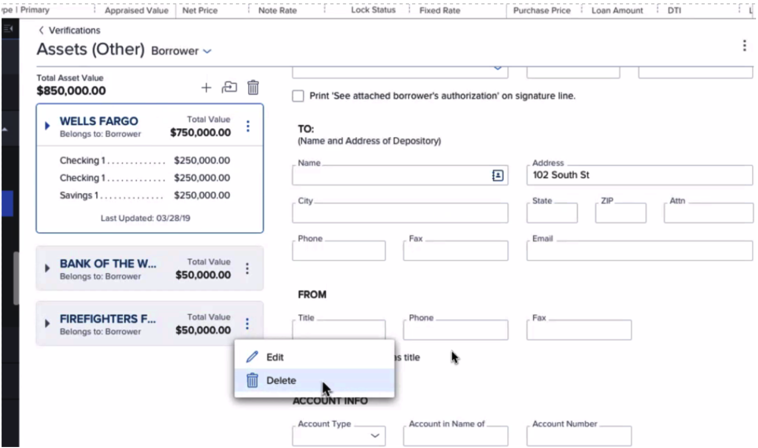 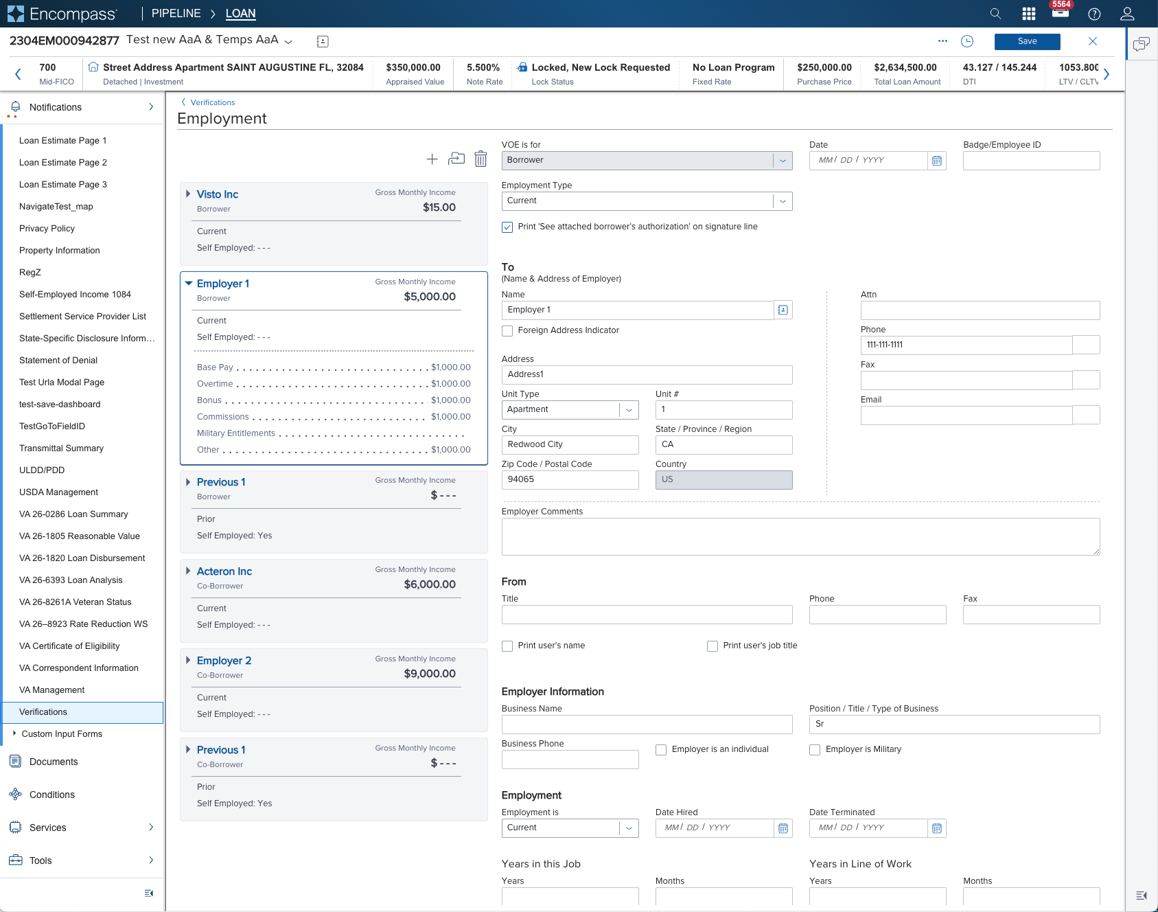 |  |
| |
 |  |
Additional Examples (Optional)
| Hypothetical Scenario Graphic | Hypothetical Scenario Solution | Hypothetical Scenario Description |
|---|---|---|
| NA | NA | NA |
Digital Accessibility
While the CardHeader Component itself primarily serves as a visual layout tool and does not introduce specific accessibility concerns, it is crucial to ensure that all content placed within the card-header is accessible. The responsibility for accessibility lies with the content and interactive elements integrated within the card-header.
Designers must adhere to accessibility guidelines for text, images, interactive controls, and other content types to ensure the overall accessibility of the card-header's content.
Given the card-header is meant to serve as the title region of the card it should not require any special treatment apart from standard concerns but ad-hoc considerations needs to be done on the app side.
Usage Warnings
No known-of issues
References
- link to storybook stories when they exist
- Resize and Reflow Guidance