v.1.0.0
Overview
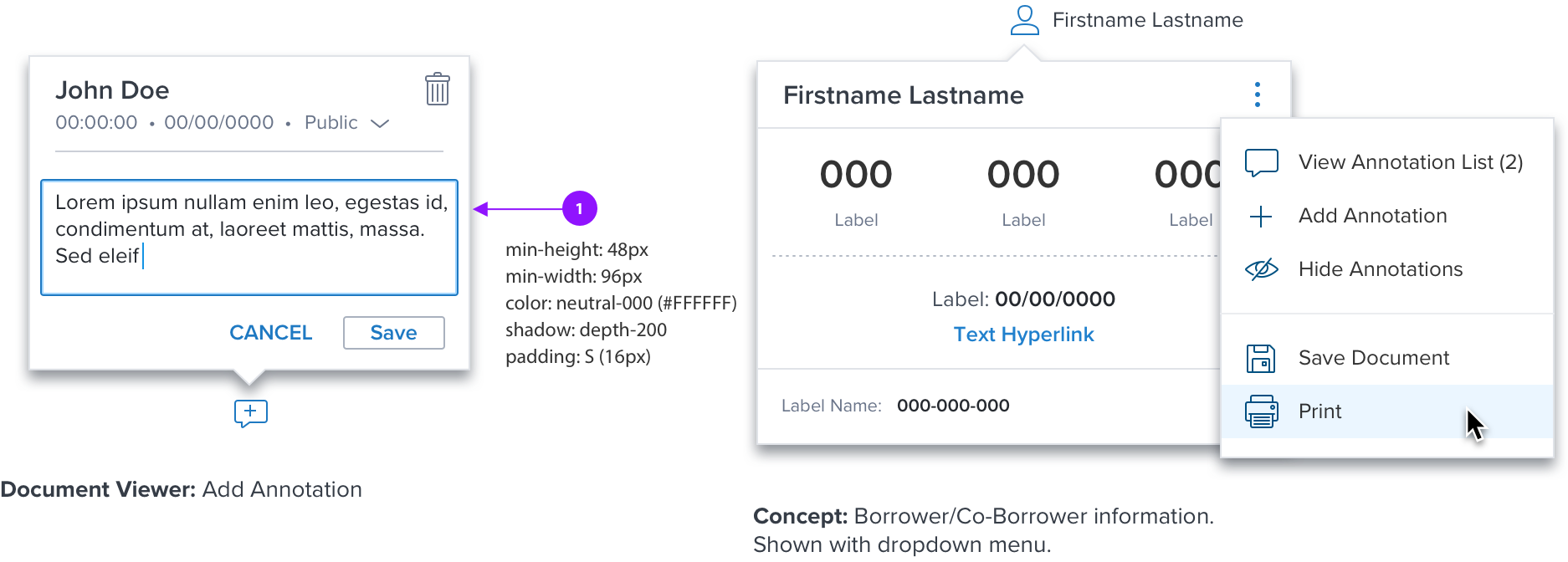
A Popover provides additional information or minor action for a page element.
Defaults to opening down but will automatically open towards the interior of page/modal.
Do not open popovers from a popover.
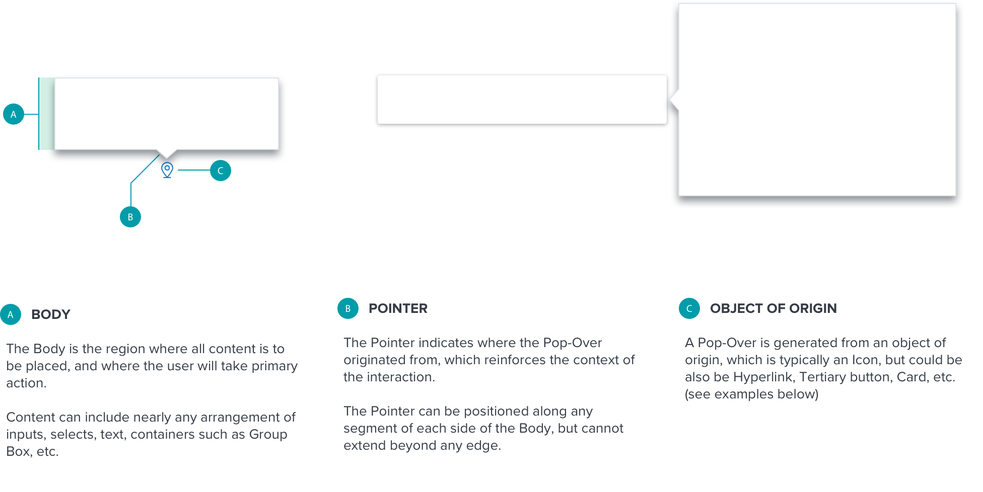
Anatomy
Visual Style
Interaction
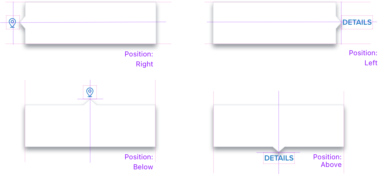
Positioning
The Popover is placed directly adjacent to the object of origin. It will be aligned to the center or middle of the object of origin.
The Popover can placed to the left, right, above and below the object of origin, and will not overlap or obscure it. It will also not overlap or obscure the content its’ reference content.
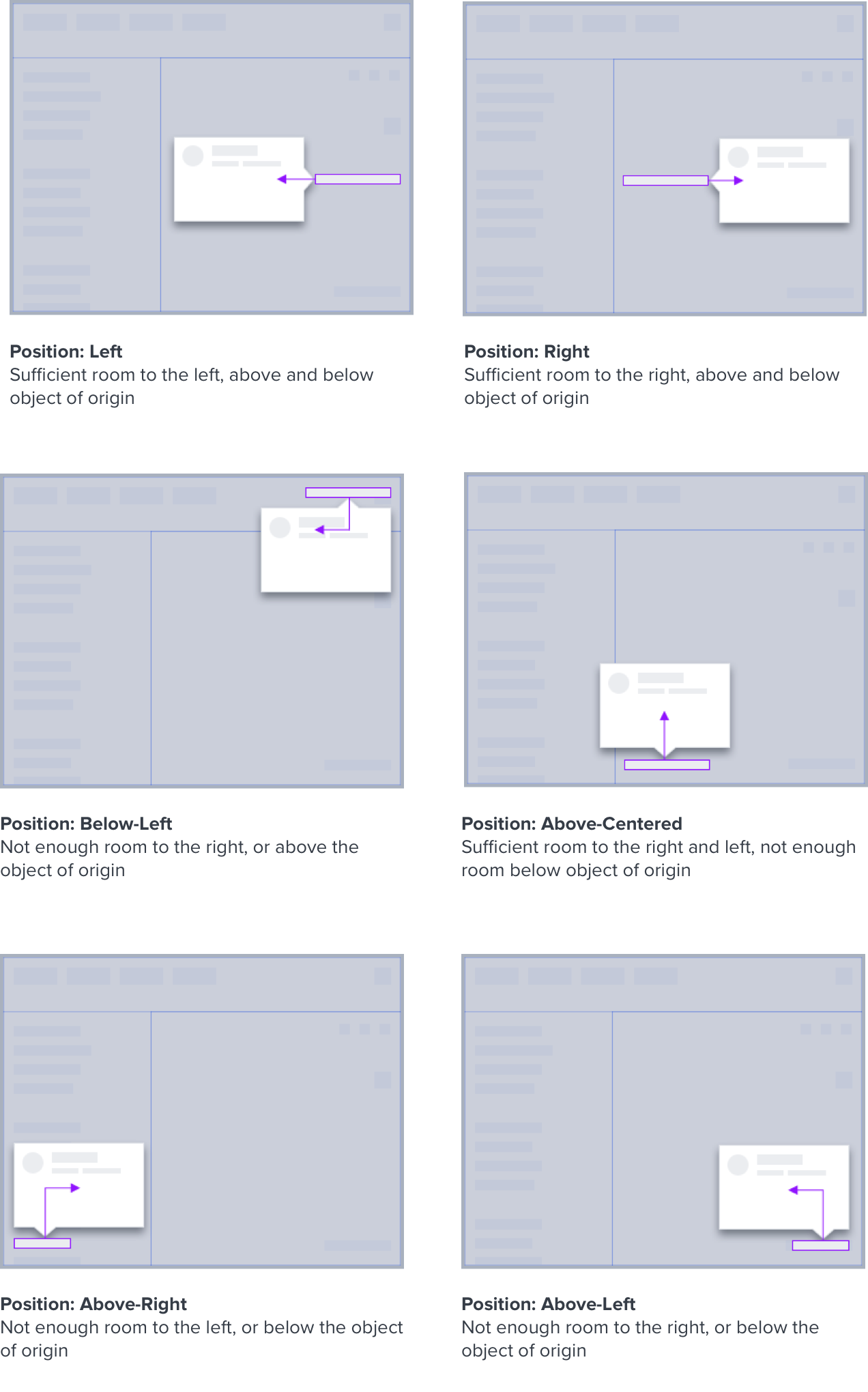
Layout Rules
The following rules pertain to how the Popover will layout on the webpage relative to both the viewport and object of origin.
If there isn’t enough room to the right, left, above, or below the object of origin, the Popover will be positioned on the opposite axis (see examples below).
Height and width are flexible, and will respond per:
• Requirements of use case
• Position of the object of origin
• Size of the viewport
If content is longer than the max height and width, a scrollbar will be triggered.
Once a Popover is triggered, it will remain in it’s corresponding position. It will not reposition or flip.
Popover is triggered by the object of origin, and dismissed by selecting a control within the Body (such as a Primary Button), or by clicking/tapping anywhere outside it’s bounds.
If content includes a control with a drop menu (such as Combo Box), selecting ESC or clicking outside the bounds of the Popover will dismiss the menu, but the Popover will persist.
Digital Accessibility
| KEY | FUNCTION |
|---|---|
| TAB | Advances focus to next available control |
| SHIFT+TAB | Advances focus to previous available control |
| ESC | Closes any active menu controls, then closes the Pop-Over entirely |