v.1.0.5.
Overview
A toggle lets people choose between a pair of opposing states, like on and off, using a different appearance to indicate each state.
Anatomy
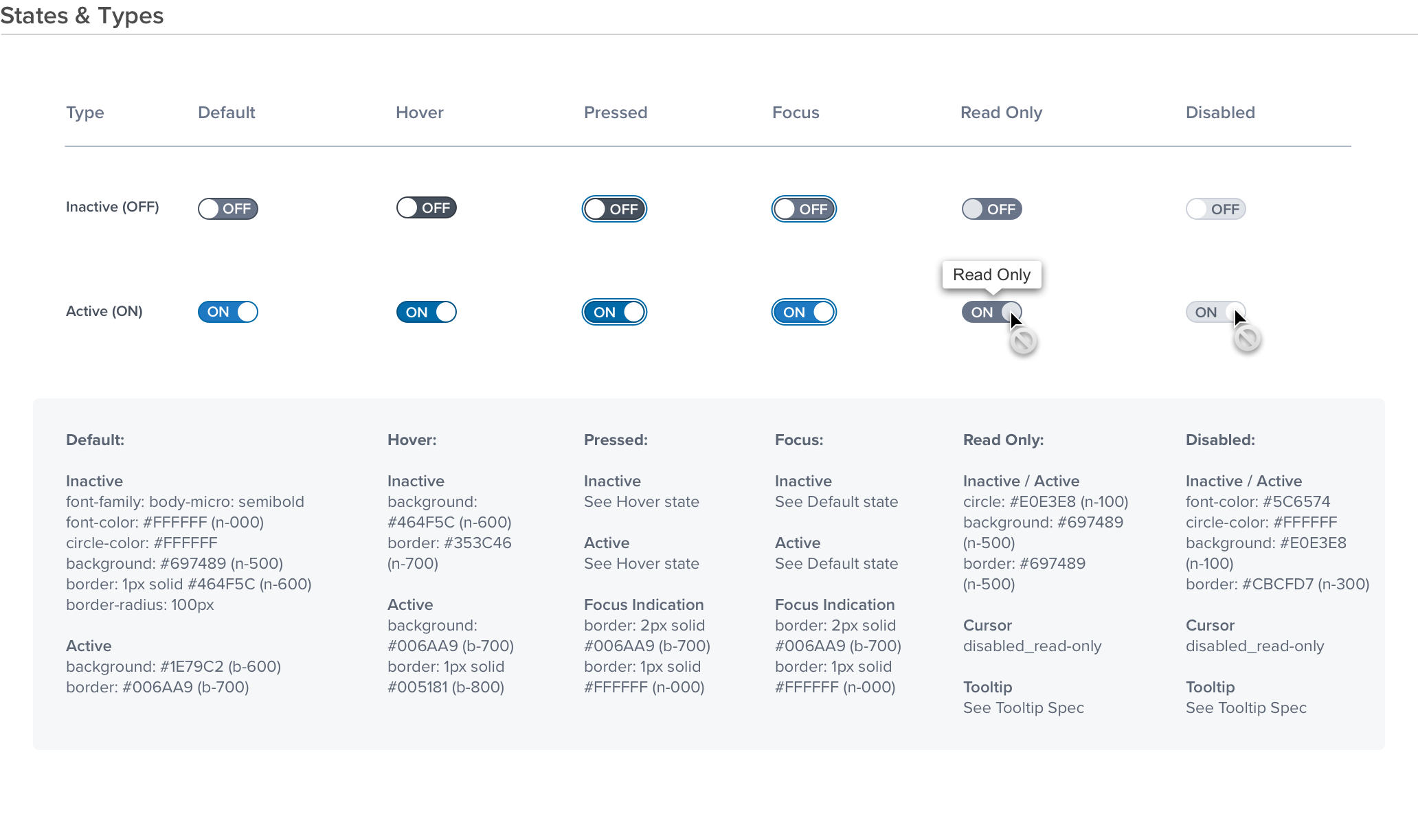
Visual Style

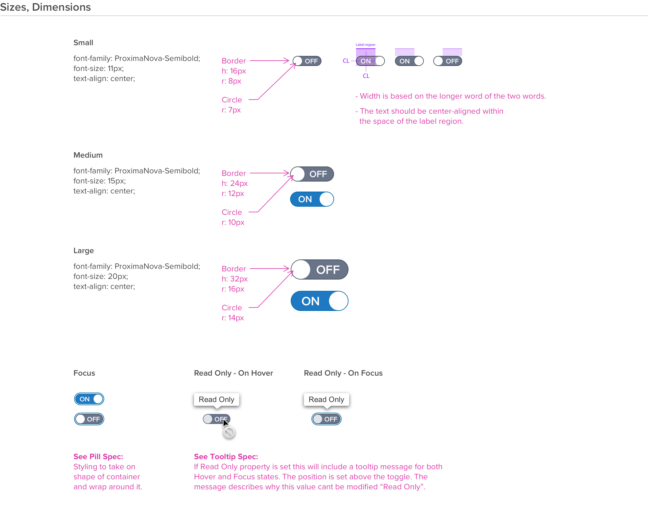
Sizes, Dimensions

Digital Accessibility
| KEYBOARD BEHAVIOR | |
|---|---|
| Key | Function |
| TAB | • Takes user to the next interactive element in the tab order. |
| SHIFT+TAB | • Takes user to the previous interactive element in the tab order. |
| ENTER/RETURN OR SPACEBAR | • Selects/Deselects the toggle, the status/value change is indicated. |
| SCREEN READER | |
|---|---|
| HTML/Semantic Role | Announced Content |
| Switch | With aria label: "custom label" being the aria-label examples • On / Off, custom label, Switch Without aria label • On / Off, Switch |
| DOCUMENTATION AND LINKS | |
|---|---|
| Announced Content | Rationale |
| On/Off, custom label, Switch | • UX/Dev analysis determined this is a more descriptive and a better UX for screen reader than check-box. • The checkbox component is already announced as "checkbox", to differentiate the announcement and remain in compliance with standard practices, this is the best standard alternative that allows us to differentiate and adhere to WCAG 2.1 A-AAA Success criteria. |
