Overview
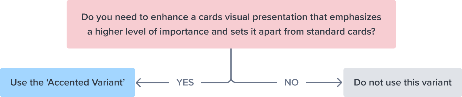
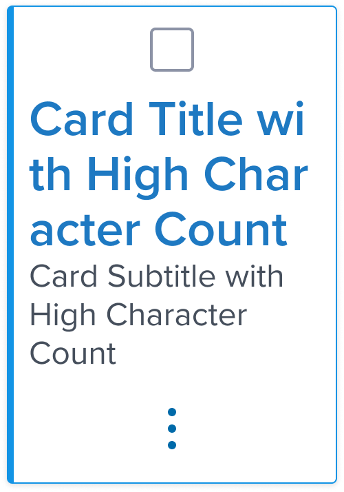
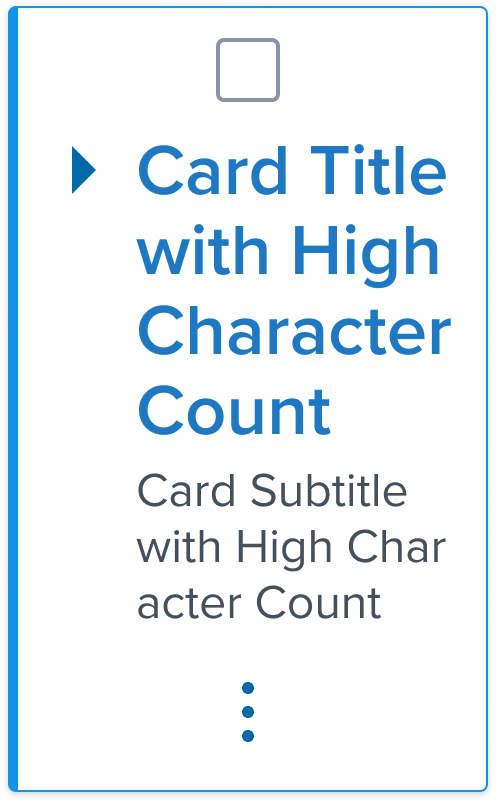
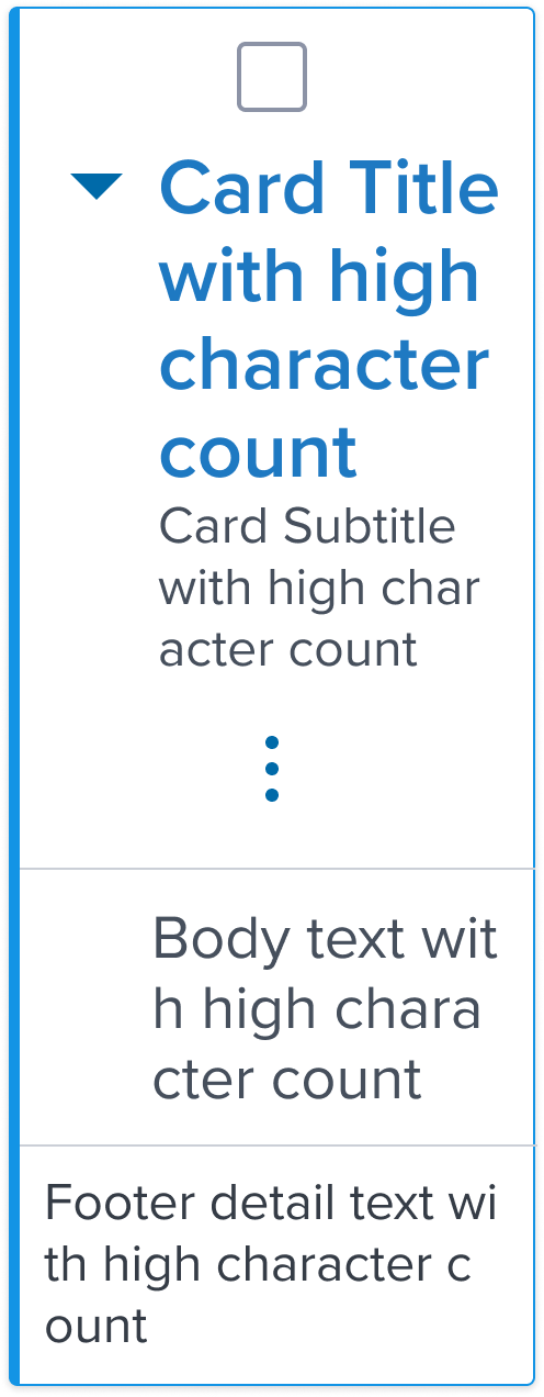
The Card accented variant emerges as a vibrant alternative within the Dimsum Design System, enhancing the traditional Card component with a touch of branding to draw user attention effectively.
This variant leverages a distinctive branded border, setting it apart from standard Cards.
Its purpose is to signal a higher level of importance or to demarcate specific content that requires emphasis, making it an excellent tool for guiding user focus and enhancing the informational hierarchy within a user interface.
By maintaining the foundational design elements of the standard Card, the accented variant offers familiarity while adding an element of distinction that captures and retains user engagement.
Design
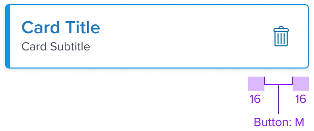
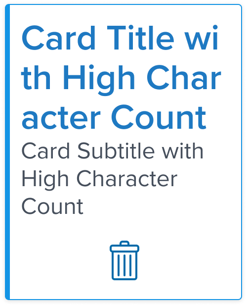
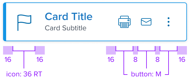
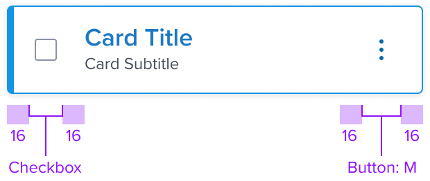
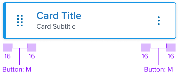
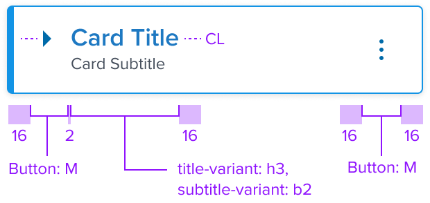
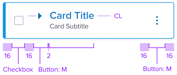
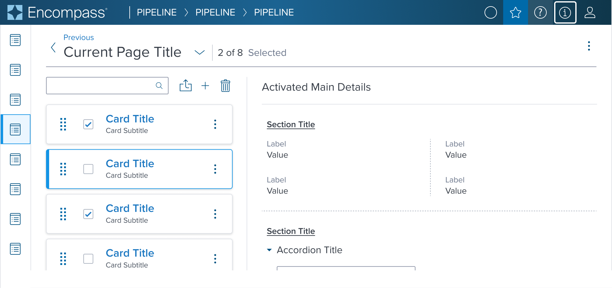
Box Model Specifications
The design choices for the Card accented variant are carefully selected to align with the standard Card's flexibility and responsiveness, with the addition of unique styling cues to mark its significance:
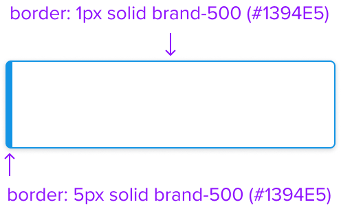
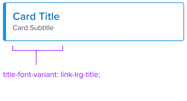
Border 1px 1px 1px 5px solid brand-500
The standout feature of the accented variant is its unique border, thicker on one side and colored in the brand's primary hue (brand-500).
-
This design choice not only draws attention but also serves as a visual indicator of the Card's special status or purpose.
The branded border acts as a clear marker for distinguishing the accented Card from its standard counterparts, effectively transmitting the intention behind its use.
The Card accented variant's box model is a testament to the thoughtful integration of branding elements within functional design.
It preserves the versatility and user-centric approach of the standard Card while introducing a visual distinction that elevates the overall design narrative.
Responsive
No difference with the standard variant
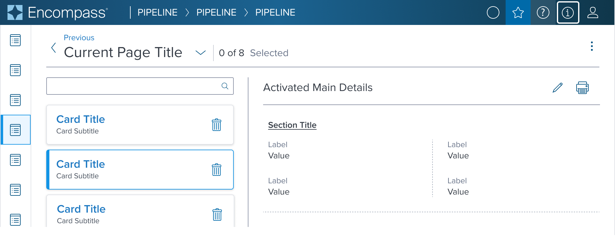
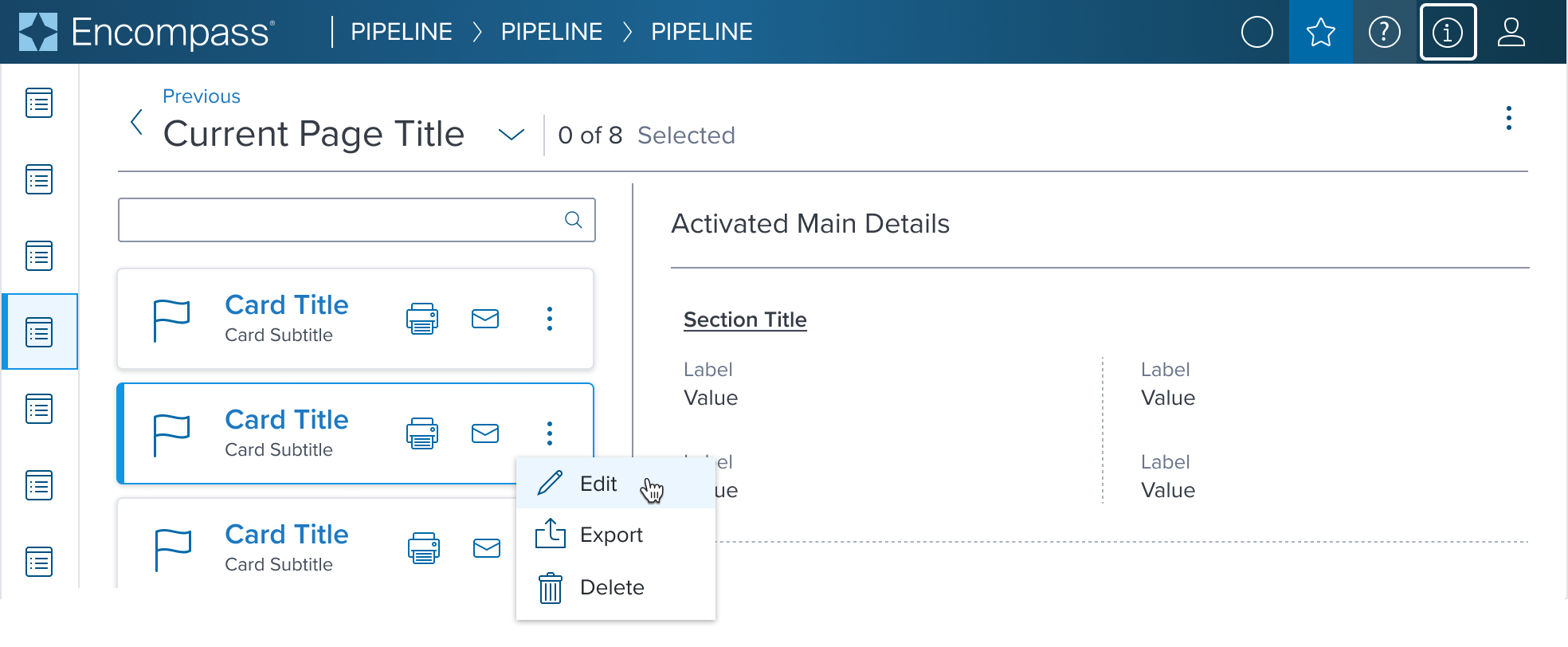
States
| State | Starting Graphic | Variation Graphic | Variation Styling |
|---|---|---|---|
| Idle |  |  | [vs standard idle] border-left: 5px, solid brand-500 (#1394E5) |
| Focus | N/A (no IE, no focus received) | N/A (no IE, no focus received) | N/A |
| Disabled |  |  | [vs standard disabled + variant-idle] - variant idle styles box-shadow: none background: neutral-050 (#F6F7F9) border: 1px solid neutral-100 (#E0E3E8) border-left: 5px, solid neutral-100 (#E0E3E8) |
| Read-only | N/A (content needs to apply) | N/A (content needs to apply) | N/A |
| Hover |  |  | [vs standard hover + variant-idle] |
| Error | N/A (no required cases) | N/A | N/ |
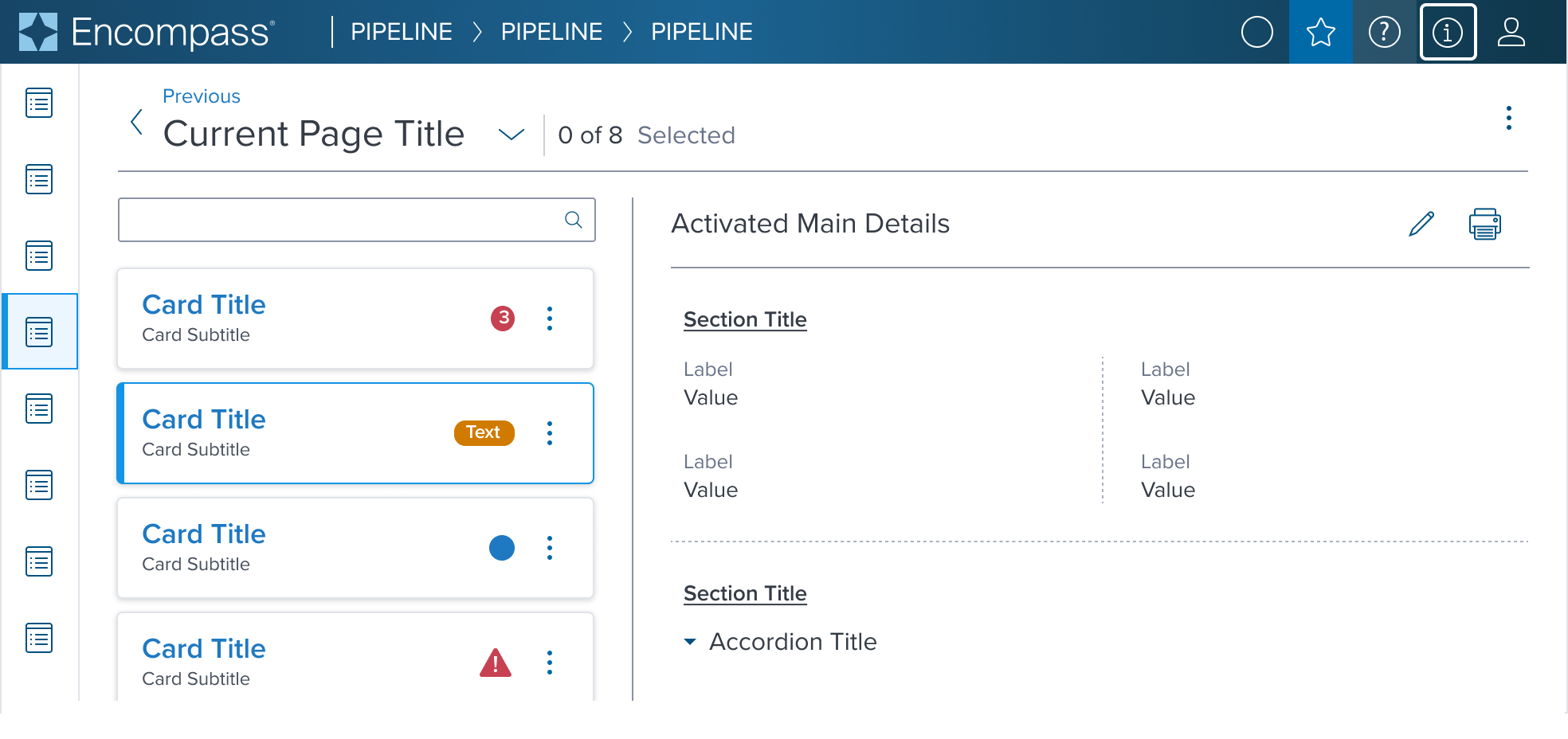
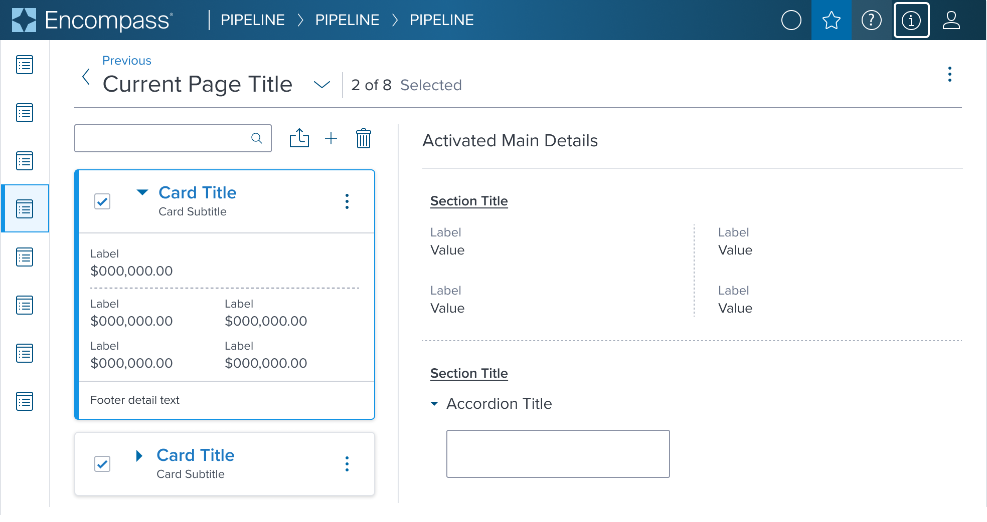
Use Cases
| Original Scenario (Use Case) | Dim Sum Version (Proposed Solution with DS Components) |
|---|---|
  |  |
Examples
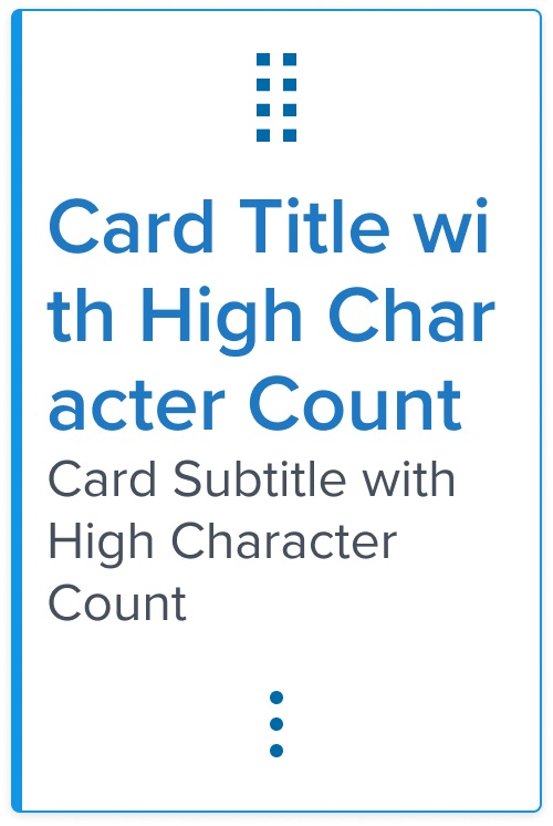
Given the Card Component's role as a primarily container-centric element in the design system, its content is highly dependent on what scenario it's used in
The component's value lies in its ability to provide a structured, visually consistent container for diverse content types.
We have selected a curated list of scenario that can be achieved through atomic composition with other components in the design system, allowing for a wide range of layout possibilities while maintaining a cohesive design language to serve as the baseline for application to expand on and integrate as is if the scenario is already covered.
| Scenario Graphic | Scenario Solution | Text Resize and Reflow (200%) | Scenario Description |
|---|---|---|---|
 |  |  | No Action When information requires user action to be taken. |
 |  |  | Action When information requires user action to be taken. |
 |  |  | Multiple Action When information requires user action to be taken on multiple items. |
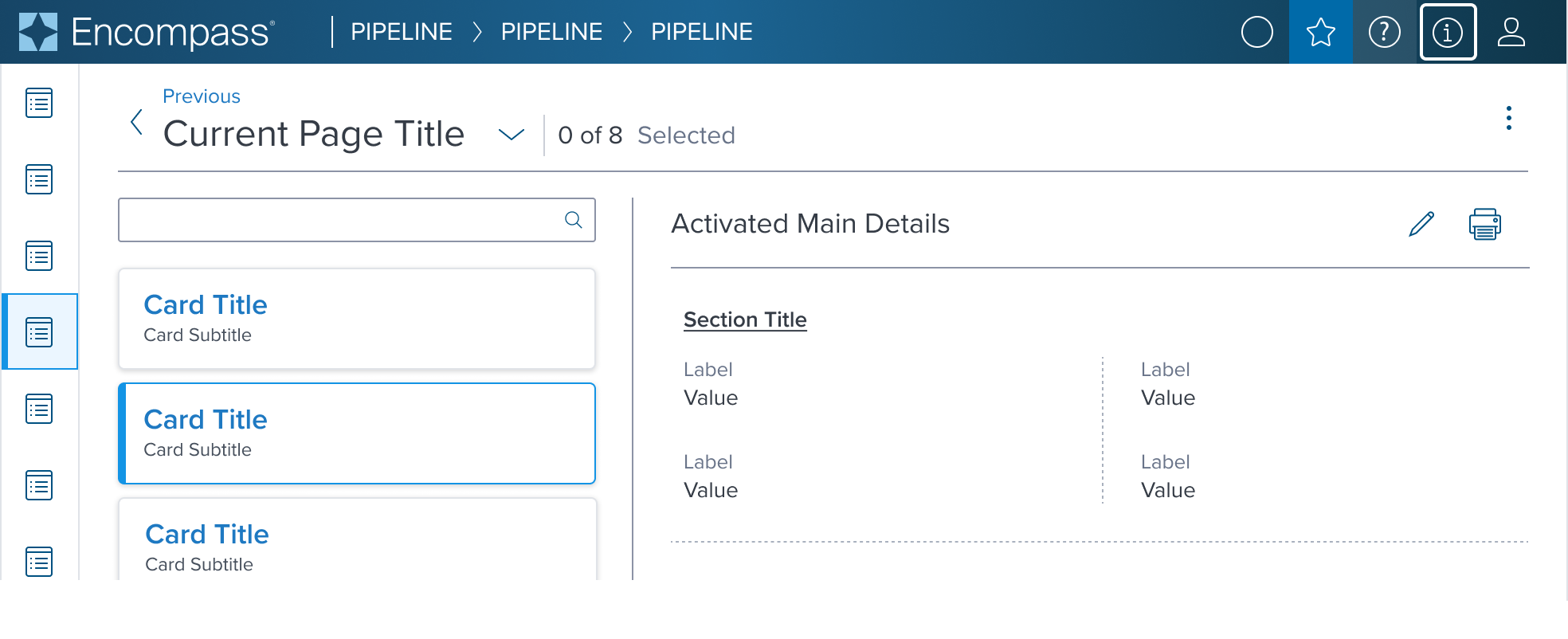
 | 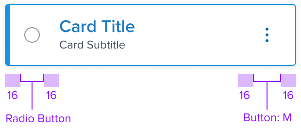 |  | Single Select For selecting a single card within a card region. Includes contextual action. |
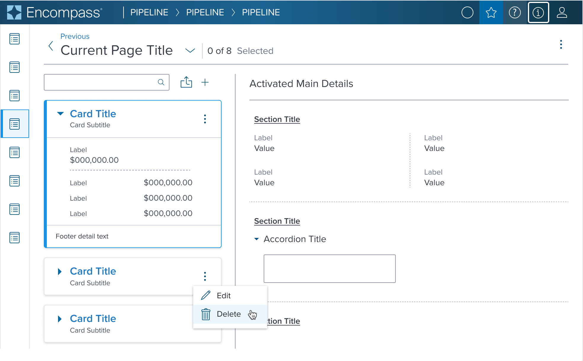
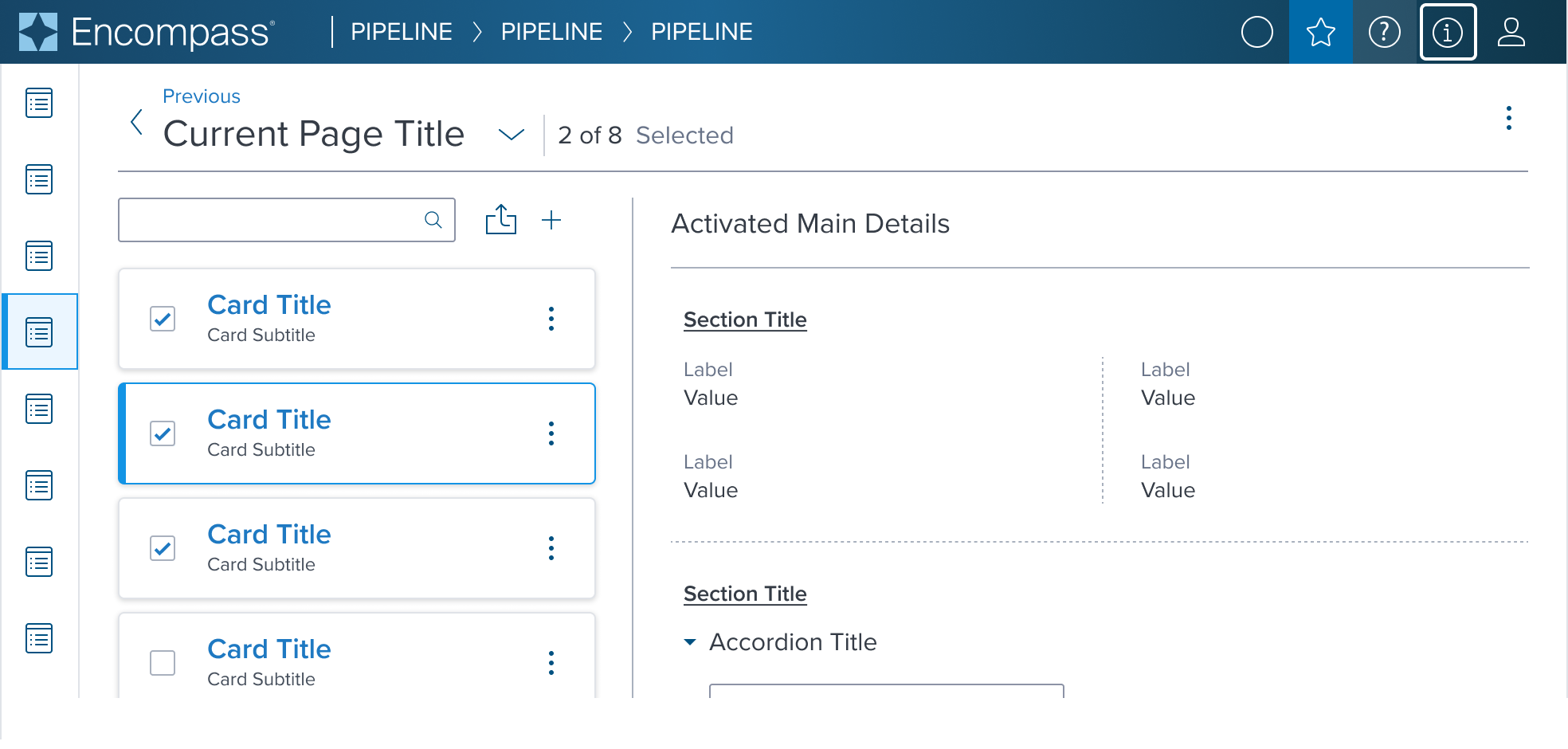 |  |  | Multi Select For taking bulk action within a card region. Includes contextual action. |
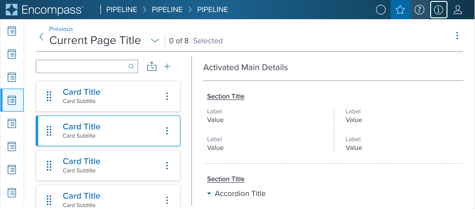 |  |  | Drag and Drop Allows for moving a card within a matrix or list to arrange in a desired order. Includes contextual action. |
 | 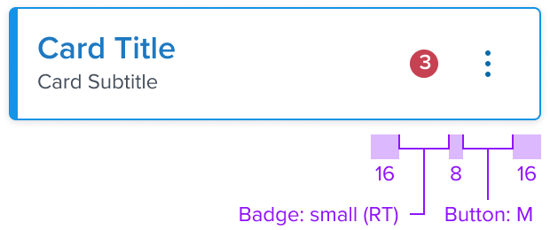 | 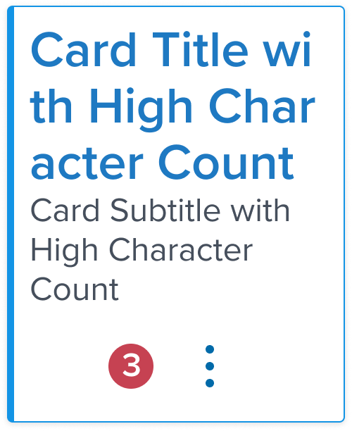 | Notification Badge When status change, new or unread items or quantity of items added needs to be indicated. Includes contextual action. |
 |  |   | Accordion Expand and collapse to hide or reveal additional content. Includes contextual action. |
Additional Examples
| Hypothetical Scenario Graphic | Hypothetical Scenario Solution | Text Resize and Reflow (200%) | Hypothetical Scenario Description |
|---|---|---|---|
 |  |   | Multiple Control Expand and collapse to hide or reveal additional content and take bulk action within a card region. Includes contextual action. |
 |  |  | Multiple Control-1 Allows for moving a card within a matrix or list to arrange in a desired order and to take bulk action within a card region. Includes contextual action. |
Accessibility
This variant doesn't add any specific accessibility concern, the visual feedback is already designed to work with people affected by color blindness and would provide a similar UX callout to every visual user.
All the callouts from the standard variant also applies here.
Usage Warnings
No known-of issues
References
- link to storybook stories when they exist
- link to usage guidelines for ensuring this variant is used the intended way?
- Resize and Reflow Guidance