v3.0.8
Overview
The combo box is an input control that combines a text box with a drop menu that opens automatically when the control has focus.
- A Combo Box is typically part of a form, but can also be used in toolbars.
- Although the control supports lists up to 10,000 items, it is best applied when list of of items is less than 30 and can be ordered intuitively. If the list is longer than 30 consider using a multi column selection dialog with better filtering capabilities.
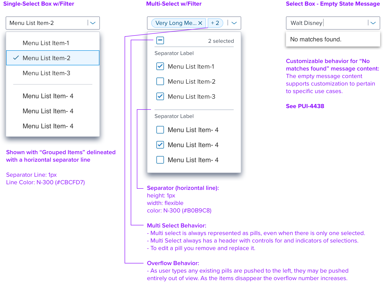
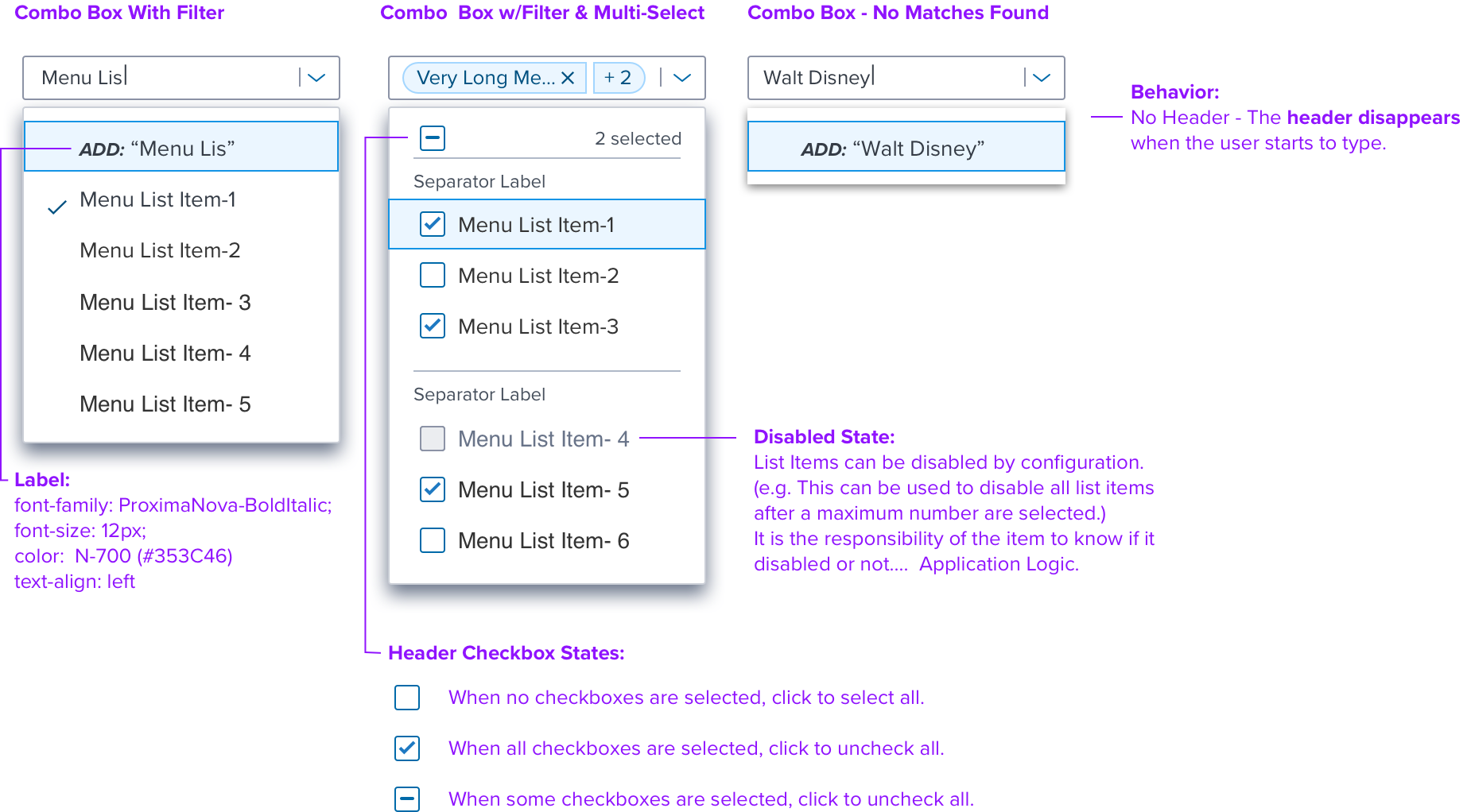
Anatomy
Select Box & Combo Box Overview
Menu Details & Behavior
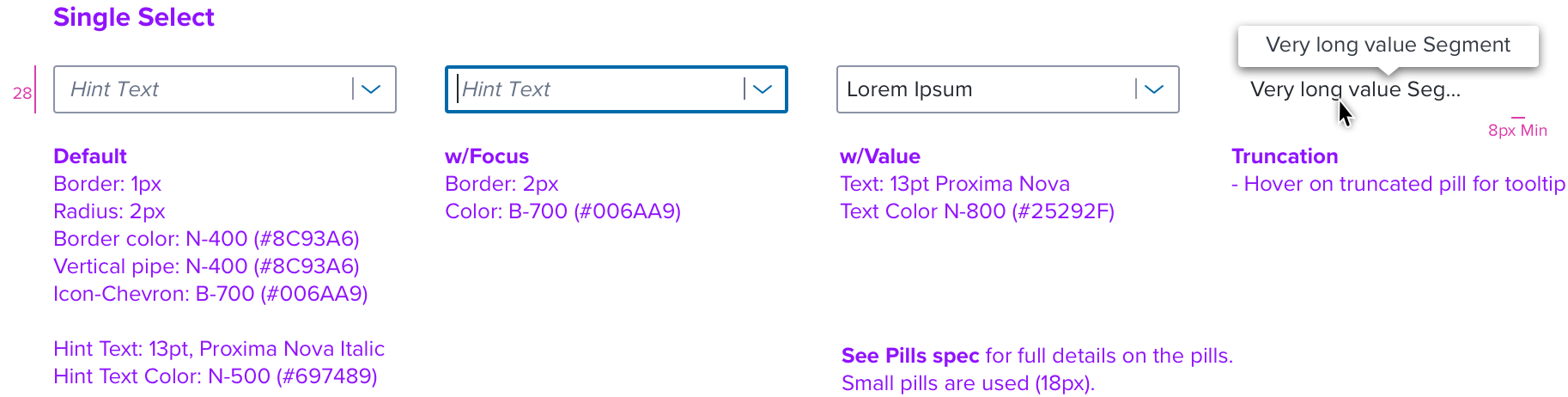
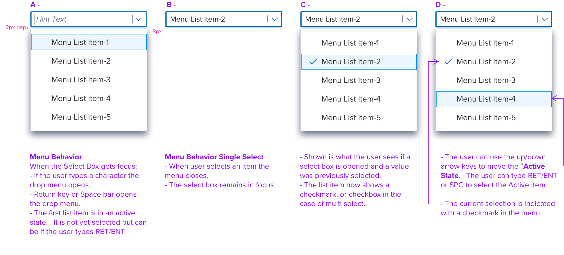
Single Select: Textbox & Menu Behavior
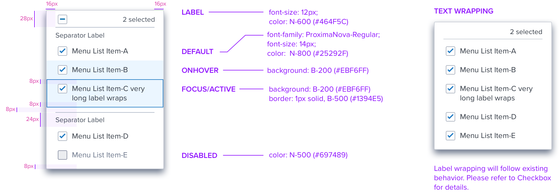
Multi Select Menu States & Dimensions
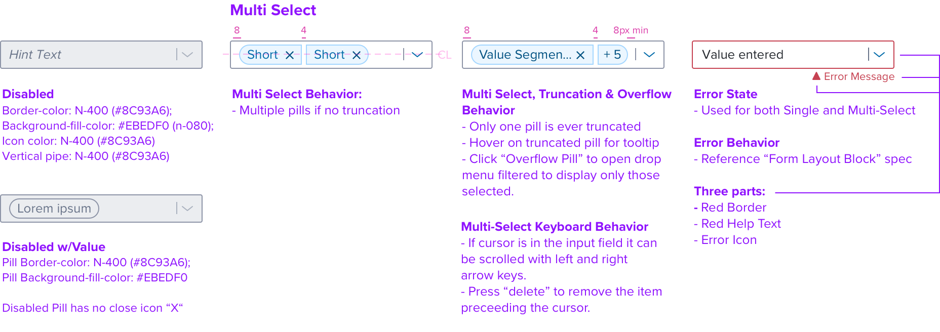
Multi Select
Multi Select Behavior

Select Box (no Createable)
Combo Box (Createable)
Inline Appearance

Digital Accessibility
Keyboard Interaction
• Select/Combo Box is made up of two elements; a text input field and a drop menu.
• Keyboard acts on both of these at the same time. The combo box supports both free text input (Creatable) and list selection.
• Combo box drop down menu appears when the user first types any character.
• Select box drop down menu appears when the user first types a character that matches one of the items in the predefined list.
• The Select/Combo Box is reached by Tab key and the text input field receives focus indication. Tab moves through the interactive elements left to right top to bottom, Arrow Up/Down keys move through the drop menu, Enter and Spacebar activate and
confirm selections. Escape closes the drop menu and returns focus indicaton to the text input field.
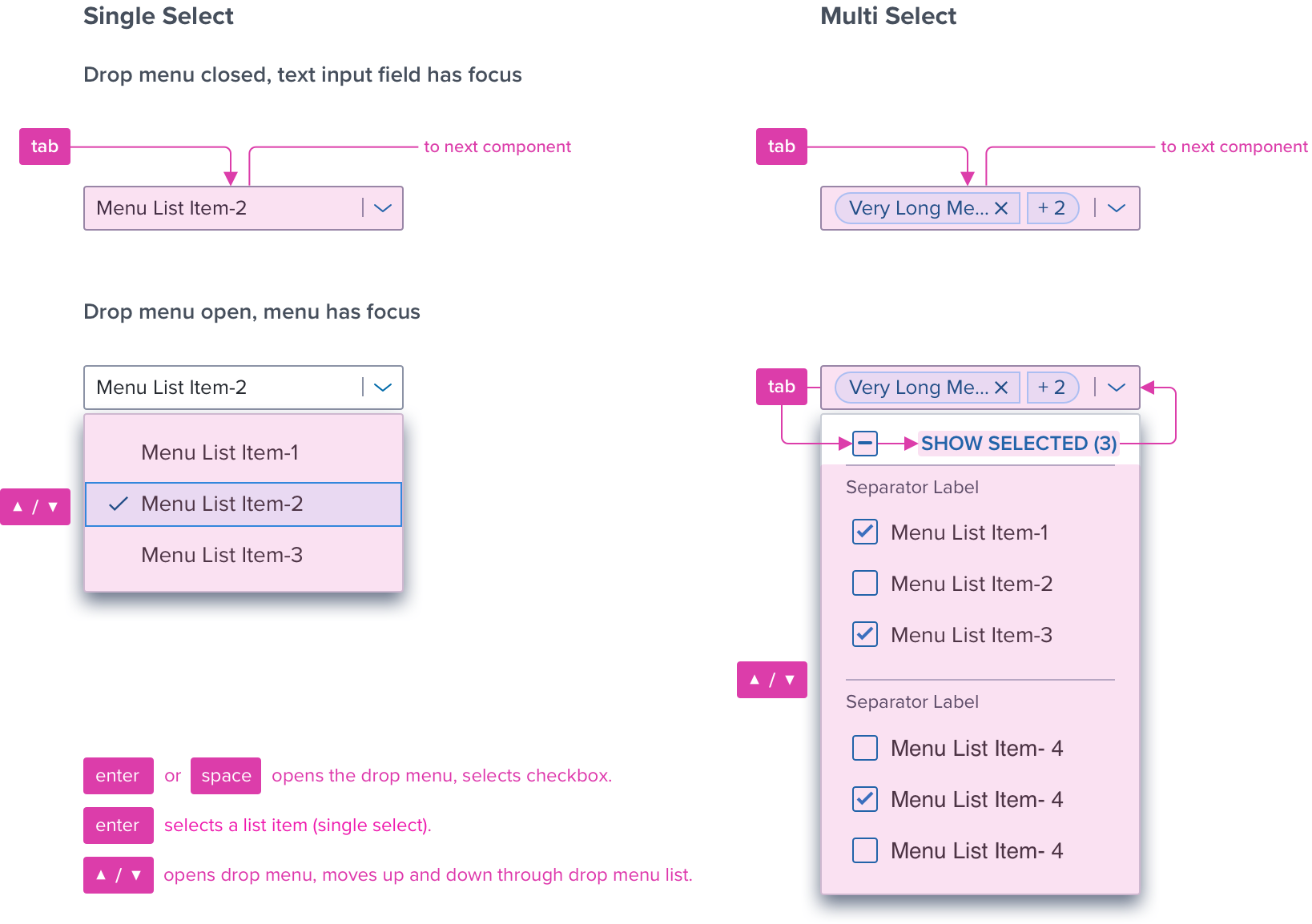
Keyboard & Focus
*Global standard keyboard interactions apply, and in order of operations from left to right, top to bottom.
| Key | Function |
|---|---|
| Tab | • If the drop menu is closed the focus moves to the next focusable or interactive element, in the Dom. • MultiSelect and Creatable: Cycles through text input field and the interactive elements on the drop menu (eg. All, CLEAR, etc. buttons) . |
| Shift+Tab | • If focus is on an element in the drop down menu this moves focus to previous interactive element. • When the focus is on the text input field this closes the drop down menu. |
| Enter | • Open the drop menu if it is not already open. • Toggle the checkbox on and off |
| CNTRL-Enter | • Toggles the drop menu open and closed |
| SPC (SpaceBar) | • Always acts on the text box to add space between characters. |
| CNTRL-SPC | • Toggles the drop menu open and closed. |
| Command/Control+A | • Multi-Select Behavior: When the text input field has focus, selects all of the list items (checks all checkboxes) and inserts the pills into the text input field. |
| ESC | • If the drop menu is open then close it. Focus indication is returned to the text input field. |
| Down Arrow | • If the drop menu is not yet visible then the drop menu opens and the first list item is in the Active state. • If the drop menu is already visible then the next list item is made Active. • If active is on the last item make first item active. |
| Up Arrow | • If the drop menu is not yet visible then the drop menu opens and the last list item is visible and in the Active state. • If the drop menu is visible and the first list item is “active” then Up Arrow advances to the last list item. • If the drop menu is visible and the first list item is not “active” then Up Arrow moves “active” up one list item. |
| Right Arrow | • When in the text input field, moves the editing cursor one character to the right. • If there are no letters typed and the cursor is to the left of one or more pills, then cursor is moved to next pills. |
| Left Arrow | • When in the text input field, moves the editing cursor one character to the left. • If there are no letters typed then cursor is moved to previous pill |
| Home | • Moves the editing cursor at the beginning of the text input field. |
| End | • Moves the editing cursor at the end of the text input field. |
| Printable Characters | • Types the character in the text input field. |
| Standard Single Line Text Ending Keys | • Keys used for cursor movement and text manipulation, such as Delete and Shift + Right Arrow. • An HTML input with type=text is used for the textbox so the browser will provide platform-specific editing keys. |
| Delete | • When the focus is on the text input field, the cursor is active and this removes selections one at a time. NA when using “non-clearable” type. |
Screen Reader
*Steps from object to object or by jumping between components. Converts interactive elements into speech.
| Semantic HTML Role | Announced Content (defined by app-side) | AREA Attribute |
|---|---|---|
| TEXT INPUT FIELD | Label and Value | NA |
| BUTTON | Label | NA |
| CHECKBOX | State (select/unselect all, checked/unchecked/mixed) | NA |
| BUTTON (TEXT) | Label, State, Count | Na |
| LIST | List Content and Selected List Item | NA |
| LIST ITEM CONTENT | Item Position and Title/Subtitle Label | NA |
Screen Reader Rule
• Hint text should be announced by SR if there are not any entries in the combo box.
• Form layout block label and help text should be announced by SR when the control has focus.
• When the combo box drop menu opens, SR announces the name of the item that is “active” and total number of items in the list.
• On tab into a combo box, all of the entries in the combo box will be announced by the SR, if there are any already selected.
Multi Selected Items Expected Behaviour:
• When multiple items are selected from the drop down menu the screen reader will announce the values on the pills in the same order that they appear within the input reading ALL from left to right.
• Brief Rationale: This remains consistent across components and provides AT (Assistive Technology) users with a full context and summary from beginning to end instead of announcing only the currently selected item.
References
Storybook (Internal Only)