v 3.0
Overview
There are four atomic components used in various combinations to create form elements, these are: InputText, Large Input Text, InputGroup, and FormLayoutBlock.
- Input Text is the essential building block used for entering text.
- Icons can be added It can be wrapped in an Input Group.
- Label and help text can be added by wrapping it in a Form Item Block.
- Input Mask will no longer be a stand alone component, instead it will be a property of the Input Text component.
- Zip Code Search will no longer be a stand alone component, instead it will be a mask property of the Input Text component.
- Date and Time will no longer be masks as they are all ready a set of stand alone components.
Anatomy
Sizes
The small size is used to create controls that fit nicely into the various component headers.

States and Specifications
| Graphic | Styling | Styling |
|---|---|---|
| Idle | 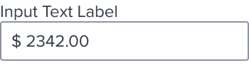 | border: 1px, solid, #8C93A6; N400 background: #FFF; N000 border-radius: 2px font-size: 13px RT font-line-height: font-weight: regular font-color: #353C46; N700 |
| Hover | 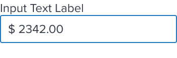 | [vs standard idle] border: 1px, solid, #1E79C2; B600 |
| Focus/Active | 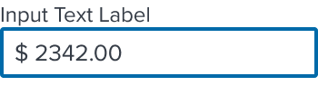 | [vs standard idle] border: 2px, solid, #006AA9; B700 |
| Disabled - Idle | 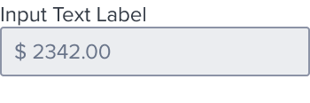 | [vs standard idle] background: #EBEDF0; N080 font-color: #697489; N500 |
| Disabled - Hover | 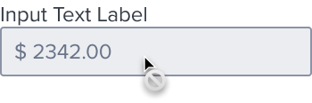 | [vs disabled idle] cursor: disabled-read_only |
| Aria-Read-Only / Aria-Disabled - Idle | 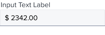 | [vs disabled idle] background: #F6F7F9; N050 border: 1px, solid, #EBEDF0; N080 bottom-border: 1px, solid, #8C93A6; N400 |
| Aria-Read-Only / Aria-Disabled - Hover |  | [vs aria-read-only/aria-disabled idle] border: 1px, solid, #1E79C2; B600 cursor: disabled-read_only |
| Aria-Read-Only / Aria-Disabled - Focus | 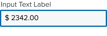 | [vs aria-read-only/aria-disabled idle] border: 2px, solid, #006AA9; B700 |
| Error | 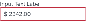 | [vs standard idle] border: 1px, solid, # C64252; error900 |
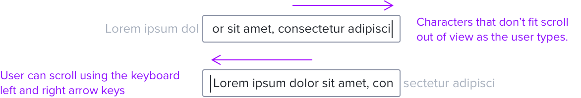
TextBox Overflow
Horizontal scrolling is used to navigate content that does not fit into the text field.
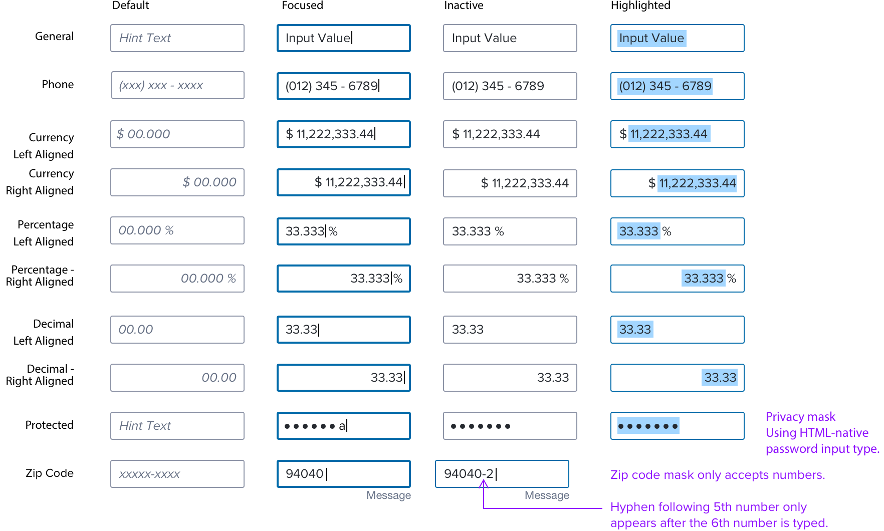
Mask Types
- See Text Input spec for general interaction rules.
- In editable forms, computable numerical values will align left.
- In non-editable, or within comparison components/screens, computable numerical values will align right.
- See Date/Time Input component when a Date/Time Mask is called for.
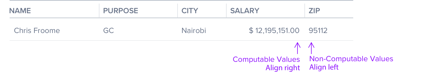
Data Table Exceptions
Computable values align right in data tables and other types of components where comparison is important.
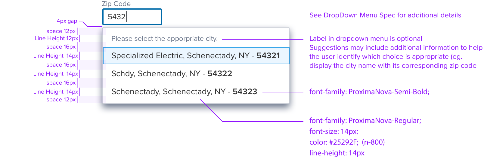
Input Text AutoComplete
- Auto Complete requires at least one character is typed before before, menu drops and, suggestions start.
- Default is 3 characters before suggestions start.
- Auto Complete is an atomic component that may be wrapped.
Special States
Digital Accessibility
Keyboard Interaction
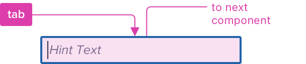
The input text is reached by Tab, the text box receives focus indication with active cursor.
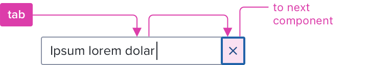
Clearable
Additional tab stop added and focus is moved to the clear icon-button, and activated by Enter or Spacebar.
Keyboard & focus
Global standard keyboard interactions apply, and in order of operations from left to right, top to bottom.
| Key | Function |
|---|---|
| TAB | SHIFT+TAB | Moves focus to the next and previous interactive elements in the tab order. |
| SPC | ENT/RET | Activates and confirms action when auto complete is used, an active list item, opens/closes dropdown menu when type ahead is applied. |
| ▲/▼ | Date/Time Inputs: moves through field values. Highlighted Values: moves cursor to beginning/end of selected values. |
| ◀︎/▶︎ | Highlighted Values: Moves cursor to beginning/end of selected values. |
| DEL | Deletes backward (to the left). |
| Fn+DEL or CTRL+D | Deletes forward (to the right). |
Screen Reader
Steps from object to object or by jumping between components. Converts interactive elements into speech.
| Semantic HTML Role | Announced Content (Defined by app-side) | ARIA Attribute |
|---|---|---|
| INPUT FIELD | State + placeholder text or helper label + value entered | NA |