v.3
Overview
Banner is a type of asynchronous notification that provides feedback for system events. It is placed in a location that does not block the UI, which allows the user to operate other areas of the product as the event continues in the background. Banners are typically excused manually, but may be set to self-dismiss after a specified duration of time.
Anatomy
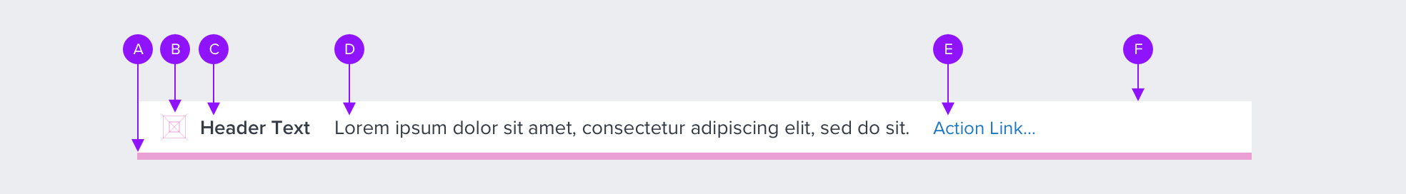
A - Bottom Highlight Bar
Helps identify the type of notification with a specific color bar.
height: 5px
width: 100% of container
color: notification specific
B - Icon (Notification Type)
Helps identify the type of notification:
size: 20x20px
vertical-align: middle
color: notification specific (i.e. error, warning, success, info)
C - Text (Header)
Used to indicate and emphasize the number of items and notification type.
font-family: proxima-nova
font-weight: semi bold
font-size: 14px
color: neutral-700 (#353C46)
align: left
D - Text (Body)
Detail or descriptive qualifier for the notification.
font-family: proxima-nova
font-weight: regular
font-size: 14px
color: neutral-700 (#353C46)
align: left
E - Link (Actionable Text)
Configurable if additional user actions are required. Hyperlink. Dismisses the notification on user click.
font-family: proxima-nova
font-weight: regular
font-size: 13px
color: brand-600 (#1E79C2)
align: left
F - Primary Container
Flexible width and height to accommodate a range of content volume.
background-color: neutral-000 (#FFFFFF)
height/min-height: flexible; 76px
G - Icon (Close "X")
Dismisses the notification on user click.
size: size: 12px
color: brand-600 (#1E79C2)
ds-icon: close-med
Visual Style
Purpose
The Loan Summary assists in keeping a loan on-track by displaying the state and status of critical information within the Loan File.
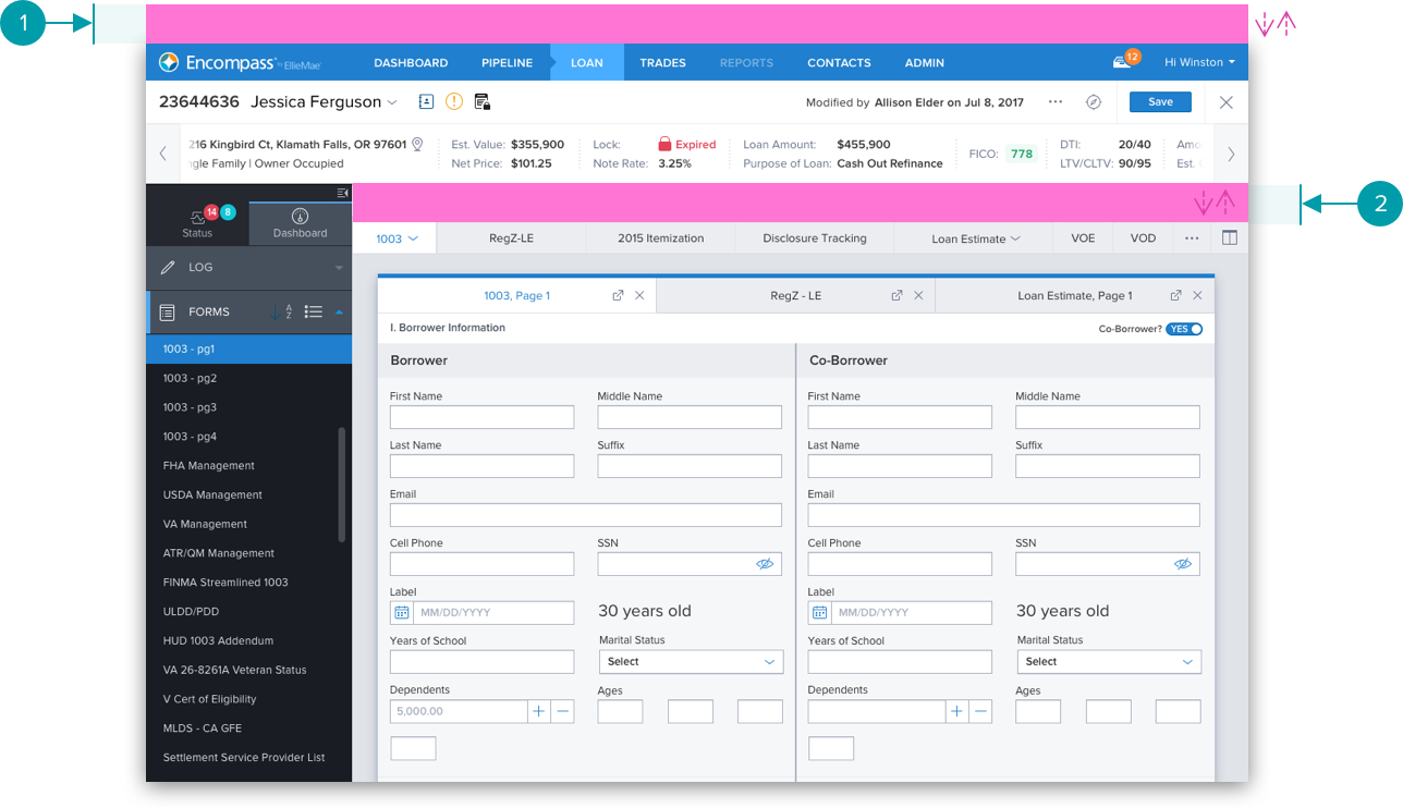
1 - UI Placement (Global Level)
Addresses notifications at the system level, and are located at the top of the page. 100% fixed width.
2 - UI Placement (Construct Level)
Addresses notifications that occur within a construct region of a page, such as a form or dialog. 100% fixed width.
3 - Motion and Animation
• On open, slides down from underneath the above region.
Becomes a grid influncer and pushes the content down.
• Animates the banner and all elements as a group.
• Fade in and fade out concurrently.
• On close or click on action link, slides up underneath the
above region. The content moves back up and back to the
default position.
• Motion speed for up and down is .5 sec (500 ms)
Types
A - Success
color: feedback-900 (#207E56)
ds-icon: checkmark-circle-fill

B - Information
color: brand-600 (#1E79C2)
ds-icon: info-circle-fill

C - Warning
color: feedback-warning-900 (#D17A00)
ds-icon: warning-square-fill

D - Error
color: feedback-danger-900 (#C64252)
ds-icon: warning-triangle-fill

Specs
Body Text Single-Line with Actionable Link

Body Text Wrap with Actionable Link
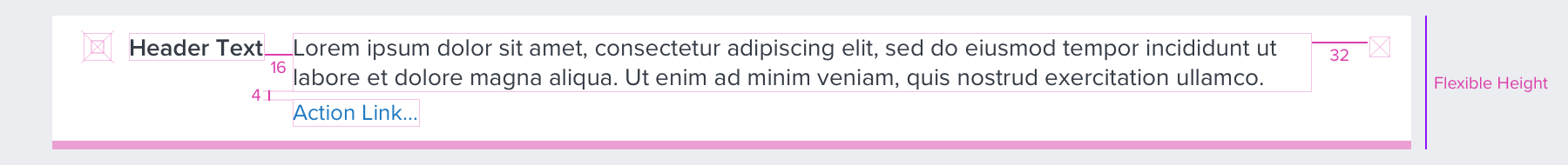
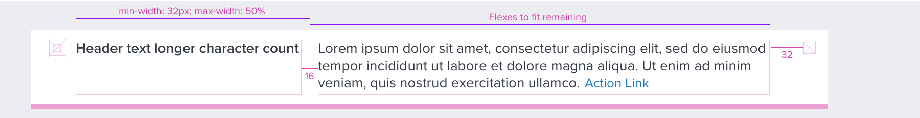
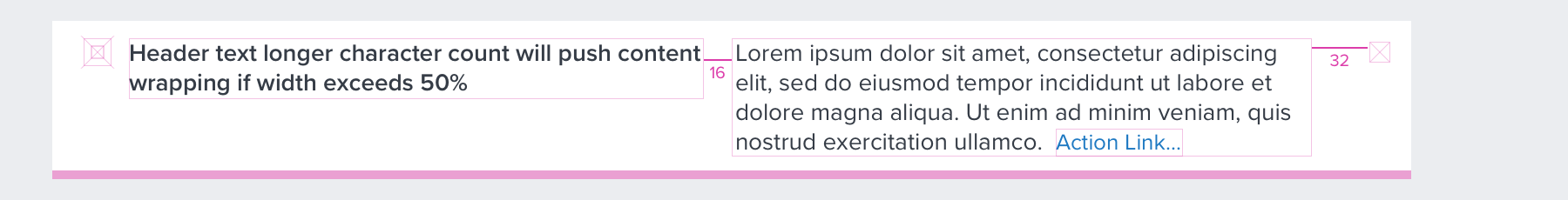
Title+Body Text Wrapping
• Both Title and Body text will wrap if text includes higher character counts, or if horizontal space is limited.
• Title Text: min-width of 32px; max-width: 50%
• Body Text: width will flex to fit remaining space
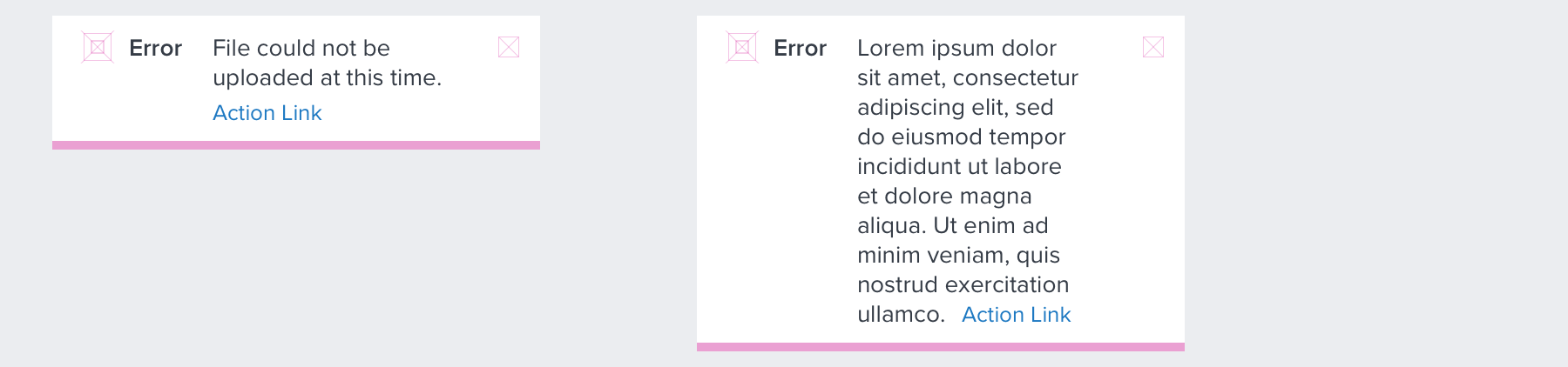
Without Body Text

Without Body Text and Actionable Link

Button

Digital Accessibility
Keyboard
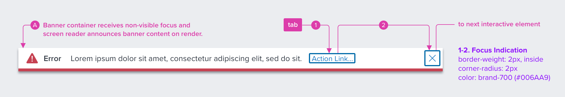
A - Container
FOCUS: When banner displays, application side determines what interactive element receives focus indication. Inital focus can be located on other interactive element, and not necessarily on the banner.
1 - Action Link - (Optional)
WCAG 2.1 Level AA guidelines pertaining to link text should be observed.
• Is not a full URL
• Is not vague (such as “learn more”) UNLESS you have an ARIA override which
announces “learn more about restarting the server” or something more descriptive
• Is not the same link text announcement going to two different places
• Is not ALL CAPS
2 - Clear "X" - Icon-button
• The Clear “X” icon-button in some cases can be the single interactive element within the component, if the “Link” is not present.
| Key | Center |
|---|---|
| TAB or SHIFT+TAB | Moves focus indication to the next and previous interactive elements in the tab order (e.g. action link, close/clear icon-button). |
| SPC or ENT / RET | Activates and confirms action when an interactive element receives focus indication (e.g. action link, close/clear icon-button). |
| ESC | When focus is placed anywhere inside of the banner, this action closes the banner. Focus should retain the user’s point of regard, and return focus to the trigger element that invoked the banner open (outside of the banner). |
Screen Reader
| Semantic HTML Role | Announced Content (defined by app-side) | ARIA Attribute |
|---|---|---|
| ALERT | Title and type | <div role="alertdialog”, aria-labelledby="dialog1Title”, aria-describedby="dialog1Desc"> |
| LINK | Label | tag, tabindex=”0” |
| BUTTON | Label | NA |
| ARIA Consideration |
|---|
| NA |