v.1.5
Overview
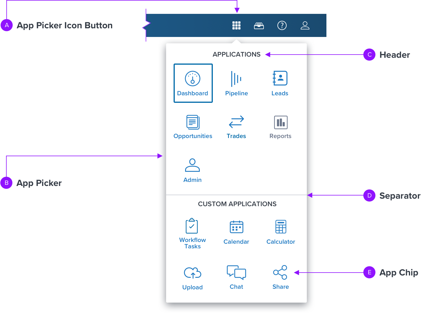
App Picker allows the user to easily switch between applications from the Global Header. When selected, a drop menu displays an array of Chip buttons of each available application or application feature. Once a chip button is selected the user will be redirected to the corresponding location.

Anatomy
Visual Style
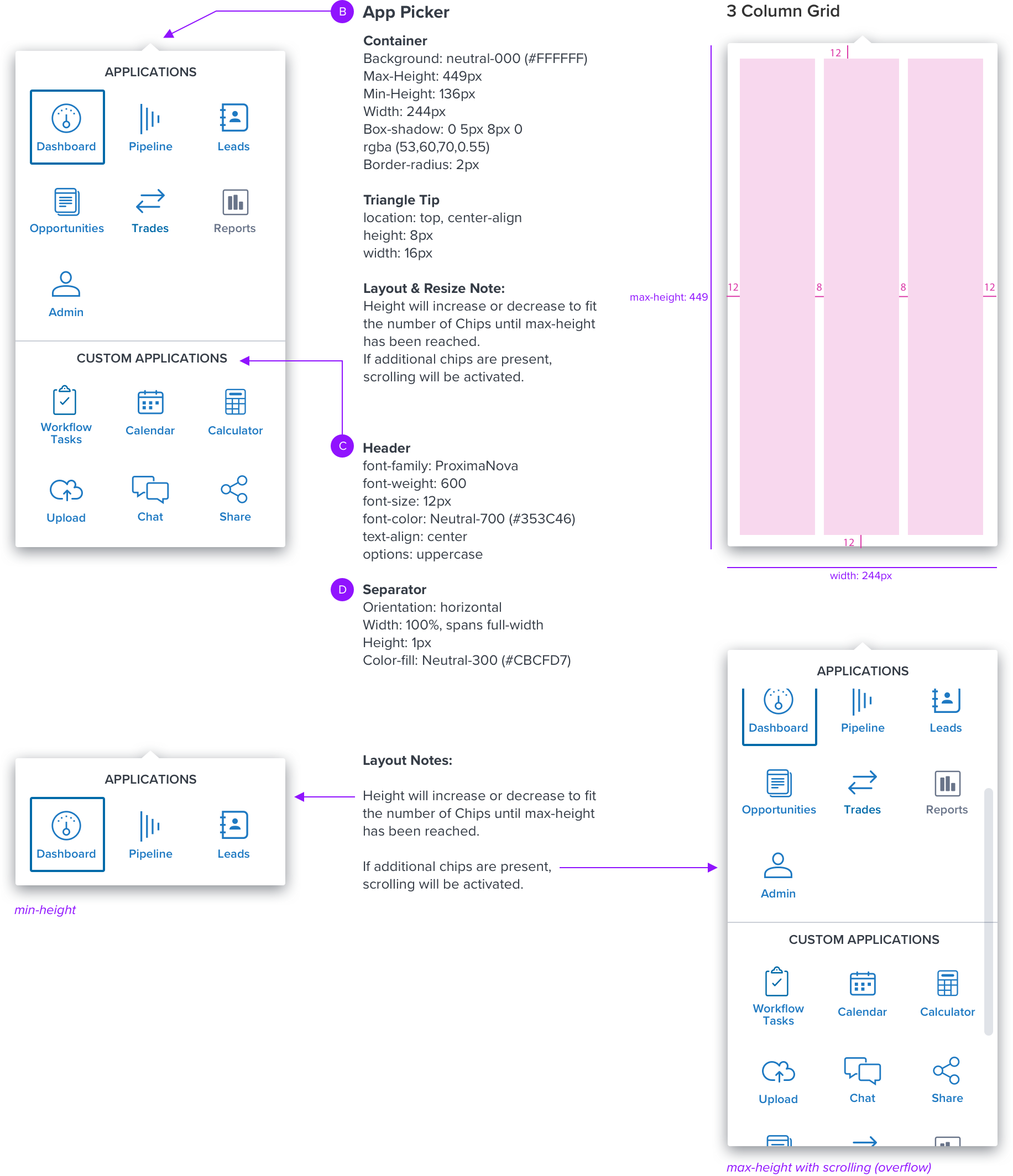
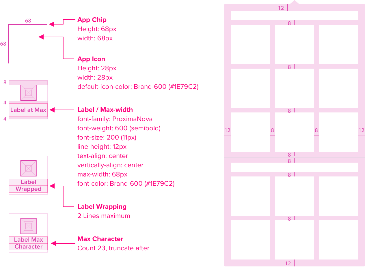
App Picker is made of a dropdown menu with a triangle pointing to its corresponding trigger element. It may include sections to help group related items, which are made of a Title and Horizontal Separator. All spacing and dimensions use existing Dim Sum values. Future enhancement will support an optional “More” button that will increase the height to show all items in the menu instead of using scrolling.
Spacing and Dimensions
The App Picker is triggered from the Global Header by an Icon Button. Please refer to corresponding specs for complete details.
<need to add the Global Header or Icon Button to the visuals directly below>

Chip Button Detail
Please refer to Chip for complete details.

Responsive Design
Content pending: Description and visuals of how the component changes…
- Rendered on a small/touch device, or even larger viewports/desktop?
- The height and width reach min- and max-width/height?
- How and when does content 'stack and/or wrap'?
- Does the position on the screen change?
- Re-Positioning: how does content ‘stack and/or wrap’?
- Text Resize: How does the components’ appearance change if the user increases the font size by 300%?; Truncation, wrapping
Interactions
The first interactive list item (Chip) inside of the menu receives focus by default, unless an application is already selected, focus is then set on that selected application chip <need visual>.
<'Interaction States' has been replaced by a reference to the Chip Button component to reduce redundancy.>
Digital Accessibility
Keyboard Behaviour

| FUNCTION |
|---|
| Moves focus to the next interactive element within the menu. Cycles through the list |
| Moves focus to the previous interactive element, within the menu Cycles through the list |
| Makes a selection (ie. app picker icon button or app chip) Opens the menu, focus is on the first interactive list item (app chip) in menu OR closes the menu and keeps the currently selected list item The first interactive list item (app chip) inside of the menu recieves focus by default, unless an application is already selected, focus is then set on that selected application chip. |
| Closes menu and returns to the app picker icon button |
| FLYOUT INTERACTION | |
|---|---|
| Spacebar | Selecting an item (using Spacebar or Enter/Return) will take user back to root menu UNLESS the menu is multi select, in which case spacebar will be used to select an item and doing so will not close the menu, but will remain open to allow user to navigate within the menu to select additional options. |
ARIA Labels
- An element that contains or owns all the list options has role listbox.
- Each option in the listbox has role option and is a DOM descendant of the element with role listbox or is referenced by an aria owned property on the listbox element.
- If the listbox is not part of another widget, then it has a visible label referenced by aria-labelled by on the element with role listbox.
- In a single-select listbox, the selected option has aria-selected set to True.
- If the listbox supports multiple selection:
- The element with role listbox has aria-multiSelectable set to true.
- All selected options have aria-selected set to True.
- All options that are not selected have aria-selected set to False. - If the complete set of available options is not present in the DOM due to dynamic loading as the user scrolls, their aria-setsize and aria-posinset attributes are set appropriately.
- If options are arranged horizontally, the element with role listbox has aria-orientation set to horizontal. The default value of aria-orientation for listbox is vertical.
