Overview
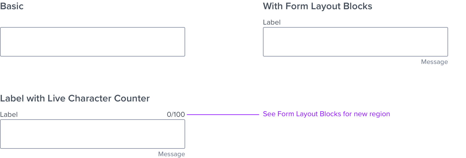
The Large Input Text is one of four atomic components used in various combinations to create form elements, these are: Input Text, Large Input Text, Input Group, and Form Layout Blocks. Refer to the Input Text spec for details.
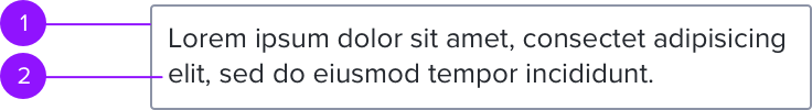
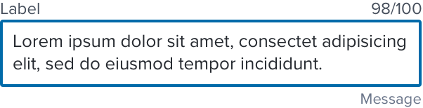
Large Input Text is shown below and contains these elements:
- Text area: input field for text.
- Value text: text within the input field.
Context
Anatomy
Visual Style
Grid placement
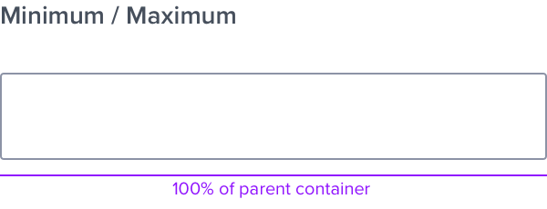
Width of the text-area scales with the parent container (100%).
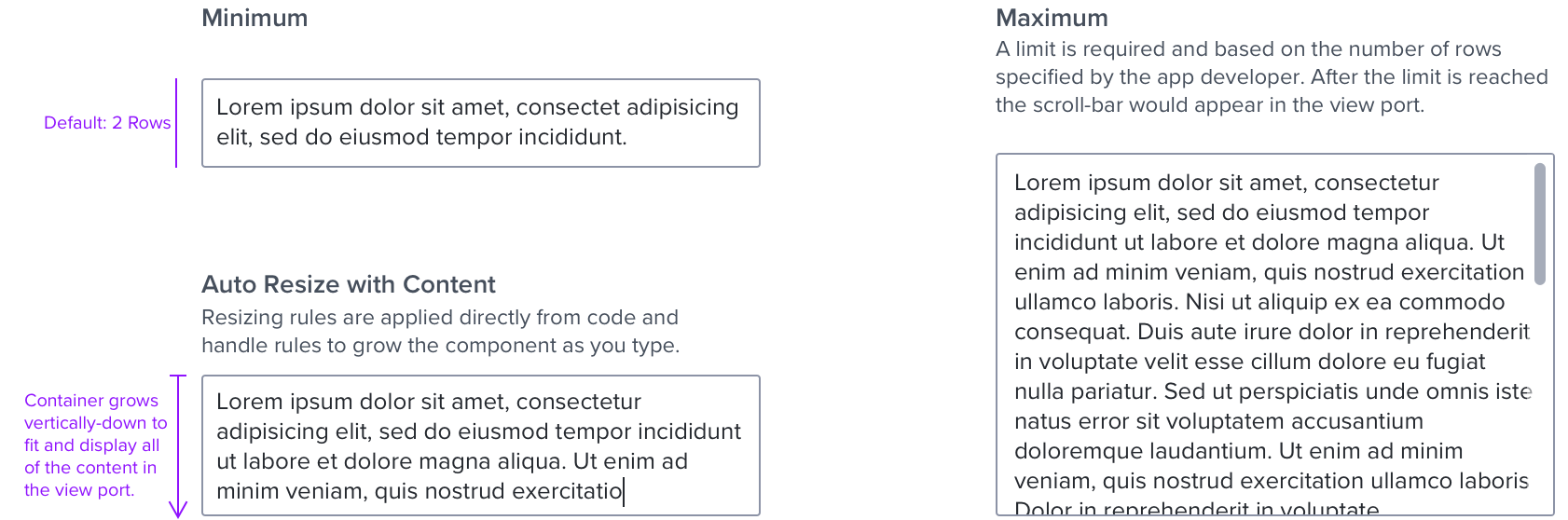
Height is based on the number of rows specified by developer.
Wrapping - Words break at syllables. Strings can break arbitrarily.
Scrollable - When text entries surpass the predetermined fixed height, a scroll bar appears.
Width
Height
States
See the Input Text spec for more state details.
| Graphic | Styling | Styling |
|---|---|---|
| Idle |  | border: 1px, solid, #8C93A6; N400 background: #FFFFFF; N000 border-radius: 2px |
| Focus/Active |  | [vs standard idle] border: 2px, solid, #006AA9; B700 |
| Disabled - Idle |  | [vs standard idle] background: #EBEDF0; N080 |
| Disabled - Hover | 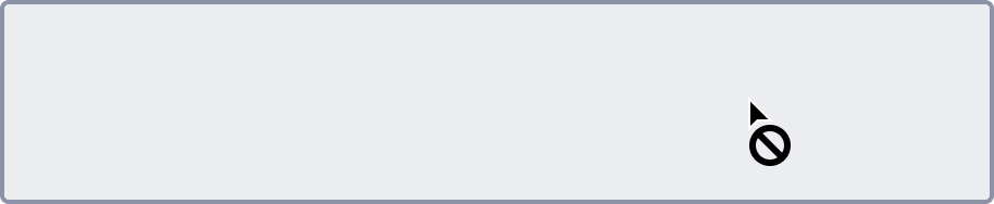 | [vs disabled idle] cursor: disabled-read_only |
| Aria-Read- Only / Aria-Disabled - Idle |  | [vs disabled idle] background: #F6F7F9; N050 border: 1px, solid, #EBEDF0; N080 bottom-border: 1px, solid, #8C93A6; N400 |
| Aria-Read-Only / Aria-Disabled - Hover |  | [vs aria-read-only/aria-disabled idle] border: 1px, solid, #1E79C2; B600 cursor: disabled-read_only |
| Aria-Read-Only / Aria-Disabled - Focus |  | [vs aria-read-only/aria-disabled idle] border: 2px, solid, #006AA9; B700 |
| Hover |  | [vs standard idle] border: 1px, solid, #006AA9 B700 |
| Error |  | [vs standard idle] border: 1px, solid, # C64252; error900 |
Digital Accessibility
Screen Reader
Note: The below values are aligned with aria descriptions (‘ids’) to ensure screen readers announce for accessibility.
- Label: Should be wrapped in tag with attribute ‘For=“idOfLargeInput” ’ instead of aria-labelledby
- Textarea: aria-controls=“idOfStatusMessage”
- Live Character Counter: role=“status” aria-live=“polite”
- Message (feedback helper text): “aria-describedby”
- Error Message: role=“status” (part of layout block)
The character count is announced by the screen reader to the user when the user focuses onto the text area in proper order.
Keyboard Behavior
- Use global standard keyboard interactions, and in order of operations (e.g. left to right, top to bottom).
- Navigation details for embedded components can be found in their respective specs.
Documentation and Rationale for Resizing
- The resizable handle feature is being deprecated due to the inability to fully comply with accessibility standards and would be less than optimal for the best user experience. The auto-resize funcationality will repalce it and complies with accessibility standards and guidelines.
- By providing resizing rules applied directly from the code, resize rules will support scroll while the input field height grows as the user types, a max height limit can be specified by the app dev side.