Overview
The Breadcrumb inherits it’s behavior from the ‘Typography / Text Modifier Link Variant’ component, utilizing rem values with the root element defined with Resize-Text (RT) rules, aligning to the base font family ProximaNova-Regular.
The breadcrumb is a secondary navigation pattern that helps a user understand the hierarchy among levels and navigate back through them. Breadcrumbs show users their current location and enable them to quickly move up to a parent level or previous step.
There is one breadcrumb style type with two use cases:
| Use Case | Purpose |
|---|---|
| Location-based (Fixed) | These illustrate the site’s hierarchy and show the user where they are within that hierarchy. |
| Path-based (Dynamic) | These show the actual steps the user took to get to the current page, rather than reflecting the site’s information architecture. Path-based breadcrumbs are always dynamically generated. |
Anatomy
Visual Style
Interactions: All the breadcrumb page links should be interactive and link to their respective pages.
Hover / Focus: All breadcrumb page links are interactive and can be selected with a mouse and keyboard. The separators between page links are not interactive.

Dimensions

Variants
| Breadcrumb Variant | Use Case |
|---|---|
 | • Breadcrumbs are placed in the top left portion of the page. They sit underneath the header and navigation, but above the page title. |
 | • If a page doesn’t have a title, the current page can be included in the breadcrumb trail. • The current page is always the last page link listed and is not an interactive link. |
 | • If a page clearly displays a page title, the current page is not included in the breadcrumb trail. • The breadcrumb is constructed with the page header shown above the current page title. • The separator (trailing slash) is an optional property and is ON by default, can be turned OFF. |
Interactions
The Breadcrumb has four state styles: Enabled, Hover, Focus, and Current. Refer to the ‘Typography’ component spec, section ‘Text Modifier Link Variant’.
Truncation
| Current Behaviour | Details |
|---|---|
 | Truncation pattern currently being utilized in the Shuttle. |
 | When not enough space is available each string/level should be truncated on the right side of the character string. |
 | When the user Hovers over one of the truncated strings it expands to display the entire string. The other strings lose characters to allow more space to display the full string. |
 | When one of the truncated strings receives focus indication it expands to display the entire string. The other strings lose characters to allow more space to display the full string. |
Examples
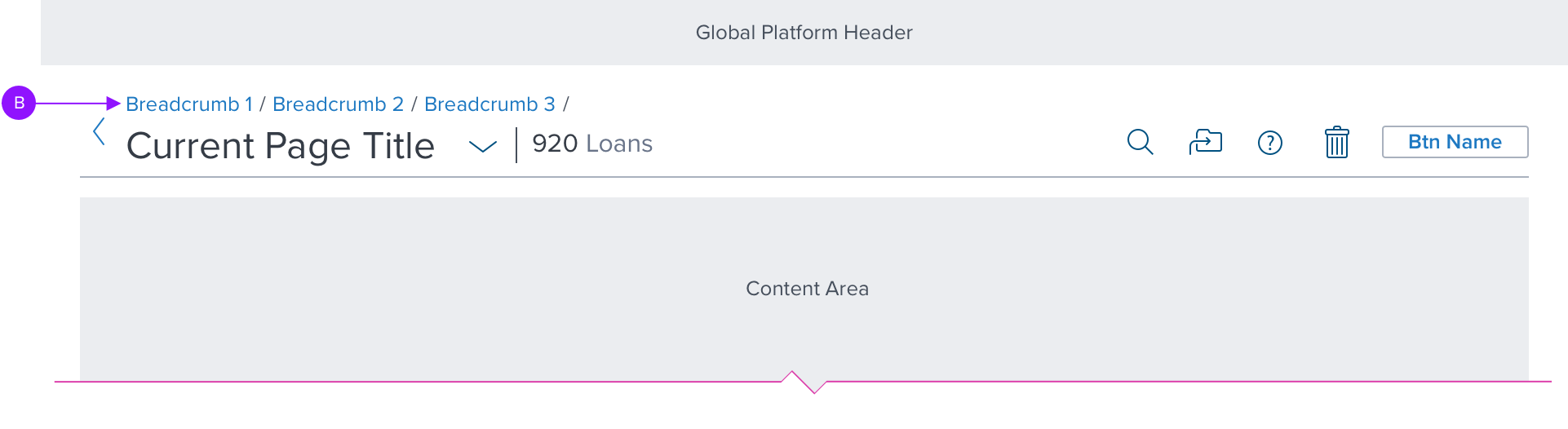
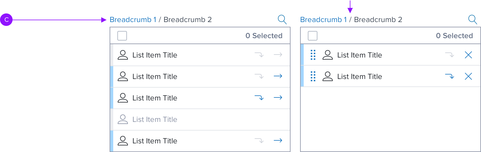
Breadcrumb used in the following locations and components:
A. Page: Placed in the top left portion of the page. They sit underneath the header and navigation, but above the page content.
B. Page Header: Constructed with the page header component shown above the current page title.
C. Shuttle-v2: Shown in both the Source Panel and Destination Panel of the Shuttle component.

Digital Accessibility

Keyboard Behavior
*Global standard keyboard interactions apply, and in order of operations from left to right, top to bottom.
| Key | Function |
|---|---|
| TAB / SHIFT+TAB | Moves focus to the next and previous interactive elements in the tab order. |
| ENT / RET | Activates and confirms action when an interactive element receives focus indication (e.g. breadcrumb). |
Screen Reader
*Steps from object to object or by jumping between components. Converts interactive elements into speech.
| SR Consideration |
|---|
| VoiceOver: Users can trigger a breadcrumb link by pressing Enter or Control-Option-Space. Users can navigate between breadcrumb links by pressing Tab and Shift-Tab. NVDA / Jaws: Users can trigger a breadcrumb link by pressing Enter. Users can navigate between breadcrumb links by pressing the Up and Down arrow keys. |
| ARIA Consideration |
|---|
| - Use the element. This allows assistive technology to present the breadcrumbs in context as a navigational element on the page. - Use ordered lists and list items. Use an
|