v1.0.0
Overview
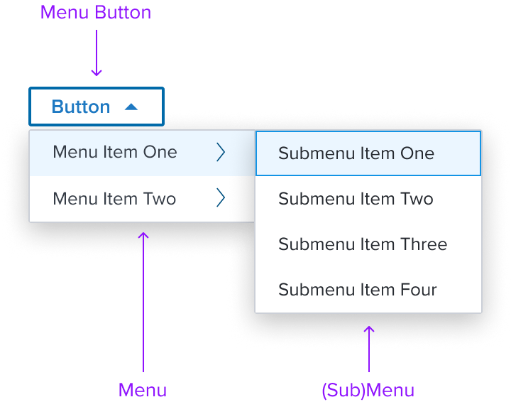
Menu Button is a widget composed of a button that opens a menu.
Design
Box Model
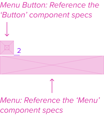
Menu Button
The Menu Button uses the button component to open the menu. See Button Specs
Menu
The Menu is a composable element meant to only be used in combination with the menu-button. See Menu Specs
Responsive
For Responsive use Menu Specs.
States
For States use Button Specs
Use Cases
For Use Cases use Menu Specs.
Examples
For Examples use Menu Specs.
Digital Accessibility
The Menu-Button by design is accessible out of the box by being opinionated and enforcing the standard HTML Patterns and Roles described below. Please refer to the documentation for complete details for Keyboard Interaction and ARIA roles and properties.
Restricted allowed ARIA roles and properties
HTML semantics are enforced by restricting the allowed ARIA roles and properties to ensure that the menu-widget is accessible and follows the WAI-ARIA Author. In particular, the menu-widget uses the role=menu, role=menuitem, role=menuitemcheckbox, role=menuitemradio, and role=group roles, which by current HTML specifications are the only roles allowed under a menu context.
Keyboard/Mouse interaction
The menu-widget is implemented following the WAI-ARIA Authoring Practices for Menubar and Menu keyboard, since the pattern includes "optional" keyboard interactions, and seems to be missing some details on specific interactions, the opinions of the menu-widget are further detailed in the Regarding WAI Pattern Optionals and Opinionated choices section.
Variants
This has no known-of variants.
Related Composition Components
This Component's flexibility and adaptability are enhanced when used in conjunction with other atomic components within the Dim Sum Design System. These related components may include:
- Menu: is a composable element meant to be used specifically and only in combination with the menu-button.
By leveraging this atomic component, designers can create highly customized card layouts that cater to specific content needs while ensuring a consistent and cohesive user experience across the interface.
Usage Warnings
This has no known-of issues or concerns.
Alternate Components
- Combo Box Use when there are many states or selectable items, one or more can be selected, and space is at a premium.