Overview
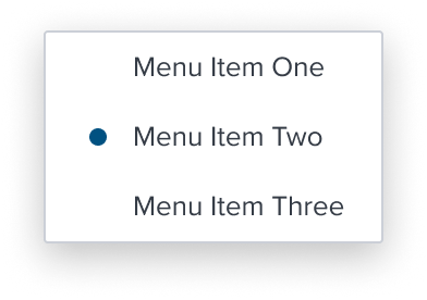
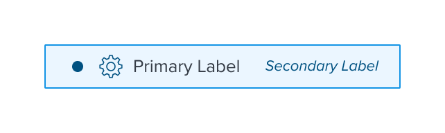
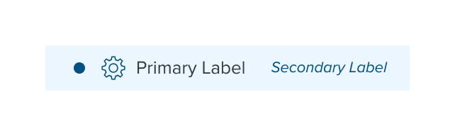
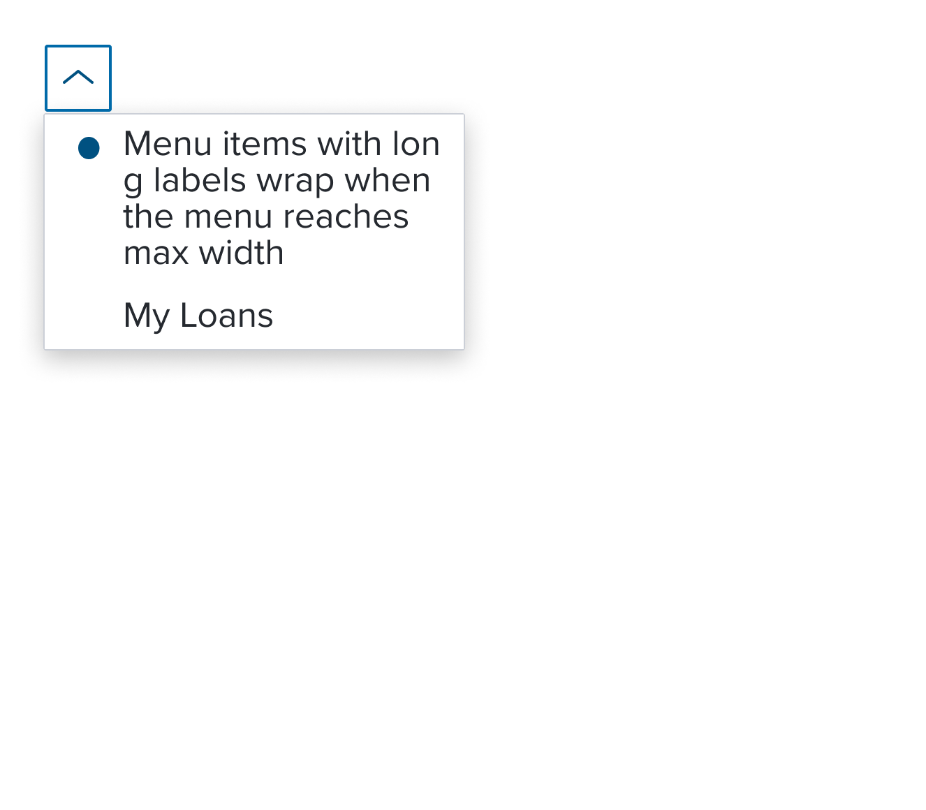
Single Activation is a menu item whose activation implies exclusive selection within the same selection group. The visual feedback to indicate the activation state is a circular dot.
Design
Box Model
Configurations
With Left Region

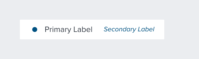
With Secondary Label
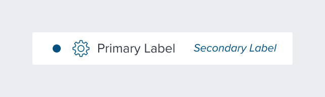
With All Configurations
This composable uses all the visual styles from the Basic Activation [Composable], and may also include any of the following according to the use case and requirements.
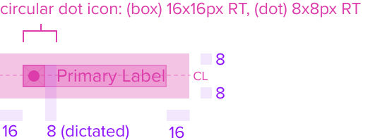
- Single Selection (Dot Icon) Color brand-800 (#005181)
Uses the standard brand design system color and visual styling that offers sufficient contrast to delineate it as a distinct selection element for a menu item. - Height & Width (Dot) 8x8px RT, (Box) 16x16px RT
Uses the standard design system sizing for visual consistency and alignment throughout applications. - Padding-x 8px (dictated)
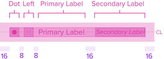
The single select region has a left placement of the menu item and left position to the primary label and left agnostic region. It has pre-built spacing to dictate the proper distance between the primary label or agnostic left region.
Responsive
This composable uses the Standard Menu responsive behavior.
States
| State | Default Graphic | Default Styling |
|---|---|---|
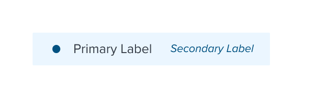
| Idle | 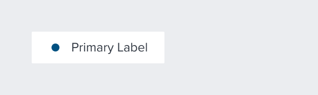 | circular-dot-icon: brand-800 (#005181) |
 | left-icon-color: brand-800 (#005181) | |
 | secondary-label-font: b4 font-color: brand-800 (#005181) - new variant font-style: italic - new variant | |
 | N/A | |
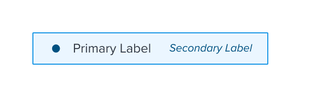
| Focus |  | background: brand-200 (#EBF6FF) border: 1px solid brand-500 (#1394E5) |
 | N/A | |
 | N/A | |
 | N/A | |
| Disabled |  | font-color: neutral-500 (#697489) - new variant cursor: disabled circular dot icon disappears |
 | left-icon-color: neutral-400 (#8C93A6) | |
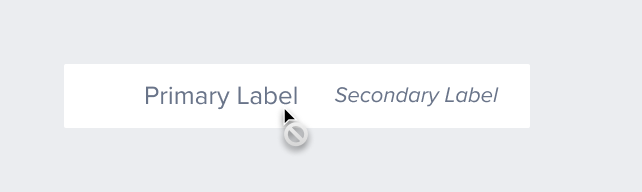 | secondary-label-font: b4 font-style: italic - new variant | |
 | N/A | |
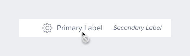
| Hover |  | background: brand-200 (#EBF6FF) |
 | N/A | |
 | N/A | |
 | N/A | |
| Read-only | N/A | N/A |
| Error | N/A | N/A |
Use Cases
| Original Scenario (Use Case) | Dim Sum Version (Proposed Solution with DS Components) | Scenario Description |
|---|---|---|
 |  | Single Activation Menu This is showing the Pills v2 component used with Menu Button component. These two components MUST be configured together to achieve this result. See Pills v2 Specs |
Examples
| Scenario Graphic | Scenario Solution | Text Resize and Reflow (200%) | Scenario Description |
|---|---|---|---|
 |  |  | Single Activation Menu menu item whose activation implies exclusive selection within the same selection group. The visual feedback to indicate the activation state is a circular dot. |
Digital Accessibility
This composable has no known-of related A11y concerns.
Variants
This composable has no known-of variants.
Usage Warnings
The single select menu Item shares many characteristics with the multi select item, with three key distinctions:
1. Auto-exclusive Selection within a Group:
Single select items enforce exclusive selection within a group, but multiple single selection groups can existwithin the same menu or submenu, allowing for multiple "single selections" across groups.
2. Grouping Requirement:
Single select items must always be wrapped in a group menu item, even if the group lacks a visual label, to ensure proper behavior.
3. Design Considerations:
When multiple single selection groups are present, designs must visually distinguish them. This can be done implicitly (through proximity, labels, or separators) or explicitly (with group labels or by using a submenu for each group). Submenus are recommended when too many groups exist at the same menu depth.
Reference
This composable has no known-of references.