This menu item is highly discouraged from usage and only intended for retro-compatibility with Drop Down Menu V2.
Overview
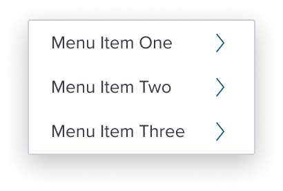
Activation with Submenu menu item introduces a hierarchical structure within the menu-button widget. This type of menu item acts as a parent to a submenu, which can contain any of the eight other valid menu items. It provides a right facing chevron serves the purpose of providing visual feedback about the presence of a (sub)menu spawning from the given "submenu" menu item.
The (sub)menu content can contain any of the documented composable menu-items but because they now live under a "sub" menu, a semantic hierarchical relationship between menu items is from this point forward established between different depth levels and both design and functionality MUST ensure and enforce meaningful hierarchical treatment.
Design
Box Model
Configurations
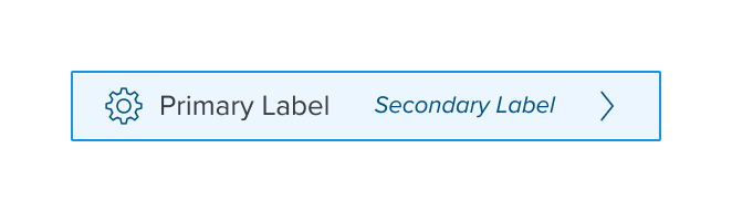
With Left Region

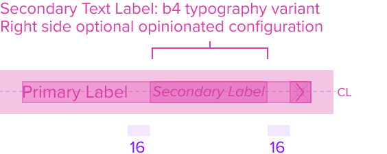
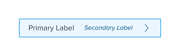
With Secondary Label
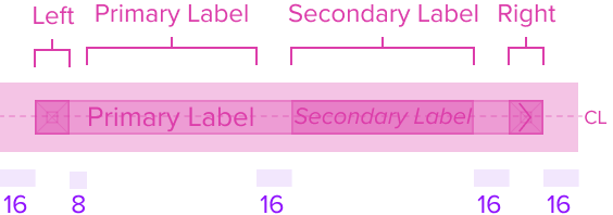
With All Configurations
This composable uses all the visual styles from the Basic Activation [Composable], and may also include any of the following according to the use case and requirements.
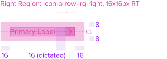
- Submenu (Right Chevron) Color brand-800 (#005181)
Uses the standard brand design system color and visual styling that offers sufficient contrast to delineate it as a distinct selection element for a menu item. - Height & Width 16x16px RT
Uses the standard design system sizing for visual consistency and alignment throughout applications. - Padding-x 8px (dictated)
The submenu region has a right placement of the menu item and right position to the primary and secondary labels. It has pre-built spacing to dictate the proper distance between labels and the (sub)menu.
Responsive
This composable uses the Standard Menu responsive behavior.
States
| State | Default Graphic | Default Styling |
|---|---|---|
| Idle |  | icon-arrow-lrg-right: brand-800 (#005181) |
 | left-icon-color: brand-800 (#005181) | |
 | secondary-label-font: b4 font-color: brand-800 (#005181) - new variant font-style: italic - new variant | |
 | N/A | |
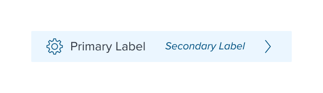
| Focus |  | background: brand-200 (#EBF6FF) border: 1px solid brand-500 (#1394E5) |
 | N/A | |
 | N/A | |
 | N/A | |
| Disabled |  | font-color: neutral-500 (#697489) - new variant cursor: disabled |
 | left-icon-color: neutral-400 (#8C93A6) | |
 | secondary-label-font: b4 font-style: italic - new variant | |
 | N/A | |
| Hover |  | background: brand-200 (#EBF6FF) |
 | N/A | |
 | N/A | |
 | N/A | |
| Read-only | N/A | N/A |
| Error | N/A | N/A |
| When submenu is open (Parent is highlighted) | | background: brand-200 (#EBF6FF) |
 | N/A | |
 | N/A | |
 | N/A |
Use Cases
| Original Scenario (Use Case) | Dim Sum Version (Proposed Solution with DS Components) | Scenario Description |
|---|---|---|
 | 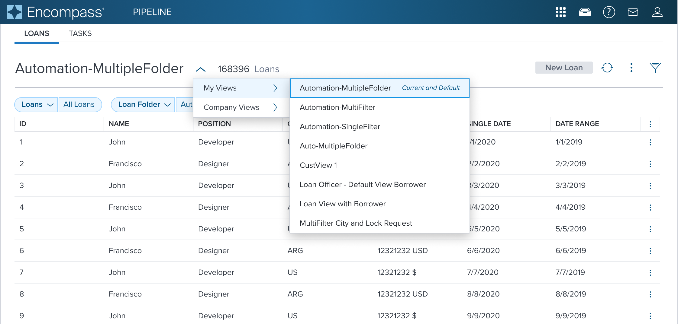 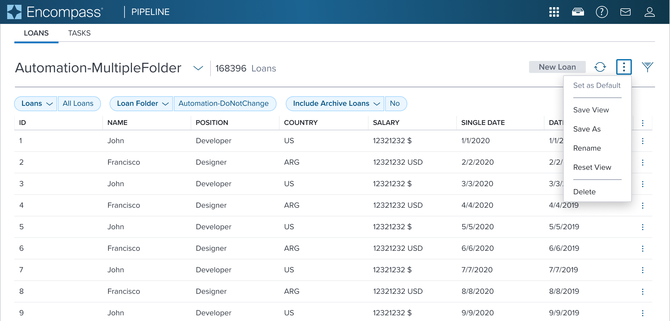 | Top: Navigation Menu with (Sub)Menu Shown in a Page Header. The current selection and default menu items are marked with a Secondary Label 'Current and Default'. Bottom: Activation Menu Actions shown moved out of the Navigation Menu, and relocated to the Toolbar. This separates the two different semantic roles from co-mingling the different functionalities. |
Examples
| Scenario Graphic | Scenario Solution | Text Resize and Reflow (200%) | Scenario Description |
|---|---|---|---|
 | 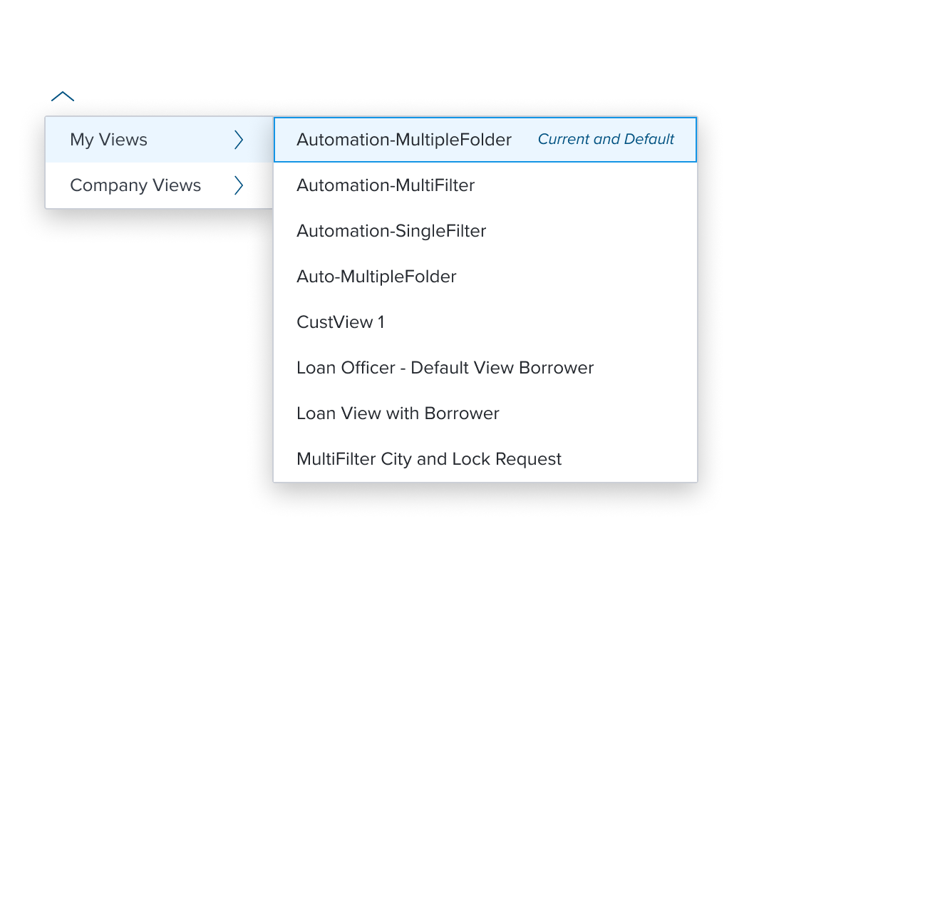 | 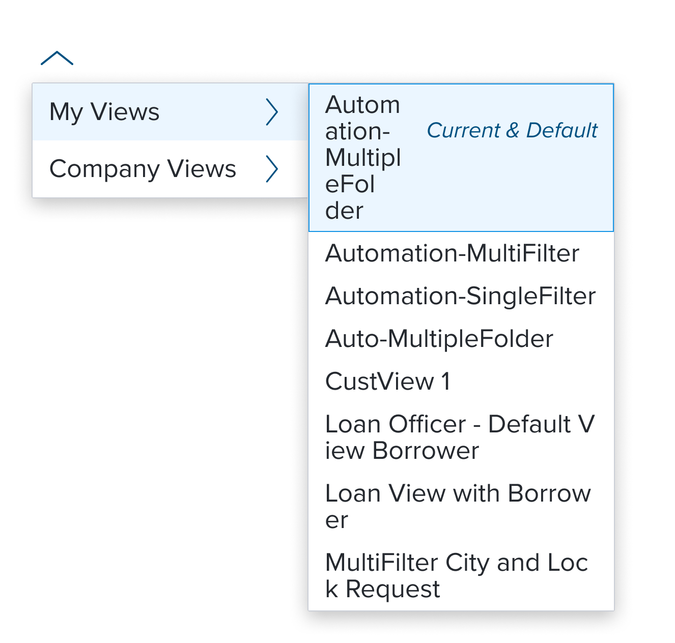 | Activation Menu with (Sub)Menu menu with a right facing chevron serves the purpose of providing visual feedback about the presence of a (sub)menu spawning from the given "submenu" menu item. |
Digital Accessibility
This composable has no known-of related A11y concerns.
Variants
This composable has no known-of variants.
Usage Warnings
The introduction of this hierarchy is a key characteristic, requiring logical and semantic parent-child relationships to avoid confusion and carries significant design implications.
When using the with submenu item, designers must carefully consider the hierarchical relationships between the parent item and its submenu items.The parent-child relationship MUST be logical and semantically meaningful. Failing to establish clear relationships can lead to a confusing user experience, both for users with and without disabilities.
Beyond the need for careful design to ensure logical hierarchy, the with submenu item functions similarly to other menu items, without additional pitfalls to consider.
Reference
This composable has no known-of references.