Overview
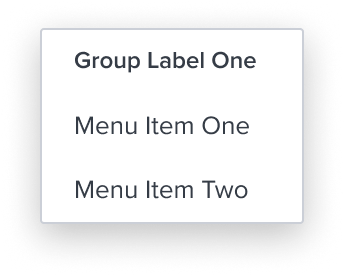
The Group is a unique element within the menu-button widget that serves two main purposes:
- Delimit exclusive single selection within a group of items.
- Provide a label acting for a group of menu items that helps to organize the menu structure.
Design
Box Model
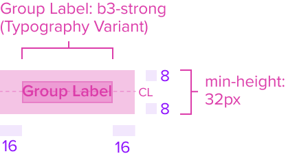
This composable uses some of the visual styles from the Basic Activation [Composable], such as the background color, and the min and max height and width. It is purely presentational and has no states or action. It includes the following styles that define it's unique purpose in the menu.
- Group Text Label: "b3-strong" (this requires a new typography variant)
The group text label by design is an opinionated configuration and has forced styling and alignment. It's styled with a stronger visual weight to distinguish it from the primary label. It has a left placement of the text that grows to the right and is forced to wrap.
Responsive
This composable uses the Standard Menu responsive behavior.
States
| State | Default Graphic | Default Styling |
|---|---|---|
| Idle | 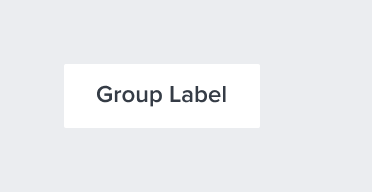 | background: neutral-000 (#FFFFFF) font: b3-strong (12px, semi-bold, neutral-700) - new variant font-color: neutral-700 (#353C46) |
| Focus | N/A | N/A |
| Disabled | N/A | N/A |
| Read-only | N/A | N/A |
| Hover | N/A | N/A |
| Error | N/A | N/A |
Use Cases
| Original Scenario | Dim Sum Version | Scenario Description |
|---|---|---|
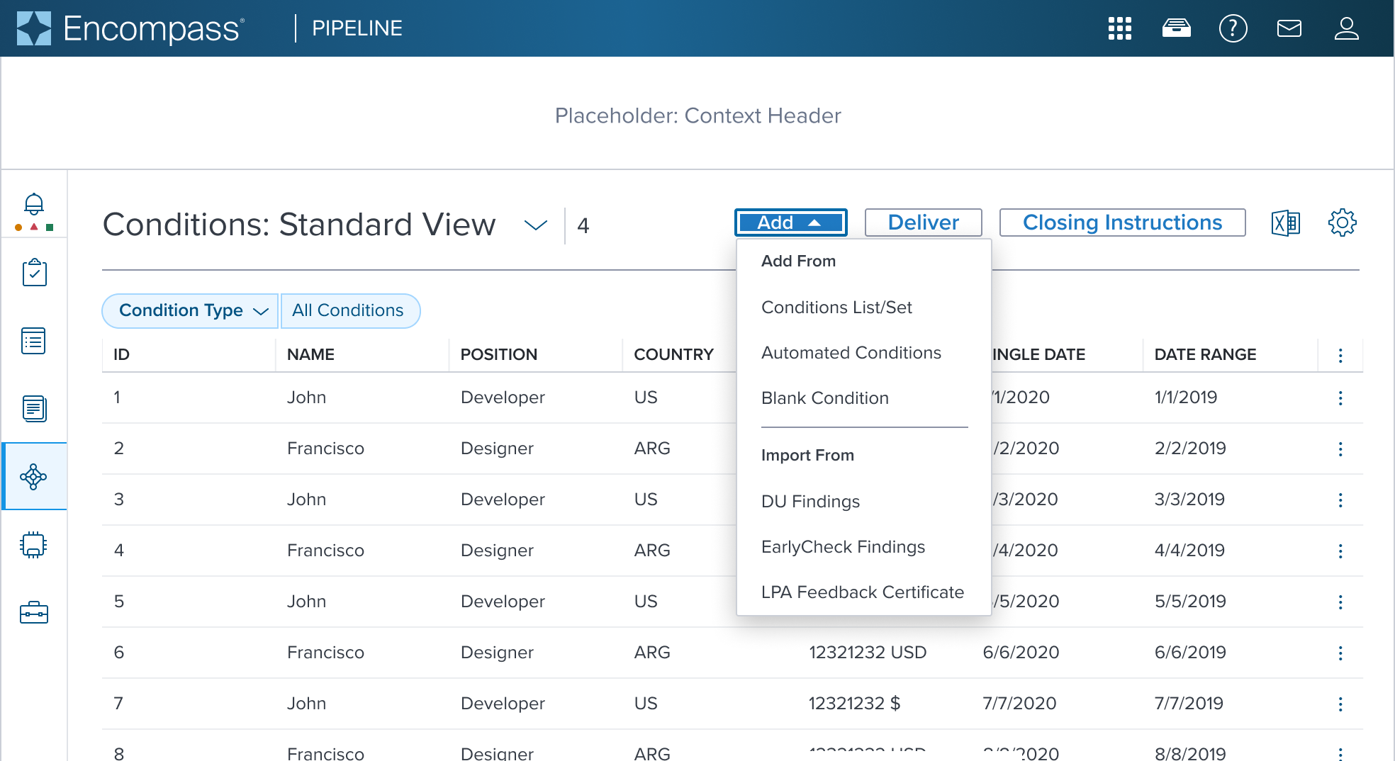
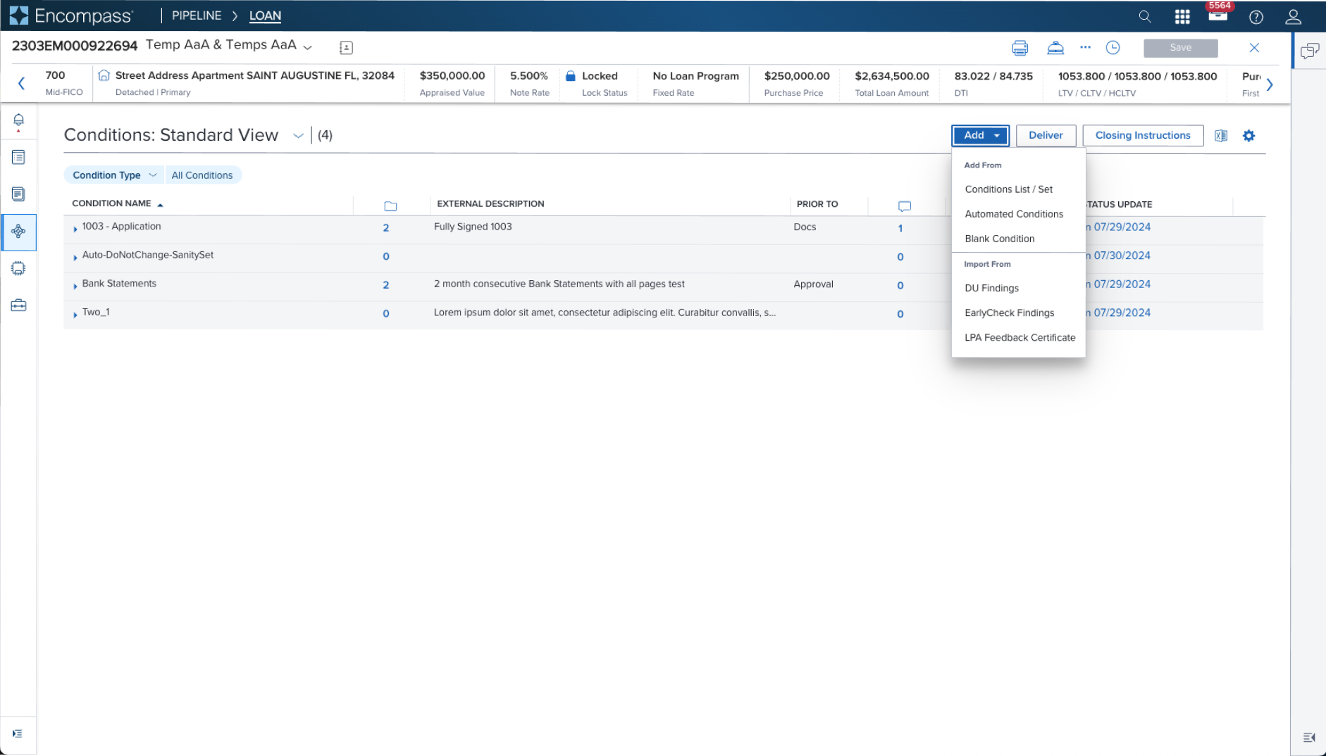 |  | Activation Menu with Group Label and Separator shown with Group Label and Separator used in a Page Header Toolbar (triggered from a filled toggle button) The original scenario (use case) shows a context header with a complex page header that is a custom implementation by the application side. This is not a pattern that Dim Sum currently supports and therefore is not promoted as a solution. A 'Placeholder: Context Header" region is shown in the 'Dim Sum Version' graphic until addressed. |
Examples
| Scenario Graphic | Scenario Solution | Text Resize and Reflow (200%) | Scenario Description |
|---|---|---|---|
 | 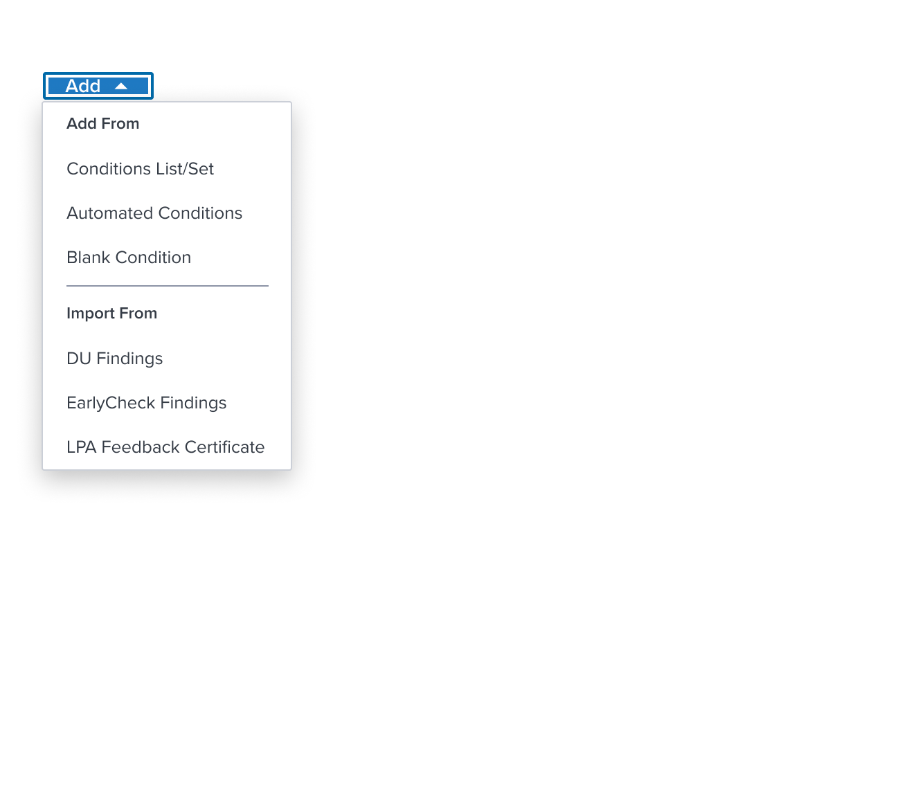 | 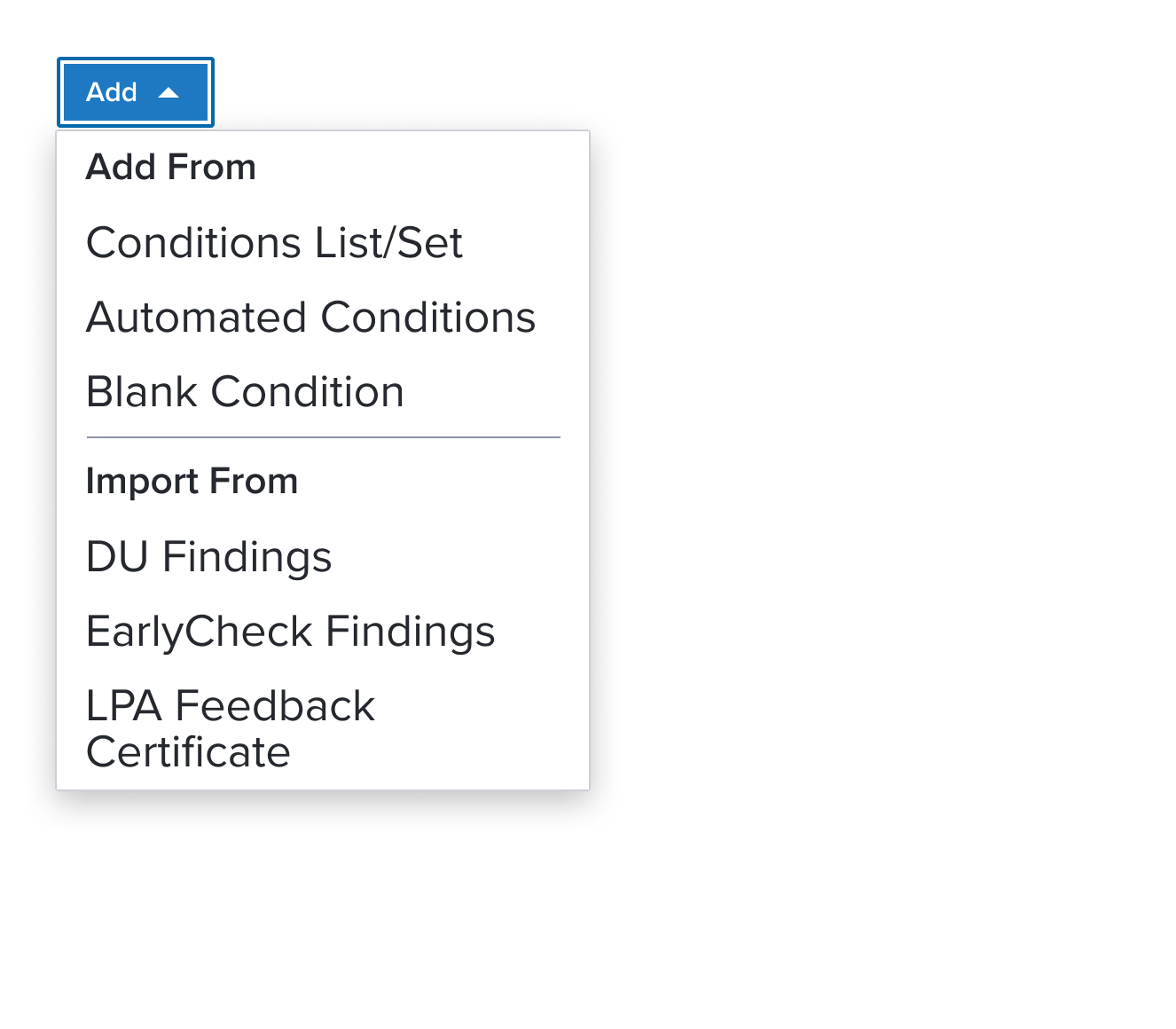 | Menu with Group Label an element who's purpose is to delimit single selection within a group of items. It is placed at the top of a group of menu items acting as a label for related items, helping to organize the menu structure. The scenario graphic shows a context header with a complex page header that is a custom implementation by the application side. This is not a pattern that Dim Sum currently supports and therefore is not promoted as a solution. A 'Placeholder: Context Header" region is shown in the 'Scenario Graphic' until addressed. |
Digital Accessibility
This composable has no known-of related A11y concerns.
Variants
This composable has no known-of variants.
Usage Warnings
If multiple groups are used within the same menu, it may indicate that too many actions are at the same level or that item relationships are unclear. This should prompt a reconsideration of whether the menu-button widgetis the right choice or if another component (or hierachy via submenus) is more appropriate.
A key limitation is that nesting groups is not allowed. While not an HTML restriction, this best practice avoids user confusion. If nested groups seem necessary, consider using a with submenu item instead.
When a label is included, the widget automatically ensures that the group is announced correctly by screen readers, with the group being announced when the first focusable element within it is focused.
Reference
This composable has no known-of references.