This menu item is highly discouraged from usage and only intended for retro-compatibility with Drop Down Menu V2.
Overview
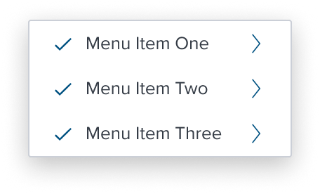
Multi Activation with Submenu menu item is a pre-composed and orchestrated component that unifies the semantics and behaviors of "multi selection" composable and "submenu" composable.
Most of the concerns and design choices of this composition must be inherited and expanded from the two other composables, with particular attention to how the selection behaves with the sub-menu hierarchy to maintain and guarantee semantic behavioral hierarchical interactions.
It's important to note, deselecting a menu item automatically deselects ANY selection at any depth of the sub-tree.
Design
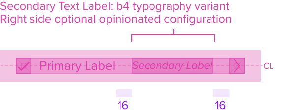
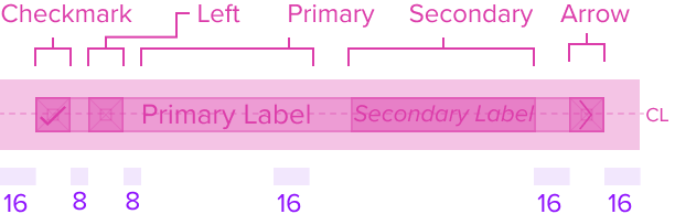
Box Model

Configurations
With Left Region

With Secondary Label
With All Configurations
This composable uses all the visual styles from the Basic Activation [Composable], and may also include any of the following according to the use case and requirements.
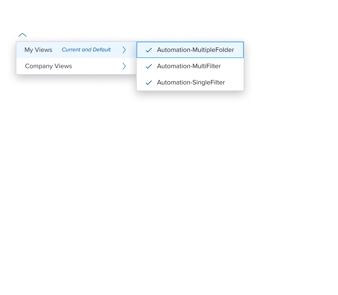
Multi Select Region (Dot Icon)
- Color brand-800 (#005181)
Uses the standard brand design system color and visual styling that offers sufficient contrast to delineate it as a distinct selection element for a menu item. - Height & Width 16x16px RT
Uses the standard design system sizing for visual consistency and alignment throughout applications. - Padding-x 8px (dictated)
The multi select region has a left placement of the menu item and left position to the primary label and left agnostic region. It has pre-built spacing to dictate the proper distance between the primary label or agnostic left region.
Submenu Region (Right Chevron)
- Color brand-800 (#005181)
Uses the standard brand design system color and visual styling that offers sufficient contrast to delineate it as a distinct selection element for a menu item. - Height & Width 16x16px RT
Uses the standard design system sizing for visual consistency and alignment throughout applications. - Padding-x 8px (dictated)
The submenu region has a right placement of the menu item and right position to the primary and secondary labels. It has pre-built spacing to dictate the proper distance between labels and the (sub)menu.
Responsive
This composable uses the Standard Menu responsive behavior.
States
| State | Default Graphic | Default Styling |
|---|---|---|
| Idle |  | checkmark-icon: brand-800 (#005181) icon-arrow-lrg-right: brand-800 (#005181) |
 | left-icon-color: brand-800 (#005181) | |
 | secondary-label-font: b4 font-color: brand-800 (#005181) - new variant font-style: italic - new variant | |
 | N/A | |
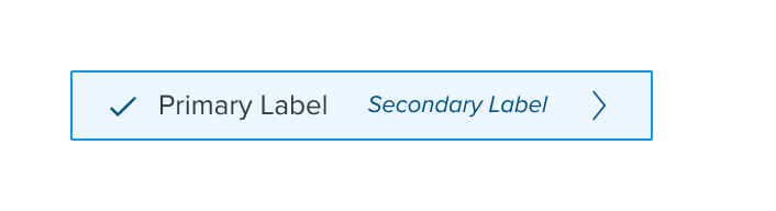
| Focus |  | background: brand-200 (#EBF6FF) border: 1px solid brand-500 (#1394E5) |
 | N/A | |
 | N/A | |
 | N/A | |
| Disabled |  | font-color: neutral-500 (#697489) - new variant cursor: disabled Single checkmark and right arrow icons disappear |
 | left-icon-color: neutral-400 (#8C93A6) | |
 | secondary-label-font: b4 font-style: italic - new variant | |
 | N/A | |
| Hover |  | background: brand-200 (#EBF6FF) |
 | N/A | |
 | N/A | |
 | N/A | |
| Read-only | N/A | N/A |
| Error | N/A | N/A |
| When submenu is open (Parent is highlighted) |  | background: brand-200 (#EBF6FF) |
 | N/A | |
 | N/A | |
 | N/A |
Use Cases
| Original Scenario (Use Case) | Dim Sum Version (Proposed Solution with DS Components) | Scenario Description |
|---|---|---|
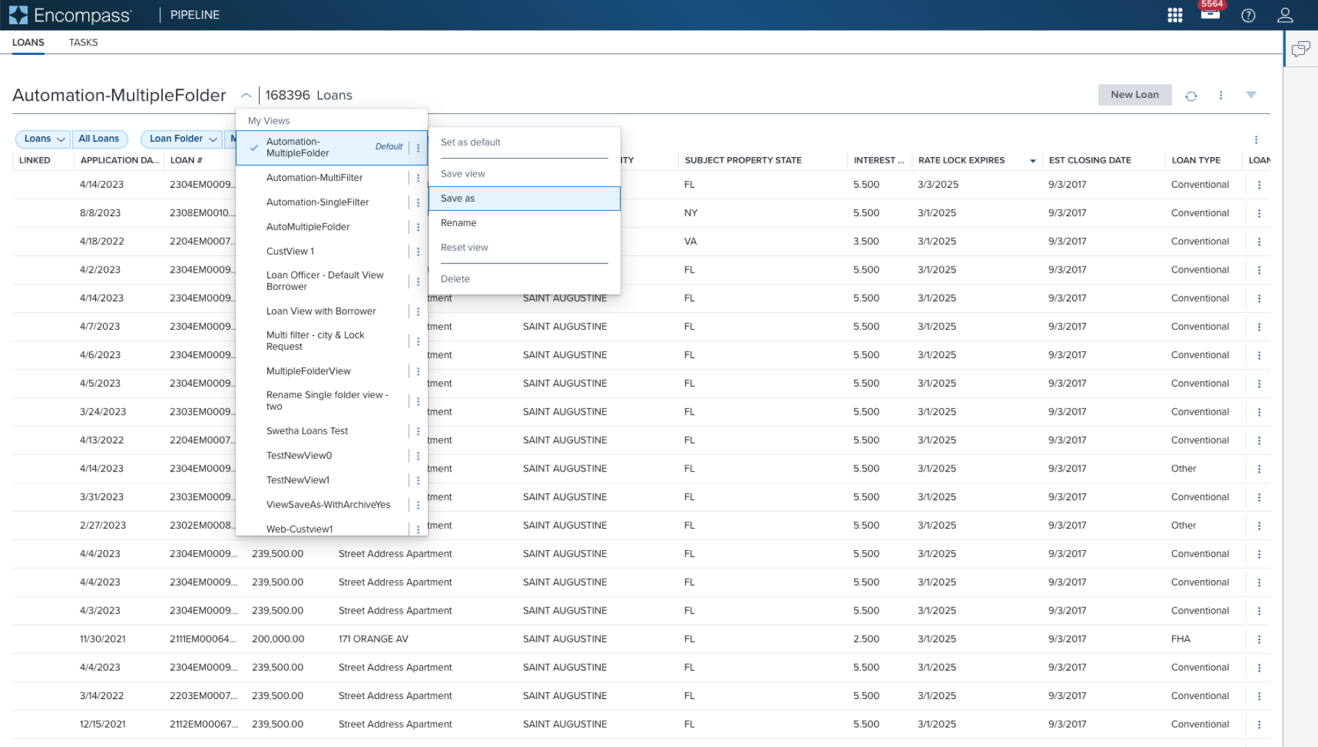 |  | Multi Activation Menu with (Sub)Menu menu pre-composed and orchestrated component that unifies the semantics and behaviors of "multi selection" composable and "submenu" composable |
Examples
| Scenario Graphic | Scenario Solution | Text Resize and Reflow (200%) | Scenario Description |
|---|---|---|---|
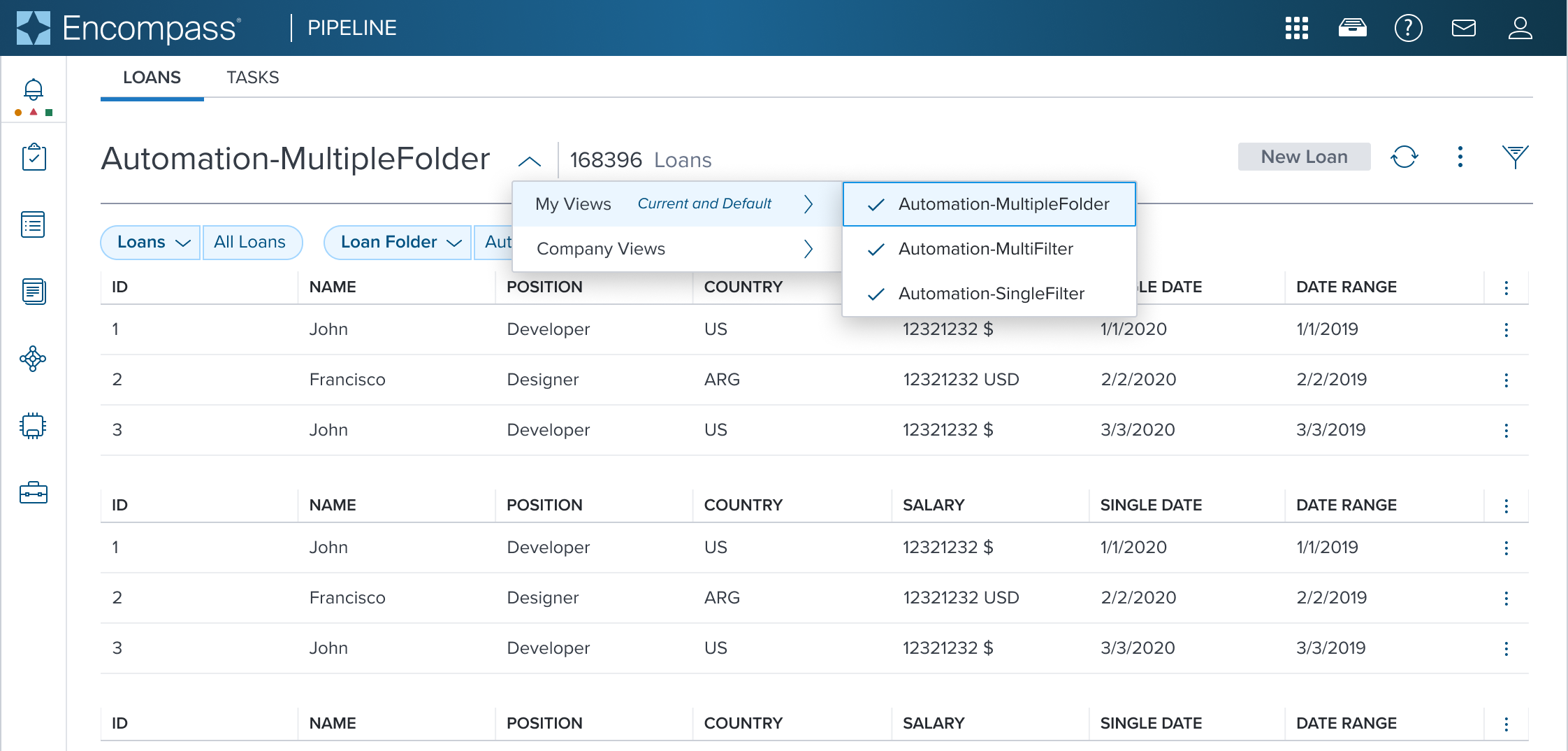 |  |  | Multi Activation Menu with (Sub)Menu menu pre-composed and orchestrated component that unifies the semantics and behaviors of "multi selection" composable and "submenu" composable |
Digital Accessibility
This composable has no known-of related A11y concerns.
Variants
This composable has no known-of variants.
Usage Warnings
These MUST be used sparingly due to their potential to violate WCAG standards and include strict embedded limitations on behaviors to prevent such violations. Ensuring clear grouping, hierarchy, and appropriate use of items guarantees an accessible and user-friendly experience.
When using the with submenu item, designers must carefully consider the hierarchical relationships between the parent item and its submenu items.The parent-child relationship MUST be logical and semantically meaningful. Failing to establish clear relationships can lead to a confusing user experience, both for users with and without disabilities.
Beyond the need for careful design to ensure logical hierarchy, the with submenu item functions similarly to other menu items, without additional pitfalls to consider.
Reference
This composable has no known-of references.