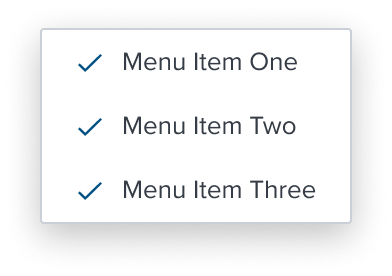
Multi Activation is a menu item whose activation implies non-exclusive selection within the same selection group. The visual feedback to indicate the activation state is a single check mark.
Design
Box Model

Configurations
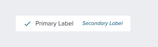
With Left Region

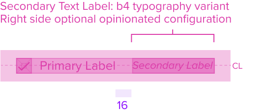
With Secondary Label
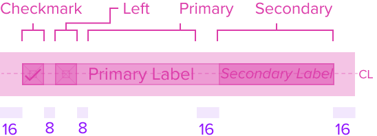
With All Configurations
This composable uses all the visual styles from the Basic Activation [Composable], and may also include any of the following according to the use case and requirements.
- Multi Selection (Single Checkmark) Color brand-800 (#005181)
Uses the standard brand design system color and visual styling that offers sufficient contrast to delineate it as a distinct selection element for a menu item. - Height & Width 16x16px RT
Uses the standard design system sizing for visual consistency and alignment throughout applications. - Padding-x 8px (dictated)
The multi select region has a left placement of the menu item and left position to the primary label and left agnostic region. It has pre-built spacing to dictate the proper distance between the primary label or agnostic left region.
Responsive
This composable uses the Standard Menu responsive behavior.
States
| State | Default Graphic | Default Styling |
|---|---|---|
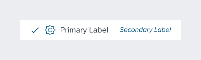
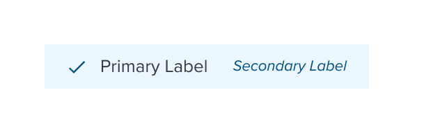
| Idle |  | single checkmark-icon: brand-800 (#005181) |
 | left-icon-color: brand-800 (#005181) | |
 | secondary-label-font: b4 font-color: brand-800 (#005181) - new variant font-style: italic - new variant | |
 | N/A | |
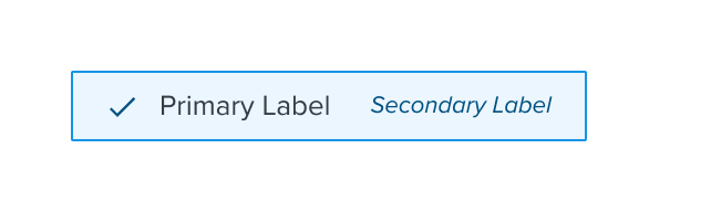
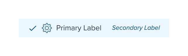
| Focus |  | background: brand-200 (#EBF6FF) border: 1px solid brand-500 (#1394E5) |
 | N/A | |
 | N/A | |
 | N/A | |
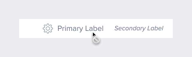
| Disabled |  | font-color: neutral-500 (#697489) - new variant cursor: disabled single checkmark icon disappears |
 | left-icon-color: neutral-400 (#8C93A6) | |
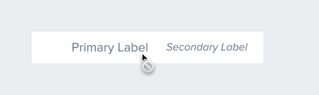 | secondary-label-font: b4 font-style: italic - new variant | |
 | N/A | |
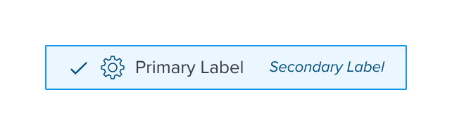
| Hover |  | background: brand-200 (#EBF6FF) |
 | N/A | |
 | N/A | |
 | N/A | |
| Read-only | N/A | N/A |
| Error | N/A | N/A |
Use Cases
| Original Scenario (Use Case) | Dim Sum Version (Proposed Solution with DS Components) | Scenario Description |
|---|---|---|
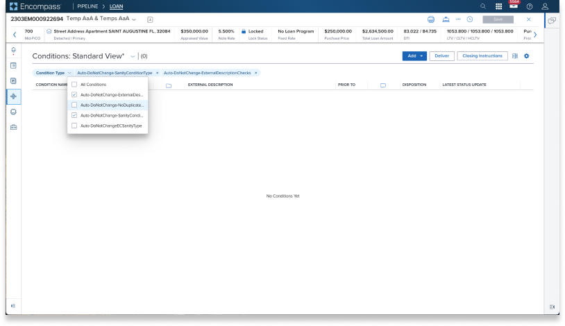 | 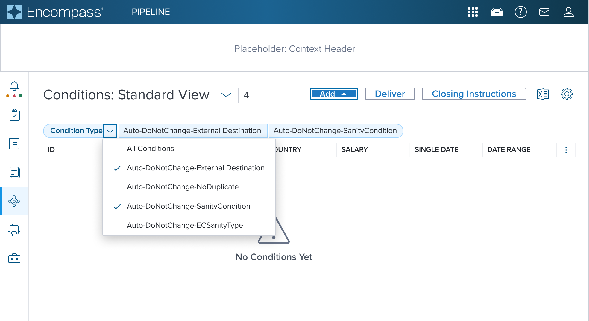 | Multi Activation Menu This is showing the Pills v2 component used with Menu Button component. These two components MUST be configured together to achieve this result. The original scenario (use case) shows a context header with a complex page header that is a custom implementation by the application side. This is not a pattern that Dim Sum currently supports and therefore is not promoted as a solution. A 'Placeholder: Context Header" region is shown in the 'Dim Sum Version' graphic until addressed. See Pills v2 Specs |
Examples
| Scenario Graphic | Scenario Solution | Text Resize and Reflow (200%) | Scenario Description |
|---|---|---|---|
 | 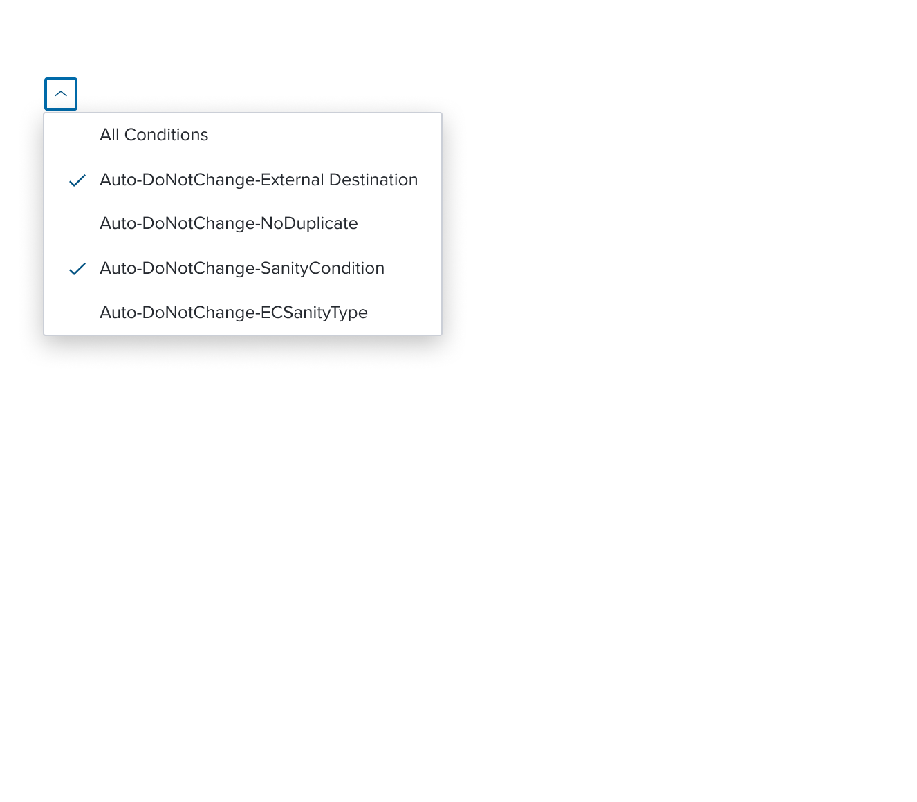 | 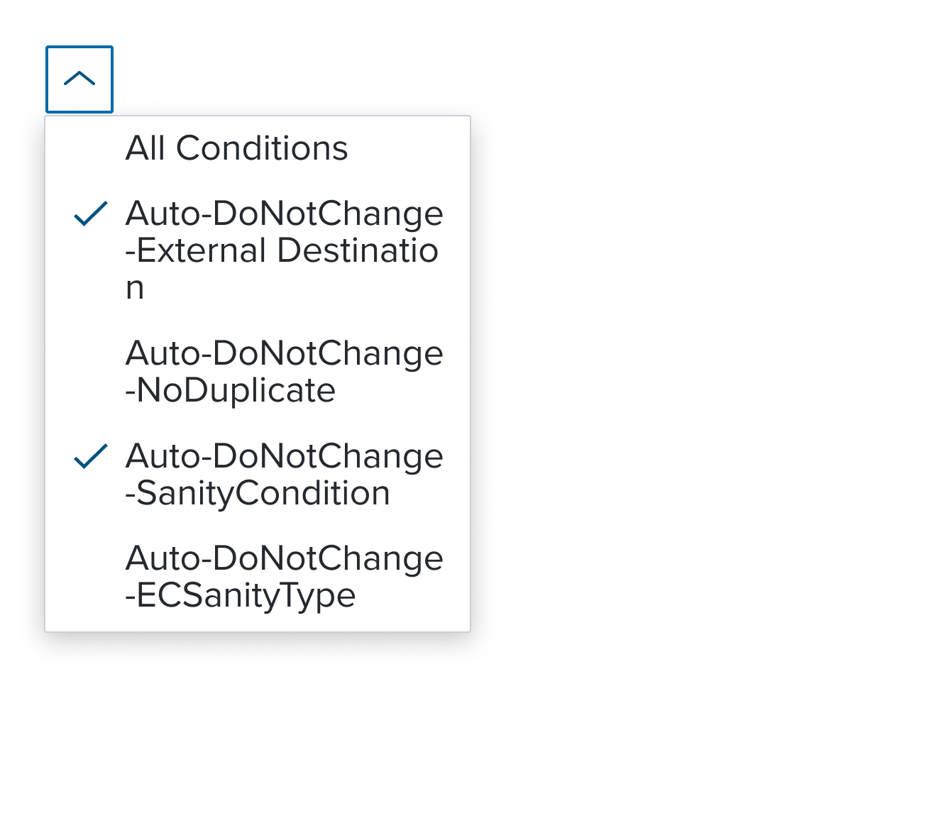 | Multi Activation Menu menu item whose activation implies non-exclusive selection within the same selection group. The visual feedback to indicate the activation state is a single check mark. The scenario graphic shows a context header with a complex page header that is a custom implementation by the application side. This is not a pattern that Dim Sum currently supports and therefore is not promoted as a solution. A 'Placeholder: Context Header" region is shown in the 'Scenario Graphic' until addressed. |
Digital Accessibility
This composable has no known-of related A11y concerns.
Variants
This composable has no known-of variants.
Usage Warnings
The multi select Item is a specialized menu item within the menu-button widget that combines two flows: partial navigation and selection.
This item type is intended for scenarios where both flows are required simultaneously.
It is not designed to simply handle multiple selections; instead, it is meant to address cases where each selection or deselection triggers a progressive update to the content of the page.
Designers must use the multi select item with this specific intent in mind.
If the scenario does not involve altering the page content (usually in real-time as selections are made or removed), other components, such as a combobox, should be considered instead.
Reference
This composable has no known-of references.