Overview
Tabs are a set of layered sections of content, known as tab panels, that display one panel of content at a time.
Design
Objective: Provide meaningful images that clearly transmit the information from the above sections. Include a visual 'schematic' of the component similar to the familiar box model. Hi-fidelity visuals are not appropriate here, and are valid if they are:
- Clear: Ensure the visual is easily understandable to viewers of the specification.
- Relevant: Provide meaningful insight on either functionality or usage.
Box Model
Objective: Provide a visual representation of the fixed dimensions, spacings and styles of the component. All specs in this region are systematic and cannot be modified, which creates visual consistency, predictability.
Include a description and rationale for the fixed styles, for example:
Box-shadow "xs"
The extra-small shadow signifies a subtle elevation, distinguishing the card from its background without overshadowing the content it contains.
-
Border 1px solid neutral-100
The fine border marks the card's perimeter, providing enough contrast to define the card as a separate entity while keeping the design clean and unobtrusive. -
Border Radius 4px
The rounded edges make the interface appear softer and more inviting, providing an intuitive, user-friendly and accessible interface. -
Background: neutral-000 (#FFFFFF)
The card background has a neutral color fill to provide sufficient contrast with the foreground content for proper presentation. -
Margin/padding
Card does not come with pre-set spacing values in order to optimize the flexibility of content layout.UX will provide exact guidance on a case-by-case basis to ensure consistent styling, which will follow standard Dim Sum spacing values.
-
Min-width 240 RT and Min-height 64 RT
These dimensions guarantee that the card remains functional and aesthetically pleasing across different devices and screen sizes, adhering to the principles of responsive design. -
Stretches to fit content
The card expands to fit the content, ensuring that the design adapts to content volume while maintaining the card's visual integrity. It may also be confined to grid layout in order to maintain it's relationship and context in the user interface.
The Card Component's box model is intricately tied to its purpose as a visual segregator in the design system.
Each aspect of the box model is deliberately chosen to uphold the clarity and distinctiveness of the card as a content container.
Responsive
Objective: Describe how the component will change depending on the space must fit within, which may be a page region, viewport dimension or devices size. Note: Most components will use a combination of fixed (px) and flexible (RT) units in order to maintain consistent spacing and accommodate text resize.
By design, Card supports responsive resize and reflow characteristics by defining minimum height and width in relative units. Relative measurements ensure that the card maintains its structural integrity and visual appeal across different screen sizes and orientations, adapting gracefully as needed.
Dictating content-specific reflow behaviors goes beyond its scope and is managed by the individual content elements within the card, which are designed to be responsive in their own right within the overarching design system.
This approach allows the card to serve a wide array of content types and interaction contexts without imposing rigid layout constraints that could hinder the adaptability of the content it hosts.
States
Objective: Show a visual and provide style details for the 'default' set of states. Other styles may exist for Variants or unique Examples.
Place [DS Table] States (Component) here, then fill in the visuals and style details per this example:
| State | Graphic | Default Styling |
|---|---|---|
| Idle |  | box-shadow: 'xs' border: 1px solid neutral-100 border-radius: 4px min-width: 240 RT min-height: 64 RT background: neutral-000(#FFFFFF) |
| Focus | N/A (no IE, no focus received) | N/A |
| Disabled |  | [vs standard idle] cursor: disabled background: neutral-050 (#F6F7F9) box-shadow: none |
| Read-only | N/A (contents need to apply) | N/A |
| Hover |  | [vs standard idle] box-shadow: 'xs', 0 1px 5px 0 rgba(0,0,0,0.60) |
| Error | N/A (no required cases) | N/A |
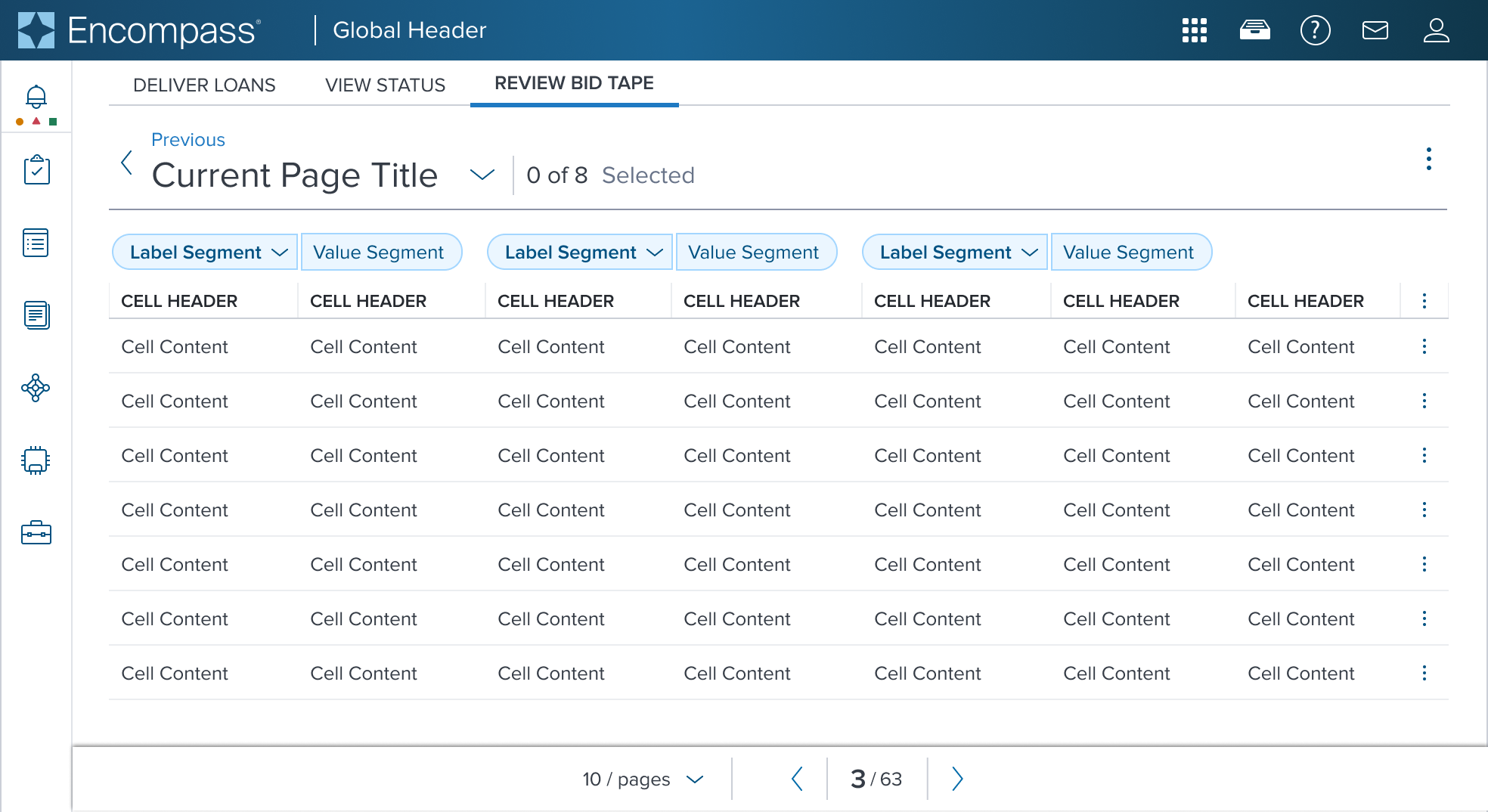
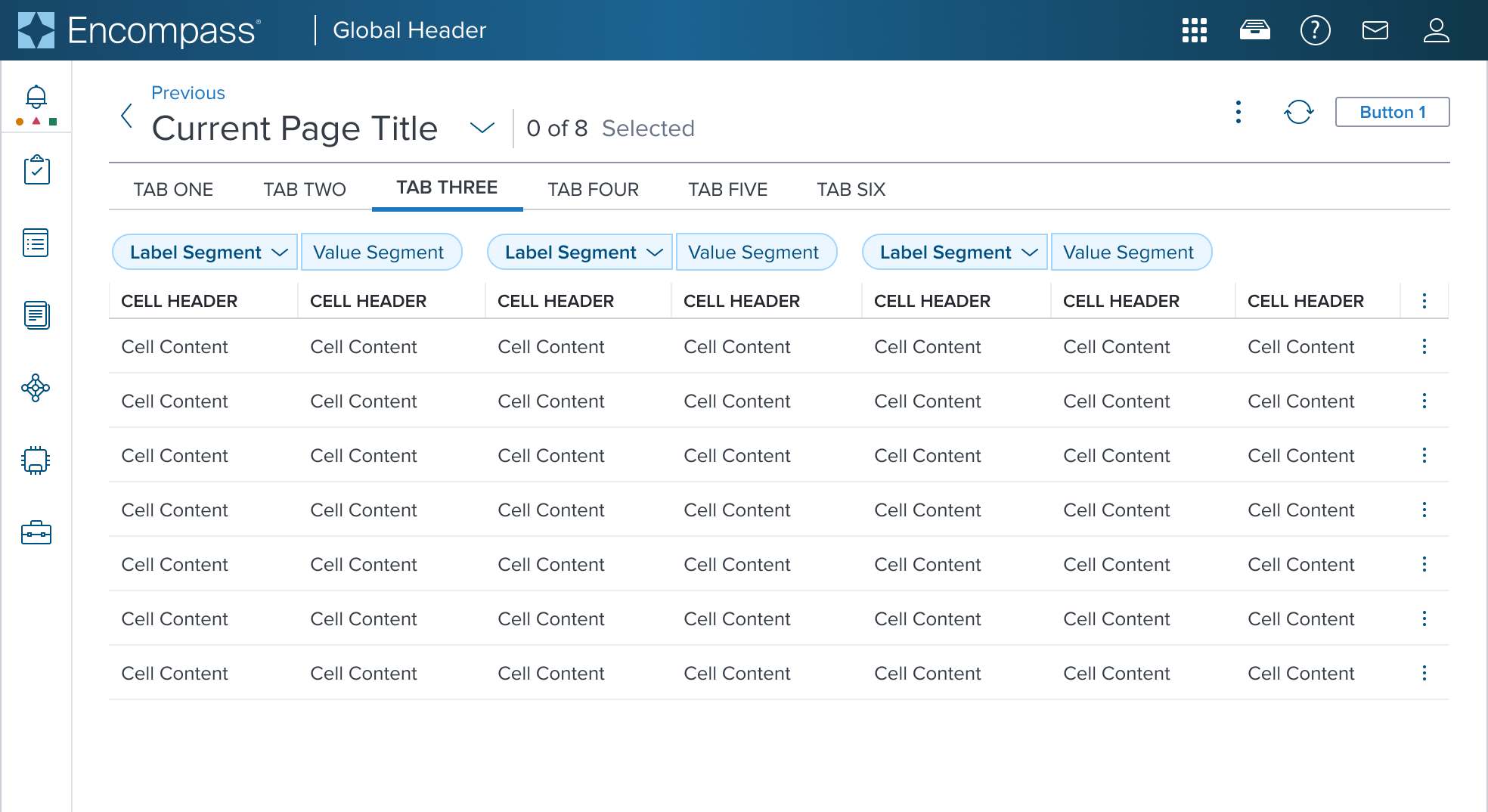
Use Cases
Objective:Provide a set of KNOWN product scenarios that inform and define this component. 2-4 use cases should be enough to convey the purpose of the component.
| Original Scenario | Dimsum's version | Scenario Description |
|---|---|---|
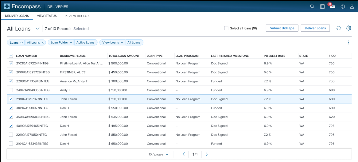 |  | Tabs shown above a Page Header (used for navigation purpose) |
 |  | Tabs shown below a Page Header, and above Data Table (used for progressive disclosure purpose) |
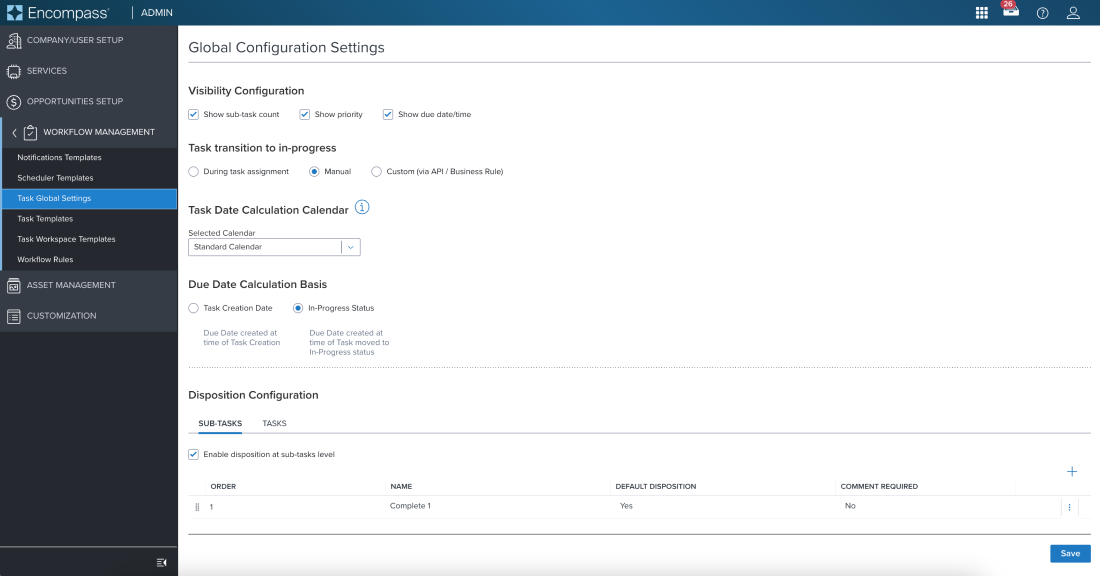 | 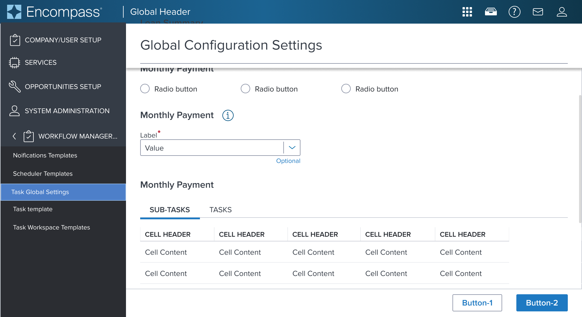 | These example shows tabs within settings configuration, showing only one portion of the content (used for progressive disclosure purpose) |
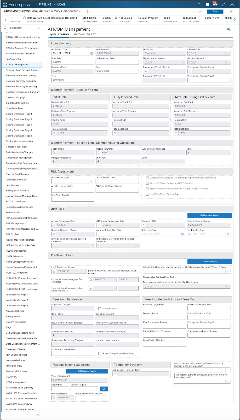 | 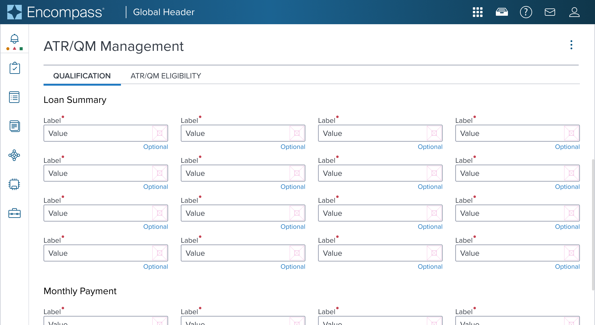 | Tabs shown in a form (used for progressive disclosure purpose), allows for displaying only one portion of the content. |
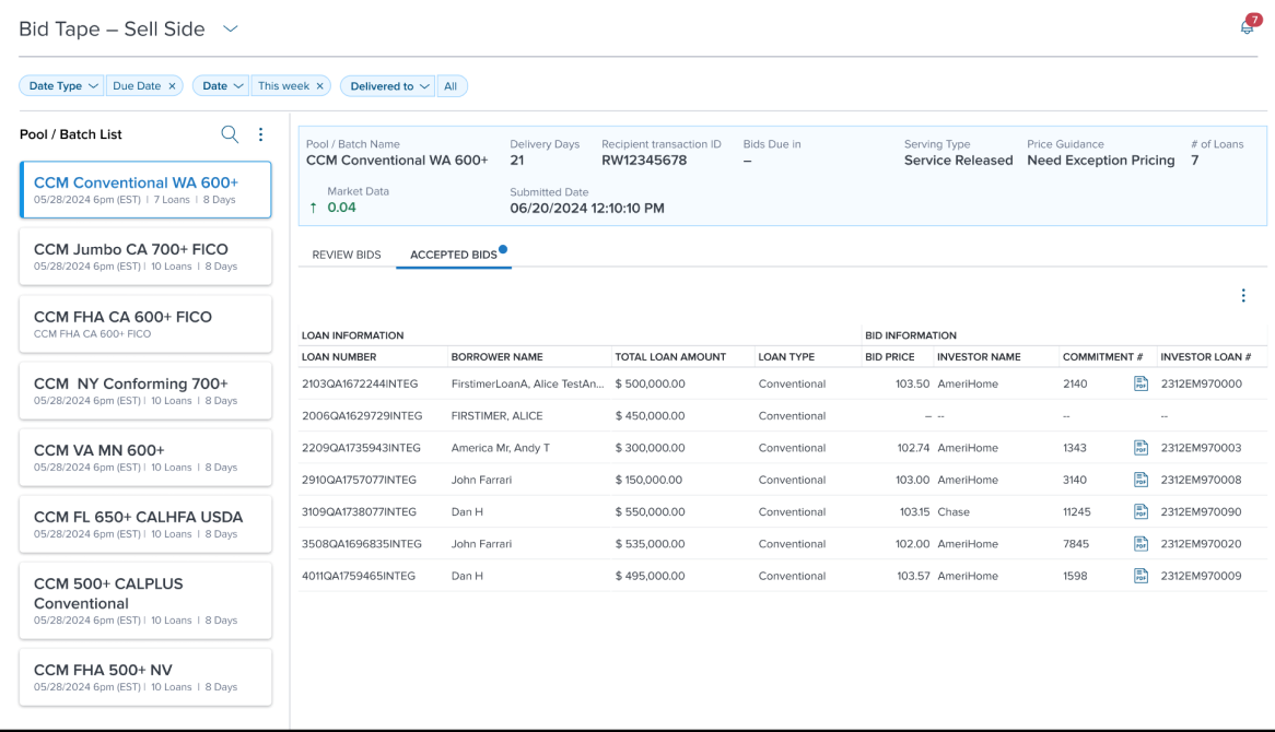 | 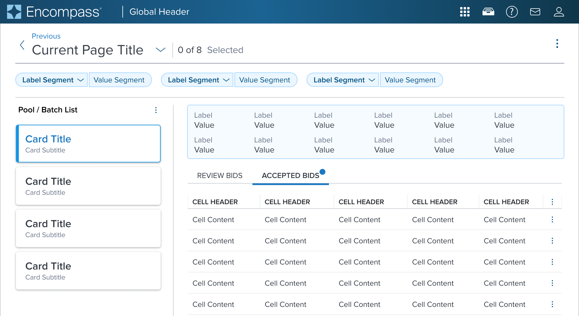 | Tabs shown for progressive disclosure purpose, allowing for displaying only one portion of the content. |
| Original Scenario (Use Case) | Dim Sum Version (Proposed Solution with DS Components) |
|---|
Additional Examples
Objective: This section is optional. It is needed if it is very clear other use cases are likely to surface in the near future. If needed, provide a table similar to that from the Use Case section.
Digital Accessibility
Objective: This section is required if unique 'Local' accessibility details exist. However, it may be that most of the details can reference as 'Global' patterns found the Digital Accessibility section of Dim Sum Guidelines. If so, provide a link. For example, if the keyboard focus order follows the global pattern, simply link to it instead of showing diagrams and details.
While the Card Component itself primarily serves as a visual layout tool and does not introduce specific accessibility concerns, it is crucial to ensure that all content placed within the card is accessible. The responsibility for accessibility lies with the content and interactive elements integrated within the card.
Designers must adhere to accessibility guidelines for text, images, interactive controls, and other content types to ensure the overall accessibility of the card's content.
Given the card is meant to separate it's content from the rest of the page it's a good candidate to serve as a role='region' but ad-hoc consideration needs to be done on the app side.
Variants
Objective: Provide an exhaustive list of the expected and available graphical variations that the component can take out-of-the-box, officially supported by the Dimsum team. Each variant's will then be created as a sub document but the this document should provide the quick-resume of each variants main points.
- Variant Name 1 (Provide link)
- Variant Name 2 (Provide link)
- Variant Name 3 (Provide link)
Usage Warnings
Objective: Address common errors or misunderstandings related to the component's use or implementation.
A component may have obvious potential to be used incorrectly by UX or product. It is possible there are common implementation pitfalls for app devs as well. List these below with complete references and rationale.
Pitfalls & Misconceptions
Highlighted content may go here if necessary.
Alternate Components
Provide a bullet list and link of other components that may better fit the use case.