Overview
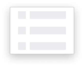
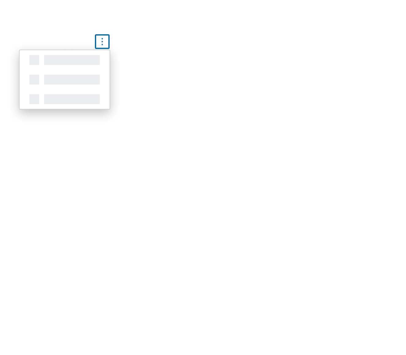
The skeleton item is a specialized menu item that serves as a placeholder when the menu items are not yet loaded. It uses the 'S1' loading pattern for rendering fidelity.
Design
Box Model
This composable uses the following visual styles.
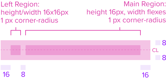
- Left Region 16x16px
A left region is present to indicate a left element is likely to be in the menu item. It helps differentiate from other single region skeleton's and provides a visual appeal for a better look and feel. - Main Region 16px Height and Width flexes
A standard region that represents the menu item data that is always present. - Left & Main Region Corner radius 1px
The main and left region's have rounded edges that provide a softer and more inviting look and feel. - Region Color neutral-080 (#EBEDF0)
The main and left regions maintain a neutral color fill to provide sufficient contrast over the background for proper presentation. - Background neutral-000 (#FFFFFF)
The background maintains a neutral color fill to provide sufficient contrast with the foreground content for proper presentation. - Padding-y 8px & Padding-x 16px
This composable comes with pre-set spacing values to ensure correct spacing and consistent styling, which follow Dim Sum standards. - Min-Height 32 RT
Uses the standard menu styles. - Min-Width Stretches to fit content
The width stretches over the minimum size to fit the content as best possible. - Max-Width Stretches to fit parent
Uses the standard menu styles.
Responsive
This composable uses the Standard Menu responsive behavior.
States
| State | Default Graphic | Default Styling |
|---|---|---|
| Idle |  | [vs standard idle] background: neutral-000 (#FFFFFF) skeleton: neutral-080 (#EBEDF0) |
| Focus | 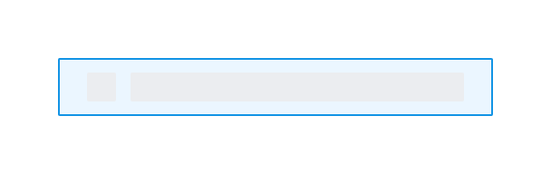 | [vs standard idle] background: brand-200 (#EBF6FF) border: 1px solid brand-500 (#1394E5) |
| Hover | 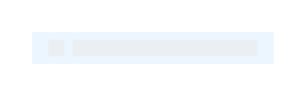 | [vs standard idle] background: brand-200 (#EBF6FF) |
| Disabled | N/A (no required cases) | N/A |
| Read-only | N/A (no required cases) | N/A |
| Error | N/A (no required cases) | N/A |
Configurations
This composable has no known-of configurations.
Use Cases
| Original Scenario (Use Case) | Dim Sum Version (Proposed Solution with DS Components) | Scenario Description |
|---|---|---|
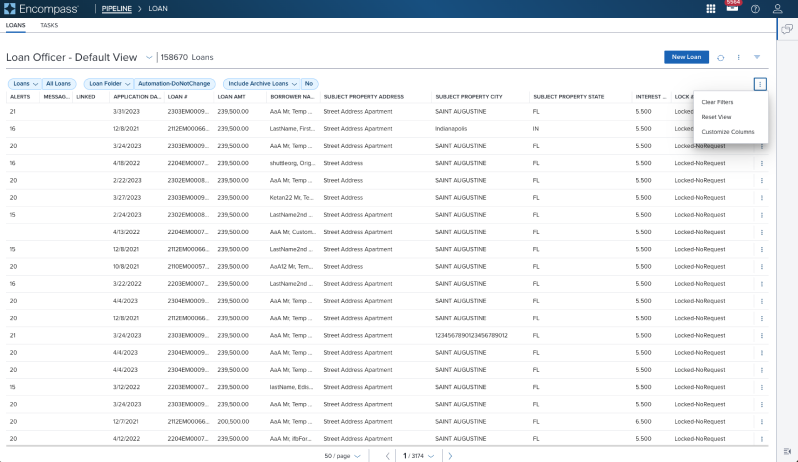 |  | Skeleton showing a skeleton loading pattern in an Activation Menu located in a Toolbar above a Data Table (using an overflow icon-only button) |
Examples
| Scenario Graphic | Scenario Solution | Text Resize and Reflow (200%) | Scenario Description |
|---|---|---|---|
 |  |  | Skeleton Activation Menu uses the Skeleton 'S1' loading pattern for rendering fidelity. |
Digital Accessibility
This composable has no known-of related A11y concerns.
Variants
This composable has no known-of variants.
Usage Warnings
In the rare case where the menu items are progressively loaded and by the time the user interacts with the content of the menu, the items are not yet loaded, the skeleton item can be used to indicate that the menu (or the specific menu item) is loading.
The Dimsum team is not aware of valid scenario of usage for this, but it is available as part of the "skeleton" effort that is still being refined and not yet published.
While usage is not directly discouraged, we do encourage you to consult with Dimsum team regarding your scenario in case any a11y consideration needs to be taken into account.
Reference
This composable has no known-of references.