Overview
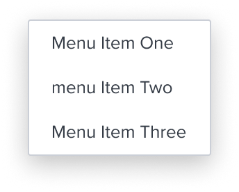
Activation is the simplest and most commonly used menu item in the menu-button widget. It should be the default choice in most scenarios due to its straightforward nature. This simplicity makes it highly reliable, as it minimizes the risk of edge case semantic issues during the design process.
As a basic, clickable option, the Activation item triggers direct action directly changing page content without any additional layers or interactions (e.g., hierarchy or selection behavior). This item type should be favored whenever possible to maintain simplicity and alignment with accessibility standards.
Design
Box Model
Configurations
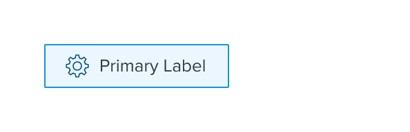
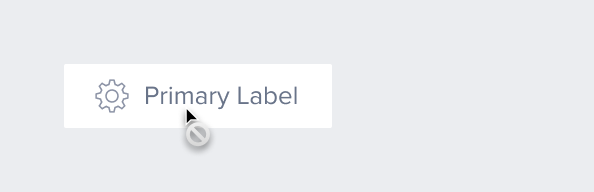
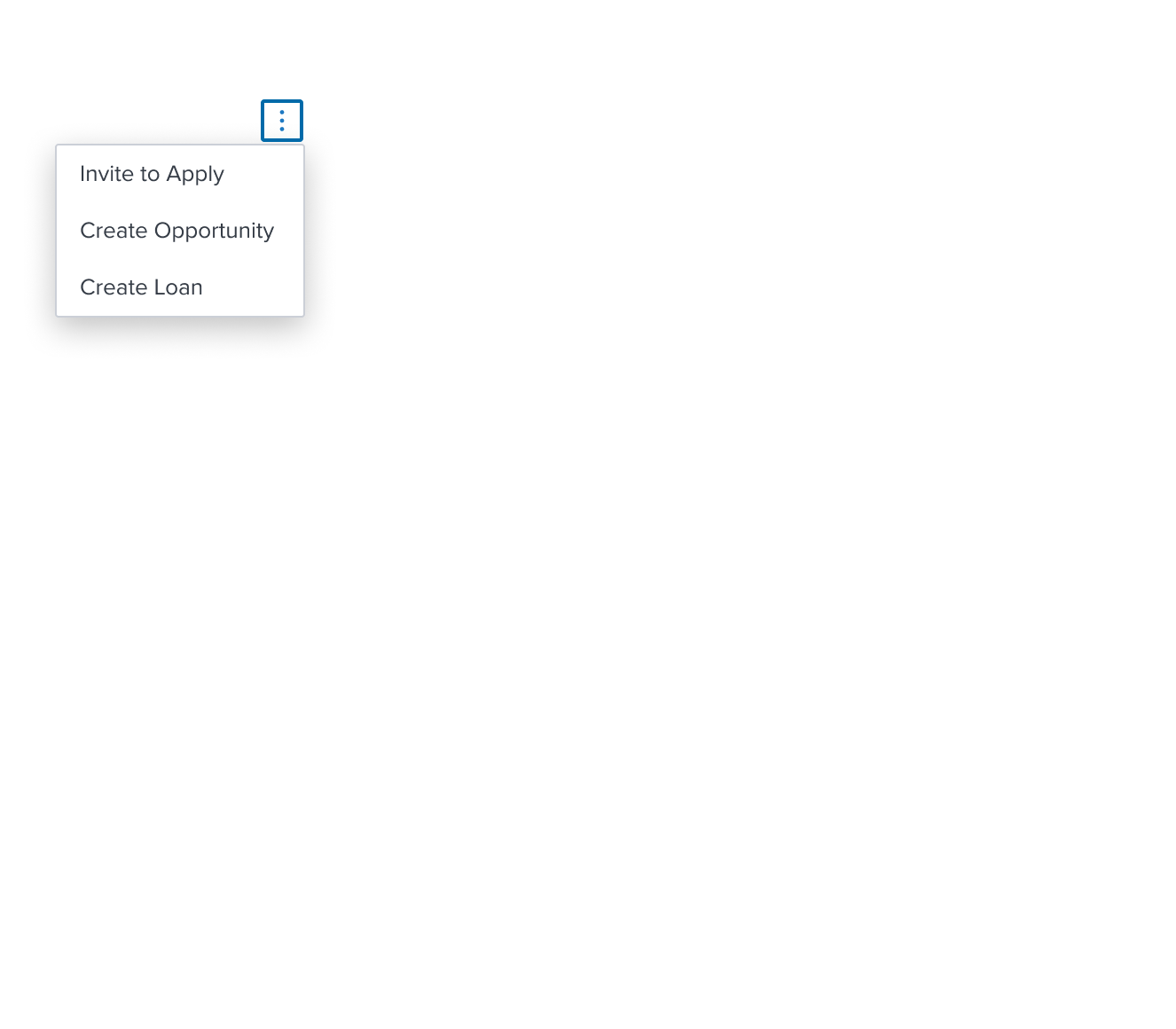
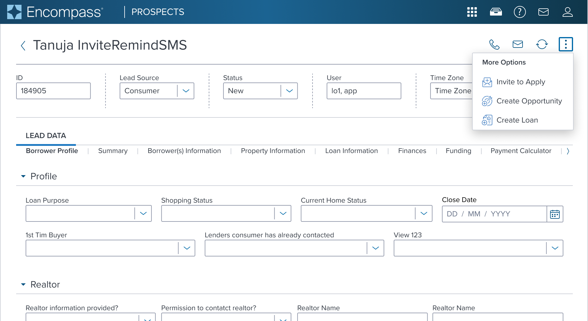
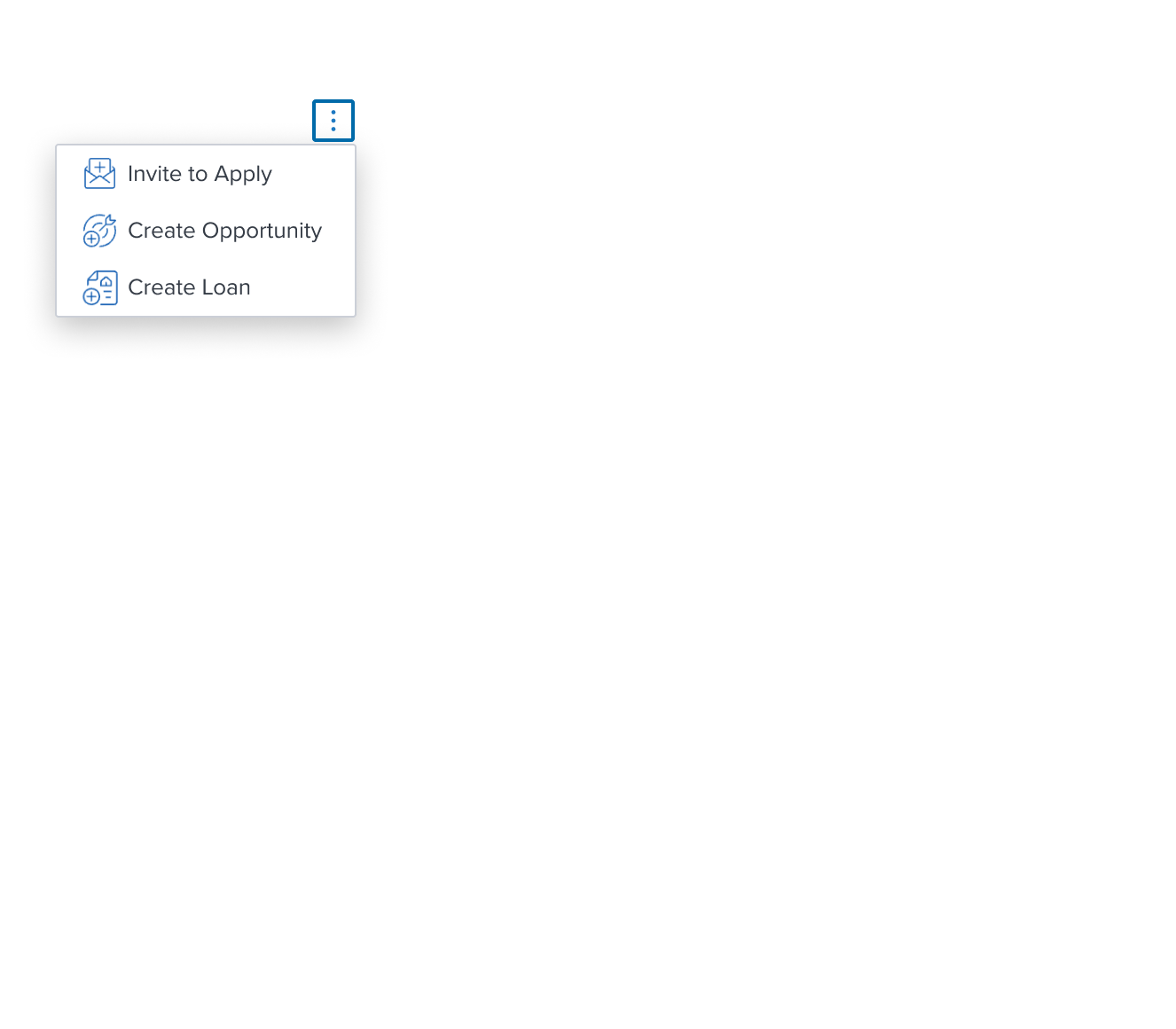
With Left Region
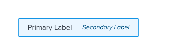
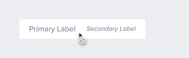
With Secondary Label
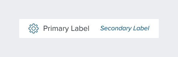
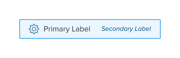
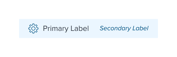
With All Configurations
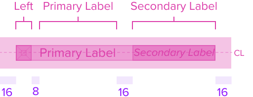
This composable uses all the visual styles from the Standard Menu, and may also include any of the following according to the use case and requirements.
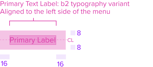
- Primary Text Label: "b2" (Typography Variant)
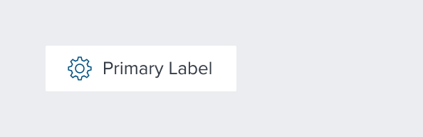
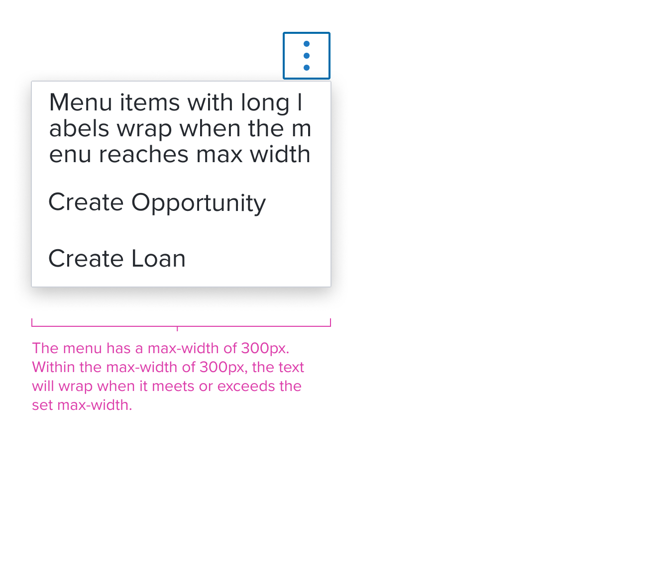
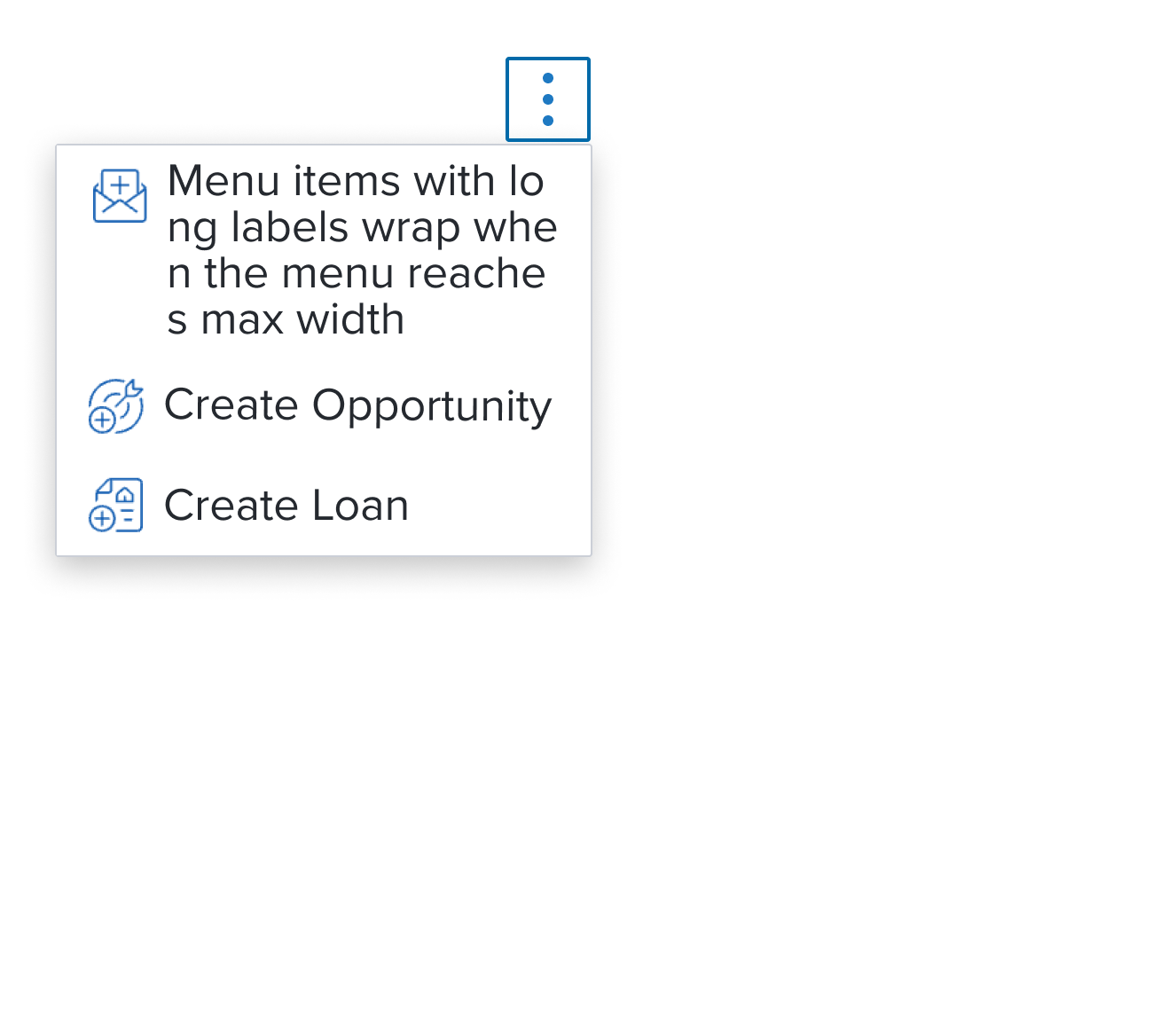
The primary label by design is an opinionated configuration and has forced styling and alignment. It has a left placement of the text that grows to the right and is forced to wrap to accommodate additional labels that are displayed in full length. - Left Agnostic Region
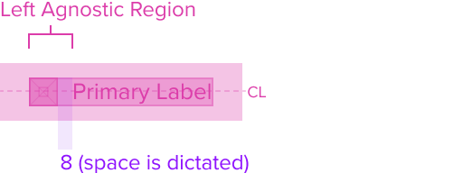
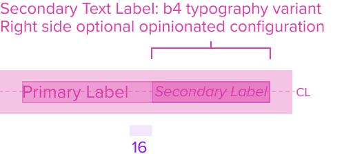
The menu item can have an agnostic region on the left side of the menu item. It has pre-built spacing to dictate the proper distance between the primary label, but still within close proximity to maintain the relationship. This region can be used for a decorative element to provide better understanding of various actions to be taken. - Secondary Text Label (Optional): "b4" (New Typography Variant)
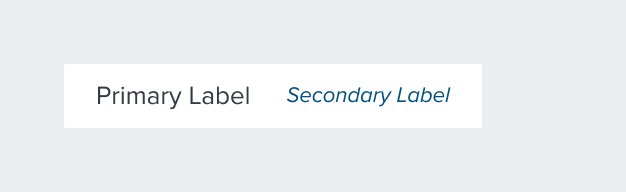
The secondary label by design is an optional opinionated configuration and has forced styling and alignment. It has a right placement of the text that grows to the left, and pre-built spacing to always maintain sufficient space between the primary label.
The secondary label never wraps and is always displayed in it's full length to take as much space as it needs. This forces the primary label to wrap to accommodate it. Secondary labels should be used sparingly and only for text strings that are short and concise. Authors are in charge of ensuring the primary and secondary relationship through the display of content.
Responsive
This composable uses the Standard Menu responsive behavior.
States
| State | Default Graphic | Default Styling |
|---|---|---|
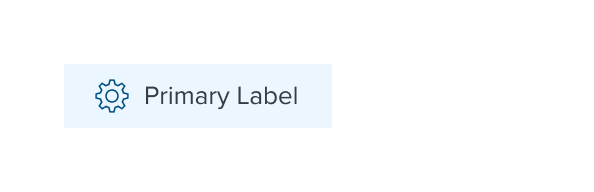
| Idle | 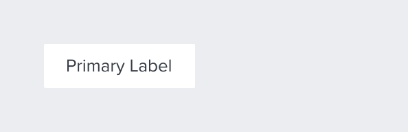 | background: neutral-000 (#FFFFFF) font: b2 (typography variant) font-color: neutral-700 (#353C46) |
 | left-icon-color: brand-800 (#005181) | |
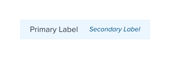
 | secondary-label-font: b4 (new variant) _font-color: brand-800 (#005181) font-style: italic | |
 | N/A | |
| Focus | 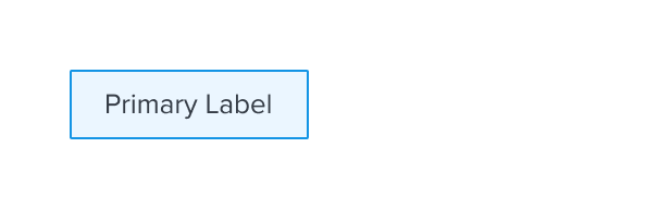 | background: brand-200 (#EBF6FF) border: 1px solid brand-500 (#1394E5) |
 | N/A | |
 | N/A | |
 | N/A | |
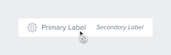
| Disabled |  | font-color: neutral-500 (#697489) - new variant cursor: disabled |
 | left-icon-color: neutral-400 (#8C93A6) | |
 | secondary-label-font: b4 font-style: italic - new variant | |
 | N/A | |
| Hover | 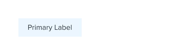 | background: brand-200 (#EBF6FF) |
 | N/A | |
 | N/A | |
 | N/A | |
| Read-only | N/A | N/A |
| Error | N/A | N/A |
Use Cases
| Original Scenario (Use Case) | Dim Sum Version (Proposed Solution with DS Components) | Scenario Description |
|---|---|---|
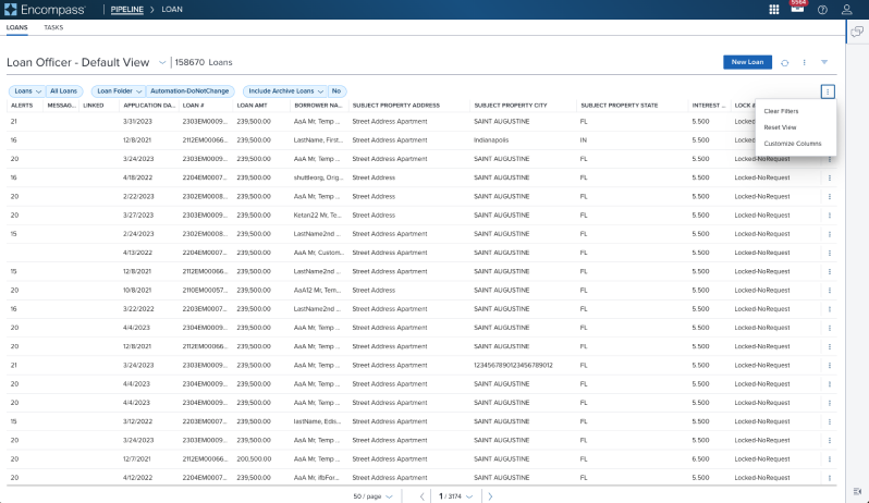 |  | Activation Menu Shown in a Toolbar located above a Data Table (using an overflow icon-only button) |
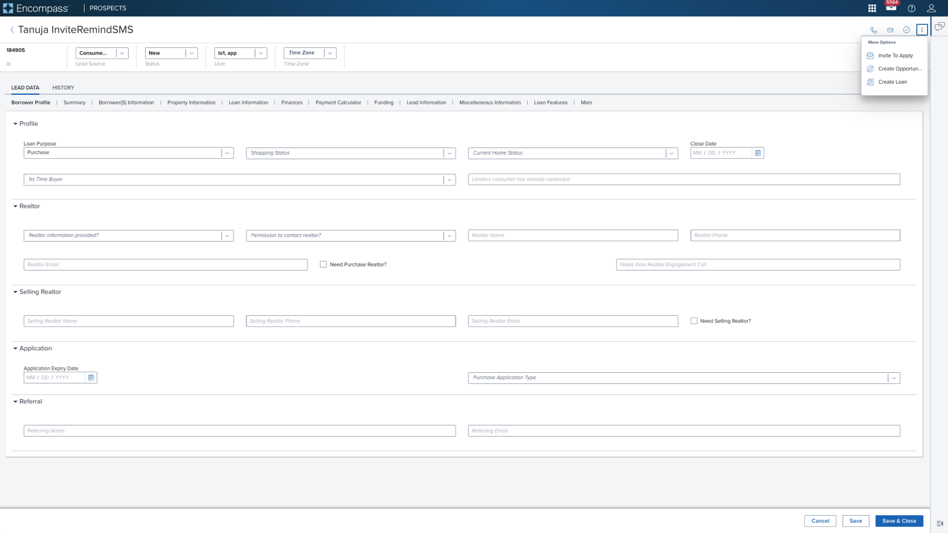 |  | Activation Menu with Left Decorator Shown in a Page Header Toolbar (triggered from an overflow icon-only button) |
Examples
| Scenario Graphic | Scenario Solution | Text Resize and Reflow (200%) | Scenario Description |
|---|---|---|---|
 |  |  | Activation Menu menu consisting of menu items (labels) for taking immediate action on one or more items. When standard action occurs and no visual representation is needed. |
 |  |  | Activation Menu with Left Decorator menu configured with a left decoration icon for better understanding of various actions to be taken. |
Digital Accessibility
This composable has no known-of related A11y concerns.
Variants
This composable has no known-of variants.
Usage Warnings
This composable has no known-of usage warnings.
Reference
This composable has no known-of references.