Overview
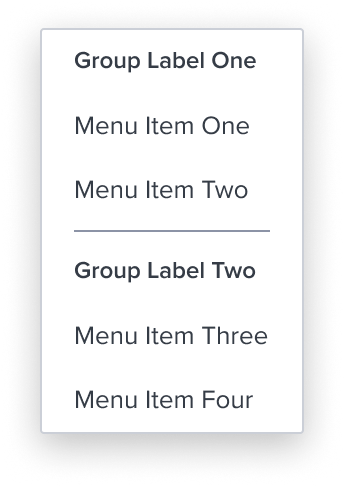
The Separator is an element who's purpose is to divide section content within a group of items. It's delicate horizontal border offers sufficient contrast to delineate it as a distinct element.
Design
Box Model
This composable uses some of the visual styles from the Basic Activation [Composable], such as the background color, and the min / max width. It is purely presentational and has no states or action. It includes the following styles to distinguish from menu items.
- Horizontal Separator: neutral-400 (#8C93A6), 1px solid
The separator has a fine horizontal border that offers sufficient contrast to delineate it as a distinct separate entity while keeping the design clean and unobtrusive.
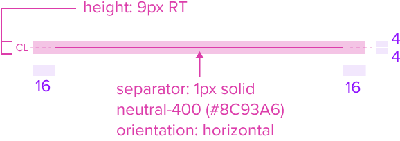
This feature maintains a clean and minimalistic design, avoiding any visual clutter. - Height: 9 RT
Height ensures the separator remains functional and visually appealing on different devices and screen sizes, embracing the principles of responsive design. - Padding-y 4px & Padding-x 16px
The separator maintains uniform spacing around it to ensure it is easily distinguishable and provides enough spacing between menu items.
This consistent spacing contributes to a cohesive experience across various projects.
Responsive
This composable uses the Standard Menu responsive behavior.
States
| State | Default Graphic | Default Styling |
|---|---|---|
| Idle | 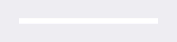 | background: neutral-000 (#FFFFFF) separator: 1px solid, neutral-400 (#8C93A6) orientation: horizontal |
| Focus | N/A | N/A |
| Disabled | N/A | N/A |
| Read-only | N/A | N/A |
| Hover | N/A | N/A |
| Error | N/A | N/A |
Configurations
This composable has no known-of configurations.
Use Cases
| Original Scenario | Dim Sum Version | Scenario Description |
|---|---|---|
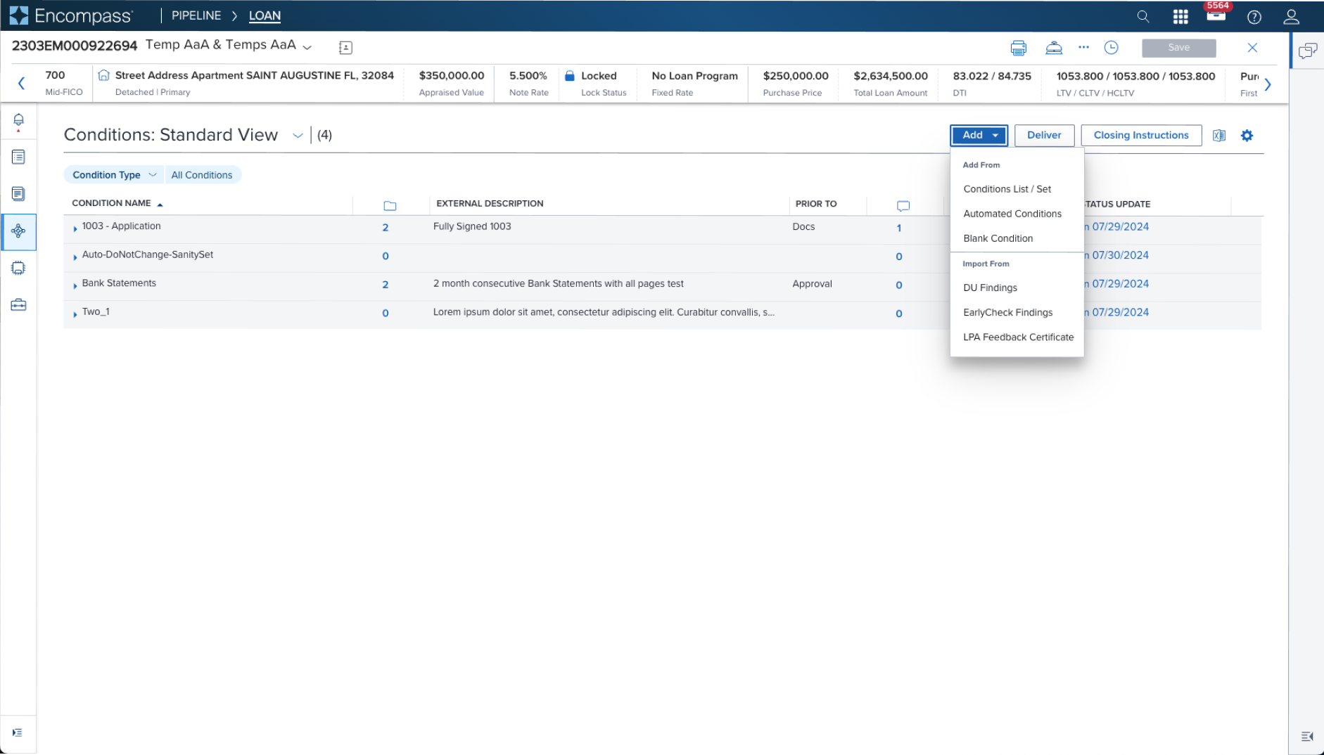 | 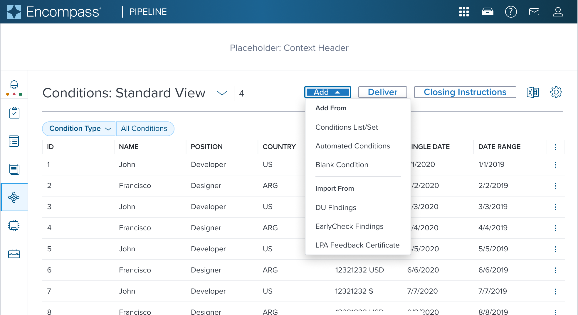 | Activation Menu with Group Label and Separator shown with Group Label and Separator used in a Page Header Toolbar (triggered from a filled toggle button) The original scenario (use case) shows a context header with a complex page header that is a custom implementation by the application side. This is not a pattern that Dim Sum currently supports and therefore is not promoted as a solution. A 'Placeholder: Context Header" region is shown in the 'Dim Sum Version' graphic until addressed. |
Examples
| Scenario Graphic | Scenario Solution | Text Resize and Reflow (200%) | Scenario Description |
|---|---|---|---|
 | 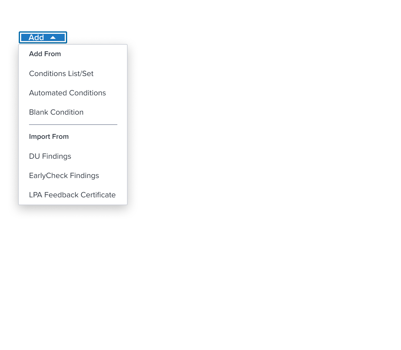 | 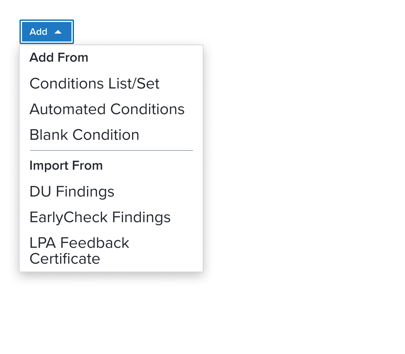 | Activation Menu with Separator an element who's purpose is to divide section content within a group of items. It's delicate horizontal border offers sufficient contrast to delineate it as a distinct element. It is purely presentational and has no action associated with it. The scenario graphic shows a context header with a complex page header that is a custom implementation by the application side. This is not a pattern that Dim Sum currently supports and therefore is not promoted as a solution. A 'Placeholder: Context Header" region is shown in the 'Scenario Graphic' until addressed. |
Digital Accessibility
This composable has no known-of related A11y concerns.
Variants
This composable has no known-of variants.
Usage Warnings
This composable has no known-of usage warnings.
Reference
This composable has no known-of references.