v.2.9.5
A1 - OVERVIEW

B1 - TYPES + STATES

C1 - DIMENSIONS

D - INTERACTION
Button can be set to reveal a tooltip on Hover, Focus and Disabled states

E - DIGITAL ACCESSIBILITY
E1 Responsive Behavior
Guidelines for Labels
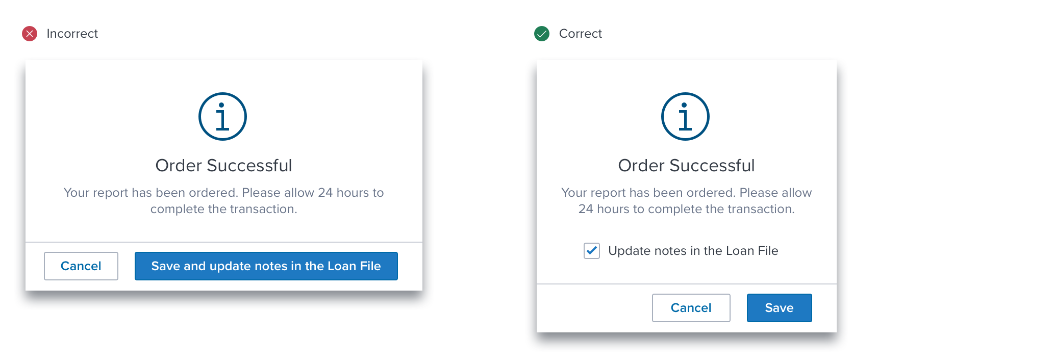
It's critical to consider usability when deciding on the label length for a button. Longer labels may cause issues with layout and readability, especially on smaller screens or when the button is used in conjunction with other elements.
It is recommended to keep button labels concise and descriptive, providing enough information for users to understand the action associated with the button without overwhelming them with excessive text. In this fictional case, the text regarding Loan File Notes is placed in the content region as a Checkbox instead of making the primary action difficult to read.
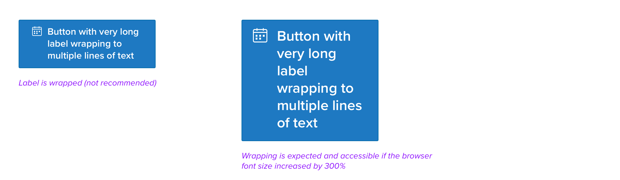
Font Resize
If longer button labels cannot be avoided, or if the browser font size is increased, the text string will utilize existing wrapping patterns.
E2 Keyboard Usage

References
Usage Guidelines
Basic Keyboard Functions
WCAG Success Criterion for Target Size (Minimum)