Overview
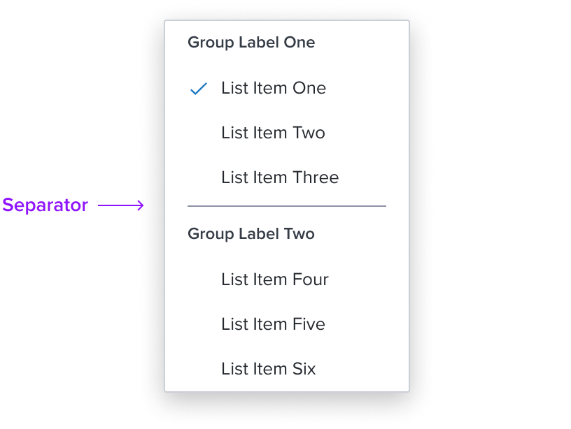
Separator list item is an element who's purpose is to divide section content within a group of items in the list. It's delicate horizontal border offers sufficient contrast to delineate it as a distinct element.
It is purely presentational and has no action associated with it.
Design
Box Model

This composable uses some of the visual styles from the Standard [Composable], such as the background color, and the min / max width. It is purely presentational and has no states or action. It includes the following styles to distinguish from list items.
- Horizontal Separator: neutral-400, 1px solid
The separator has a fine horizontal border that offers sufficient contrast to delineate it as a distinct separate entity while keeping the design clean and unobtrusive. This feature maintains a clean and minimalistic design, avoiding any visual clutter. - Height: 9px
Height ensures the separator remains functional and visually appealing on different devices and screen sizes, embracing the principles of responsive design. - Padding-y 4px & Padding-x 16px
The separator maintains uniform spacing around it to ensure it is easily distinguishable and provides enough spacing between list items. This consistent spacing contributes to a cohesive experience across various projects.
Responsive Layout
This composable uses the standard list responsive behavior.
List Item States
| State | Default Graphic | Default Styling |
|---|---|---|
| Idle | 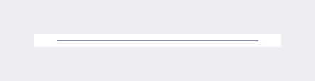 | background: neutral-000 separator: 1px solid, neutral-400 orientation: horizontal |
| Focus | N/A | N/A |
| Disabled | N/A | N/A |
| Read-only | N/A | N/A |
| Hover | N/A | N/A |
| Error | N/A | N/A |
Configurations
This composable has no known-of configurations.
Use Cases
| Original Scenario | Dim Sum Version | Scenario Description |
|---|---|---|
| No known-of-use cases | NA | NA |
Examples
| Scenario Graphic | Scenario Solution (100%) | Text Resize and Reflow (200%) | Scenario Description |
|---|---|---|---|
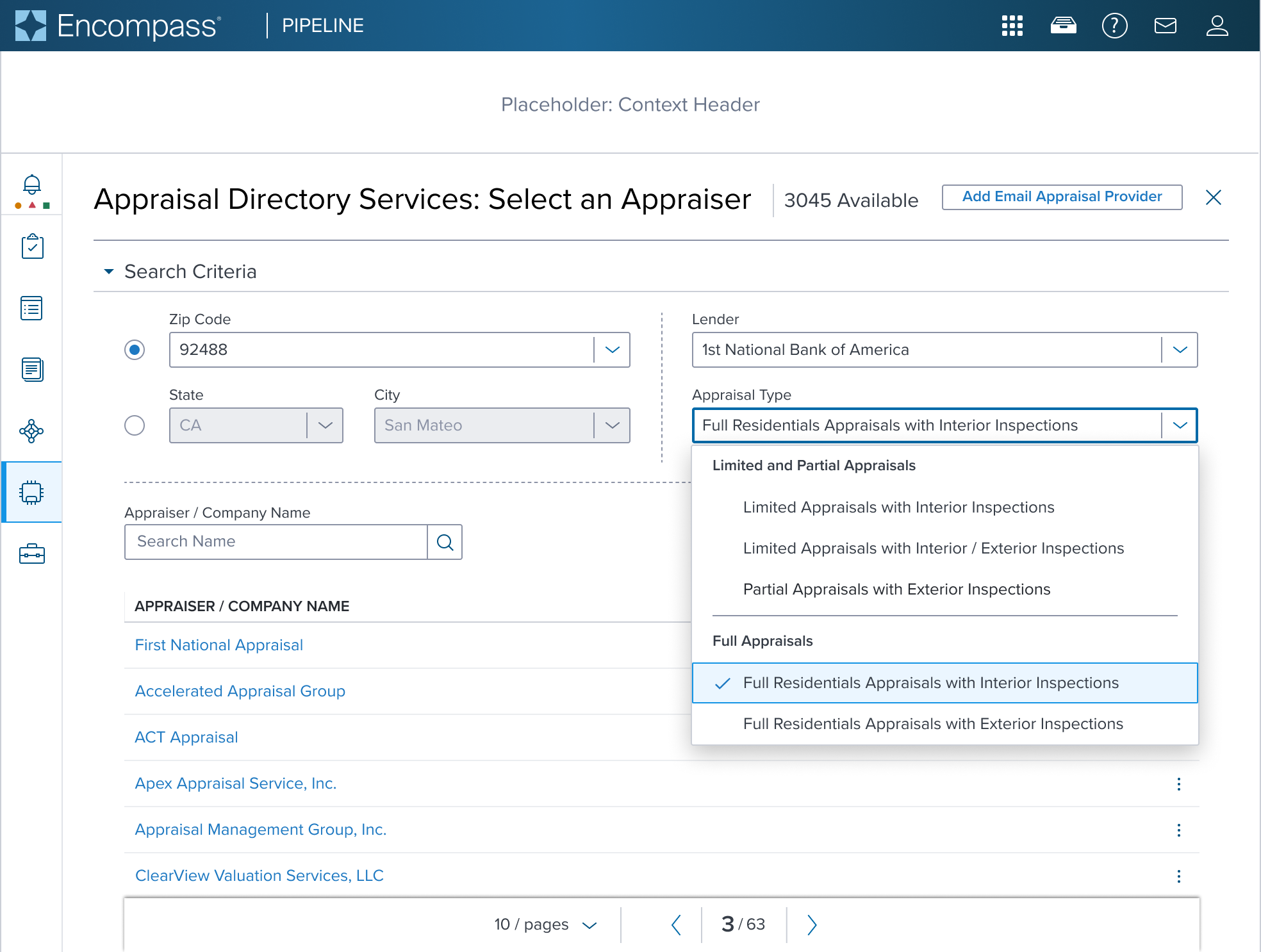 | 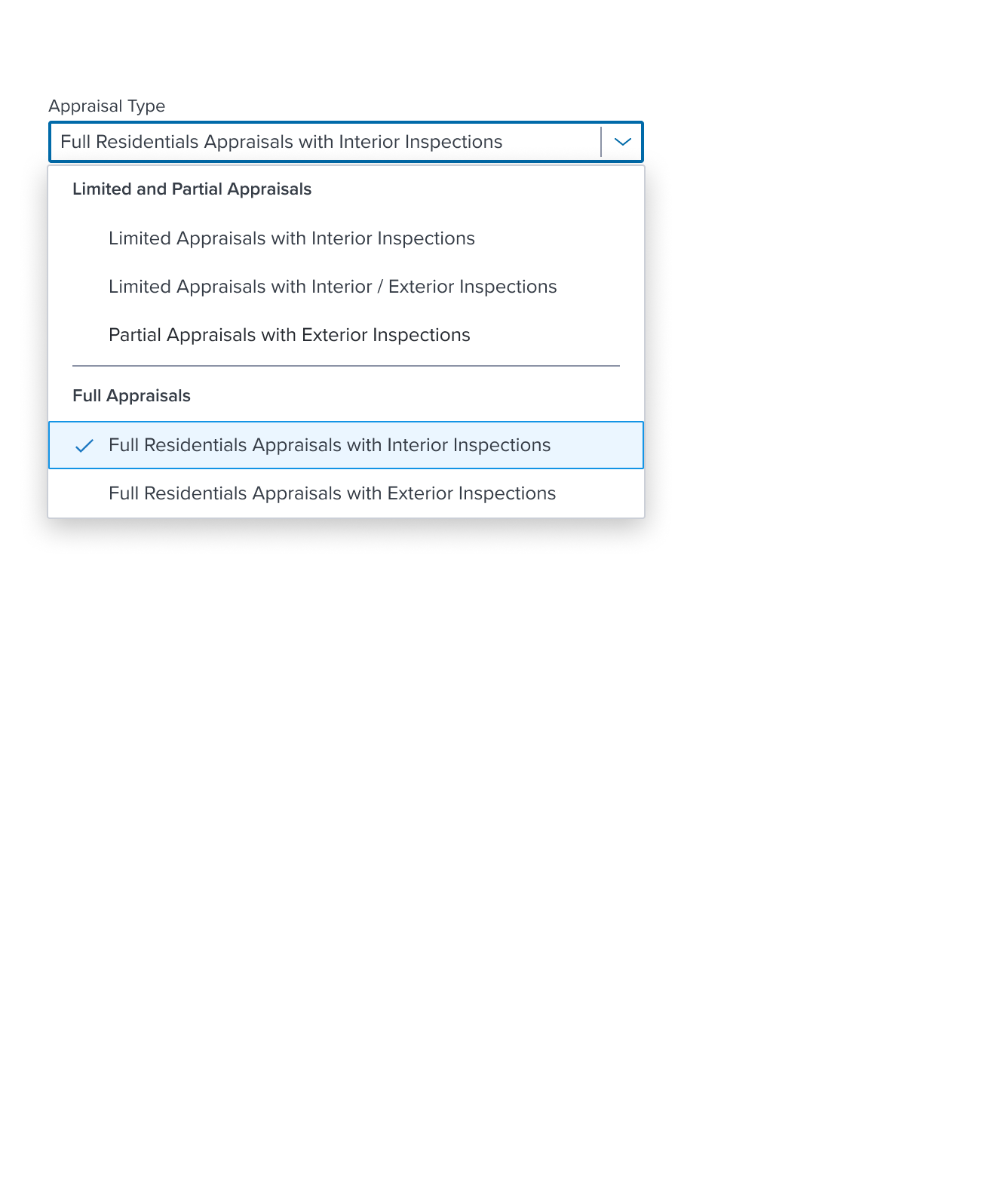 | 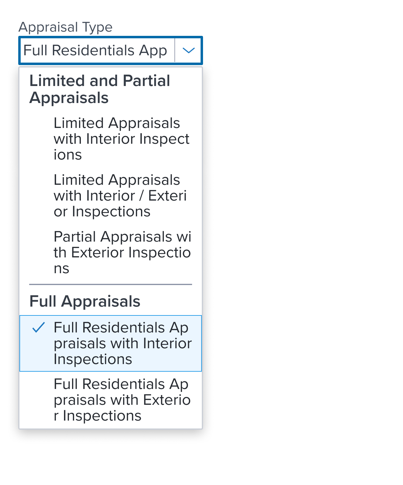 | Separated List Shown within the main content region form UI composed with Form Layout Block; Text label placed on top of the input. |
Digital Accessibility
This composable has no known-of related A11y concerns.
Variants
This composable has no known-of variants.
Usage Warnings
This composable has no known-of usage warnings.
Reference
This composable has no known-of references.