Overview
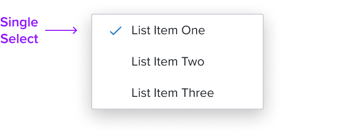
Single Select is a list item whose activation implies exclusive selection within the same selection group. The visual feedback to indicate the selection state is a single checkmark.
Design
Box Model
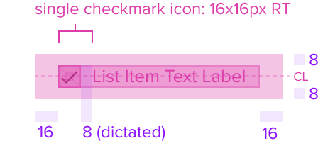
This composable uses all the visual styles from the Standard [Composable], and may also include any of the following according to the use case and requirements.
- Single Selection (Dot Icon) Color brand-800 (#005181)
Uses the standard brand design system color and visual styling that offers sufficient contrast to delineate it as a distinct selection element for a menu item. - Height & Width (Dot) 8x8px RT, (Box) 16x16px RT
Uses the standard design system sizing for visual consistency and alignment throughout applications. - Padding-x 8px (dictated)
The single select region has a left placement of the menu item and left position to the primary label and left agnostic region. It has pre-built spacing to dictate the proper distance between the primary label or agnostic left region.
Responsive
This composable uses the Standard Menu responsive behavior.
States
| State | Graphic | Default Styling |
|---|---|---|
| Idle |  | Single Checkmark and Label: checkmark: none font-color: neutral-800 (#25292F) font-size: 'b2' typography variant Background: background: neutral-000 (#FFFFFF) |
| Idle - Selected |  | [vs standard idle] Single Checkmark and Label: checkmark: 1px solid brand-600 (#1E79C2) Background: no change |
| Focus-Active |  | [vs standard idle] Single Checkmark and Label: no change Background: background: brand-000 (#FFFFFF) border: 1px solid brand-500 (#1394E5) |
| Focus-Active - Selected |  | [vs standard focus-active] Single Checkmark and Label: checkmark: 1px solid brand-600 (#1E79C2) Background: no change |
| Disabled |  | [vs standard idle] Single Checkmark and Label: checkmark: none font-color: neutral-500 (#25292F) Background: cursor: disabled |
| Disabled - Selected | N/A (no required cases) | N/A |
| Aria-Read Only / Aria-Disabled - Idle |  | [vs standard idle] Single Checkmark and Label: checkmark: none Background: no change For list behavior see Usage Warnings |
| Aria-Read Only / Aria-Disabled - Selected |  | [vs standard Aria-Read Only / Aria-Disabled - Idle] Single Checkmark and Label: single-checkmark: 1px solid neutral-400 (#8C93A6) Background: no change |
| Aria-Read Only / Aria-Disabled - Hover |  | [vs standard Aria-Read Only / Aria-Disabled - Selected] Single Checkmark and Label: no change Background: background: brand-200 (#EBF6FF) |
| Aria-Read Only / Aria-Disabled - Focus |  | [vs standard Aria-Read Only / Aria-Disabled - Hover] Single Checkmark and Label: no change Background: border: 1px solid brand-500 (#1394E5) |
| Hover |  | [vs standard idle] Single Checkmark and Label: no change Background: background: brand-200 (#EBF6FF) |
| Hover - Selected |  | [vs standard Idle - Selected] Single Checkmark and Label: no change Background: background: brand-200 (#EBF6FF) |
| Error | N/A (no required cases) | N/A |
Configurations
This composable has no known-of configurations.
Use Cases (IN PROGRESS)
| Original Scenario (Use Case) | Dim Sum Version (Proposed Solution with DS Components) | Scenario Description |
|---|---|---|
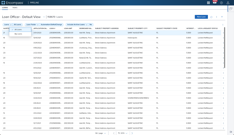 | 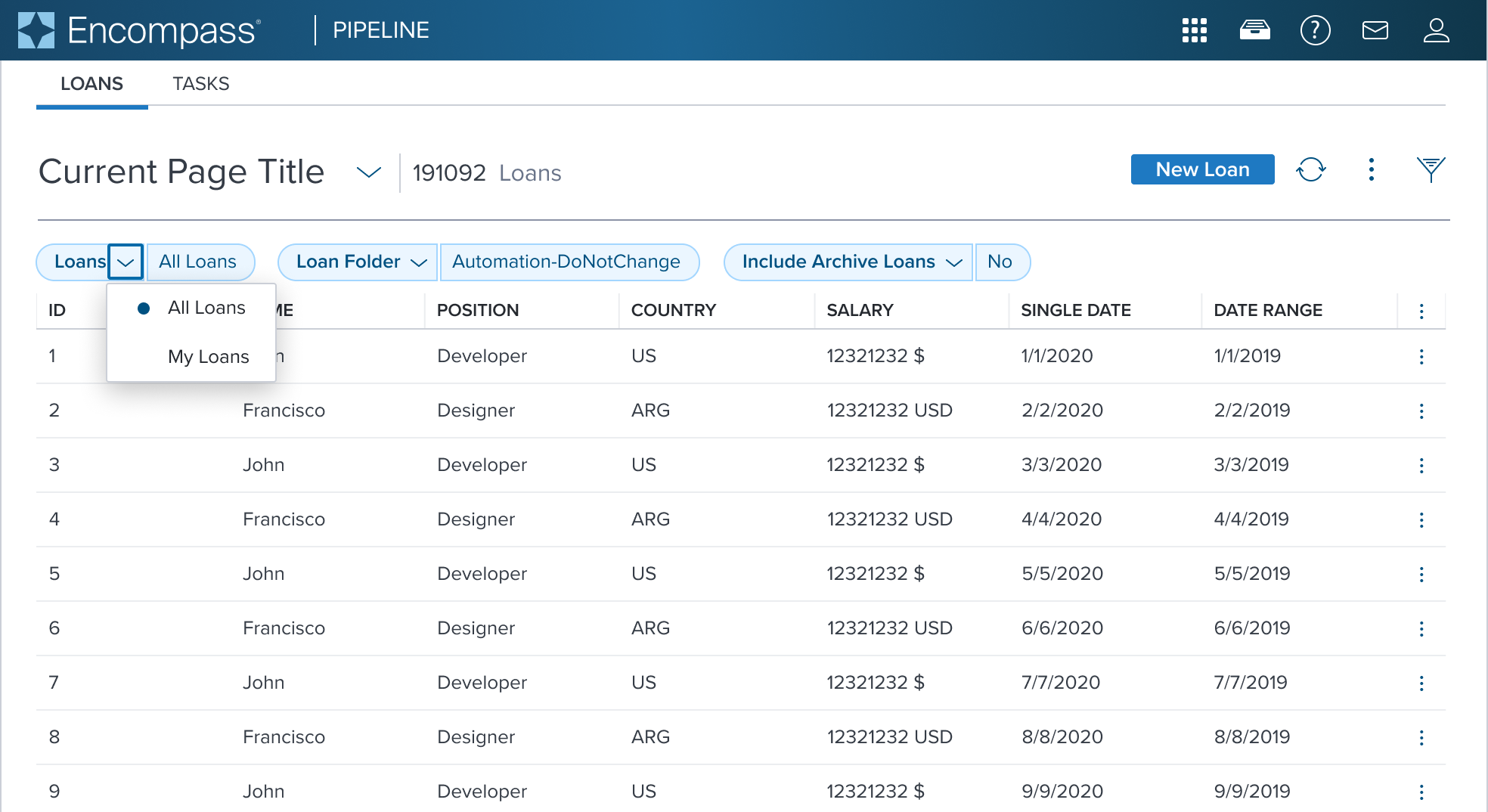 | Single Select List Showing a single select list within a... |
Examples (IN PROGRESS)
| Scenario Graphic | Scenario Solution | Text Resize and Reflow (200%) | Scenario Description |
|---|---|---|---|
 | 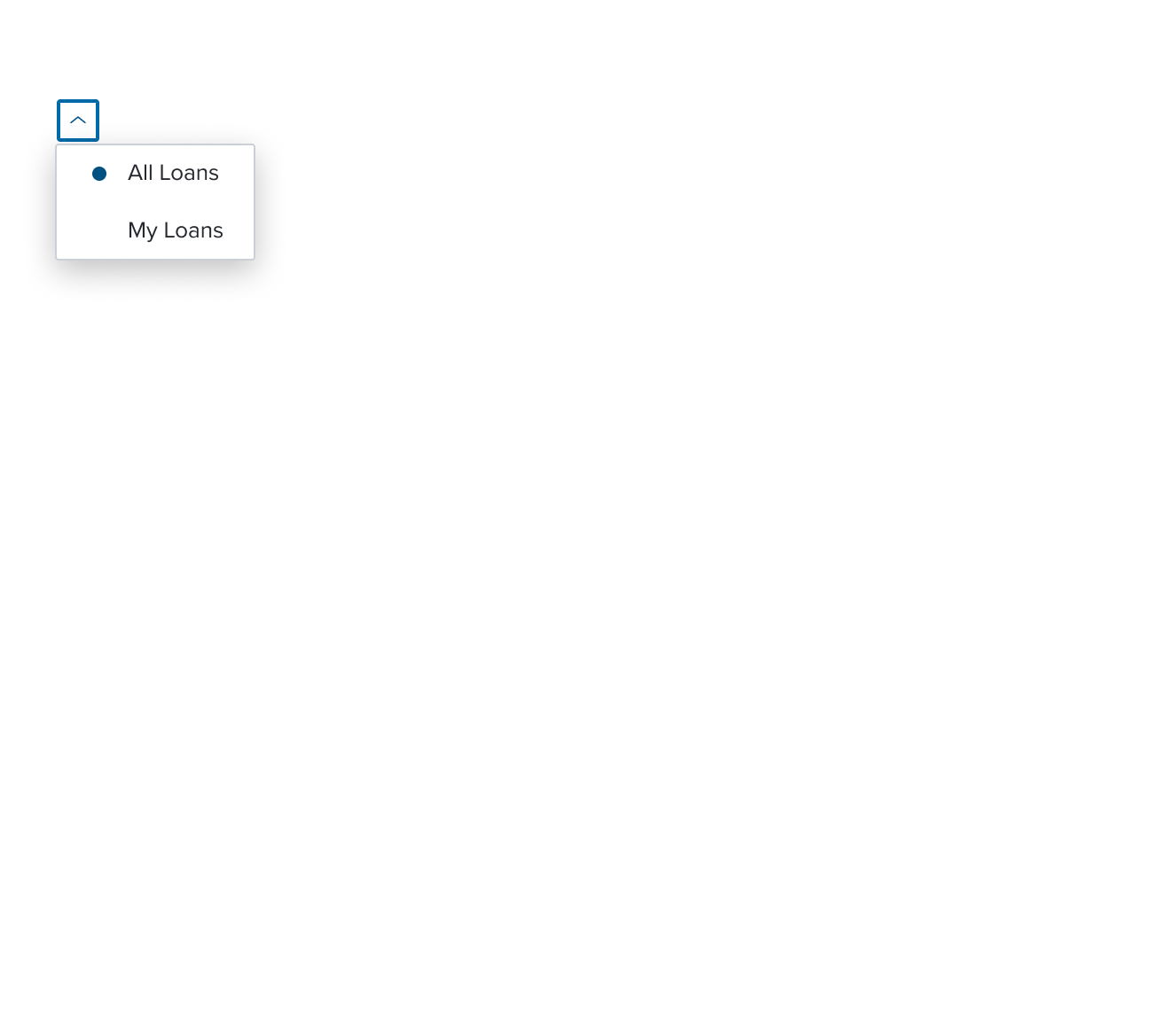 | 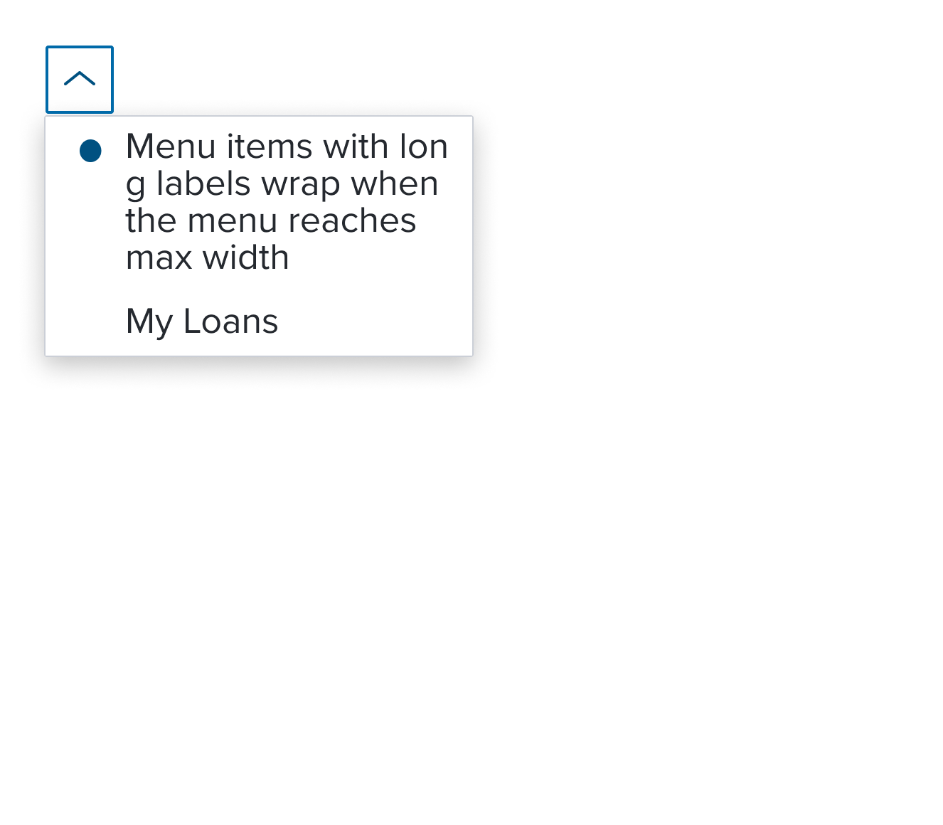 | Single Select List list item whose selection implies exclusive action within the same selection group. The visual feedback to indicate the activation state is a single checkmark icon. |
Digital Accessibility
This composable has no known-of related A11y concerns.
Variants
This composable has no known-of variants.
Usage Warnings
List Behavior for Read Only
The Dimsum team is in process of evaluating if the Combo Box list of options will open or not in Read Only. The current behavior does not allow the list to open. This effort is still being refined and not yet published. Please refer to the documentation for current details.
The single select list Item has three key distinctions:
1. Auto-exclusive Selection within a Group:
Single select items enforce exclusive selection within a group, but multiple single selection groups cannot exist across groups within the same list.
2. Grouping Requirement:
Single select items must always be wrapped in a group menu item, even if the group lacks a visual label, to ensure proper behavior.
3. Design Considerations:
When single selection groups are present, designs must visually distinguish them. This can be done implicitly (through proximity, labels, or separators) or explicitly (with group labels or by using a submenu for each group). Submenus are recommended when too many groups exist at the same menu depth.
Reference
This composable has no known-of references.
