Overview
Combo Box Single Select is a widget made of an input and list of options. The input allows the user to filter items, while the list of options enables a user to choose a single item from predefined values.
For other options see Alternate Components
Design
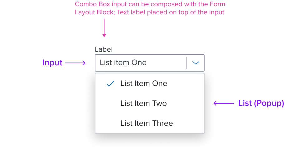
Box Model
Input

-
Border 1px solid neutral-400
The fine border marks the card's perimeter, providing enough contrast to define the card as a separate entity while keeping the design clean and unobtrusive. -
Border Radius 2px
The rounded edges make the interface appear softer and more inviting, providing an intuitive, user-friendly and accessible interface. -
Background: neutral-000 (#FFFFFF)
The input background has a neutral color fill to provide sufficient contrast with the foreground content for proper presentation. -
Margin/padding
The input does not come with pre-set spacing values in order to optimize the flexibility of content layout.UX will provide exact guidance on a case-by-case basis to ensure consistent styling, which will follow standard Dim Sum spacing values.
-
Min-width 92 px and Min-height 28 px
These dimensions guarantee that the input remains functional and aesthetically pleasing across different devices and screen sizes, adhering to the principles of responsive design. -
Stretches to fit content
The input expands to fit the content, ensuring that the design adapts to content volume while maintaining the card's visual integrity. It may also be confined to grid layout in order to maintain it's relationship and context in the user interface.
List (Popup)

- Box-shadow "s"
The List's container is styled with a drop shadow and always appears in front of other content. - Border 1px solid neutral-300 (CBCFD7)
The fine border marks the Menu's perimeter, providing enough contrast to define the Dropdown Menu as a primary entity while keeping the design clean and unobtrusive. - Border radius 1px
The List's rounded edges make the interface appear softer and more inviting, providing an intuitive, user-friendly and accessible interface. - Background neutral-000 (#FFFFFF)
The List background has a neutral color fill to provide sufficient contrast with the foreground content for proper presentation. - Margin / Padding
The List does not come with pre-set spacing values in order to optimize the flexibility of content layout. Correct spacing is instead ensured through atomic composition of the out-of-the-box composed elements. In case authors hosts custom content, authors are in charge of ensuring consistent styling, which will follow standard Dim Sum spacing values. - Min-Height 32 RT
When a List exists, it MUST have at least one item, and by design follow the minimum sizing for an interactive element action menu item. This ensures for accessibility compliant minimum region size requirements while maintaining a visually pleasing size. - Min-Width Stretches to fit content
The width stretches over the minimum size to fit the content as best possible. - Max-Height 256px
When the max-height is reached the menu component itself is designed to add it's own scrollbar out of the box. This can be altered by authors in specific scenarios. - Max-Width 300px
The max-width is designed to cover most use cases. This can be altered by authors in specific scenarios, but 200% resize and reflow MUST be considered. If the Menu with Submenu is used, a 'per screen size' MUST be used to ensure the fly-out is able to fit and labels can wrap when the max-width is reached.
Responsive
Input
By design, Combo Box supports responsive resize and reflow characteristics by defining minimum height and width in relative units. Relative measurements ensure that the input field maintains its structural integrity, visual appearance and usability across different screen sizes and orientations.
Content-specific reflow is also managed responsively for elements within the field, or integrated with the field. For example, Form Item Block includes both fixed and flexible settings to maintain spacing, alignment and other visual styles, which are designed to be responsive in their own right within the overarching design system.
This approach ensures Input Text will align to familiar user expectations of modern software applications and meet standardized HTML practices.
List (Popup)
The List is designed with a responsive box model that by default has a defined max height and width to accommodate most use cases. This provides a baseline for content scalability accounting for resize and reflow to ensure a consistent and accessible user experience.
When the maximum height is reached the menu component is designed to incorporate a scrollbar to keep the menu content usable. Menu items should appear always in the same order and with the same wording and destination. When on smaller screens, and in long drop downs, to prevent them from overflowing off the screen.
For Resize and Reflow behaviors, see the Examples Section
Input States
Read Only List Behavior: Jira - 15099 (Currently the list does not open)
| State | Graphic | Default Styling |
|---|---|---|
| Idle |  | background-color: neutral-000 border: 1px solid neutral-400 border-radius: 2px separator: width 1px, neutral-400 separator-color: solid neutral-400 icon-only: chevron-down, brand-600 typography: neutral-500 |
| Idle - With Value |  | [vs standard idle] typography: neutral-700 |
| Focus |  | [vs standard idle] Border: 2 px solid brand-700 |
| Focus - With Value |  | [vs standard idle - with value] no change |
| Disabled - Idle |  | [vs standard idle - with value] background: neutral-080 border: 1px solid neutral-400 icon: chevron-down, neutral-400 |
| Disabled - Hover | 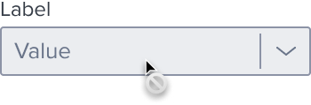 | [vs disabled idle] cursor: disabled |
| Disabled - Focus | N/A (no required states) | N/A (no required states) |
| Aria-Read-Only / Aria-Disabled - Idle |  | [vs standard idle] background: neutral-050 border: 1px solid neutral-080 border-bottom: 1px solid neutral-400 For list behavior see Usage Warnings |
| Aria-Read-Only Aria-Disabled - Hover |  | [vs aria-read-only / aria-disabled idle] border: 1px solid brand-600 |
| Aria-Read-Only / Aria-Disabled - Focus |  | [vs aria-read-only / aria-disabled idle] Border: 2 px solid brand-700 |
| Hover |  | [vs standard idle] border: 1px solid brand-600 |
| Hover - With Value |  | [vs standard hover] no change |
| Error | 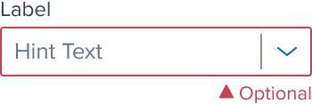 | [vs standard idle] border: 1px solid feedback-danger-900 icon/optional-text: feedback-danger-900 |
List States
| State | Graphic | Default Styling |
|---|---|---|
| Idle |  | background: neutral-000 (#FFFFFF) |
| Focus-Active |  | [vs standard idle] background: brand-200 (#EBF6FF) border: 1px solid brand-500 (#1394E5) |
| Hover |  | [vs standard idle] Single Checkmark and Label: no change Background: background: brand-200 (#EBF6FF) |
| Disabled |  | [vs standard idle] cursor: disabled |
| Aria-Read Only / Aria-Disabled - Idle |  | [vs standard idle] no change For list behavior see Usage Warnings |
| Aria-Read Only / Aria-Disabled - Hover |  | [vs standard hover] no change |
| Aria-Read Only / Aria-Disabled - Focus |  | [vs standard focus-active] no change |
| Error | N/A (no required cases) | N/A |
Use Cases (IN PROGRESS)
| Original Scenario (Use Case) | Dim Sum Version (Proposed Solution with DS Components) | Scenario Description |
|---|---|---|
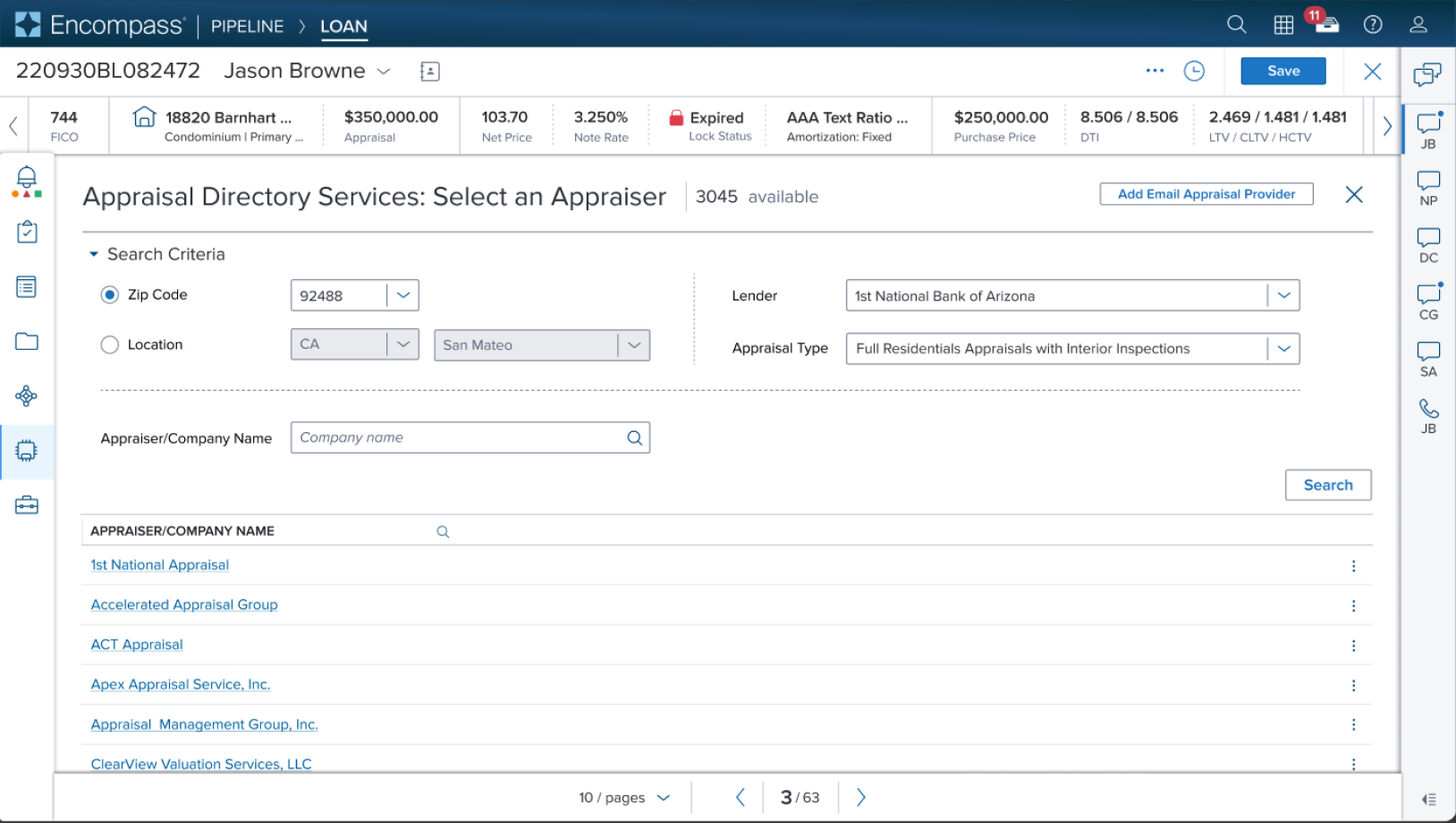 |  | Title Shown in what and located where? |
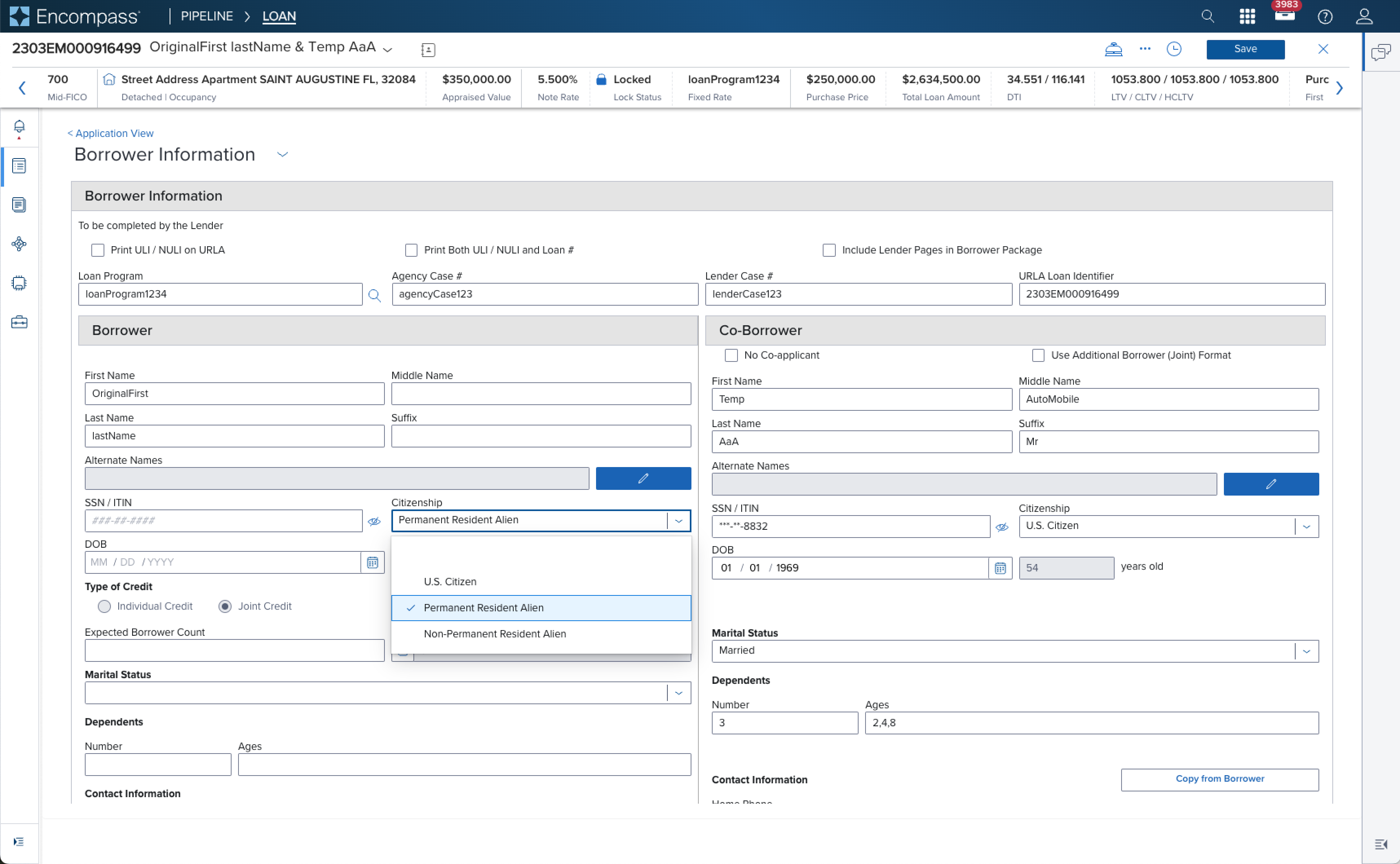 | ds-solution graphic is in progress | Title Shown in what and located where? |
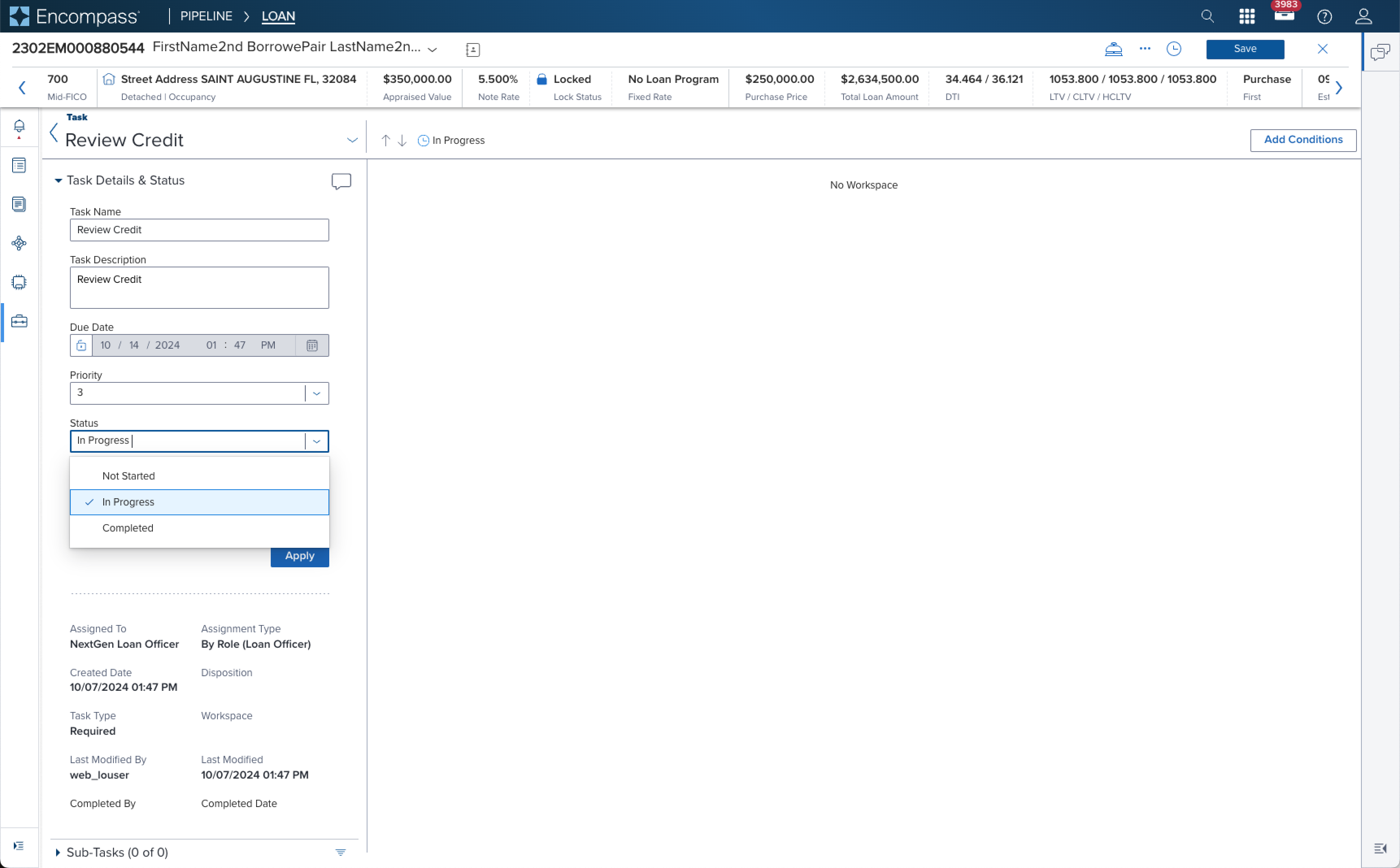 | ds-solution graphic is in progress | Title Shown in what and located where? |
 ! 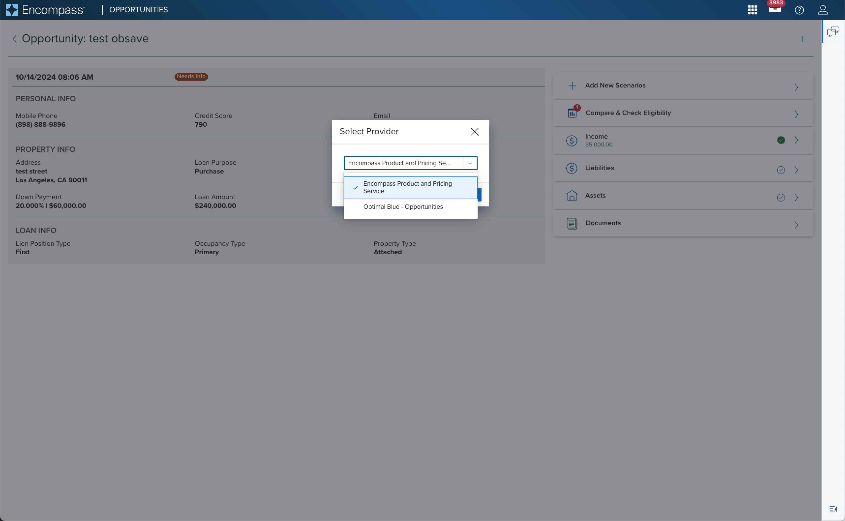 | ds-solution graphic is in progress | Title Shown in what and located where? |
| Form Layout Block; Text label placed on top of the input |
Examples (IN PROGRESS)
| Scenario Graphic | Scenario Solution | Text Resize and Reflow (200%) | Scenario Description |
|---|---|---|---|
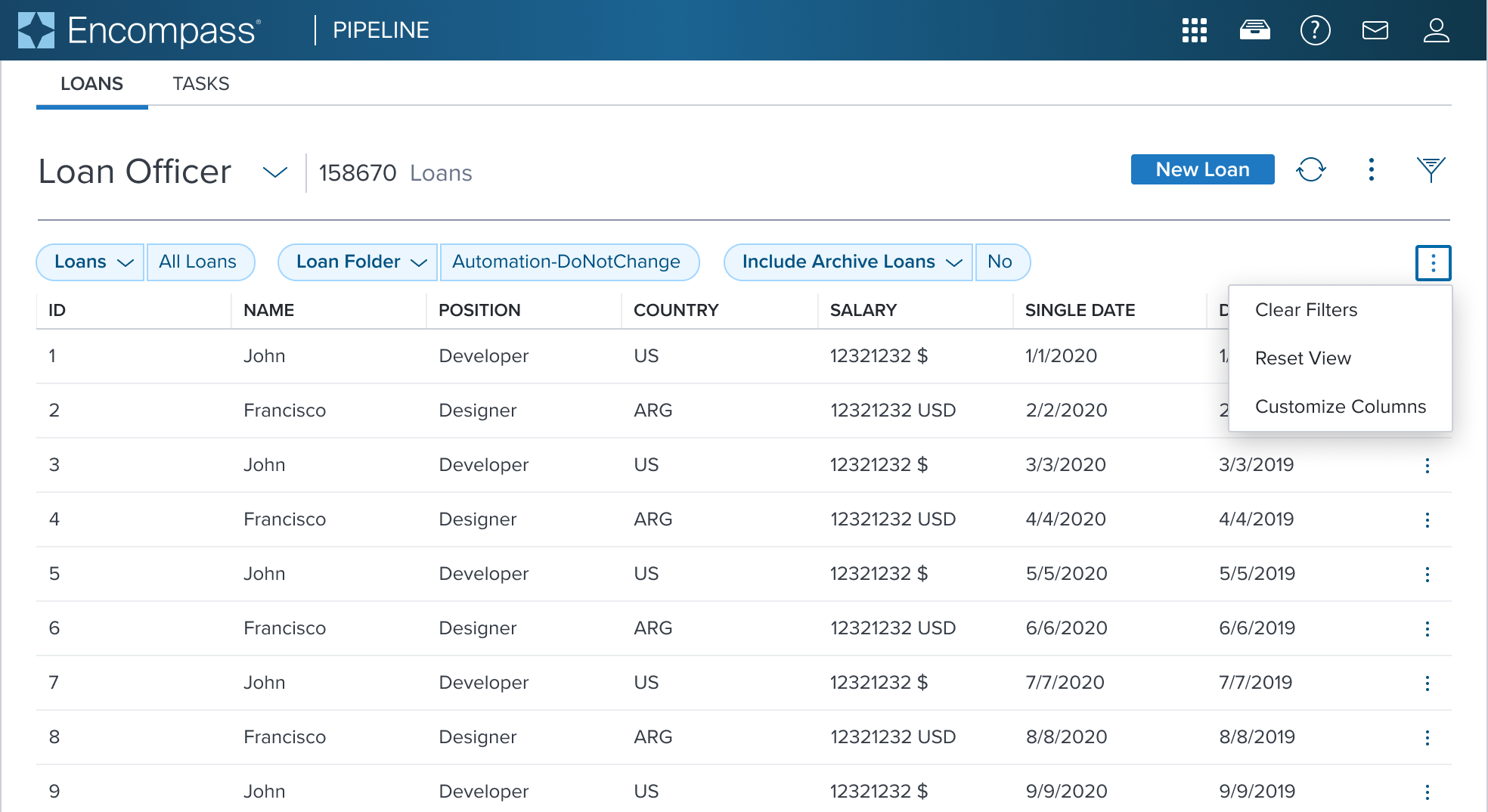 | 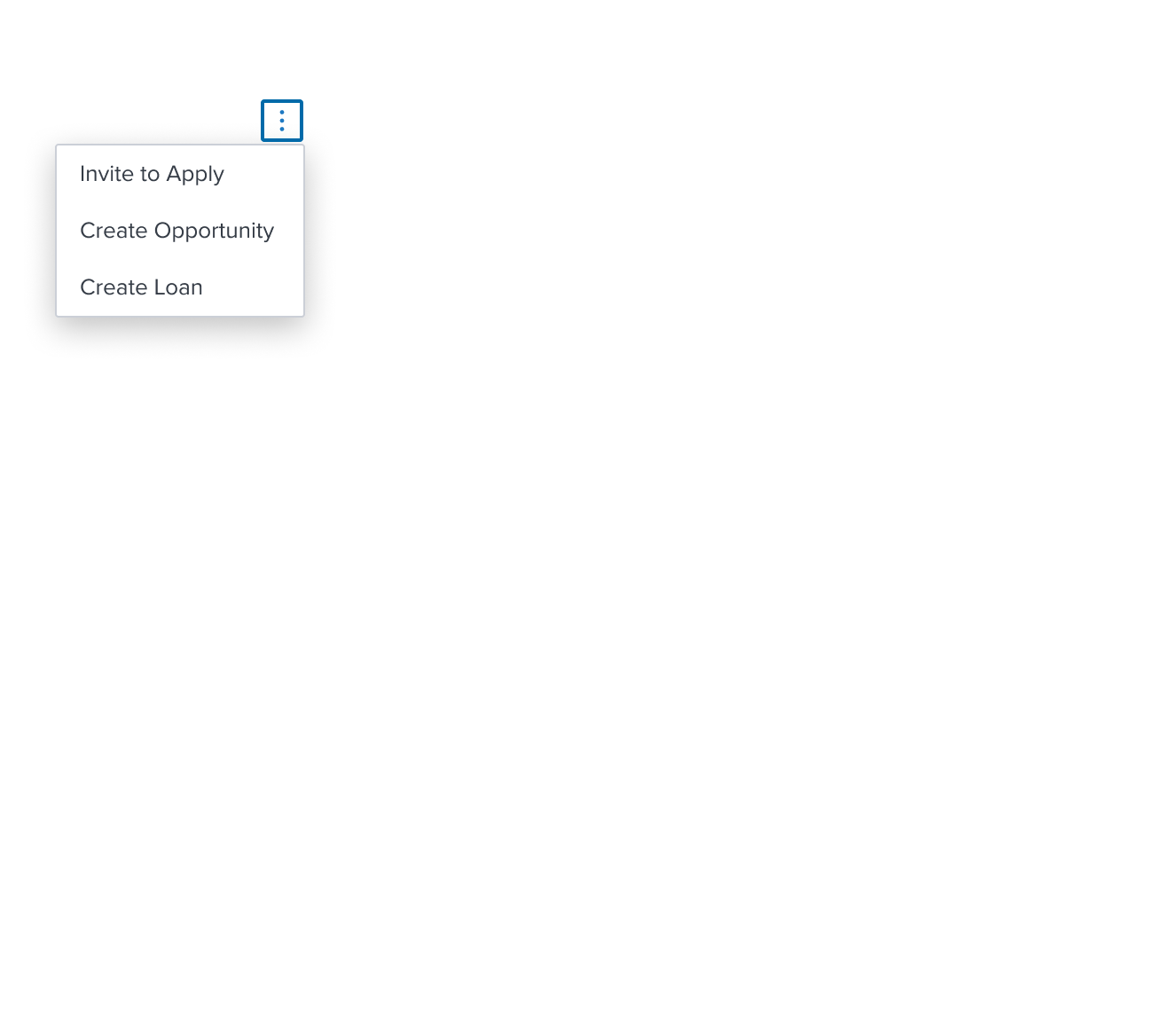 | 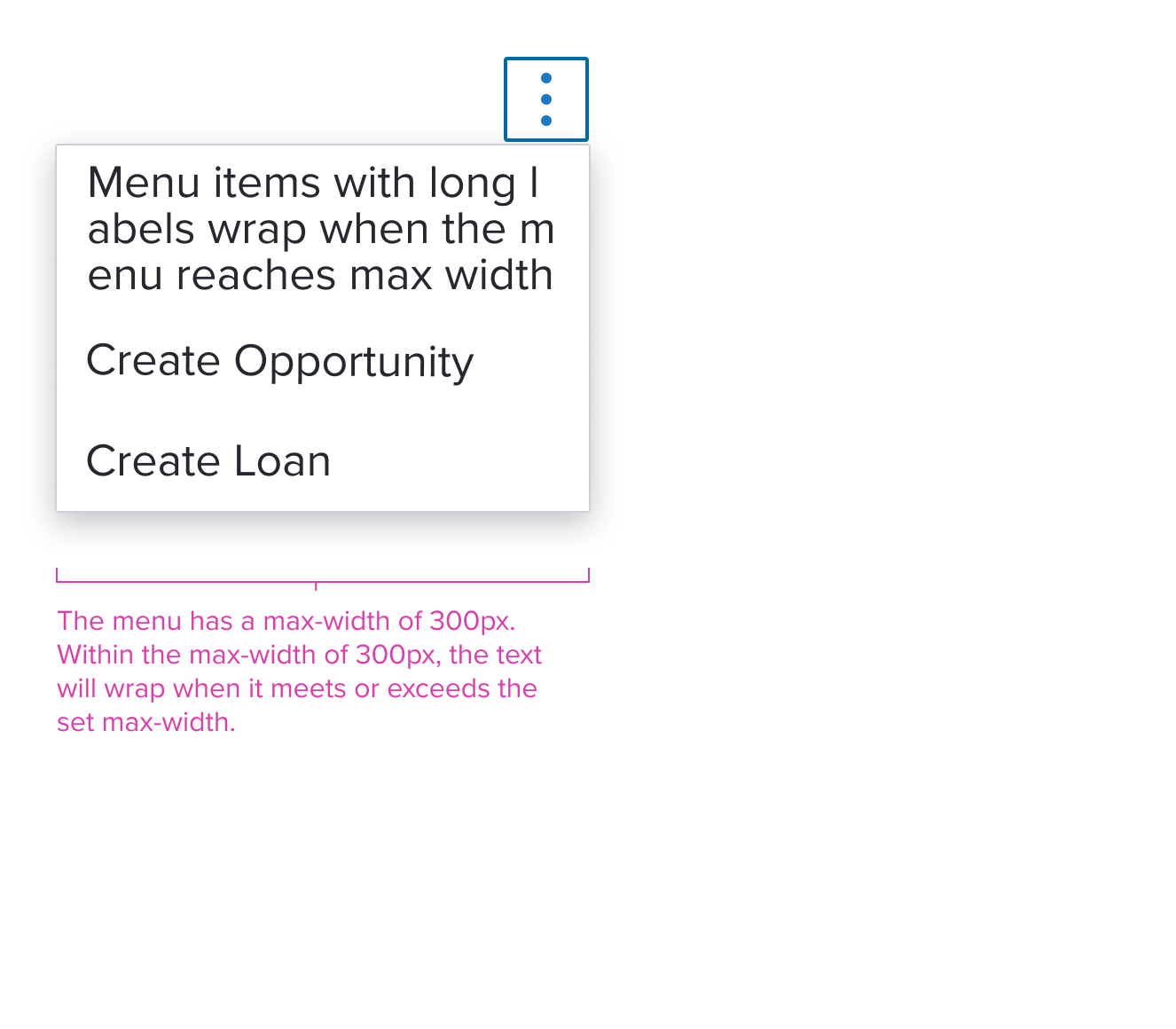 | Activation Menu menu consisting of menu items (labels) for taking immediate action on one or more items. When standard action occurs and no visual representation is needed. |
Composables
The Combo Box Single Select simplifies interactions with predefined, accessible list items, each serving a specific role.
| Composables | Link and Description |
|---|---|
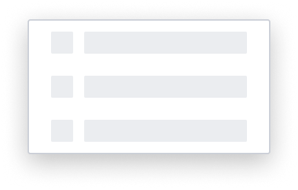 | Skeleton List Item The Menu uses the Skeleton 'S1' loading pattern for rendering fidelity. |
Single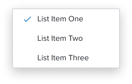 | Single Select List Item Handle altering page content dynamically while also tracking selections so far, when activating a specific menu item can't logically happen continuously. |
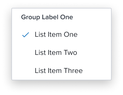 | Group List Item Ensures exclusive selection within a set of items and must wrap single select items and can also be used, sparingly, to provide a label for a group of menu items within the same menu or submenu level. |
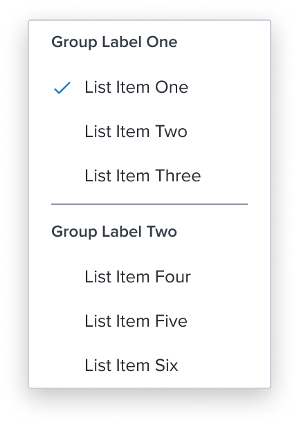 | Separator List Item Divides section content within a group of items. It's delicate horizontal border offers sufficient contrast to delineate it as a distinct element. |
Digital Accessibility
Combo box is a standard HTML component and therefore uses the familiarrole=comboboxPlease refer to the documentation for complete details.
References
Variants
This component has no known-of variants.
Usage Warnings
List Behavior for Read Only
The Dimsum team is in process of evaluating if the Combo Box list of options will open or not in Read Only. The current behavior does not allow the list to open. This effort is still being refined and not yet published. Please refer to the documentation for current details.
Alternate Components
- Native Select: Use when you require the auto advance feature.
- Combo Box Multi Select: Use when need to choose more than one option from predefined list of options.
- Modal Dialog: Use a Modal Dialog when the number of items to select from will be large (approx. 10+) and columns of extra information would help selection.
- Shuttle: Use a Shuttle when Items to be selected will be coming from a large list (approx. 50+) or a list that has a hierarchy and user will appreciate seeing the selection set before committing.
Reference
- Usage Guidelines
- Keyboard Interaction
- Resize and Reflow Guidance
- WCAG Combobox Pattern
- View code on Storybook
