Overview
The "Icon" Button variant is designed specifically for use cases where the button's content consists solely of a single icon. This minimalist approach is perfect for interfaces that require non-textual, direct action cues without the distraction of textual content. Unlike the "Text" variant, the "Icon" variant incorporates automatic internal spacing adjustments to center the icon within the button's bounding box, ensuring optimal alignment and clarity across all states.
This variant is tailored for a highly specialized range of applications where a clear, concise visual cue is needed without accompanying text. It addresses the unique challenges of icon-based interaction, such as maintaining visibility and alignment, especially in focus states where the icon must remain distinct and centered.
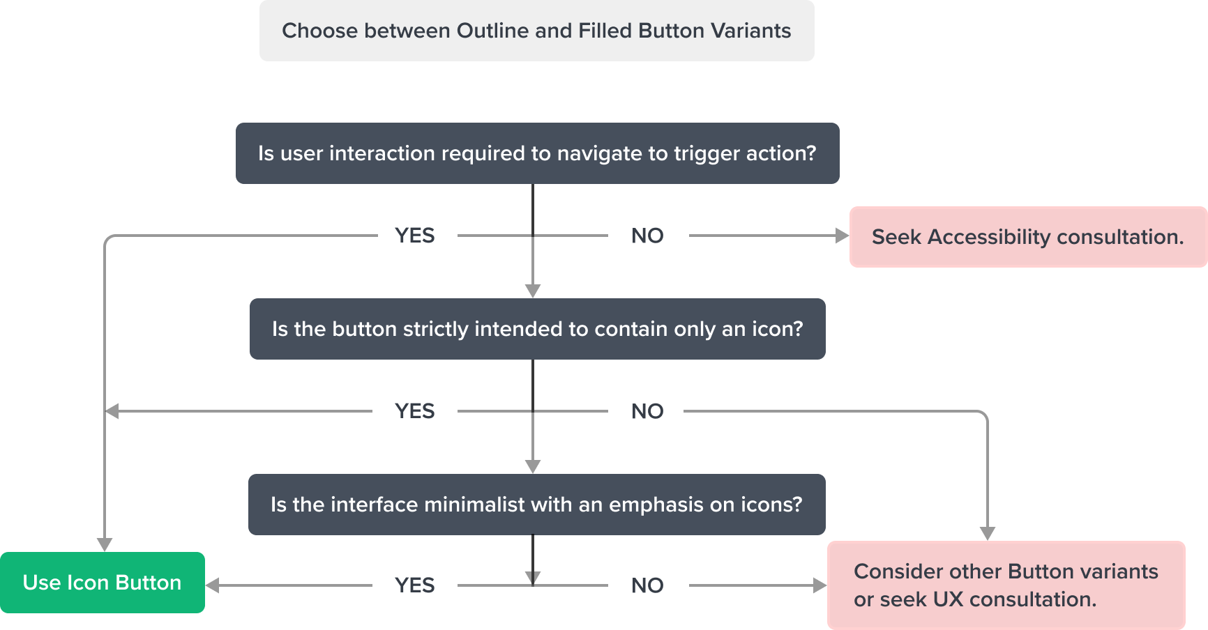
Usage
Use the "Icon" variant in situations where space is limited or where a textual label would be redundant or clutter the interface. This variant is ideal for toolbars, minimalist interfaces, or as supplementary actions within a content-rich UI where icons can clearly convey the action without needing text.
The automatic spacing calculation feature of this variant ensures that icons are always perfectly centered, avoiding visual misalignment or overlap issues that can detract from user experience, particularly in focus and hover states.
Guidelines
The "Icon" button should be used sparingly and only in contexts where its function can be clearly understood without textual explanation. The icon chosen should be universally recognized or easily understood within the context of the application to maintain usability and accessibility.
Special attention should be given to the size and spacing of the icon to ensure it remains legible and actionable across all device sizes and resolutions.
Objective
The "Icon" Button component offers a solution for integrating discrete, actionable icons within applications without the need for accompanying text. It supports designs that aim for a clean, uncluttered aesthetic while still providing intuitive navigation and interaction cues to users.
By ensuring icons are centered and visually distinct even in focused or hovered states, the "Icon" variant enhances the clarity and coherence of the interface, making it easier for users to recognize and engage with actions.
Design
"Icon" variant has a square container design with a background fill, border corner radius, and displays an icon.

Box Model
Icon Button Box Model is designed with specific features to ensure that it meets its core objectives as a container for structured, visually appealing content within a user interface. In order to accomplish this, Button includes two region types.
Dictated Regions (Always required)
- Content (can have an icon)
- Container (background fill)

This variant uses all the visual styles from the Outline Icon Button, and may also include any of the following according to the use case and requirements.
Design Notes
- Icon: "Small" Square Variant: Brand-600
Uses the standard neutral design system color and visual styling that has forced styling and alignment. It has a center aligned placement inside of the square container area. - Height and Width: 28px
- Alignment: content centered inside the box
Responsive Layout
This variant uses all the responsive behavior from the Outline Icon Button, and may also include any of the following according to the use case and requirements.
- The "Icon" variant follows the same layout and resizing principles as other button variants, ensuring consistency in spacing, alignment, and adaptability across devices. The key distinction is its automatic adjustment of internal spacing to maintain the icon's centered position within the button, ensuring consistent visual alignment across different states and screen sizes.
For Resize and Reflow behavior, see Examples
States
This variant uses all the interaction state visual styles from the Outline Button, and may also include any of the following according to the use case and requirements.
| State | Graphic | Default Styling |
|---|---|---|
| Idle |  | Background: Neutral-000 Icon-color: Brand-600 |
| Hover |  | [vs standard idle] Background-color: Brand-200 Icon-color: Brand-700 Cursor: Pointer |
| Focus |  | [vs standard idle] Border: 2 px Brand-700 |
| Disabled |  | [vs standard idle] Icon-color: Neutral-500 |
| Disabled + Hover |  | [vs standard disabled] Cursor : Disabled |
| Disabled + Focus | NA | NA |
| Aria-Disabled |  | [vs standard disabled] no change |
| Aria-Disabled + Hover |  | [vs standard disabled + hover] no change |
| Aria-Disabled + Focus |  | [vs standard disabled] Border focus: 2 px Solid Brand-700 |
| Error / Error + Hover / Error + Focus | NA | NA |
Use Cases
| Original Scenario (Use Case) | Dim Sum Version (Proposed Solution with DS Components) | Scenario Description |
|---|---|---|
 |  | Icon button shown in toolbar region of the page header component. This represents the most compact and subtle type of button, icon buttons are used for optional supplementary actions such as “Refresh, Overflow Menu, Filter”. It can appear more than once in a given space. Its minimal single icon only design is less prominent and maintains a clear visual hierarchy when shown in the same space as a primary element. |
Examples
| Scenario Graphic | hypothetical scenario solution (100%) | Resize Text and Reflow (200%) | Scenario Description |
|---|---|---|---|
 |  |  | Icon button shown in toolbar region of the page header component. |
Digital Accessibility
For the Icon variant, WCAG 2.1 AA compliance emphasizes the need for clearly defined aria-labels to convey the button's function, as the icon alone may not be universally understood by all users, especially those using assistive technologies.
The visual presentation should ensure sufficient contrast between the icon and its background, facilitating easy recognition and interaction by users with visual impairments.
This section expands what's covered within the standard variation documentation.
Usage Warnings
Pitfalls & Misconceptions
Icon Button variant does not include a text label, and must align with the following rule:
Any component that contains only images or graphics must also be accompanied by a separate aria-label, which is announced by assistive technologies to users with visual impairments. The aria-label aligns with requirements from the basic [WCAG principles](https://www.w3.org/WAI/fundamentals/accessibility-principles/.
Icon buttons - Mandatory Aria-Label
Button that contains strictly graphic must always be accompanied by a separate
aria-labeldue to its non-textual, image-based visual label. Failure to provide a dedicatedaria-labelresults in screen readers not announcing anything, significantly impairing accessibility.Icon Clarity and Consistency
The icon should unambiguously indicate the action it represents. Consistency in the usage of icons across the application is crucial to ensure clarity and prevent user confusion. This responsibility falls on the application to enforce such consistency.
IE - Discoverability in Idle State
Given the inherently subtle nature of the design, applications are responsible for ensuring the element is distinctly identifiable as an interactive element (IE) in its idle states within the context used. This adherence aligns with the discoverability principle and the principle of least surprise, enhancing user experience consistency.
Alternate Components
- Combo Box Use when there are many states or selectable items and one or more can be selected. This component is best used when space is at a premium and essential content requires progressive disclosure.