v2.0.0
Overview
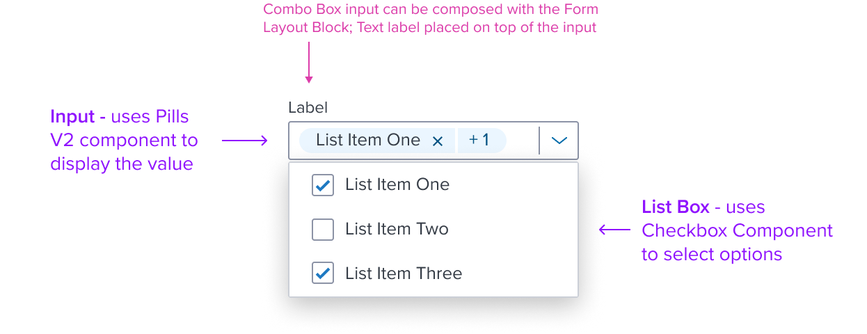
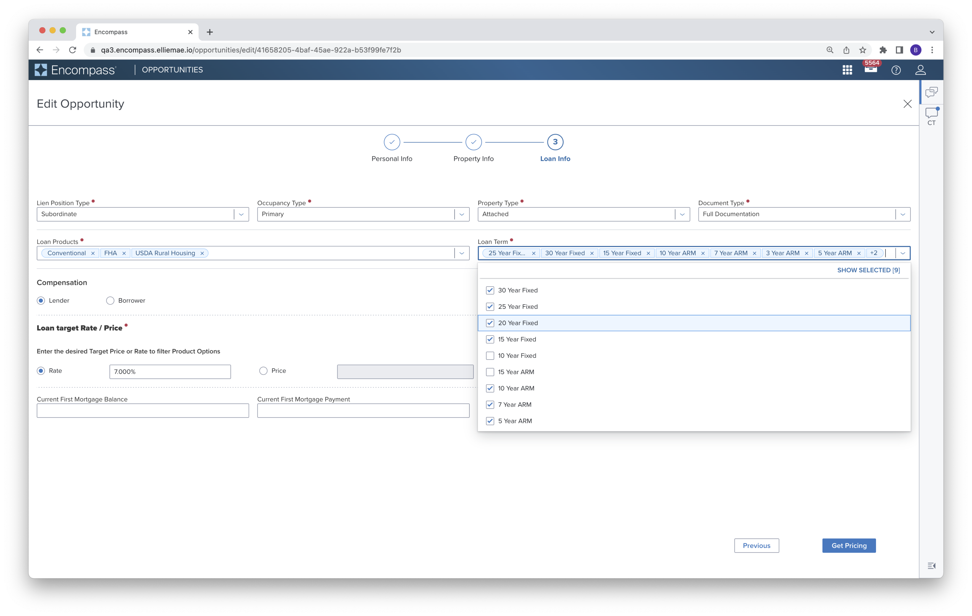
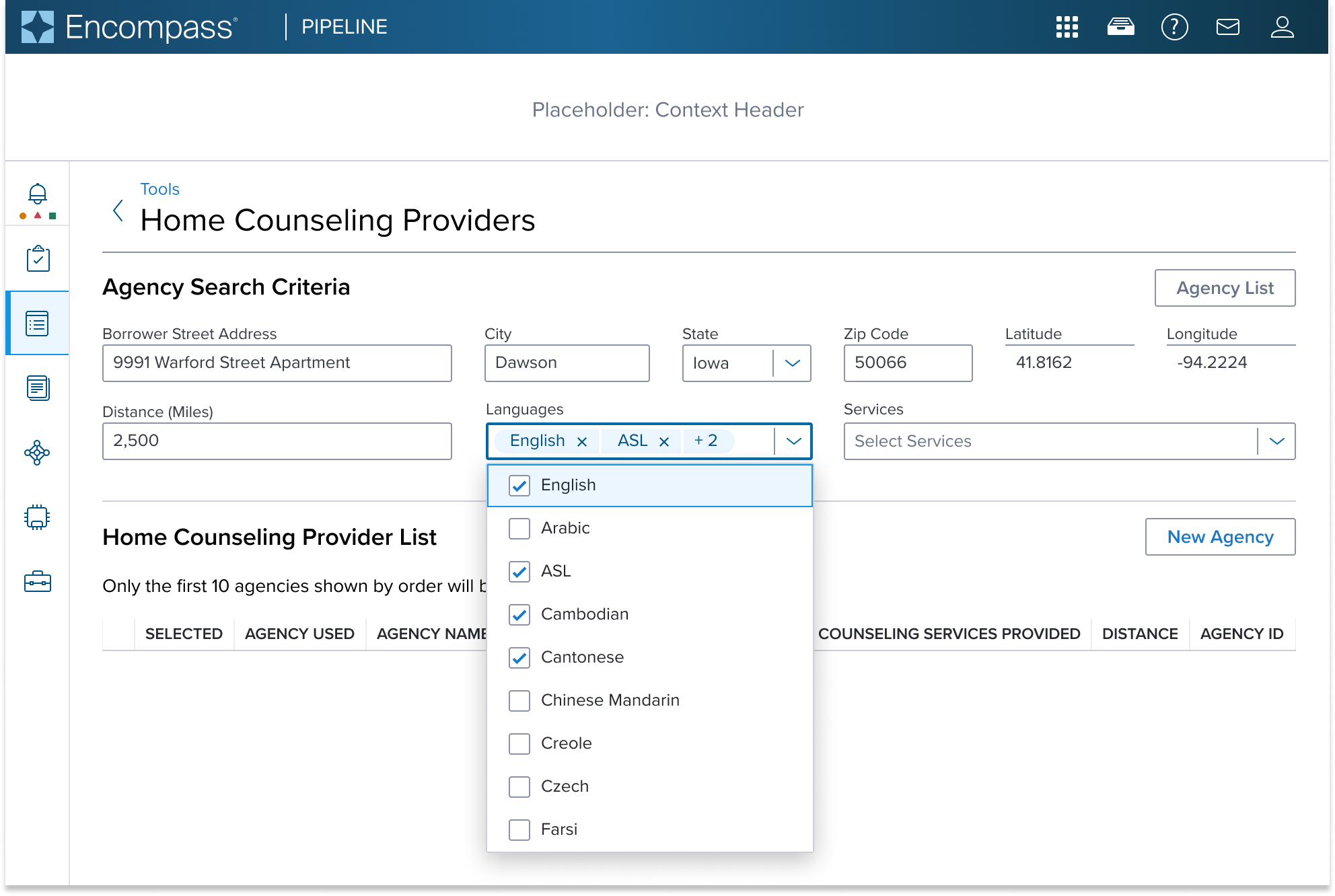
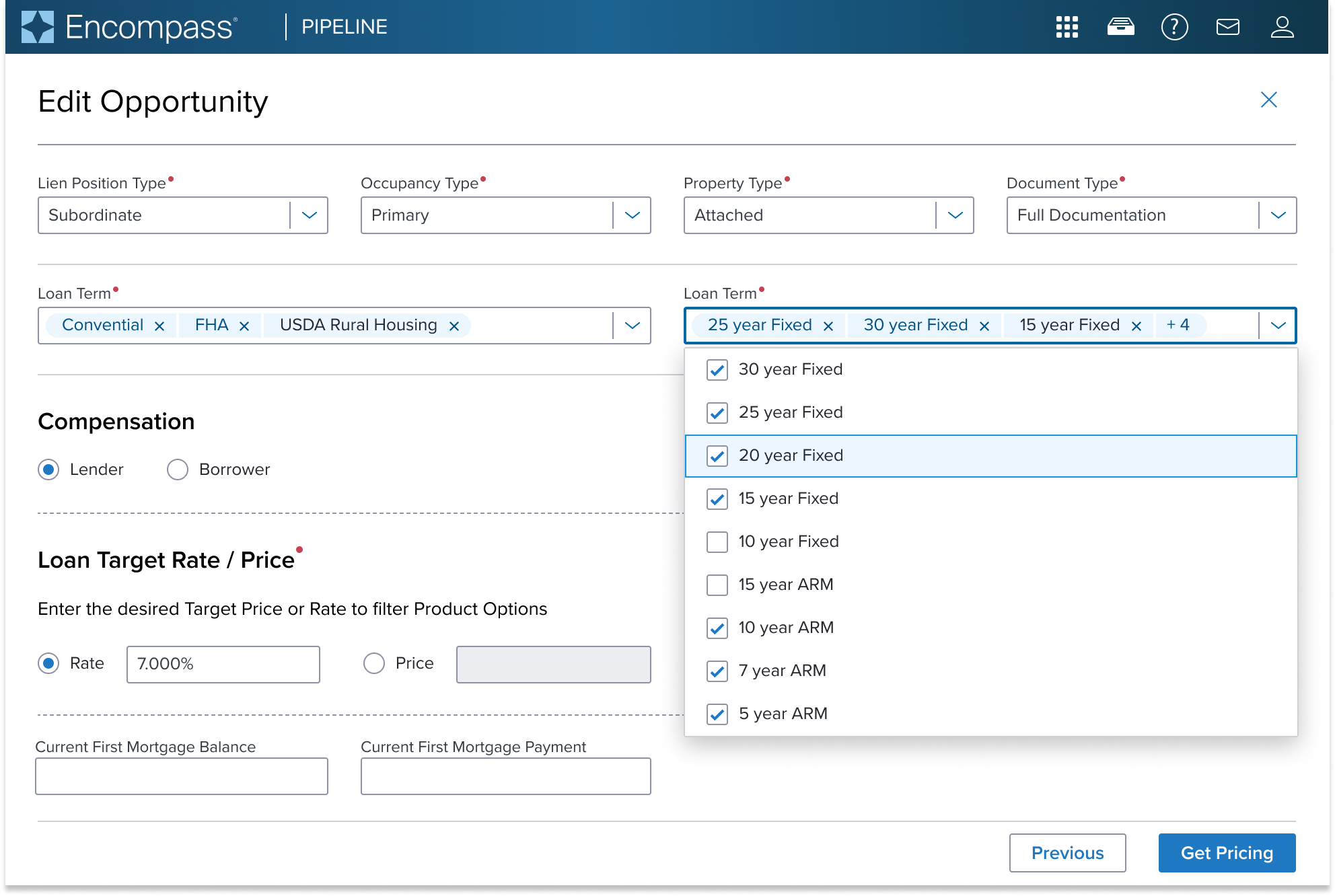
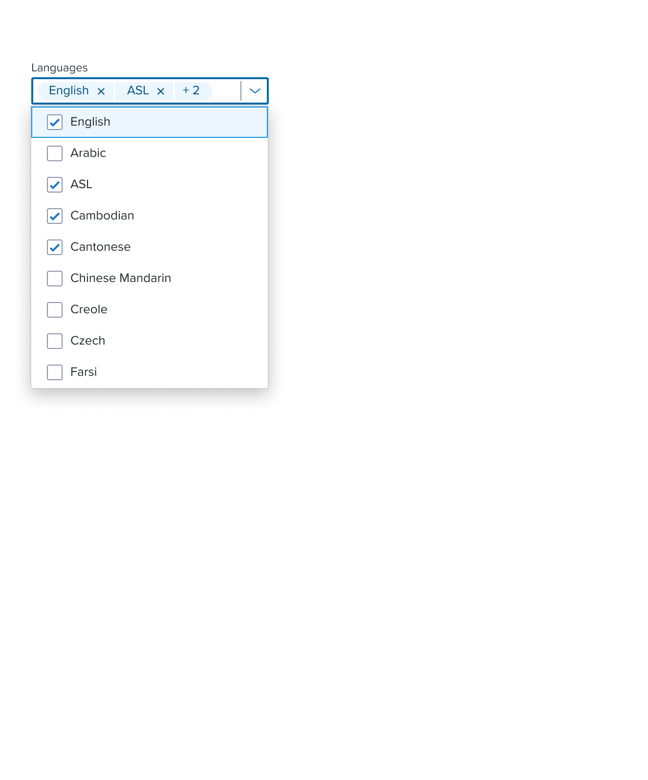
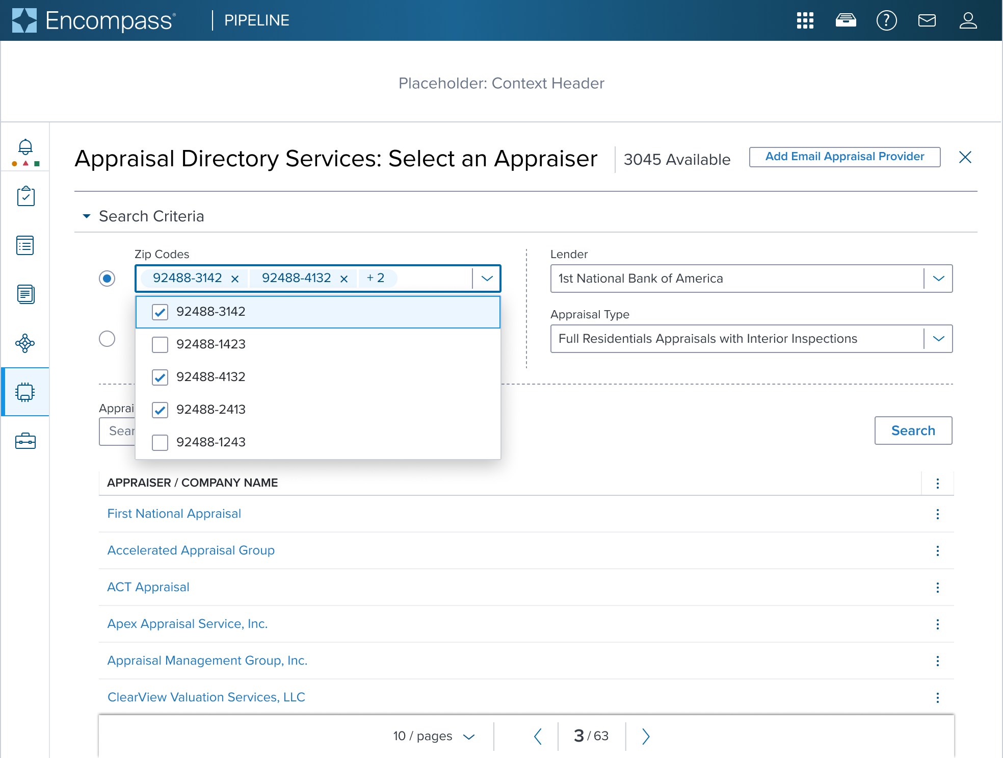
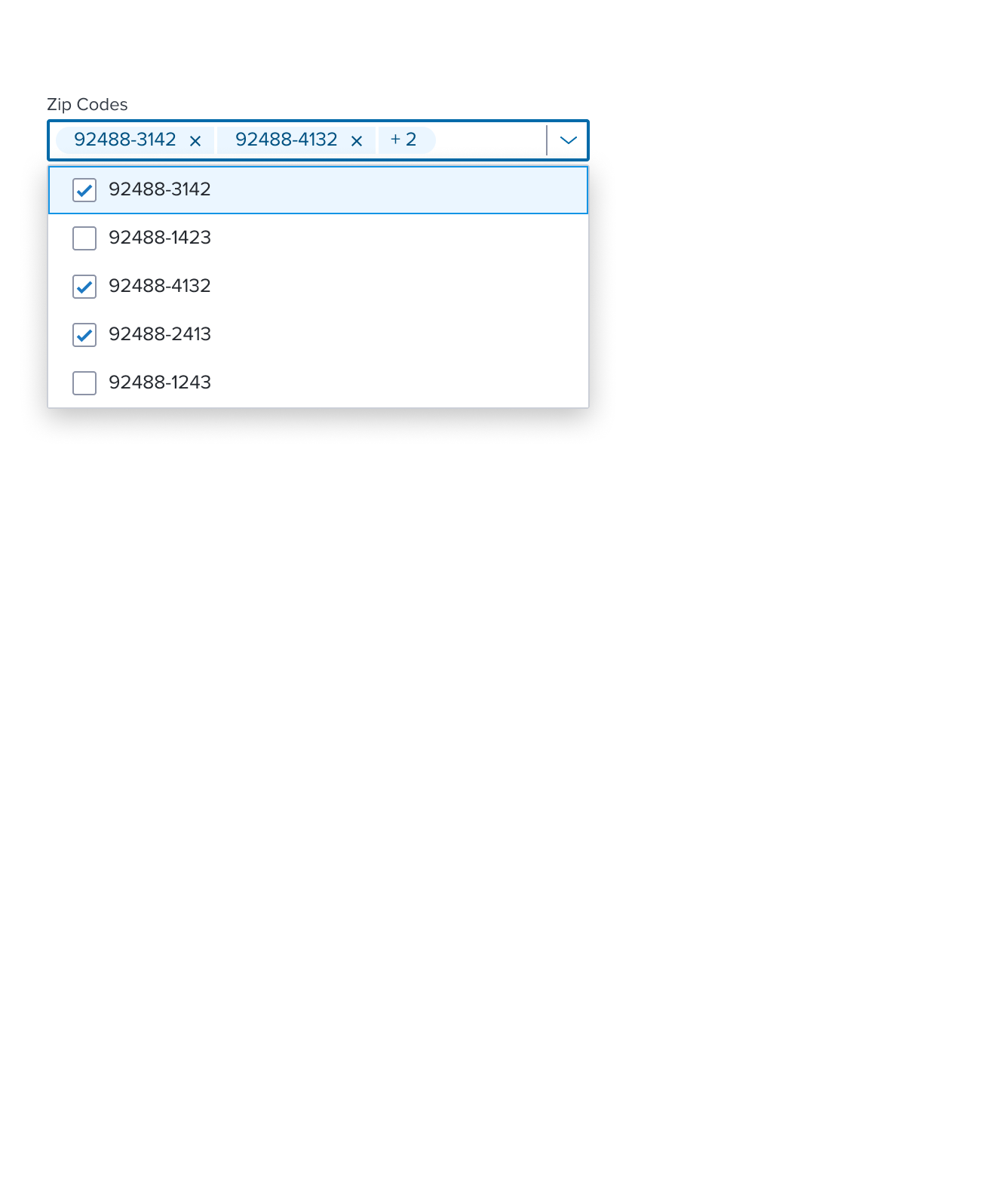
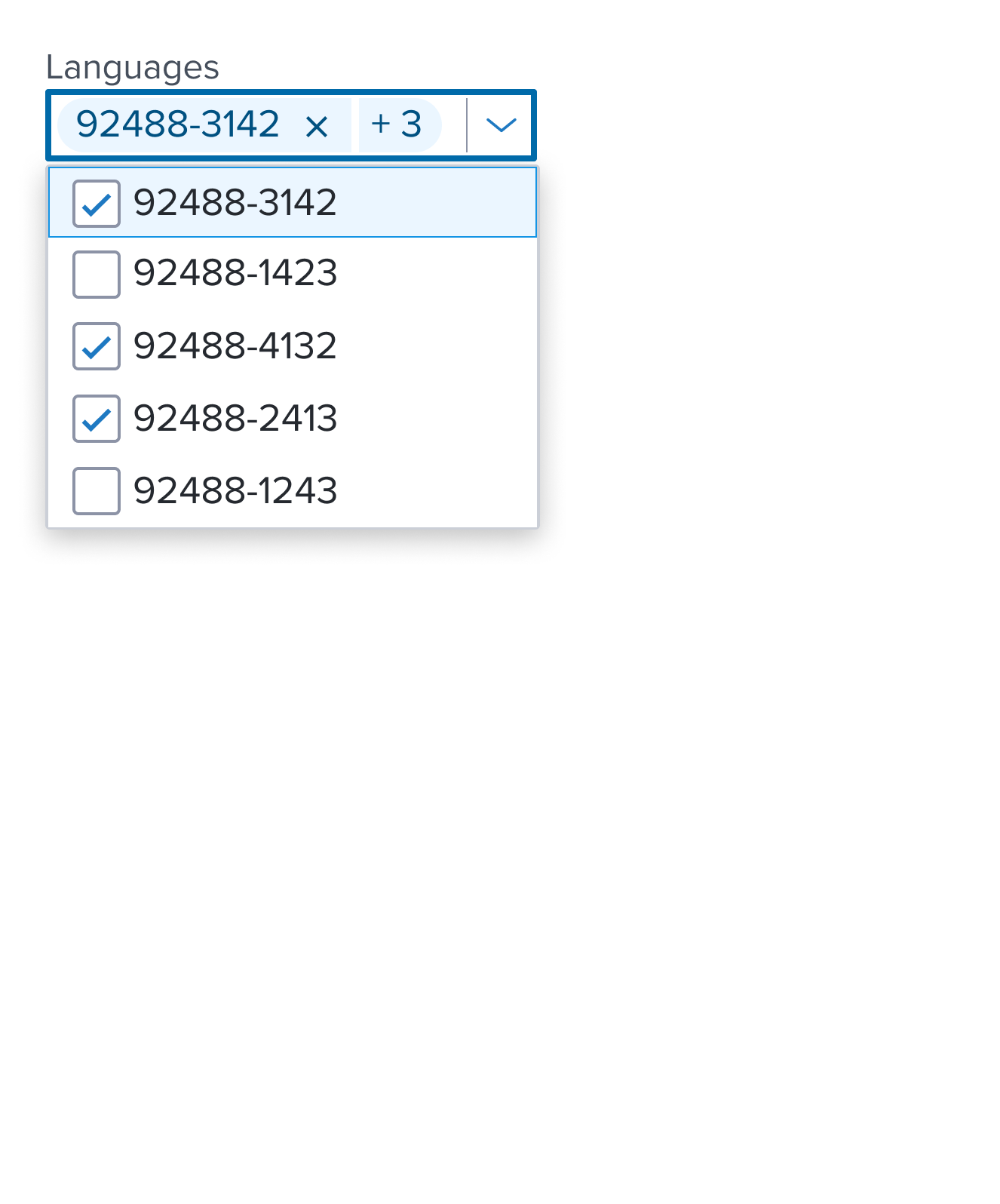
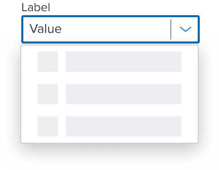
Combo Box Multi Select is a widget made of an input and list of options. The input allows the user to filter items, while the list of options enables a user to choose one or more items from predefined values.
For other options see Alternate Components
Design
Box Model
Input with Hint Text
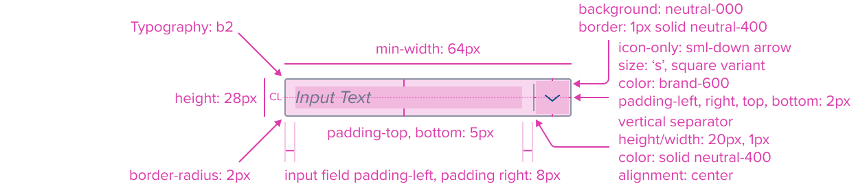
- Input Text: "b2" Typography Variant
The Input Text Label by design is an opinionated configuration and has forced styling and alignment. It has a left placement of the text that grows to the right allowing for continuous typing, and the cursor will scroll horizontally within the input field to ensure an "inline Layout" is maintained. The input height does not increase and content does not wrap. - Vertical Separator (Center-Aligned with Input Box) Color Neutral-400
Uses the standard neutral design system color and visual styling that offers sufficient contrast to distinguish the input field from the right region trigger element. - Icon-Only Square Variant (Small Down Facing Arrow) Color Brand-600
Uses the standard brand design system color and visual styling that offers sufficient contrast to delineate it as a distinct selection element to trigger the list open. - Icon-Only Padding (Left, Right, Top, Bottom) 2px
The menu button region has a right placement of the input. It has pre-built spacing to dictate the proper distance with the input field. - Border 1px solid neutral-400
The fine border marks the card's perimeter, providing enough contrast to define the card as a separate entity while keeping the design clean and unobtrusive. - Border Radius 2px
The rounded edges make the interface appear softer and more inviting, providing an intuitive, user-friendly and accessible interface. - Background: neutral-000
The input background has a neutral color fill to provide sufficient contrast with the foreground content for proper presentation. - Margin/Padding 5 px (Top, Bottom), 8px (Left, Right)
The input comes with pre-set spacing values in order to accommodate the dictated elements inside of the input. - Height 28 px
This dimension guarantees that the input remains functional and aesthetically pleasing across different devices and screen sizes, adhering to the principles of responsive design. - Min-width 64 px
These dimensions guarantee that the input remains functional and aesthetically pleasing across different devices and screen sizes, adhering to the principles of responsive design.
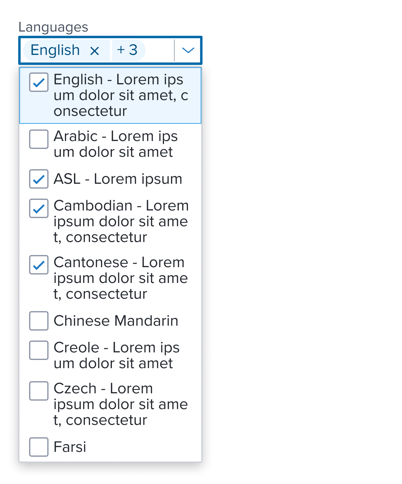
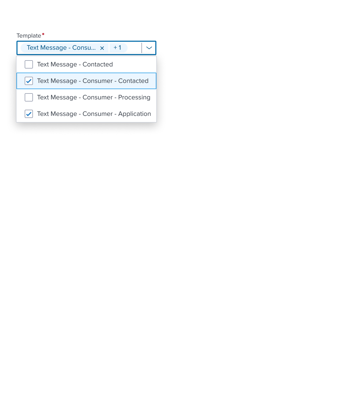
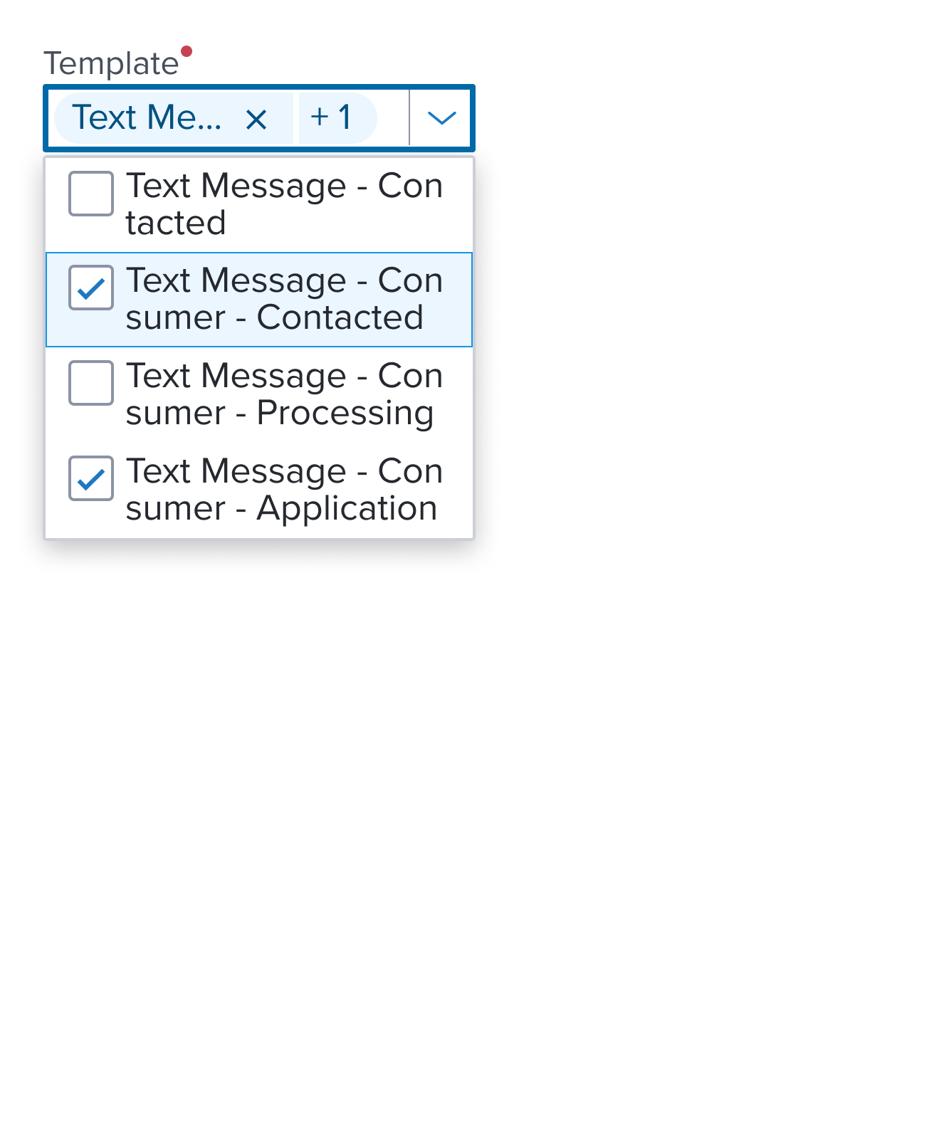
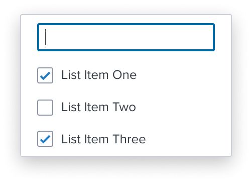
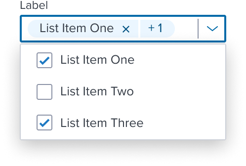
Input with Value (Pills V2)

- Pills V2 "Small Pill" Variant (18px Height): See Component Spec for Details
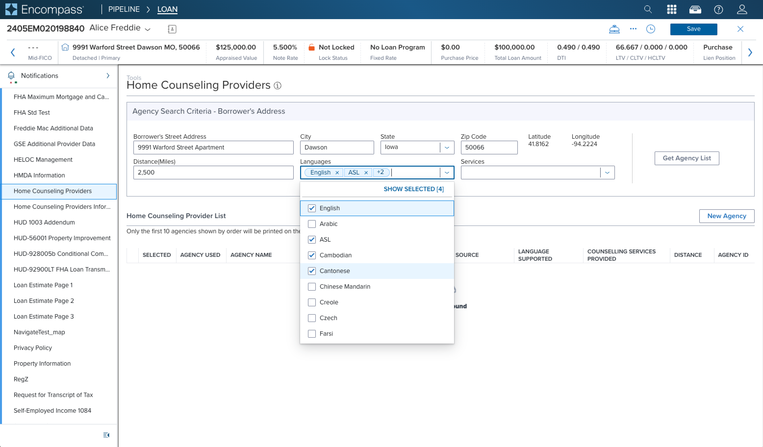
Combo Box Multi Select uses the Pills V2 "Small" Variant within the Input Field to display a filtered value or selections made from the list of options.
List Box

- Box-shadow "s"
The List's container is styled with a drop shadow and always appears in front of other content. - Border 1px solid neutral-300
The fine border marks the Menu's perimeter, providing enough contrast to define the Dropdown Menu as a primary entity while keeping the design clean and unobtrusive. - Border radius 1px
The List's rounded edges make the interface appear softer and more inviting, providing an intuitive, user-friendly and accessible interface. - Background neutral-000
The List background has a neutral color fill to provide sufficient contrast with the foreground content for proper presentation. - Margin / Padding
The List does not come with pre-set spacing values in order to optimize the flexibility of content layout. Correct spacing is instead ensured through atomic composition of the out-of-the-box composed elements. In case authors hosts custom content, authors are in charge of ensuring consistent styling, which will follow standard Dim Sum spacing values. - Min-Height 32 RT
When a List exists, it MUST have at least one item, and by design follow the minimum sizing for an interactive element action menu item. This ensures for accessibility compliant minimum region size requirements while maintaining a visually pleasing size. - Width Stretches to fit content matching the Input width 100%
Stretches to match the full width of the input. This can be altered by authors in specific scenarios, but 200% resize and reflow MUST be considered with a set max-width.
Responsive Layout
Input
Combo Box Input is designed with a fixed height and flexible width.
- Inline Overflow Behavior: The Input allows for continuous typing and scrolling the text value horizontally within the input field to ensure an 'inline' layout. The filtered value will truncate as the input field height is maintained and will not increase. For an example of text resize and reflow, see Examples
Content-specific reflow is also managed responsively for elements within the field, or integrated with the field. For example, Form layout Block includes both fixed and flexible settings to maintain spacing, alignment and other visual styles, which are designed to be responsive in their own right within the overarching design system. This approach ensures the Input will align to familiar user expectations of modern software applications and meet standardized HTML practices.
List Box
Combo Box List Box is designed to stretch to fit content match the input width 100%. A defined max height and width can be set in order to provide a baseline for content scalability accounting for resize and reflow to ensure a consistent and accessible user experience.
- Wrapping Content: The List auto expands by default to always display the full text string values inline by wrapping them within the listbox. The list box container flexes vertically to accommodate the full list item content. For an example of text resize and reflow, see Examples
When a maximum height is set and is reached the list component is designed to incorporate a vertical scrollbar to keep the list content usable. List items should appear always in the same order and with the same wording and destination. When on smaller screens, and in long drop downs, to prevent them from overflowing off the screen.
Input State
| State | Graphic | Default Styling |
|---|---|---|
| Idle | 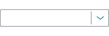 | background-color: neutral-000 border: 1px solid neutral-400 border-radius: 2px separator: width 1px, solid neutral-400 icon-only: sml-down arrow, brand-600 |
| Idle with Hint Text | 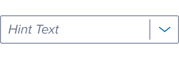 | [vs standard idle] typography: b2 font-color: neutral-500 font-style: italic |
| Idle with Value Text | 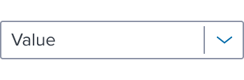 | [vs standard idle with hint text] typography: b2 |
| Idle with Value as Pill | 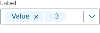 | [vs standard idle with value text] See Pill V2 Spec |
| Hover / Hover with Hint Text / Hover With Value Text / Hover with Value as Pill |  | [vs standard idle] border: 1px solid brand-600 |
| Focus / Focus with Hint Text / Focus With Value Text / Focus with Value as Pill |  | [vs standard idle] Border: 2 px solid brand-700 |
| Disabled |  | [vs standard idle background: neutral-080 icon: chevron-down, neutral-400 |
| Disabled with Hint Text | 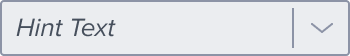 | [vs standard idle with hint text font-color: neutral-600 |
| Disabled with Value Text | 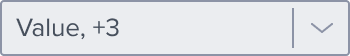 | [vs disabled with hint text] typography: b2 font-color: neutral-600 |
| Disabled with Value + Hover |  | [vs disabled with value text cursor: disabled (input text and icon-button) |
| Disabled + Focus | N/A (no required states) | N/A (no required states) |
| Aria-Read-Only / Aria-Disabled | 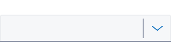 | [vs standard idle] background: neutral-050 border: 1px solid neutral-080 border-bottom: 1px solid neutral-400 |
| Aria-Read-Only / Aria-Disabled with Hint Text | 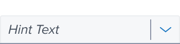 | [vs standard aria-read-only / aria-disabled] typography: b2 font-color: neutral-600 font-style: italic |
| Aria-Read-Only / Aria-Disabled with Value Text | 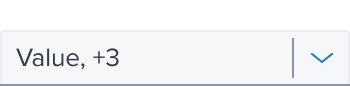 | [vs standard aria-read-only / aria-disabled with hint text] typography: b2 font-color: neutral-600 |
| Aria-Read-Only / Aria-Disabled with Value Text + Hover |   | [vs standard aria-read-only / aria-disabled with value text] border: 1px solid brand-600 cursor (input): system default cursor (icon-button): enabled |
| Aria-Read-Only / Aria-Disabled with Value Text + Focus | 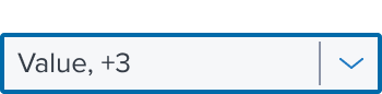 | [vs standard aria-read-only / aria-disabled with value text] border: 2 px solid brand-700 |
| Error / Error with Hint Text / Error With Value Text / Error with Value as Pill | 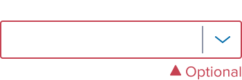 | [vs standard idle] border: 1px solid feedback-danger-900 icon/optional-text: feedback-danger-900 |
| Error with Value Text + Hover | 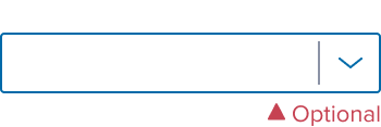 | [vs standard error / error with hint text / error with Value text / error with value as pill] border: 1px solid brand-600 |
| Error with Value Text + Focus |  | [vs standard error / error with hint text / error with Value text / error with value as pill] border: 2 px solid brand-700 |
List Box States
No special states are required for the list box because the final interaction states will be conditioned by the individual composable visuals.
List Item States
For List Item Interaction States, see List Item Composables
Read Only Combo Box Behavior for Expanding the List Box
The design system team has decided to allow the listbox to expand in its readonly state. While the readonly state does not allow typing when the input has focus, we offer our users the freedom and flexibility to quickly expand the list box by pressing any character key or the standard keys for this interaction, such as Space, Enter, ArrowUp, and ArrowDown.
Should future updates to ARIA best practices or WCAG guidelines introduce new requirements, we will adapt our approach accordingly to ensure compliance. Similarly, we will adjust our approach if a common consensus emerges in the web development community regarding the combobox widget. For full details, please see Combo Box Readonly State Documentation

Use Cases
| Original Scenario (Use Case) | Dim Sum Version (Proposed Solution with DS Components) | Scenario Description |
|---|---|---|
  |   | Multi Select List: Shown within the main content region form UI composed with Form Layout Block; Text label placed on top of the input. The input also shows overflow pattern for multi selected options in the list. |
Examples
| Scenario Graphic | Scenario Solution (100%) | Text Resize and Reflow (200%) | Scenario Description |
|---|---|---|---|
|  |  | Multi Select List: Shown within the main content region form UI composed with Form Layout Block; Text label placed on top of the input. |
 |  |  | Non Clearable: Prevents users from clearing the value entered within the input field, allowing them to select only from the options within the list. |
 |  |  | Input Mask: Input has a string of characters that defines the format of valid user input, ensuring data is entered correctly and consistently. See the Storybook Example Here |
List Item Composables
Combo box simplifies interactions with predefined, accessible list items, each serving a specific role.
| Composables | Link and Description |
|---|---|
 | Skeleton List Item Renders fidelity with the Skeleton 'S1' loading pattern. |
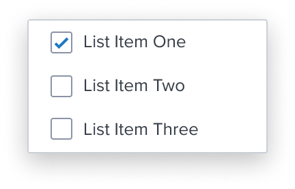 | Multi Select List Item Handles non-exclusive multi selection in a select group within a list. |
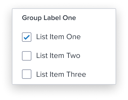 | Group List Item Ensures exclusive selection within a set of list items. It is purely presentational and has no action associated with it. |
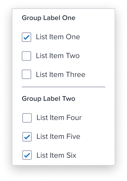 | Separator List Item Divides section content within a group of list items. It is purely presentational and has no action associated with it. |
Configurations
Combo box has pre-set configurable features and options supported by the component that seamlessly integrate with common scenarios.
| Configurations | Link and Description |
|---|---|
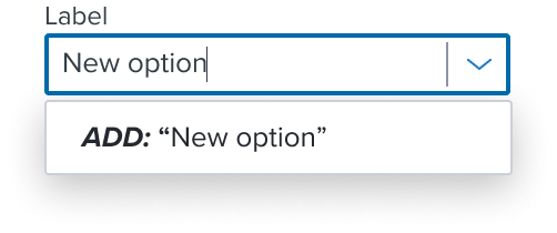 | Creatable Allows the user to type in their own value within the input field not contained in the predefined list of options. The new value becomes a selection in the list of options. |
 | Inline Combines a text box and list allowing users to enter a value within the text box or select a value from a list. It's typically used in combination with the floating contextual region. |
 | Only Selectable Prevents users from filtering from the input field, allowing them to select only from the list. |
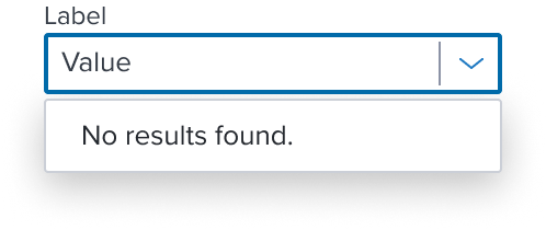 | No Results Found Customizable behavior 'No results found' message for an empty list of results. When filtered content is not returning matching options based on filter criteria. |
Variants
This component has no known-of variants. See List Item Composables
Loading
Combo box offers two loading patterns each serving a unique purpose and use case. These patterns provide a visual preview for the structure of the content users can expect to see once fully loaded. This gives a clear visual feedback the system is actively working to retrieve data, preventing confusion or frustration during loading times.
| Type | Usage Guidelines |
|---|---|
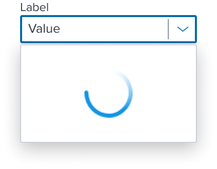 | Circular Indeterminate Indicator (See Separate Spec) Indeterminate indicators express an unspecified amount of wait time, and should be used when progress isn't detectable, or if it's not necessary to indicate how long an activity will take. |
 | Skeleton Skeleton provides a visual placeholder that mimics the structure of the upcoming content, thus reducing perceived loading time, and used when content takes longer than a second, but no more than a few seconds to load. |
Digital Accessibility
Combo box is a standard HTML component and therefore uses the familiarrole=comboboxPlease refer to the documentation for complete details.
References
Usage Warnings
Read Only Combo Box Behavior for Expanding the List Box
Conclusion and Decision from the Design System Team
The design system team has decided to allow the listbox to expand in its readonly state. While the readonly state does not allow typing when the input has focus, we offer our users the freedom and flexibility to quickly expand the list box by pressing any character key or the standard keys for this interaction, such as Space, Enter, ArrowUp, and ArrowDown.
Should future updates to ARIA best practices or WCAG guidelines introduce new requirements, we will adapt our approach accordingly to ensure compliance. Similarly, we will adjust our approach if a common consensus emerges in the web development community regarding the combobox widget. For full details, please see Combo Box Readonly State Documentation
Pitfalls & Misconceptions
The combo box is intended to be used for quick, straightforward inline selections and filtering options from a limited list within the current workflow.
If you need to present a complex set of options (approx. 10+), and columns of extra information would help selection, a Dialog Modal is best suited to provide additional user input beyond a simple selection, and help draw the user's full attention to a critical decision, complex forms, or important warning's.
Modal Dialog is typically opened by a trigger button and can display a table or list to support the level of complexity that is required depending on the use case and data that is mounted.
See specs for Modal Dialog
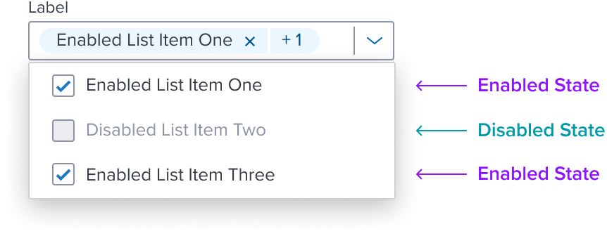
Not Supporting Mixed States inside an Enabled Combo Box
Previously, the enabled combo box included both disabled and enabled "Mixed States" to be shown inside of the list box allowing users to view all options in one location. This provided efficiency gain in some cases, accommodated business logic and dependencies, or admin user privileges, and permissions for underwriter levels that affected the availability of certain options.
Pitfalls & Misconceptions
Why this Approach is No Longer SupportedDim Sum ensures the component library meets usability and accessibility compliance for WCAG 2.1 Level AA web compatibility. Our components are being improved to directly align to HTML native standards and semantics.
The semantic list box pattern that is used in the combo box does not support the disabled state of it's items. Showing mixed states (e.g., disabled with enabled list items) inside of an enabled combo box list box is no longer supported.
There are several common issues that can arise, especially in terms of user experience, design, and accessibility, and can have some key challenges, such as:
- Confusing User Experience: When mixed options are in the same list box, users may become confused about the distinction between them causing ambiguity and inconsistent behavior.
- Cluttered Interface: Displaying mixed options can overload the combo box list making it cluttered and unorganized. This negatively impacts the design interface making it harder for users to make a decision, causing lists to extend too far down the screen, reducing visual clarity and effectiveness.
- Reduced Perceived Performance: Users may become confused and frustrated if they encounter disabled options they cannot interact with. The visual noise of these options might slow down decision-making, cause click mistakes thinking they’re available, and increase cognitive load leading to errors.
- Limited Interaction State Change: Users may not receive real-time contextual feedback for why an option is disabled, especially in dynamic forms where some options are only disabled. If disabled and enabled options look the same without visual difference, users might not recognize them as non-interactive, resulting in failed selection attempts.
The example shown below demonstrates mixed states inside of an enabled combo box list box.
Best Practice and Recommended ApproachThe recommended approach is to show only enabled list items inside of the enabled combo box list box to offer a more effective and user-friendly experience, providing clearer user interactions, better accessibility, and easier comprehension.
Mixed states (e.g., enabled and disabled) should only be shown directly in the form as preset selections using components, such as checkboxes, toggle switches, or visible labels indicating their states.
This approach offers improved visibility, accessibility, and user understanding, helping users make decisions faster and with more clarity. It’s important to balance these benefits with design constraints like available space and avoiding visual clutter.
References
Alternate Components
- Native Select: Use when the auto advance feature is required enabling the user to quickly move in and out of the component.
- Combo Box Single Select: Use when one option from a predefined list of options needs to be chosen for selection.
- Shuttle: Use a Shuttle when Items to be selected will be coming from a large list (approx. 50+) or a list that has a hierarchy and user will appreciate seeing the selection set before committing. Shuttle components typically include features like "Select All" and "Deselect All" as part of their core functionality. These actions are intuitive and contextually placed alongside the items, ensuring a seamless user experience. For scenarios requiring bulk selection, opt for a shuttle component instead of forcing "Select All" into a ComboBox. Shuttles provide a cleaner, more accessible, and user-friendly solution while avoiding the pitfalls of disjointed or ambiguous interfaces. For more details, see Storybook Documentation
Reference
- Usage Guidelines
- Keyboard Interaction
- Resize and Reflow Guidance
- WCAG Combobox Pattern
- View code on Storybook