Overview
Tab Button Primary is a single interactive element inside a primary tab list that, when activated, displays its associated content in the main content area, the tab panel. It includes a text label and may include a notification badge to indicate status.
Design
Tab Button Primary is one of three different components that make up the Tabs Pattern and is always shown inside the Tab List. By design the text label is emphasized with uppercase font styling to reinforce the high level of prominence.
- Tab Button: Each element that serves as a tab, and is contained within the tab list
Box Model
Dictated Region (always required):
- Text Label
Design Notes
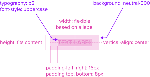
- Text Label: "b2" Typography Variant, Font-Style: Uppercase
The Text Label by design is an opinionated configuration and has forced styling and alignment. It has a center aligned placement inside of the rectangle container area. - Background: neutral-000 (#FFFFFF)
The tab button background has a neutral color fill to provide sufficient contrast with the foreground content for proper presentation. - Margin/padding-left, right: 16px, top and bottom: 8px
List does not come with pre-set spacing values in order to optimize the flexibility of content layout. - Width flexes based on label
These dimensions guarantee that the list remains functional and aesthetically pleasing across different devices and screen sizes, adhering to the principles of responsive design. - Height fits content
The list expands to fit the content, ensuring that the design adapts to content volume while maintaining the list's visual integrity.
Configurations
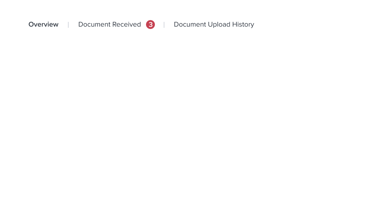
The Tab Button Primary includes pre-set configurations to seamlessly integrate with common scenarios. For example, incorporating a notification badge for status or quantity on the Tab Button helps notify and alert users when the tab panel content requires attention and action to be taken.
Notification Badge
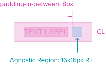
- Agnostic Region (optional), typically contains the notification badge (e.g., dot and count badge)
- Comes with dictated spacing of 8px that appears in-between it and the text label
Design Notes
- Height and Width: 16x16px RT
Uses the standard design system sizing for visual consistency and alignment throughout applications. - Padding-x 8px (dictated)
The agnostic region has a right placement in the tab button and appears after the text label. It has pre-built spacing to dictate the proper distance between the text label and maintains the padding on the right edge.
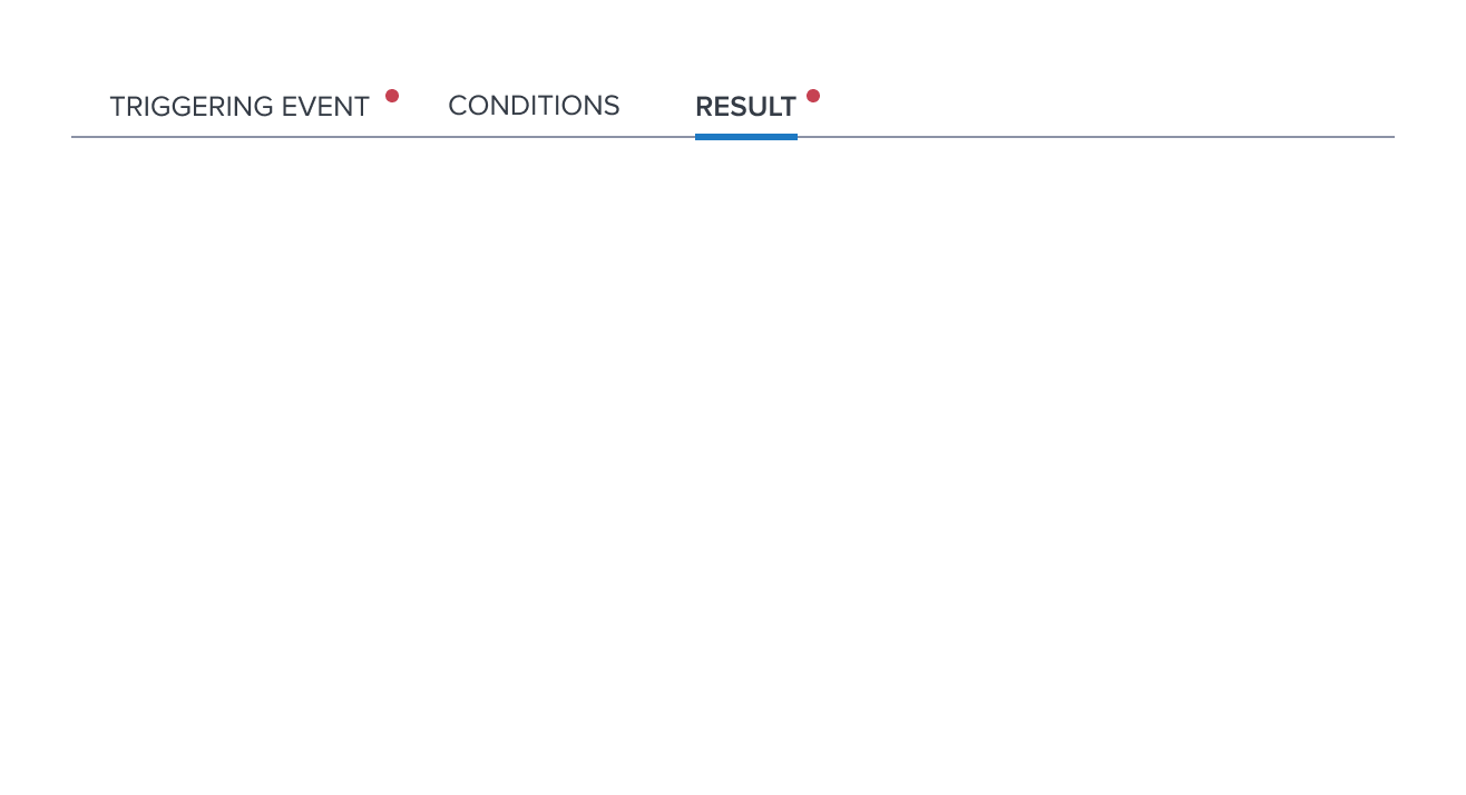
Required Indication
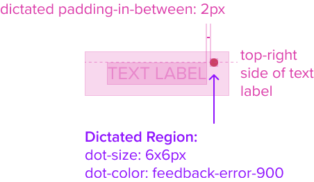
- Dictated Region (always required), tab button has a dot badge to indicate "Required" content in the tab panel
- Comes with dictated spacing of 2px that appears in-between it and the text label
Design Notes
- Dot Badge "Required" Indication, Feedback-Error-900
The dot is an opinionated configuration and has forced styling and alignment. It has a top-right side placement that follows the text label inside of the rectangle container area. - Height and Width: 6x6px RT
Uses the standard design system sizing for visual consistency and alignment throughout applications. - Padding-x 2px (dictated)
The agnostic region has a right placement in the tab button and appears after the text label. It has pre-built spacing to dictate the proper distance between the text label and maintains the padding on the right edge.
Responsive
Layout Provider
Validity Criteria:
- Covers spacing and dimensions: Identifying spacing and dimensions to ensure pieces are A11Y compliant. Use min-width/min-height instead of height/width/max-height/max-width. Define padding/margins in PX, and min-width/min-height in relative measures.
- Covers responsive/adaptive layout: Given the box models, clearly identify how the layout adapts to breakpoints and responsiveness.
| Small | Medium | Large | Description |
|---|---|---|---|
| Add details |
States
| State | Graphic | Default Styling |
|---|---|---|
| Idle |  | typography: b2 font-style: uppercase |
| Selected |  | [vs idle] font-weight: semi-bold Underline: color: brand-600 size: 3px width: matches text label position: vertical centered on tab bar baseline |
| Focus |  | [vs idle] border: 2px solid brand-700 |
| Focus + Selected |  | [vs focus] font-weight: semi-bold underline size: 3px Gap between focus border when combined with selected underline: gap-size: 4px |
| Disabled |  | [vs idle] font-color: neutral-500 |
| Disabled + Hover |  | [vs disabled] cursor: disabled |
| Disabled + Focus | NA | NA |
| Aria-Disabled | | [vs disabled] no change |
| Aria-Disabled + Hover |  | [vs aria-disabled] font-color: neutral-600 cursor: disabled |
| Aria-Disabled + Focus |  | [vs aria-disabled] border: 2px solid brand-700 |
| Hover |  | [vs idle] font-color: brand-600 cursor: pointer |
| Hover + Selected |  | [vs selected] font-color: brand-600 |
| Required / Error |  | [vs idle] required-dot-size: 6x6px dot-color: feedback-error-900 |
| Read-only | NA | NA |
Use Cases
| Original Scenario (Use Case) | Dim Sum Version (Proposed Solution with DS Components) | Scenario Description |
|---|---|---|
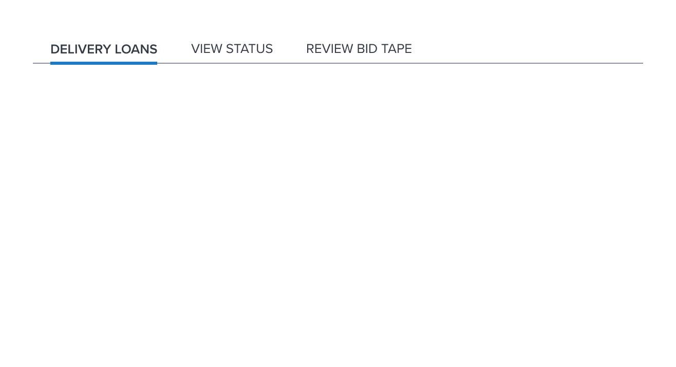
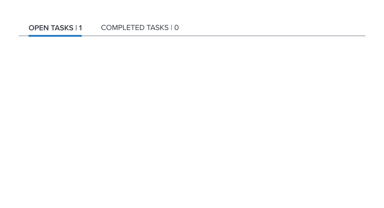
   |  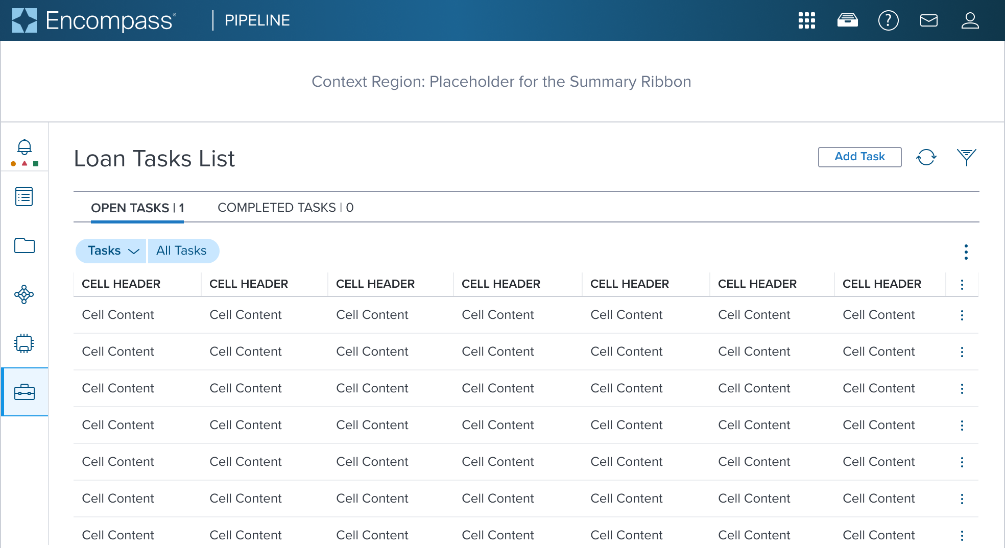  | Primary Tab Buttons: Top scenario: shown at the top of the page, displays the full page content (page header, data table and filter pills). Used for navigation purpose. Middle scenario: shown below the Page Header, displays only a portion of the content (data table and filter pills). Tab buttons showing numerical quantities within the text label. Used for progressive disclosure purpose. Bottom scenario: shown within settings configuration, displays only a portion of the content (left side list and main details on the right side). Tab buttons showing required/error indication. Used for progressive disclosure purpose. |
Examples
| Scenario Graphic | Scenario Solution (100%) | Text Resize and Reflow (200%) | Scenario Description |
|---|---|---|---|
|  | | Primary Button: Tab buttons shown status indicated by a notification badge (e.g., count or dot badge) after the text label. |
|  | | Text Label with Quantity: shown below the Page Header, displays only a portion of the content (data table and filter pills). Tab buttons showing numerical quantities within the text label. Used for progressive disclosure purpose. |
 |  | | Configured with Notification Badge: Tab buttons shown status indicated by a notification badge (e.g., count or dot badge) after the text label. |
|  | | Required/Error Indication: |
Digital Accessibility
The "Tab Button Primary" composable is one of three different components that makes up the Tabs Pattern, it use the following WAI ARIA Pattern and Role:
- Tab: Each element that serves as a tab has role, and is contained within the element with role tablist.
For the Tab Pattern and keyboard Interaction, View the WAI-ARIA Pattern and Role for Tabs
Variants
Tabs offers one variant out-of-the-box that supports size difference, visual appearance, and intended use.
| Scenario Graphic | Scenario Description |
|---|---|
 | Tab Button Primary Small Smaller variant of the primary tab button that offers a compact style for smaller spaces. |
Usage Warnings
This component may have obvious potential to be used incorrectly by UX or product. It is possible there are common implementation pitfalls for app devs as well.
Pitfalls & Misconceptions
Disabled vs Aria-Disabled State When to Use Them
While these two states share the same visual styling, they have different behaviors and usage. Best practice is to avoid mixing disabled buttons and aria-disabled buttons together in a page UI. This can potentially cause confusing behaviors for the user.
Disabled: this state is used when a tab button needs to be skipped in the page UI. This state ensures the visual is still in place, but does not receive keyboard focus or announcement by a screen reader. It MUST never be used in the same context as the 'Aria-Disabled' state to avoid confusion for the user.
Aria-Disabled: this state is used to ensure a tab button receives tab focus order and has screen reader announcement in place to provide the user with proper context. This interaction state MUST never be used in the same context as the 'Disabled' state to avoid confusion for the user and a11y compliance.
Reference
Objective:List external references, guidelines, or documentation that provide further context or information about the component.