v2.0.0
Overview
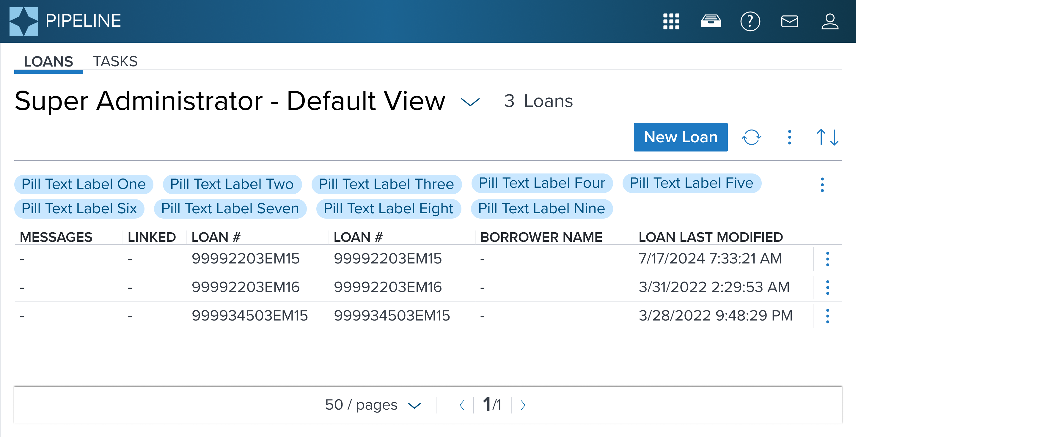
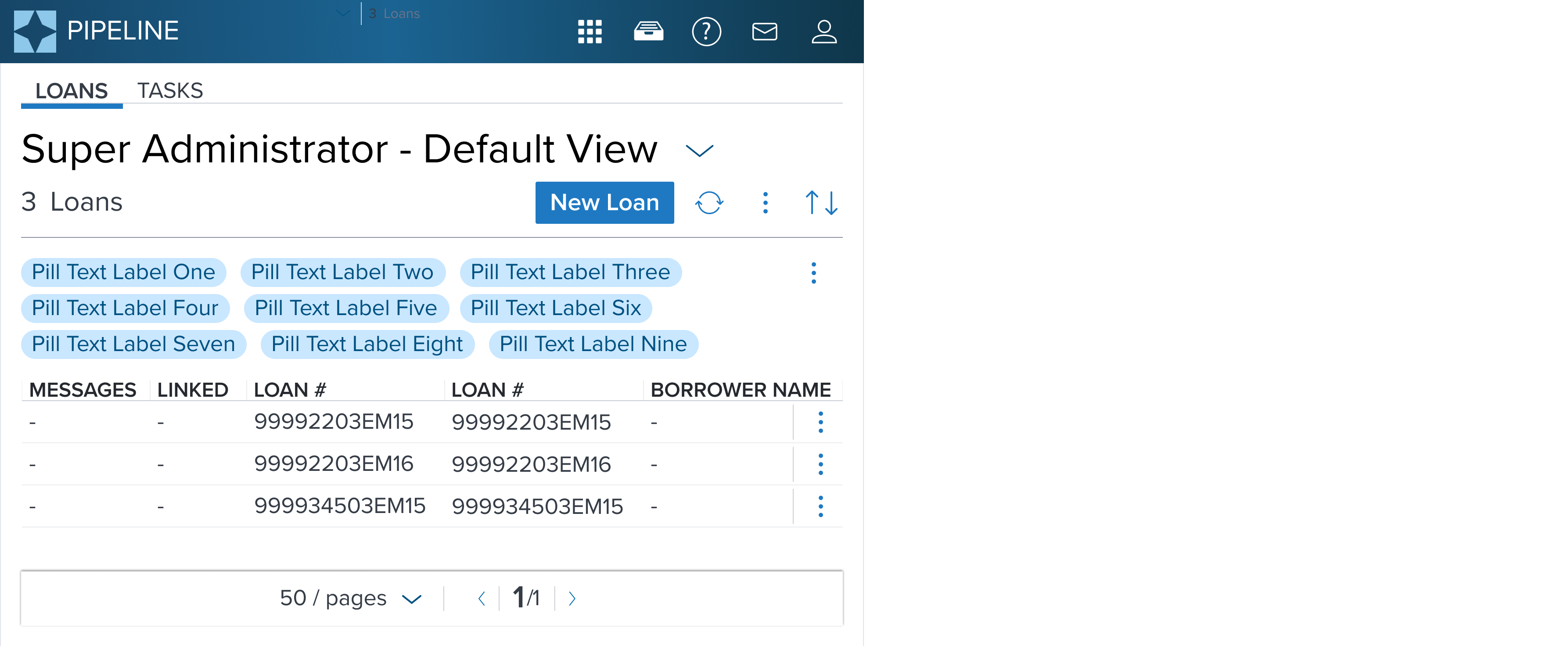
Value Pill is a data display element that can present static or interactive content in a variety of compact types for different use cases. It always displays a text label, can trigger action, or provide visual representation of chosen filter options that may be quickly added or removed by the user.
Design
The Pill component does not have a default variant in its implementation. For specification purposes, the Value Pill will be used as the default configuration.
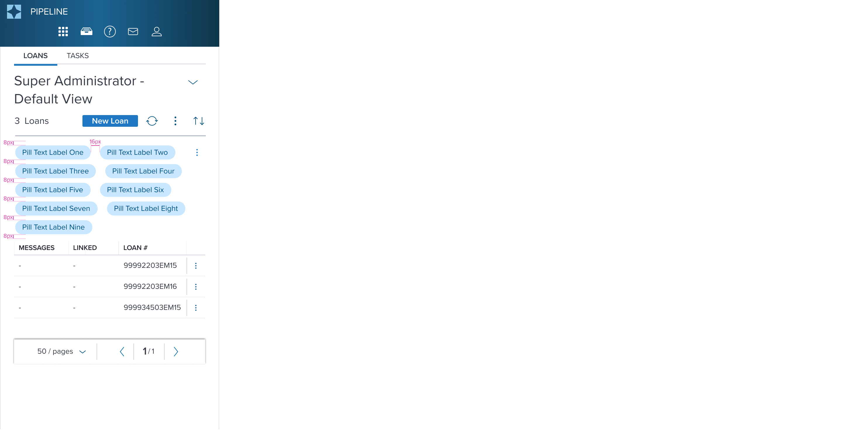
The Value Pill has a rectangular container design with border radius and displays a static text label.
Box Model
Value Pill Box Model is designed with specific features to ensure that it meets its core objectives as a container for structured, visually appealing content within a user interface. In order to accomplish this, Pill includes two region types.
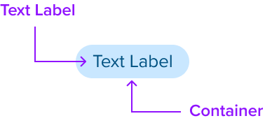
Dictated Regions (Always required)
- Text Label
- Container
Dictated Region Design Notes
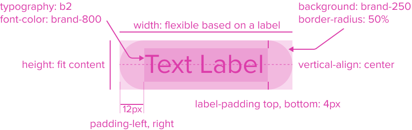
- Text Label: "b2" Typography Variant, Font-Color: Brand-800
The Text Label by design is an opinionated configuration and has forced styling and alignment. It has a center aligned placement inside of the rectangle container area. - Background: Brand-250
The Value Pill background has a brand color fill to provide sufficient contrast with the foreground content for proper presentation. - Border Radius: 50%
The rounded edges make the interface appear softer and more inviting, providing an intuitive, user-friendly and accessible interface. - Height: fit content
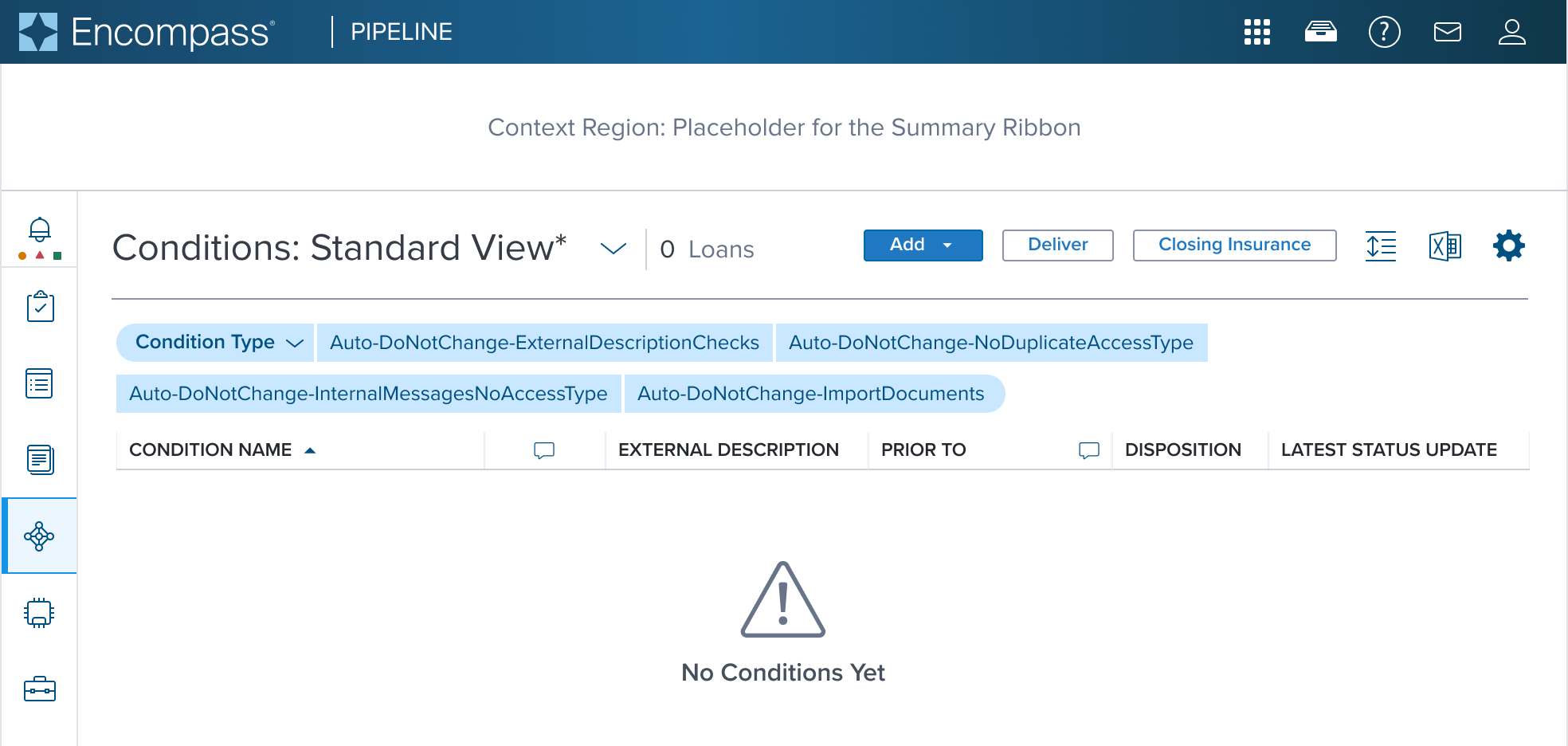
- Width: flexible based on a label
- Max-Width: Fit to parent, if exceeds wrap to multi lines
- Label-padding top, bottom: 4px
- Padding-left, right: 12px
Box Model Configurations
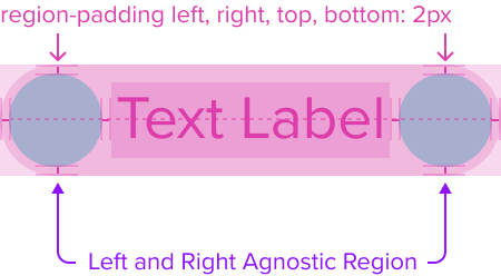
The Value Pill can have three optional preset configurations out-of-the-box. it can be configured with agnostic region's shown on the left-side, right-side, or both left and right-side of the text label. These regions can be shown sequentially or shown separately, and come with pre-built spacing to dictate the proper distance between the text label and the container.
Agnostic Region's are typically for adding a decorative or interactive elements alongside a text label to enhance the usability, aesthetic, and accessibility. They serve as quick visual cues, helping users recognize and identify the purpose of the pill faster, providing understanding of various actions to be taken.
Value Pill offers a set of predefined composables out-of-the-box. Each of them comes with simplified interactions, accessibility, each serving a different and unique role. To learn more, see Pill Composables.
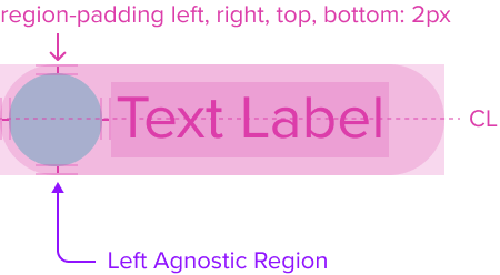
Left-Side Agnostic Region (optional)
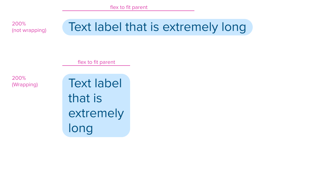
Value Pill can be configured with an agnostic region placed on the left-side shown before the text label. It's typically shows a static icon to convey the main meaning (e.g., category, status, or type).
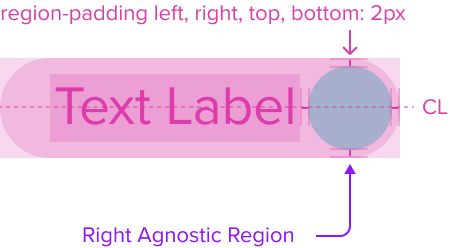
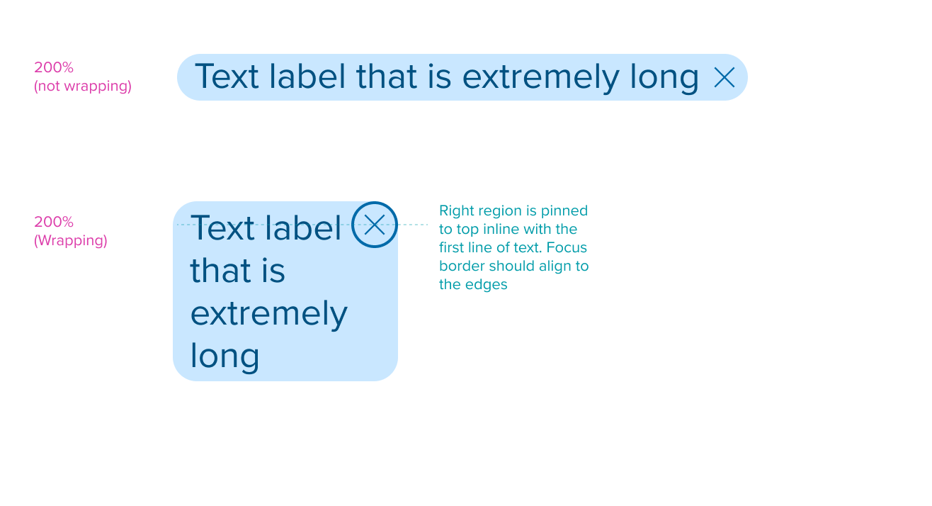
Right-Side Agnostic Region (optional)
Value Pill can be configured with an agnostic region placed on the right-side shown after the text label. It can show a static icon to offer additional context or interactive icon button to trigger action (e.g., close, edit, or expand).
Left-Side and Right-Side Agnostic Region (optional)
Value Pill can be configured with left-side and right-side region's shown sequentially. This arrangement typically shows a main static icon in the left-side region to convey the pills main meaning (e.g., category, status, or type), combined with an static icon shown in the right-side region to offer additional context or interactive icon button to trigger action (e.g., close, edit, or expand).
When using this arrangement, it's important to know that two interactive elements MUST never be shown in a single pill sequentially, and MUST be limited to one action per pill. Icon buttons to trigger action MUST only be shown in the right-side region, and the left-side region should be reserved for main static icons. This avoids confusing behavior and conflicting actions from occurring in the pill and overall user experience.
Design Notes
These configurations use all the visual styles from the Value Pill, and may also include any of the following according to the use case and requirements.
- Height: fit content
- Width: flexible based on its content (e.g., text label, configured left or right region)
- Agnostic Region-dictated padding-left, right, top, bottom: 2px
Responsive Layout
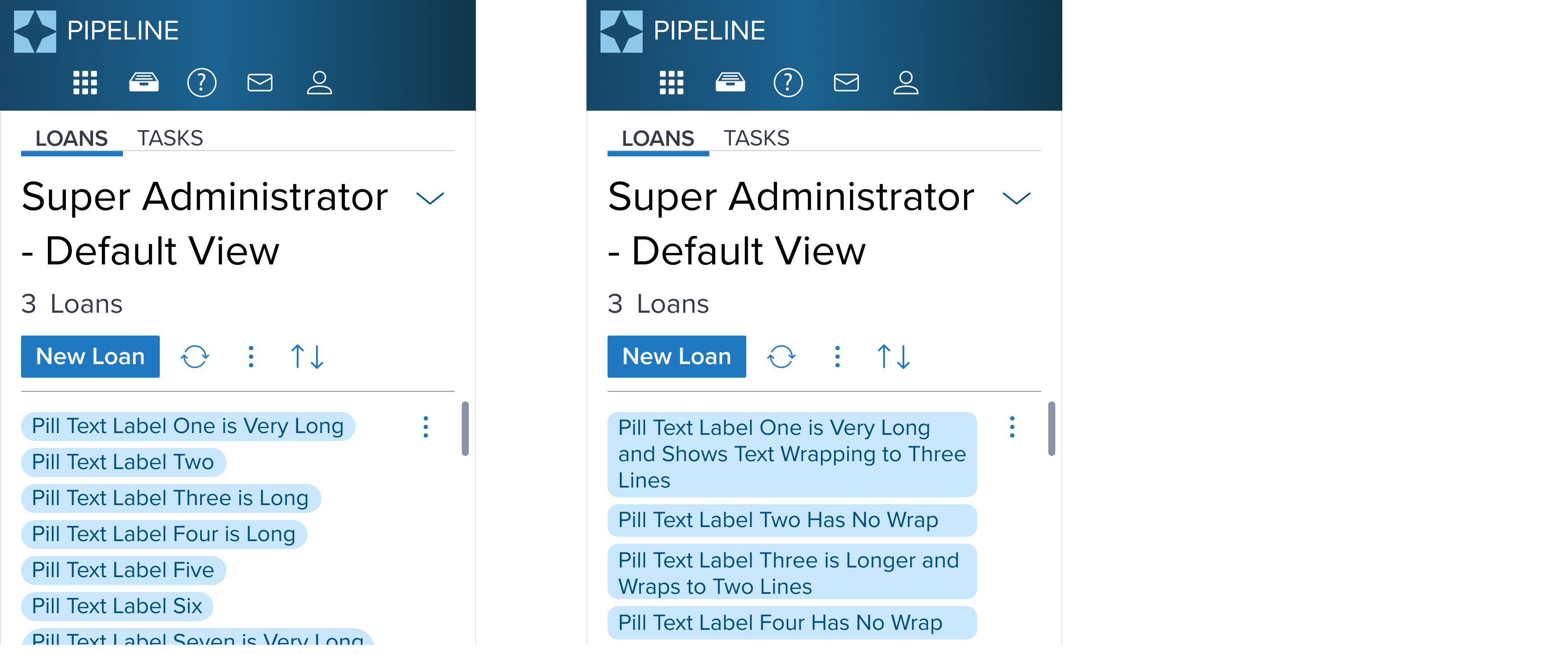
The Value Pill is designed with a responsive box model that by default has a height and width that flexes to fit its content while respecting the fixed spacing that is in place. This provides a baseline for content scalability accounting for resize and reflow to ensure a consistent and accessible user experience.
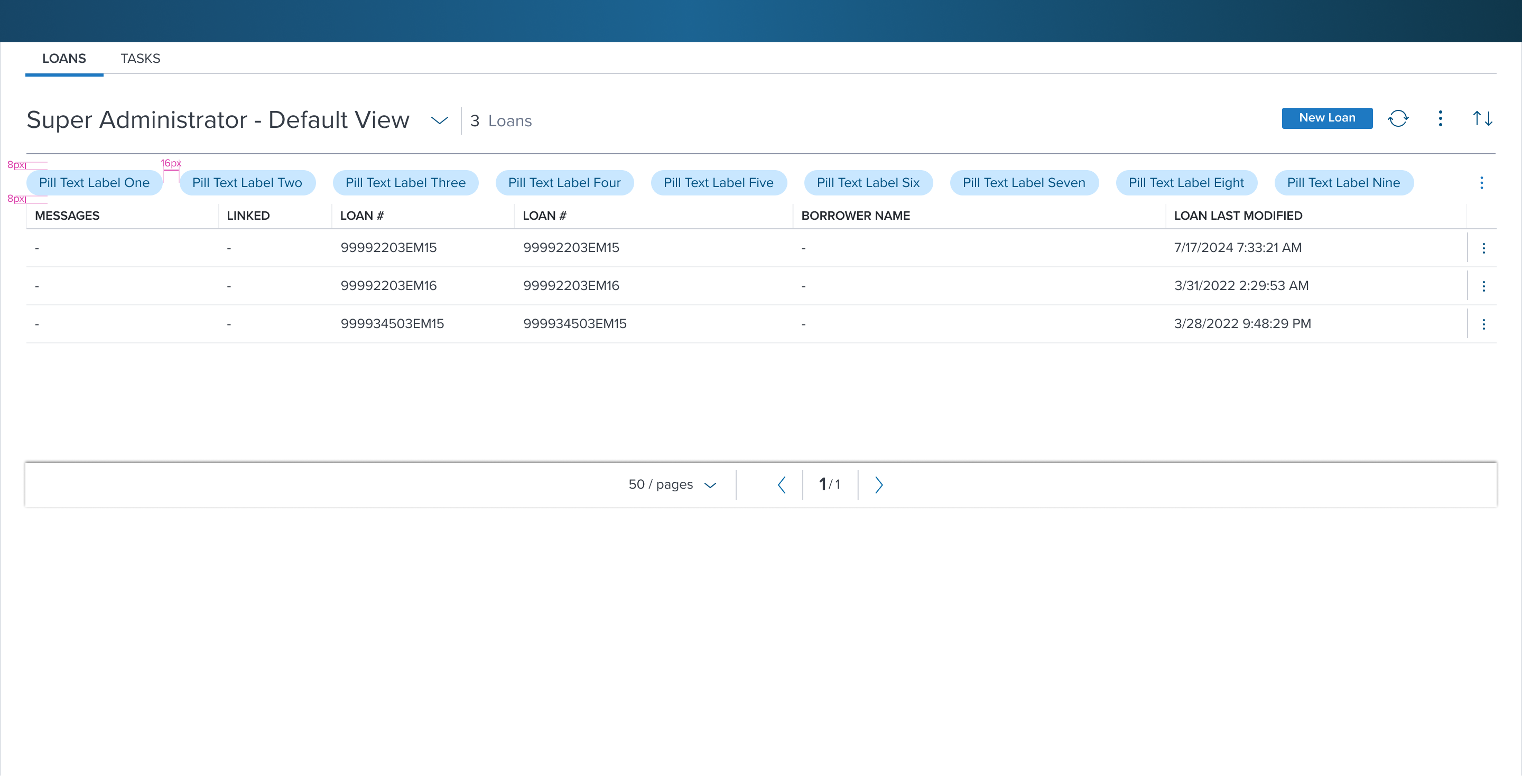
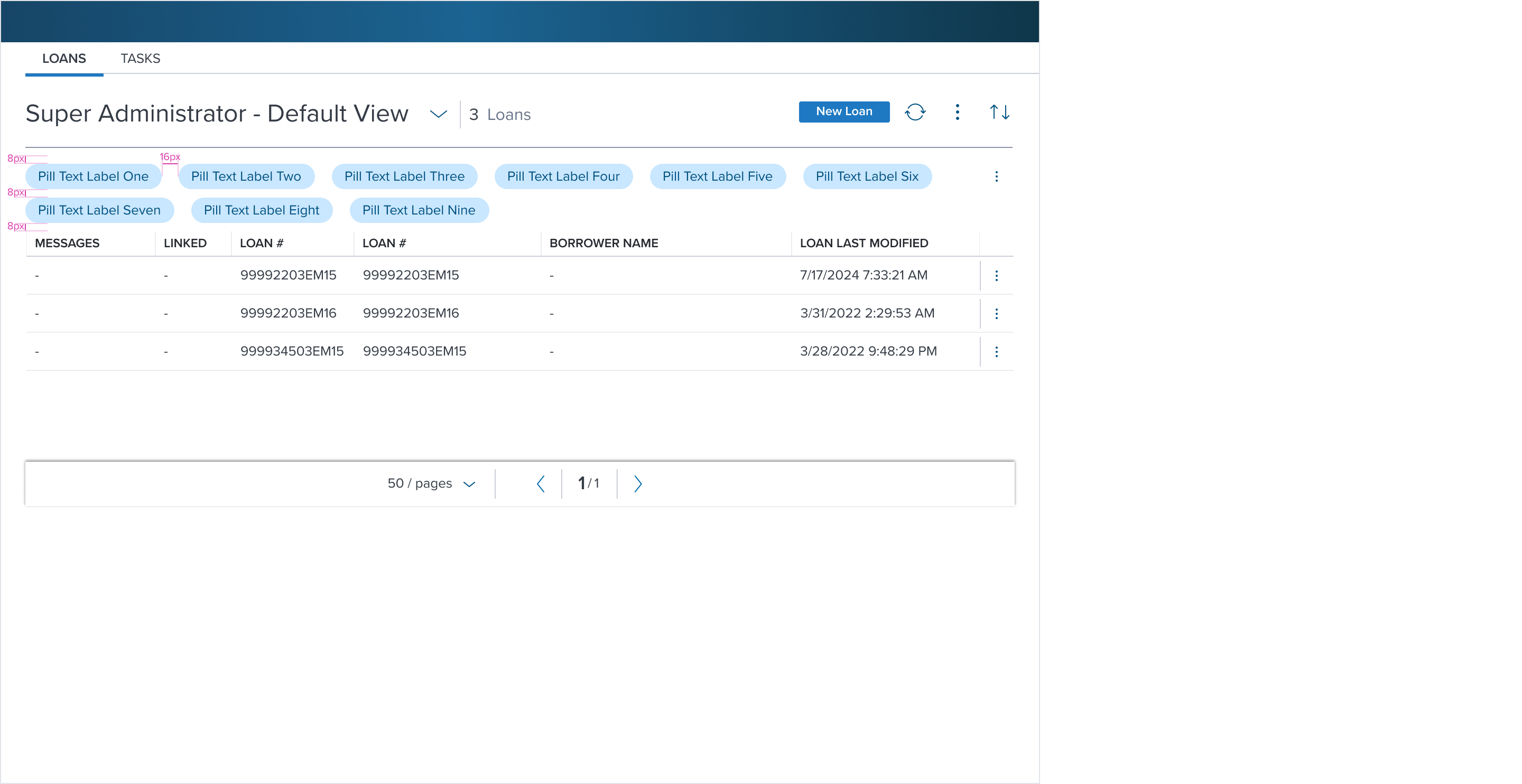
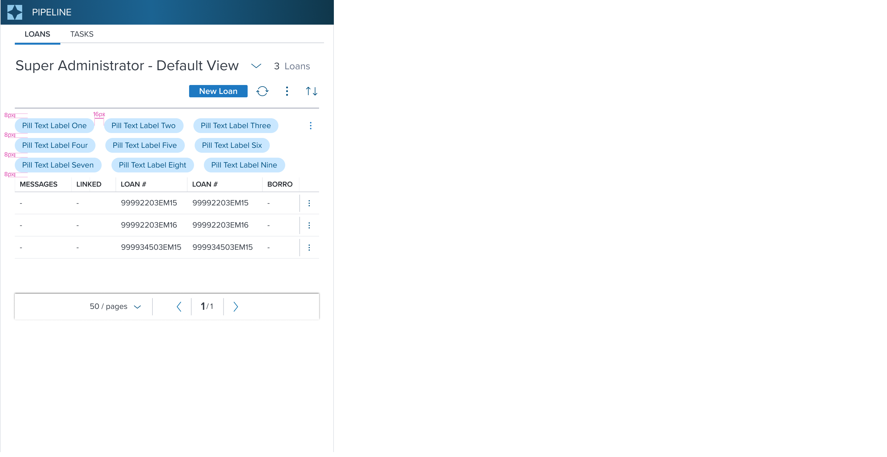
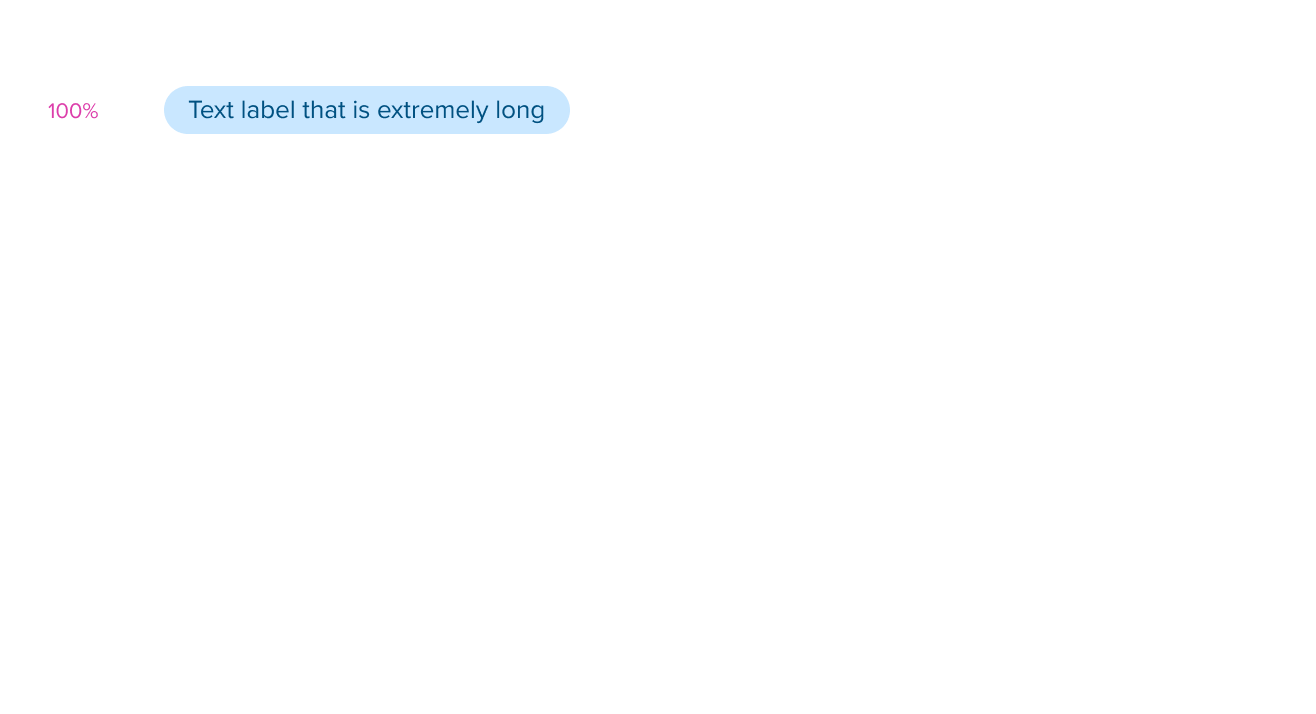
- Value Pill Groups Wrap in Parent Container: The max-width is defined by the width of the parent container of the Value Pill plus padding. When multiple Value Pills are shown and exceed the max-width of the parent container, they will wrap to multiple lines.
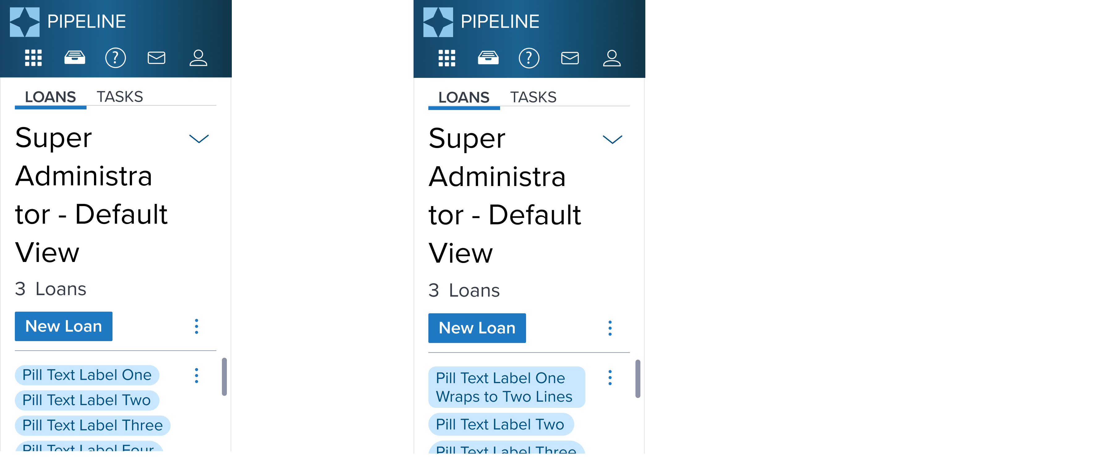
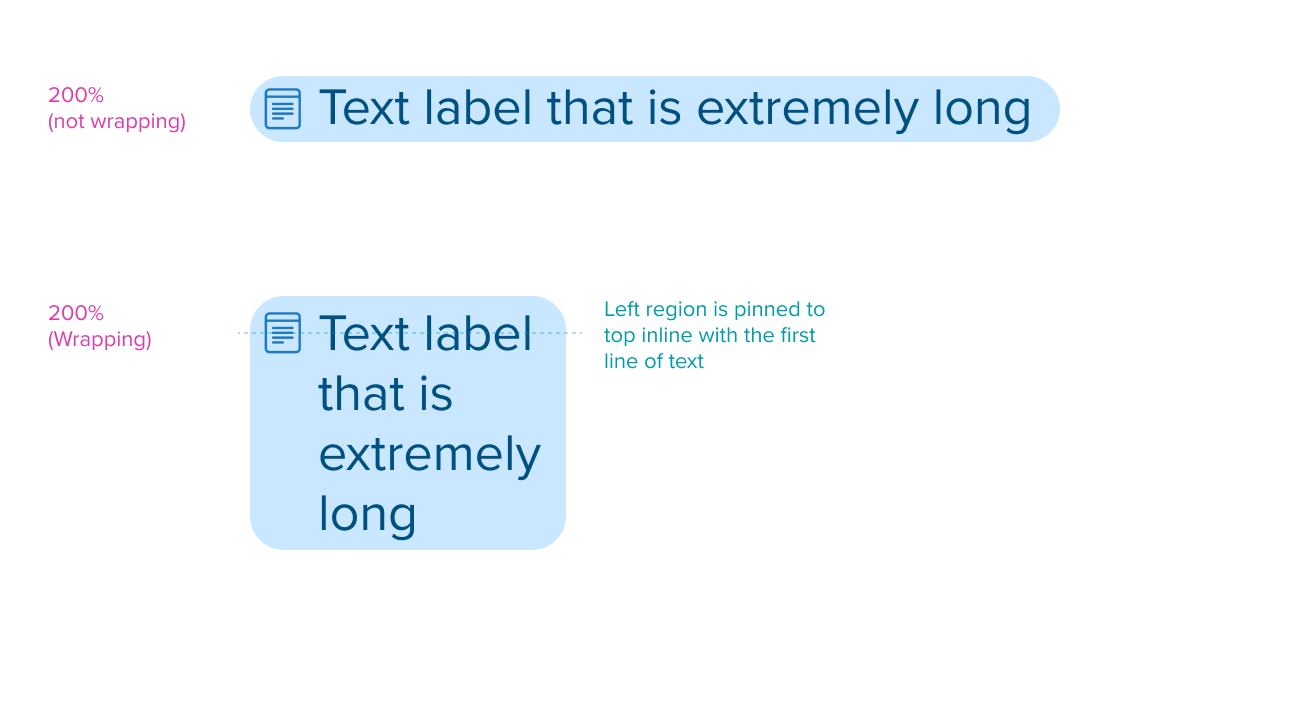
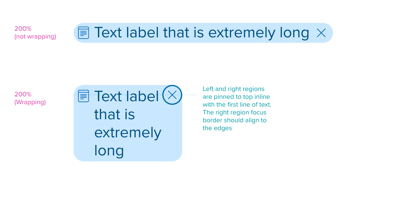
- Value Pill Text Label Wraps in Value Pill Container: In the case where text labels are long and the max-width of the parent container has been reached, text labels will wrap to multiple lines increasing the pill container height from top down pushing other elements down the page. This helps maintain visibility in the parent container and the Value Pill container to avoid truncation.
- Value Pill Segments and Text Labels Never Break: When Value Pills exceed the parent container max-width, its container and text label inside will always stay together and never break apart to fill the available space of the parent container. The Value Pill Segment will wrap to the next line and not fill the available space from the first line. This allows each pill and its text label to stay together in full context helping the readability and avoid confusion for the user.
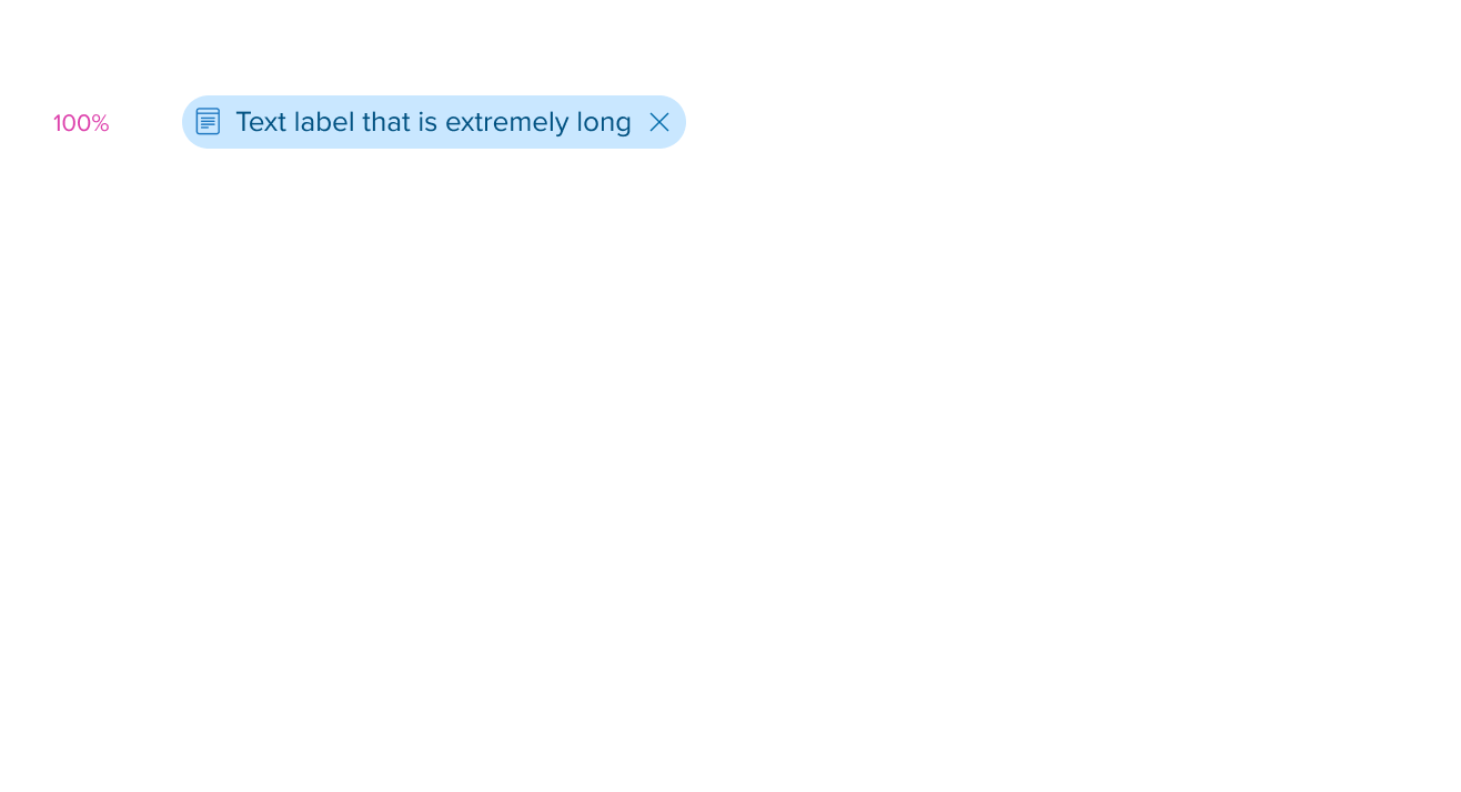
Layout Provider Examples (100%)
| Large | Medium | Small | Extra Small |
|---|---|---|---|
 |  |  |  |
| Pills shown on one line in parent container when max-width is not reached | Pills wraps to two lines when parent container max-width is reached | Pills wraps to three lines when parent container max-width is reached | Pills wraps to multiple lines when parent container max-width is reached |
Layout Provider Examples (200% Text Resize & Reflow)
| Large | Medium | Small | Extra Small |
|---|---|---|---|
 |  |  |  |
| Pills wrap to two lines when exceeds parent max-width | Pills wrap to three lines when exceeds parent max-width | Pills / Pill Text Label wraps to multiple lines when exceeds parent max-width | Pills / Pill Text Label wraps to multiple lines when exceeds parent max-width |
For Resize and Reflow behavior, see Examples
States
| State | Graphic | Default Styling |
|---|---|---|
| Idle |  | typography: b2 font-color: brand-800 background-color: brand-250 |
| Hover | NA | NA |
| Focus | NA | NA |
| Disabled / Disabled + Hover / Disabled + Focus | NA | NA |
| Aria-Disabled / Aria-Read Only / Aria-Disabled / Aria-Read Only + Hover / Aria-Disabled / Aria-Read Only + Focus | NA | NA |
| Error / Error + Hover / Error + Focus | NA | NA |
Use Cases
| Original Scenario (Use Case) | Dim Sum Version (Proposed Solution with DS Components) | Scenario Description |
|---|---|---|
 |  | Label Pill Variant used with Removable Value Pill shown within the main content region. Label Pill with Removable Pill was manually filtered directly from left panel. The section header labels are reflected in label pill and the selected checkboxes are reflected in the value pills. |
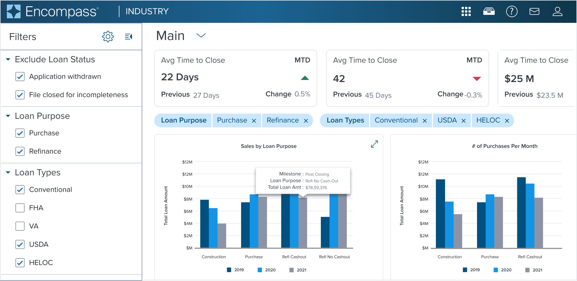
 | 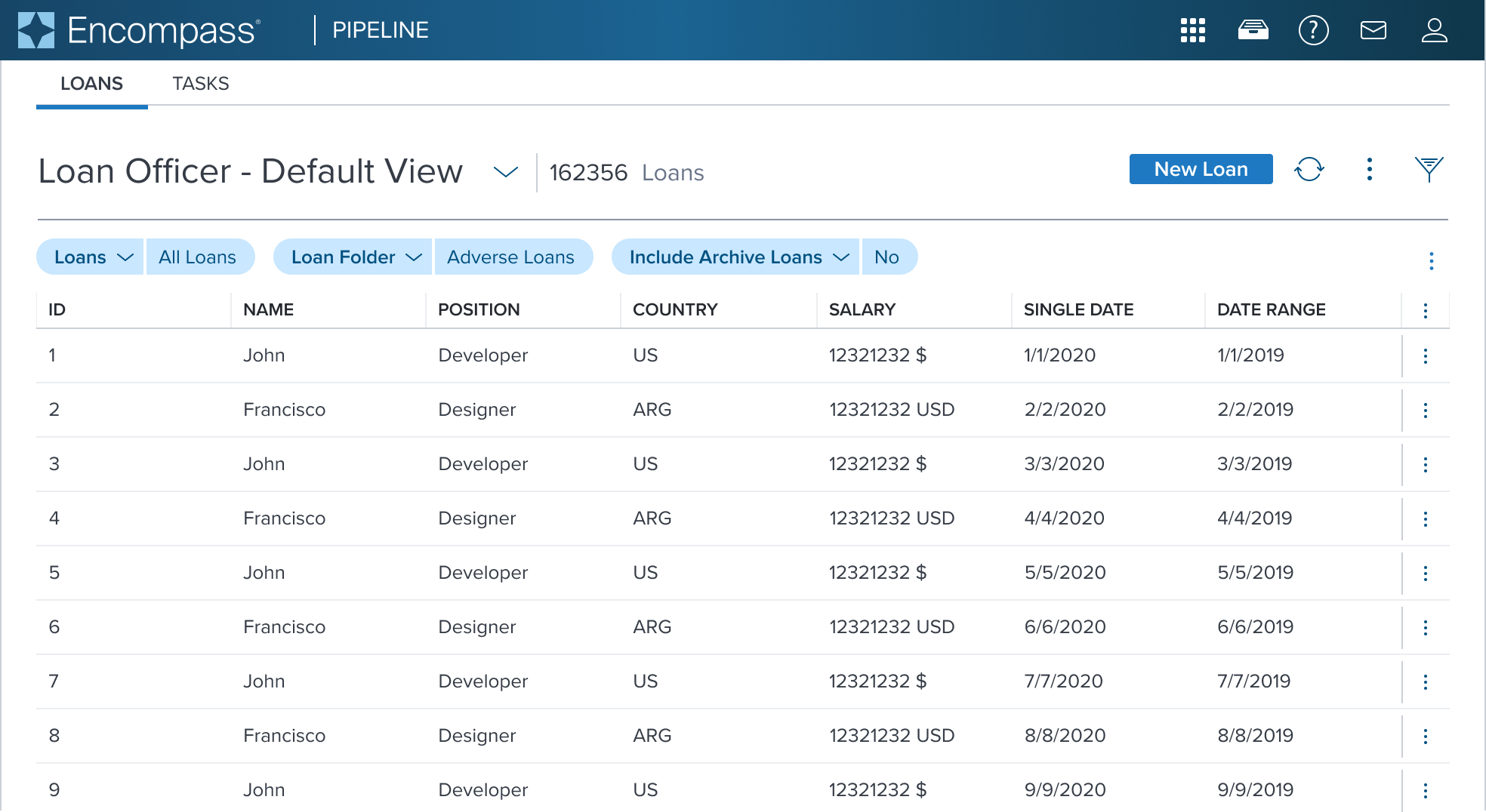 | Preselected Single-Select Native Pills shown within the main content region below page header and data table. |
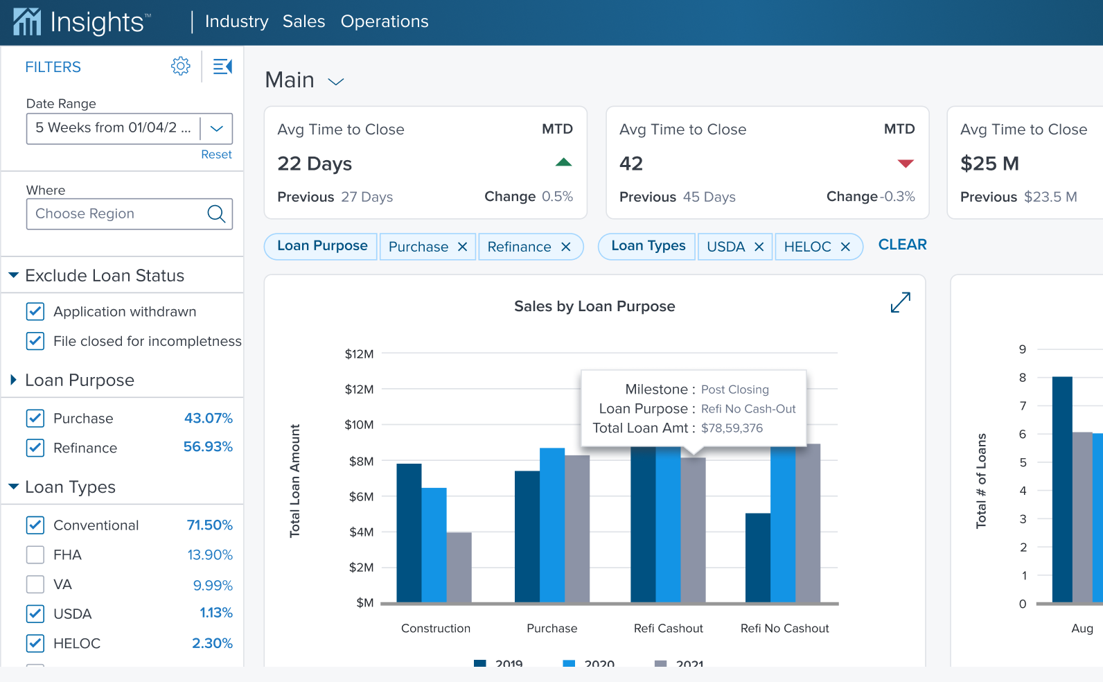
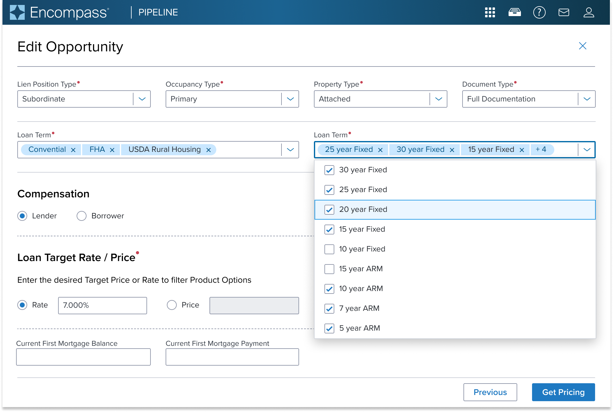
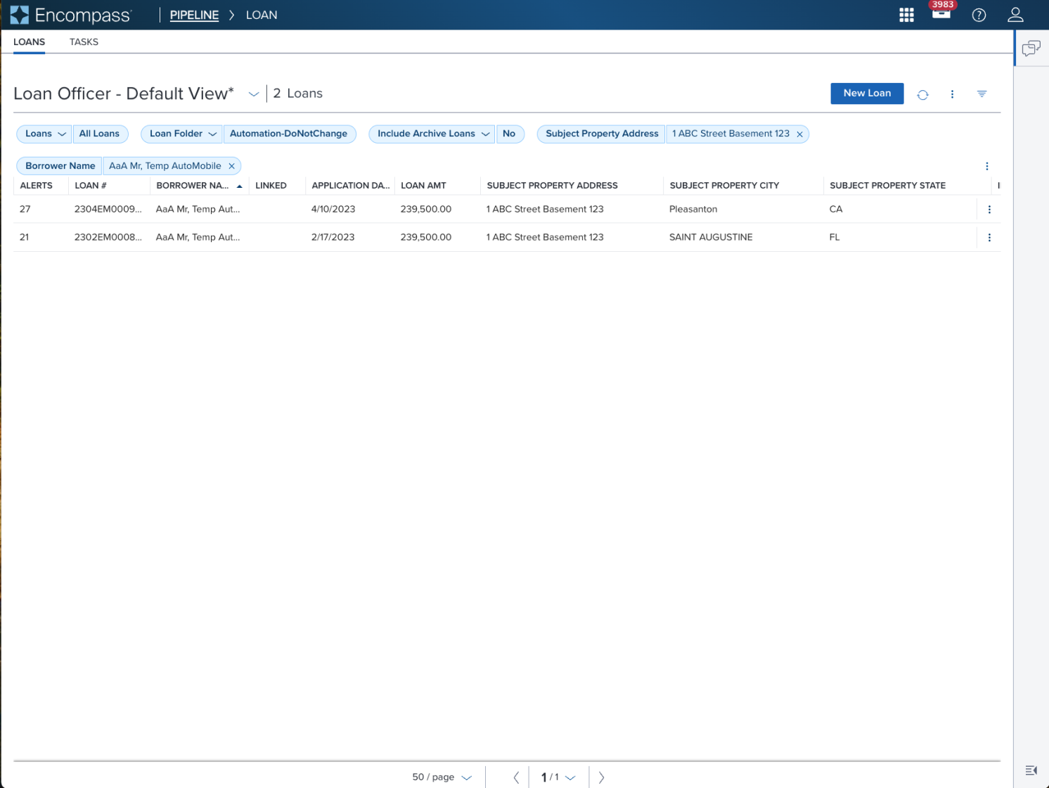 |  | Pill shown within the main content region with page header and data table. First row shows Single-Select Native Pill that were preset on page load. Second row shows Label Pill with Removable Pill that was manually filtered directly from columns in the data table. The column header labels are reflected in label pill and the filtered results are shown in the value pills. |
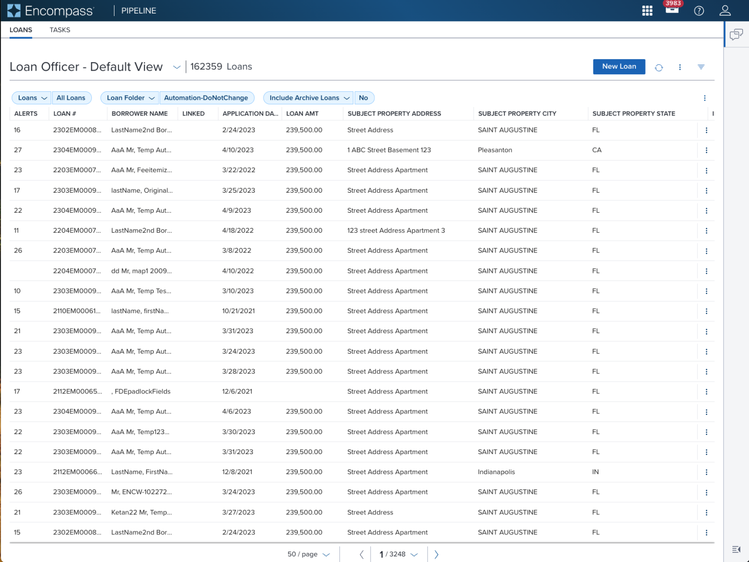
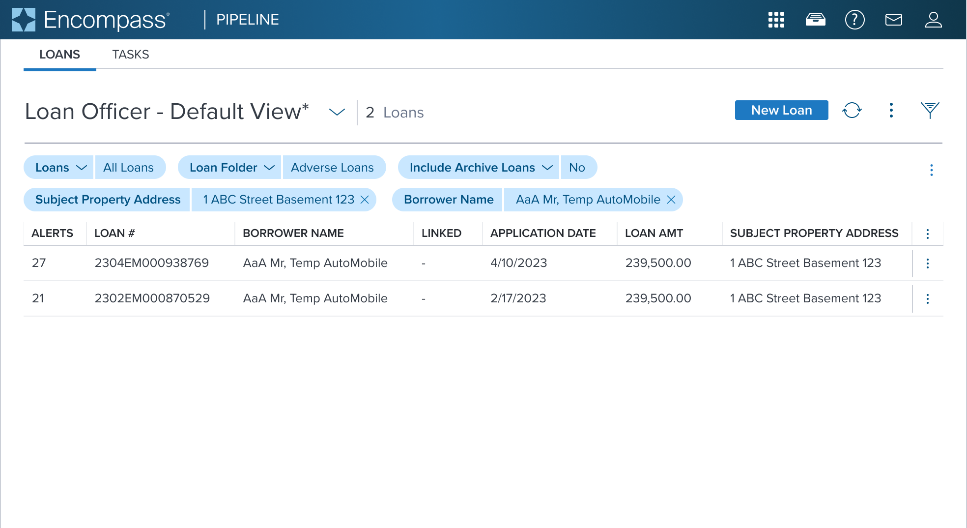
 |  | Multi-Select Native Pill shown within the main content region with page header and data table. When multiple value pills are present and exceed the space, they wrap to multi lines to avoid breaking text labels. |
Examples
| Scenario Graphic | Scenario Solution (100%) | Text Resize and Reflow (200%) | Scenario Description |
|---|---|---|---|
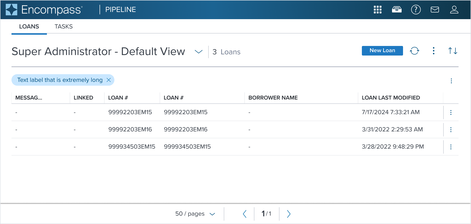
 |  |  | Value Pill Text label wraps to multiple lines within its container |
 |  |  | Value Pill + Left Region |
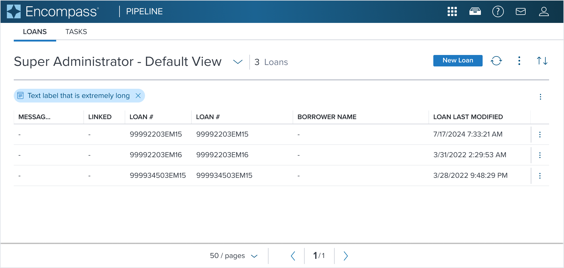
 |  |  | Value Pill + Right Region |
 |  |  | Value Pill + Right and Left Region |
Composables
The Value Pill widget has predefined examples out-of-the-box. Each offers simplified interactions, accessibility, serving a different and unique role.
| Composables | Link and Description |
|---|---|
 | Removable Value Pill composed with a removable icon button. It can enable users to quickly remove the pill from filtered options. |
 | Menu Button Label Pill Variant composed with the Menu Button component identified by a chevron icon to open a menu and can display one or more chosen options inside. |
 | Single Select Label Pill Variant and Value Pill composed with the Single Select Native component. It has an icon button to open a dropdown menu and can display one inline selection chosen from the dropdown menu list of options. |
 | Multi Select Label Pill Variant and Value Pill composed with the Multi Select Native component. It has an icon button to open a dropdown menu and can display one or more inline selection chosen from the dropdown menu list of options. |
 | Group The Group composable can show multiple static or interactive Label Pill Variant and Value Pill types arranged together in a horizontal orientation. |
Variants
Value Pill offers two variants out-of-the-box that support size difference, visual appearance, and intended use. The Value Pill, used as a default only for the purposes of the spec, and the Label and Small Pills which are shown below in the table.
| Scenario Graphic | Scenario Description |
|---|---|
 | Label Pill The Label Pill Variant is used for categorization, tagging or grouping. It can present static or interactive content and can be shown stand alone or together with a Value Pill. |
 | Small Pill The Small Pill Variant has a smaller pill size to accommodate compact areas where space is limited. This variant is typically used in the Multi Select Combo Box Input to display selected options. |
Digital Accessibility
Value Pill by default serves as a read-only data display element and is not in the tab order, are not interactive, and do not receive focus. It does not introduce specific accessibility concerns.
Usage Warnings
When using the Value Pill component, there are several important warnings, pitfalls, and misconceptions that are encountered. Below are some common issues and guidelines on how to avoid them to ensure accessibility, usability, and proper functionality.
Pitfalls & Misconceptions
- Overuse of Value Pill in a confined space should be avoided as this can cause overflow issues to occur if too many pills exist within the design. Pills by design will wrap to multiple lines to maintain proper visibility and context for the user.
- Text labels in the Value Pill should be kept simple, short and concise to avoid truncation issues. Pills are meant to display easy-to-scan content that can be quickly acted on. If longer text labels are shown this can clutter the design and cause cognitive overload for the user.
- Displaying status indications in a Value Pill MUST be avoided. There purpose is to display static or interactive content or provide visual representation of chosen filter options that may be quickly added or removed by the user.
Alternate Components
- Notification Badge: Use when you need a small, minimal, and easy to scan non-interactive label to display status, alerts, or count that works well with notifications.
- Typography Inline Feedback and Highlight Variant: Use to enhance the visual appeal and readability of textual content with a highlight to draw attention to specific text segments.
- Card v3: Use to present distinct pieces of information to offer better content organization, visual separation, and hierarchy.