Overview
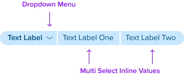
This uses the Label Pill Variant and is composed with the Multi Select Native component. It has an icon button to open a dropdown menu and can display one or more inline selections chosen from the dropdown menu list of options.
Design
The design shows a left segment that uses the Label Pill Variant and includes a down-facing chevron icon shown after the text label. The middle and right inline segments use the Value Pill that shows a text label only.
Box Model
The box model has a left segment with an agnostic region shown after the text label to support interaction. The middle and right segments only have a text label.
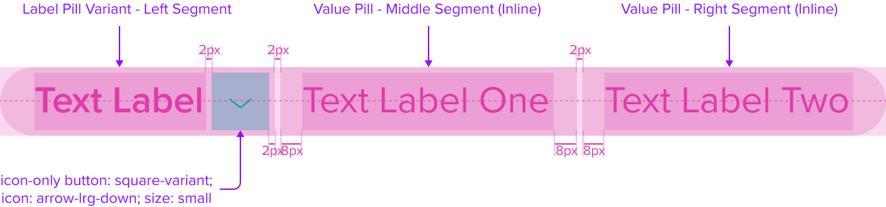
This composable uses all the visual styles from the Value Pill, and may also include any of the following according to the use case and requirements.
- Label Pill Variant - Left Segment: Padding-left 12px, between label and right 2px, border radius-left 50%, right is none
- Icon "Arrow-Lrg-Down" Icon Only Button, "Small" Square Variant: See Button V3 Spec for Details
Uses the standard brand design system color and visual styling that offers sufficient contrast to delineate it as a distinct interactive element. - Value Pill - Middle Segment (Inline): Padding-left and right 8px, border radius-left and right is none
- Value Pill - Right Segment (Inline): Padding-left 8px, right 12px, border radius-left is none, right 50%
- Padding between segments: 2px
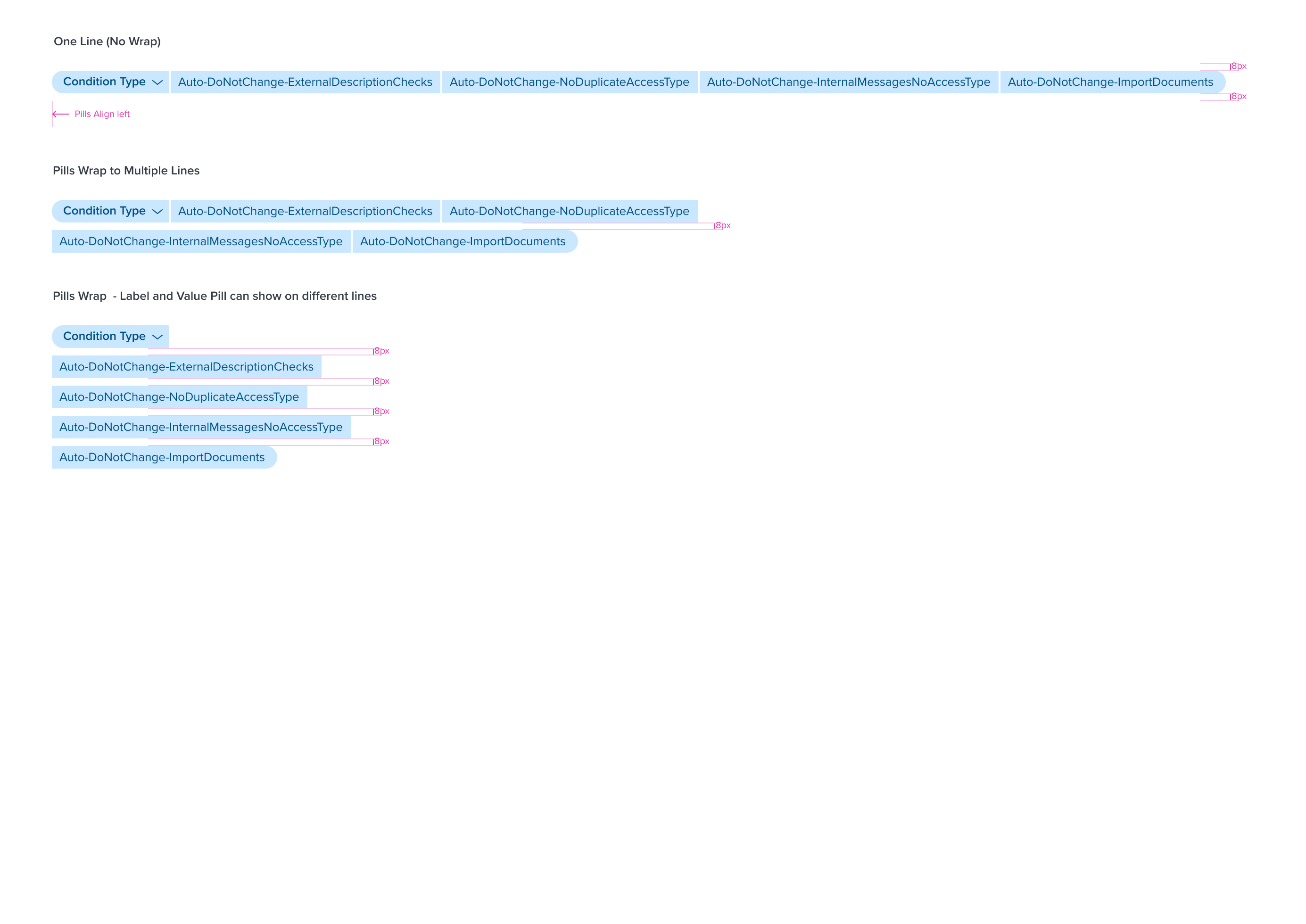
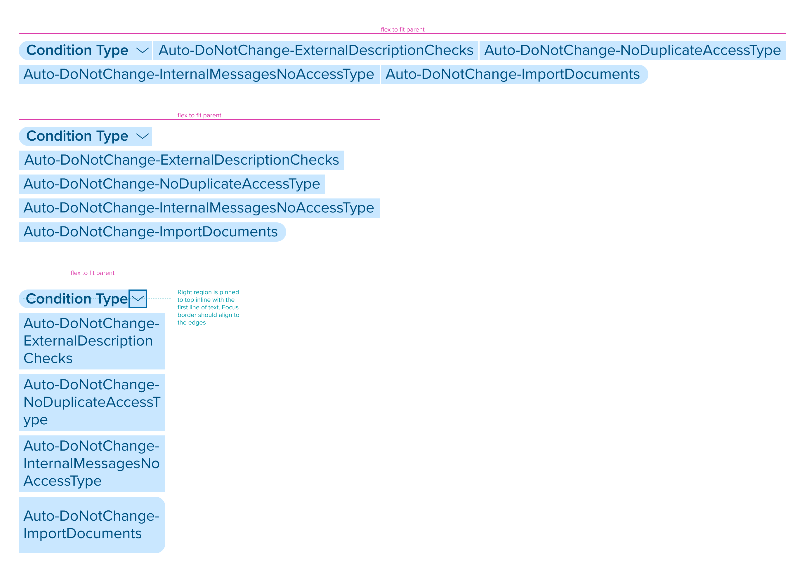
Responsive Layout
This composable uses all the responsive behavior from the Value Pill, and may also include any of the following according to the use case and requirements.
- When the Pill group reaches the parent container max-width, and the Value Pill Right Inline Segments do not have enough space to stay on the first line with the Label Pill Left Segment, they can wrap to the second line and be shown separately to fill the space.
- Label Pill Variant - Left Segment (Icon Button) is pinned to top inline with the first line of text. The focus border should align to the edges of the pill container.
For Resize and Reflow behavior, see Examples
States
This composable uses all the interaction states from the Value Pill, and uses the button component icon only variant. The native states are managed by the atomic elements that are placed within it. See the Button Specs Here
| State | Graphic | Default Styling |
|---|---|---|
| Idle |  | typography: b2 font-color: brand-800 font-style: semi-bold |
| Hover |  | [vs standard idle] see button spec |
| Focus |  | [vs standard idle] see button spec |
| Disabled |  | [vs standard idle] see button spec |
| Disabled + Hover |  | [vs standard disabled] see button spec |
| Aria-Disabled / Aria-Read Only |  | [vs standard idle] see button spec |
| Aria-Disabled / Aria-Read Only + Hover |  | [vs standard aria-disabled/aria-read only] see button spec |
| Aria-Disabled / Aria-Read Only + Focus |  | [vs standard aria-disabled/aria-read only] see button spec |
| Error / Error + Hover / Error + Focus | NA | NA |
Configurations
This composable has no known-of configurations.
Use Cases
| Original Scenario (Use Case) | Dim Sum Version (Proposed Solution with DS Components) | Description |
|---|---|---|
 |  | Multi-Select Native Pill shown within the main content region with page header and data table. Pills wrap to multi lines when exceeds space. |
Examples
| Scenario Graphic | Scenario Solution (100%) | Text Resize and Reflow (200%) | Scenario Description |
|---|---|---|---|
 |  |  | Pill groups and Pill content shown on one line and wrapping to multiple lines when exceeds the parent container max-width. |
Digital Accessibility
Multi Select Native has a left segment that is interactive and in the tab order receiving focus on the down-facing chevron icon-button. Pressing Enter or Space will open and close the menu.
It can include one or more inline value pill segments (middle and right) that serve as a read-only data display element and is not in the tab order, are not interactive, and do not receive focus. It does not introduce specific accessibility concerns.
It is crucial to ensure that all content placed within the right-side agnostic region of the left segment pill is accessible. The responsibility for accessibility lies with the content and interactive elements integrated within the pill.
Designers must adhere to accessibility guidelines for text, images, interactive controls, and other content types to ensure the overall accessibility of the pills content.
Variants
This composable has no known-of variants.
Usage Warnings
Pitfalls & Misconceptions
This composable uses carries the same usage warnings from the Value Pill, and may also include any of the following according to the use case and requirements.
- To maintain native HTML pattern and behaviors, this component does not support using the 'Removable Pill', but instead requires the user to remove a selected inline value from the dropdown menu list of options.
Alternate Components
- Combo Box Use when there are many states or selectable items and one or more can be selected. This component is best used when space is at a premium and essential content requires progressive disclosure.