Overview
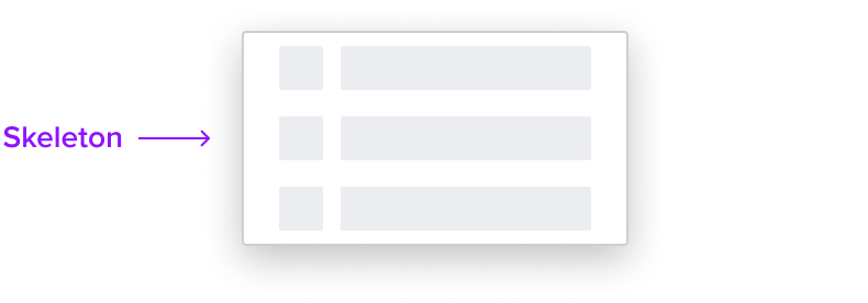
Skeleton is a specialized list item that serves as a placeholder when the list items are not yet loaded. It uses the 'S1' loading pattern for rendering fidelity.
A skeleton loading state should be used when content takes longer than a second, but no more than three seconds to load, providing a visual placeholder that mimics the structure of the upcoming content, thus reducing perceived loading time.
Design

Box Model

This composable uses the following visual styles.
- Left Region 20x20px
A left region is present to indicate a left element is likely to be in the list item. It helps differentiate from other single region skeleton's and provides a visual appeal for a better look and feel. - Right Region 20px Height and Width flexes
A standard region that represents the menu item data that is always present. - Left & Right Region Corner radius 1px
The main and left region's have rounded edges that provide a softer and more inviting look and feel. - Region Color neutral-080
The main and left regions maintain a neutral color fill to provide sufficient contrast over the background for proper presentation. - Background neutral-000
The background maintains a neutral color fill to provide sufficient contrast with the foreground content for proper presentation. - Padding-y 6px & Padding-x 16px
This composable comes with pre-set spacing values to ensure correct spacing and consistent styling, which follow Dim Sum standards. - Min-Height 32 RT
Uses the standard list styles. - Min-width 64 px:
Uses the standard list styles.
Responsive Layout
This composable uses the standard list responsive behavior.
List Item States
| State | Default Graphic | Default Styling |
|---|---|---|
| Idle |  | [vs standard idle] background: neutral-000 skeleton: neutral-080 |
| Focus-Active |  | [vs standard idle] background: brand-200 border: 1px solid brand-500 |
| Hover |  | [vs standard idle] background: brand-200 |
| Aria-Read Only / Aria-Disabled Disabled - Idle |  | [vs standard idle] no change |
| Aria-Read Only / Aria-Disabled Disabled - Hover |  | [vs standard hover] no change |
| Aria-Read Only / Aria-Disabled Disabled - Focus |  | [vs standard focus-active] no change |
| Disabled | N/A (no required cases) | N/A |
| Error | N/A (no required cases) | N/A |
Configurations
This composable has no known-of configurations.
Use Cases
| Original Scenario | Dim Sum Version | Scenario Description |
|---|---|---|
| No known-of-use cases | NA | NA |
Examples
| Scenario Graphic | Scenario Solution (100%) | Text Resize and Reflow (200%) | Scenario Description |
|---|---|---|---|
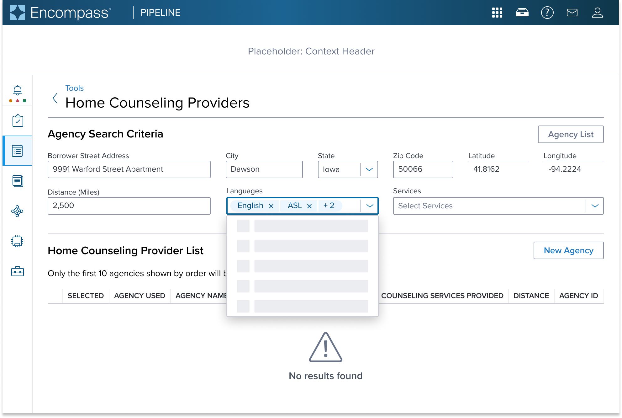
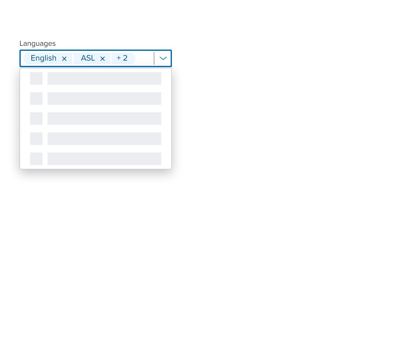
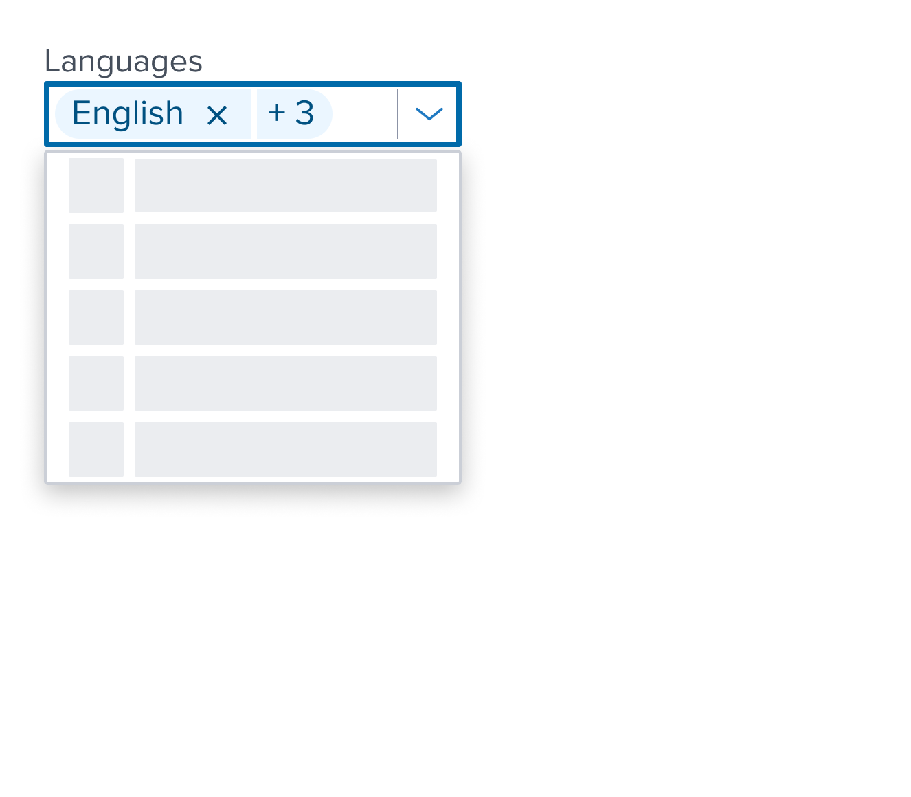
 |  |  | Skeleton List: showing a skeleton 'S1' loading pattern for rendering fidelity in a single select list within a form. Shown within the main content region form UI composed with Form Layout Block; Text label placed on top of the input. |
Digital Accessibility
This composable has no known-of related A11y concerns.
Variants
This composable has no known-of variants.
Usage Warnings
In the rare case where the list items are progressively loaded and by the time the user interacts with the content of the list, the items are not yet loaded, the skeleton item can be used to indicate that the list (or the specific list item) is loading.
The Dimsum team is not aware of valid scenario of usage for this, but it is available as part of the "skeleton" effort that is still being refined and not yet published.
While usage is not directly discouraged, we do encourage you to consult with Dimsum team regarding your scenario in case any a11y consideration needs to be taken into account.
Reference
This composable has no known-of references.
